|
|
Critique By:
ABC 123 (K:677)
10/2/2006 3:47:19 PM
Dear Rosan,
Everything in your picture is great: the soft colours of the sun rising through the dew and the same time we can see the light pointing at the end of the perspective drawn by the trees. Regarding the trees, you managed to have a long depth of field. With so few light in this region, I presume you were using a tripod? Am I wrong? Moreover you managed to have a very wide contrast and no details are lost in shadows which is from my personal experience the most problematic aspect with these kind of pictures.
It is a beautiful and amazing shot. Congratulations again.
Roland
|
| Photo By: Rosan Kador
(K:1276)
|
|
|
Critique By:
ABC 123 (K:677)
10/2/2006 3:38:52 PM
Dear Mohammad, you've got a great shot here. The 24mm on an argentic 24X36 delivers its promises. The perspective is excellent and very well controlled looking at all the wires around! Light is also well controlled: the man appears brighter than the back ground and not details are lost in shadows or highlights. We can even follow his eye-sight towards us. I appreciatate the frame and centering. The top touches the arch and the bottom just below the man arms. The position of the arms appear to me as key point in this beautiful picture.
Again congratulations!
Roland
|
| Photo By: Mohammad Reza Shahrokhi Nejad
(K:7396)
|
|
|
Critique By:
ABC 123 (K:677)
10/2/2006 3:23:46 PM
That's Indian Summer! Lucky Canadians ;-)
|
Photo By: Dave Stacey
(K:150877)

|
|
|
Critique By:
ABC 123 (K:677)
10/2/2006 3:21:47 PM
Simply beautiful The sepia effect delivers a perfect vintage aspect. Knowing how difficult it is to master, to control, it is very well done. I am wondering how the picture would like without the garbage dumped on the ground and the mattress. It will appear more nostalgic too me. The lighting is perfectly mastered as you have lost no details into the bright background: the leaves appear quite well and even the side walls are not lost in shadows.
Congratulations Andjela for this amazing shot!
Roland.
|
| Photo By: Andjela Vujic
(K:9)
|
|
|
Critique By:
ABC 123 (K:677)
10/2/2006 2:46:38 PM
I fully agree with you Jo!
|
| Photo By: Sandy Towt
(K:18)
|
|
|
Critique By:
ABC 123 (K:677)
10/2/2006 2:43:20 PM
Great shot and composition. You are right their faces are so much full of expressions.
I really like this picture and I envy to see this part of our world.
roland
|
| Photo By: Gina Del Mistro
(K:288)
|
|
|
Critique By:
ABC 123 (K:677)
10/2/2006 2:28:47 PM
Very artistic and the solarizing effect is very well controlled likewise the important contrast. The choice of black and white is obvious here. Is that a self-portrait? The look is very strong and the post-processing effect gives to it a mysterious touch. The lock of hair on the right chick is very important here. Moreover the important level of greys in the lips and the eyes make too me the difference and are responsible for the amazing result. I look forward to viewing more of your pictures.
Congratulations.
Roland
|
| Photo By: Sandy Towt
(K:18)
|
|
|
Critique By:
ABC 123 (K:677)
10/2/2006 2:15:22 PM
Hi Laphael! What an unsual and very original picture of Shanghai skyline. I imagine you were at 18mm to achieve this wide-angle effect. IMHO the red filter applied on the top and the orange one on the bottom are too strong and combined together, they deserve their purpose. I would personnally try only of these two (preferably orange) just for the sky and the clouds. Again this is just the way I see things... Nevertheless this is a great shot of a fascinating and vibrant city!
Congratulations,
Roland
|
| Photo By: laphael wang
(K:2318)
|
|
|
Critique By:
ABC 123 (K:677)
10/2/2006 10:16:10 AM
Dear Hasim,
The colors, the centering and the control of the contrast are all jsut perfect. Was the peculiar lighting on the top of the window due to an artificial lighting? Would it be possible for you to take other pictures with various small opening of the window? If yes, please keep the same centering, the lateral dark zones really highlight the central part of the picture.
Well done. Congratulations!
Roland
|
| Photo By: Hasim Aksu
(K:1032)
|
|
|
Critique By:
ABC 123 (K:677)
10/2/2006 9:16:26 AM
Anyway we are all novice and that is why I love the pictures here. Honestly your pictures are really great!
|
| Photo By: Adele McGookin
(K:532)
|
|
|
Critique By:
ABC 123 (K:677)
10/2/2006 9:12:39 AM
Wow another great shot and in color this time. I hope I could see more of your pictures in China! I can tell you that you were lucky to have this light at the Great Wall. Most of the time it is smoggy and not really favorable for the photographer. In this one the depth of field is just perfect in the window opening. I wish we could see more of the Great Wall, like a snake on the top of the mountains. But we can see up to 3 levels of mountains which is by itself a remarkable feature.
Congratulations again,
Roland
|
| Photo By: Adele McGookin
(K:532)
|
|
|
Critique By:
ABC 123 (K:677)
10/2/2006 9:07:48 AM
Hi Adele,
I really love this shot!! The centering is just perfect and the tones and contrast delivers a very wide of greys from foreground to background. You just have to let your eyes follow from black to grey. I only regret the too important depth of field which makes the archery window too clear and sharp and therefore distracts the viewer from the Great Wall in the center. I went several times to the Great Wall and to different places. That is may be why I am so enthusiastic about your picture. Hen hao!
|
| Photo By: Adele McGookin
(K:532)
|
|
|
Critique By:
ABC 123 (K:677)
10/2/2006 9:01:31 AM
Hi Silvia! This is a great shot. I am crazy about such portraits of kids. I also like very much this tight frame. This look tells us so much and his mouth... Wow you caught it at the right moment. I only regret the red triangle in the bottom-left corner. This is probably the shoulder of one the kid's firend. Cropping more on the left would be a bad idea. You might have tried some "stamping tool" in Photoshop... Nevertheless it is one of the most beautiful portrait I have seen these weeks here!
Congratulations.
Roland
|
| Photo By: Silvia Festa
(K:6008)
|
|
|
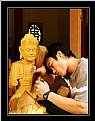
Critique By:
ABC 123 (K:677)
10/2/2006 7:55:26 AM
Great action shot! I like the contrast between the peaceful face of Buddha and the motion of the man's hand. Congratulations!
|
| Photo By: Nhat Minh
(K:178)
|
|
|
Critique By:
ABC 123 (K:677)
10/1/2006 9:49:28 PM
WOW! EXCELLENT! I really love this picture!! The light is perfectly caught. How did you manage to make this grainy effect? Have you pushed the ISO to 3200? This choice really "makes" the picture so SPECIAL and NICE. I also like the dark diagonal separating the two zones with different colors. I am wondering what would be the result on paper, without any rear-lighting...
Again VERY GOOD!
Roland
|
| Photo By: Giuseppe Guadagno
(K:34002)
|
|
|
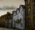
Critique By:
ABC 123 (K:677)
10/1/2006 9:45:17 PM
I really like the lighting, especially below the dark clouds and above the roofs. Tehe white house between the red-brick houses is extremely well chosen. I would prefer a slightly brighter picture but I am aware that means losing details in the sky and clouds. Finally, I would have removed the two yellow lines on the road in the bottom right corner. Hope you understand my viewpoint ;-)
Roland
|
| Photo By: Quix Photography
(K:20204)
|
|
|
Critique By:
ABC 123 (K:677)
10/1/2006 8:39:16 PM
Hi Serge. I like very much your pictures: the composition is really enhanced by the way you have captures the wires of the trolley-buses. These wires define line for the overall composition and positionning of ads and cars. IMHO, I only regret the way the white car in the right-bottom corner is captured. without this car, I would see a perfect composition. But what to do. It is nevertheless a very very nice shot! Congratulations
Roland
|
| Photo By: Serge Moscow
(K:-2917)
|
|
|
Critique By:
ABC 123 (K:677)
10/1/2006 6:58:29 PM
Hi Sandra! Your picture is lovely. The tones and contrast are just perfect. The blur effect is very well controlled and deliver a mysterious ambiance which corresponds to the colors. The bright leaves in the bottom right corner makes a very good. Nevertheless the very bright and shinny zone just below the bridge deserves in IMHO some digital post-processing. Besides this little thingy it is really a great shot. Congratulations
|
| Photo By: Sandra Berry
(K:8352)
|
|
|
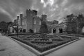
Critique By:
ABC 123 (K:677)
10/1/2006 1:43:33 PM
Hi Paolo,
I really like the composition especially your choice not to focus on the left part of the window where the dog is located. It is straight in the direction of Henri CB's style whit human faces. I am wondering why you tried to keep the reflection on the window. Is it bringing anything special? Maybe it is in direct relation with the direction of the dog's eyesight. Anyway, I like all these questions brought to me by your pictures.
|
| Photo By: Paolo Corradini
(K:59552)
|
|
|
Critique By:
ABC 123 (K:677)
10/1/2006 12:29:33 PM
The colors and contrast are really amazing. IMHO the picture needs some sharpening. The blur effect is not providing an effective result or is it the limited depth of field? I guess the aperture was maximal when you pressed the shutter, in order to catch enough light. May be with a tripod, you could have decreased the aperture. Again this is just my personal vision of this beautiful colors. Sometimes we do not carry along with us all the photo stuff. So we have to live with that! Congratulations!
|
| Photo By: Dr. Rafael Springmann
(K:89517)
|
|
|
Critique By:
ABC 123 (K:677)
10/1/2006 11:01:24 AM
I really like the 16:9-like format but personally, I am not very keen with half-half composition for the sea and the city+sky. Two particular reasons with your very nioce shot: First, the jetty on the bottom left of the picture attracts too much the sight and second the sky is quite beautiful with all these clouds. I would have taken advantage of this. Nevertheless, the lines are sharp and the light is exceptional. I love your portfolio Jason.
|
| Photo By: Jason Mckeown
(K:22200)
|
|
|
Critique By:
ABC 123 (K:677)
10/1/2006 10:36:51 AM
I like the overall composition but I wish you would have brought some asymmetry into it. It appears "too perfect": Corner in the middle of the bottom line and divisin in halves of the foreground and background. What I really like is the way you have stressed the separation between the building and the sky. It has a great effect but at the same time by contrast the foreground is no longer highlighted. It is neverthe less a great shot! Congratulations.
|
| Photo By: Salvatore Rossignolo
(K:13559)
|
|
|
Critique By:
ABC 123 (K:677)
10/1/2006 10:31:28 AM
Have you used a polarizing filter? The sky is so blue, and such adark blue... It makes the picture a bit "unreal".
|
| Photo By: hdw Photography
(K:6630)
|
|
|
Critique By:
ABC 123 (K:677)
10/1/2006 10:29:26 AM
Great shot! You are probably well aware of the little problem on the bottom right! But what to do? When you have such an opportunity of great shot, we will all press the shutter knowing the contraints. By the way, I love your B&W in your portfolio.
Roland
|
| Photo By: Anindya Maity
(K:7880)
|
|
|
Critique By:
ABC 123 (K:677)
9/29/2006 11:10:33 PM
Chris, I love it! The high key really reproduce the freezing effect! I agree with Jan regarding the crop on the right side. Nevertheless, this picture has a real effect on me. Congratulations!
|
| Photo By: chris d
(K:3046)
|
|
|
Critique By:
ABC 123 (K:677)
9/29/2006 10:55:08 PM
I love the sky, the clouds, the light and the different level of waves in the sea. IMHO the dark foreground occupies a too important space in the composition. I would have prefered more 2/3 for the sky---especially with this light and these clouds--- and 1/3 for the beach in fg. This is just the way I personnaly feel it. Attached is what I took this evening on Geneva Lake.
|
| Photo By: John Loreaux
(K:86210)
|
|
|
Critique By:
ABC 123 (K:677)
9/29/2006 10:43:01 PM
The depth of field and the perspective is perfectly mastered. But like others, I found the result too symmetrical. I wish it could be a male and a female with the female one or two steps above the male and along the diagonal for instance. Just a suggestion. It is nevertheless a GREAT SHOT!
|
| Photo By: Gianes Ma
(K:26069)
|
|
|
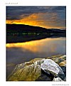
Critique By:
ABC 123 (K:677)
9/29/2006 10:12:42 PM
The background lighting is truly exceptional. I am just concerned with the very sharp and shiny rock in the foreground: it tends to catch to much attention and in my opinion it does not deserve this very specific treatment. It is nevertheless an admirable picture! Congratulations
|
| Photo By: Daniele Di Marco
(K:532)
|
|
|
Critique By:
ABC 123 (K:677)
9/29/2006 9:51:13 PM
Wow beautiful colors! The composition is classical but very effective in this amazing environment. I really love it!
|
| Photo By: Cleveland Smith
(K:7006)
|
|
|
Critique By:
ABC 123 (K:677)
9/29/2006 3:39:30 PM
Excellent shot! I really love it. The contrast is so strong. Your B&W skills are impressive!!
|
| Photo By: Asdren Xërxa
(K:696)
|
|