|
|
Critique By:
Ryan Poirier (K:182)
8/18/2004 3:23:22 AM
Awesome.
|
| Photo By: Simon Crinks
(K:-54)
|
|
|
Critique By:
Elsje Fiederelsje (K:6320)
8/17/2004 10:09:26 AM
very very good!!!
greetz elly
|
| Photo By: Simon Crinks
(K:-54)
|
|
|
Critique By:
Mark Beltran (K:32612)
8/17/2004 12:58:26 AM
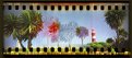
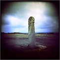
A lot of people don't realize all you have to do is pop a 35mm cartridge and some cardboard shims, and tape the leader to the takeup spool and you're set! What I like is that the results looks like a combined view from both the photographer and the camera itself.
|
| Photo By: Simon Crinks
(K:-54)
|
|
|
Critique By:
Kevin H (K:22502)
8/16/2004 10:33:07 PM
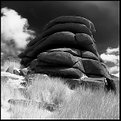
The framing and angle of this shot makes it different and spectacular. The use of brownish tone makes this picture look old. I find the rider a little to blurry (add more SOF) and really dark, as you can get any details out of the face. Beside that, it's an amazing shot. Keep up the good work.
|
| Photo By: Simon Crinks
(K:-54)
|
|
|
Critique By:
Michael Sean Fleming (K:2267)
8/3/2004 5:04:54 AM
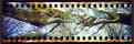
Very cool IR shot.I thought it was coral in the thumbnail.
|
| Photo By: Simon Crinks
(K:-54)
|
|
|
Critique By:
Roberto Arcari Farinetti (K:209486)

7/18/2004 9:36:54 PM
wooww
terrific!
and perfect
cheers
roby
|
| Photo By: Simon Crinks
(K:-54)
|
|
|
Critique By:
Wayne Harridge (K:18292)
7/18/2004 10:25:36 AM
Very nice.
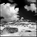
I like the way you have a bit of light on the top of the rocks providing some separation from the dark sky.
|
| Photo By: Simon Crinks
(K:-54)
|
|
|
Critique By:
Lukasz Kuczkowski (K:14687)
7/18/2004 8:16:24 AM
I like the composition here and the tones; I wish there was smaller contrast between some parts of the stones so some details in the dark parts could be seen as well;
regards
Lukasz
|
| Photo By: Simon Crinks
(K:-54)
|
|
|
Critique By:
Kym Skiles (K:1520)
7/18/2004 6:03:59 AM
Great subject for IR (in my opinion). I like the simplicity of the image. I've read about the Maco IR, but never used it, maybe I'll have to give it a go. Did you use a red #25 filter?
|
| Photo By: Simon Crinks
(K:-54)
|
|
|
Critique By:
Ian McIntosh (K:42997)
7/18/2004 4:39:19 AM
Looks Hot.
|
| Photo By: Simon Crinks
(K:-54)
|
|
|
Critique By:
Michael Romanowicz (K:165)
7/18/2004 1:54:29 AM
Excellent!
|
| Photo By: Simon Crinks
(K:-54)
|
|
|
Critique By:
jiorji m (K:489)
7/18/2004 1:32:24 AM
i love your techniques
they're very unique
|
| Photo By: Simon Crinks
(K:-54)
|
|
|
Critique By:
Rebecca Raybon (K:26654)
7/18/2004 1:21:39 AM
Magnificent IR. The hardness of the rocks against the soft, pale grass is a remarkable image.
|
| Photo By: Simon Crinks
(K:-54)
|
|
|
Critique By:
xxxIlonaxxxx xxxxKrijgsmanxxxx (K:10405)
7/8/2004 4:27:39 PM
lovely idea....like it
|
| Photo By: Simon Crinks
(K:-54)
|
|
|
Critique By:
Sara M (K:12411)
7/8/2004 4:14:15 PM
Interesting.. and very well presented.. 7/7
|
| Photo By: Simon Crinks
(K:-54)
|
|
|
Critique By:
joy blair (K:25)
7/3/2004 8:41:36 PM
This is a beautiful picture. great color, very artistic. i love your style.
|
| Photo By: Simon Crinks
(K:-54)
|
|
|
Critique By:
Kevin H (K:22502)
7/3/2004 4:10:14 PM
Love this effect and border you have going. Made a simple picture look amazing. Keep up the good work.
|
| Photo By: Simon Crinks
(K:-54)
|
|
|
Critique By:
Justine Worth (K:831)
7/2/2004 7:56:18 PM
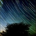
Cool picture! Very eyecatching and dramatic. You picked a really good contrast with the bush/ tree.
|
| Photo By: Simon Crinks
(K:-54)
|
|
|
Critique By:
Kevin Collier (K:19076)
6/30/2004 9:27:32 PM
Great image -- just what is Tom dreaming of?
|
| Photo By: Simon Crinks
(K:-54)
|
|
|
Critique By:
zosia zija (K:11106)
6/30/2004 9:20:25 PM
nice work!
|
| Photo By: Simon Crinks
(K:-54)
|
|
|
Critique By:
Terry McCully (K:9221)
6/30/2004 8:34:40 PM
Great Holga
|
| Photo By: Simon Crinks
(K:-54)
|
|
|
Critique By:
Terry McCully (K:9221)
6/29/2004 8:58:58 PM
still love it
|
| Photo By: Simon Crinks
(K:-54)
|
|
|
Critique By:
Kevin Collier (K:19076)
6/29/2004 3:23:04 AM
Excellent image -- great holga work here!! K
|
| Photo By: Simon Crinks
(K:-54)
|
|
|
Critique By:
Kym Skiles (K:1520)
6/29/2004 2:29:58 AM
I liked the others just as much as this one. Excellent toy work. If you have a moment, I'd love to discuss your Holga mod for 35mm, I've been wanting to mod one of my Holga's too and haven't quite figured out the best method for 35mm.
Looking forward to more of these 
|
| Photo By: Simon Crinks
(K:-54)
|
|
|
Critique By:
Terry Ward (K:-926)
6/28/2004 11:07:42 PM
Yes 35mm. Anyway, I think it's a good photo also. Very good. T
|
| Photo By: Simon Crinks
(K:-54)
|
|
|
Critique By:
Marcus Claésson (K:2179)
6/28/2004 10:01:39 PM
35mm? Anyway, a good picture.
|
| Photo By: Simon Crinks
(K:-54)
|
|
|
Critique By:
peter dolan (K:104)
6/26/2004 1:40:44 AM
Dramatic use of filters, the collusion of tones brings a comparison of the grass and the clouds, and of the rocks and the sky. I like it.
|
| Photo By: Simon Crinks
(K:-54)
|
|
|
Critique By:
peter dolan (K:104)
6/26/2004 1:38:05 AM
I find this very interesting. It plays simultaneously with the fascination with subject matter, the problematic nature of photographic "realism" (through the color problems and the inclusion of the negative edges), the fascination with technical perfection, and the equipment fetish (through the film brand markings). I like that it doesn't make any conclusions. Keep up the good work!
|
| Photo By: Simon Crinks
(K:-54)
|
|
|
Critique By:
Marcio Janousek (K:32538)
6/25/2004 1:14:20 AM
Excellent work Simon..very strong !!
|
| Photo By: Simon Crinks
(K:-54)
|
|
|
Critique By:
Bahadir k (K:8825)
6/24/2004 10:48:52 PM
thats a nice cityscape
your after-touch makes it unusal,
regards
bahadir
|
| Photo By: Simon Crinks
(K:-54)
|
|