|
|
Critique By:
Ron Clark (K:506)
10/10/2006 11:16:55 PM
Very nicely done. The black and white is perfect for this image. The eye is drawn to and remains drawn to the structure and not the surrounding elements. Keep up the good work.
|
| Photo By: Toni Petersen
(K:2404)
|
|
|
Critique By:
Ron Clark (K:506)
10/10/2006 11:05:47 PM
Thanks for the comment. I have been away so it has taken me a little while to get back. I'm glad that you like the image.
|
| Photo By: Ron Clark
(K:506)
|
|
|
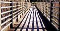
Critique By:
Ron Clark (K:506)
6/30/2006 8:40:28 PM
Very nice image. I love the colors and the texture. I would suggest burning the top of the steps where the reflected light is intense as it seems to draw the eye to that corner. Give it a try. Overall well done.
|
Photo By: Cleveland Smith
(K:7006)

|
|
|
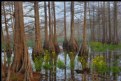
Critique By:
Ron Clark (K:506)
3/27/2006 8:10:40 PM
I like this image but think you could have saturated the color more to bring out the rust color. Otherwise, a nice image. What is it anyway?
|
| Photo By: Robert Gaither
(K:34128)
|
|
|
Critique By:
Ron Clark (K:506)
3/8/2006 11:53:07 PM
I llike the angle, perspective, and reflection in this. The lines also help lead to the subject. nice.
|
| Photo By: cory lowry
(K:458)
|
|
|
Critique By:
Ron Clark (K:506)
3/8/2006 11:39:00 PM
Very well done. Nice color and perspective.
|
| Photo By: John William
(K:775)
|
|
|
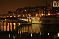
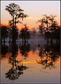
Critique By:
Ron Clark (K:506)
3/6/2006 2:55:51 PM
I must say that this is one of your better images. The light, the color, the calm water, and the reflections of light. This is a beautiful shot.
|
| Photo By: Steve Tomkinson
(K:3243)
|
|
|
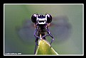
Critique By:
Ron Clark (K:506)
3/6/2006 2:33:56 PM
Excellent macro photography. In focus, very detailed. Love the colors.
|
| Photo By: Aishu Mathema
(K:84)
|
|
|
Critique By:
Ron Clark (K:506)
3/6/2006 1:38:13 AM
Good Idea. I think the image would be better with a sharper image but it works as is. Very nice.
|
| Photo By: Daniel LaHaie
(K:145)
|
|
|
Critique By:
Ron Clark (K:506)
3/6/2006 1:23:51 AM
Very nice. There is peace and serenity in this picture. Very quiet but nice. The reflection in the water, the soft focus, and the black and white are all very nice touches.
|
| Photo By: Eb Mueller
(K:24960)
|
|
|
Critique By:
Ron Clark (K:506)
2/26/2006 4:24:16 AM
Beautiful shot. The combination of lights, reflected light, and the dark areas seem to draw the eyes into the picture, searching for detail.
|
| Photo By: Roberto Baez Duarte
(K:5317)
|
|
|
Critique By:
Ron Clark (K:506)
2/26/2006 4:19:18 AM
Beautiful colors and contrast. Love the imagery.
|
| Photo By: Sara M
(K:12411)
|
|
|
Critique By:
Ron Clark (K:506)
2/26/2006 4:11:58 AM
Nice portrait, good color and composition but why did you crop the very top of her head? Keep shooting.
|
| Photo By: cecilia tovini
(K:29423)
|
|
|
Critique By:
Ron Clark (K:506)
2/21/2006 10:35:33 PM
Beautiful shot. The scene is calming. I love the warmth of the color, one could almost feel the sun on them.
|
| Photo By: Clyde Koa Wing
(K:-133)
|
|
|
Critique By:
Ron Clark (K:506)
2/20/2006 3:11:52 PM
You donn't necessarily need to center the object, but I quess with the subject and size you would have to be very close to centering, Just don't cut off the frame of the glasses or leave it touching the edge of the shot.
|
| Photo By: Ron Clark
(K:506)
|
|
|
Critique By:
Ron Clark (K:506)
2/19/2006 9:03:21 PM
Well done. I like the lines and shadows. The lines draw your look towards the end of the bridge, leading the veiwer. Keep shooting.
|
| Photo By: Chris Holland
(K:395)
|
|
|
Critique By:
Ron Clark (K:506)
2/19/2006 8:59:33 PM
Nicely done. The image is well composed. I do wonder if it would have been good to saturate the color a little bit, it would have brought out the sunlight on the ground a little more.
|
| Photo By: cessy karina
(K:14205)
|
|
|
Critique By:
Ron Clark (K:506)
2/19/2006 8:54:38 PM
Beautiful image. I love the black and white, the shadows crossing the tower, and the spiral of the stairs. Very good eye.
|
| Photo By: cessy karina
(K:14205)
|
|
|
Critique By:
Ron Clark (K:506)
2/19/2006 8:50:53 PM
Hopefully you weren't drinking this when you cut your son's hair. Nice experiment.
|
| Photo By: Bradley Prue
(K:30678)
|
|
|
Critique By:
Ron Clark (K:506)
2/19/2006 8:47:20 PM
Who, in their right mind, would let you anywhere near their head with scissors? I thought Alex would have been smarter than that. But then again, he does like to live on the edge. Nice shot though.
|
| Photo By: Bradley Prue
(K:30678)
|
|
|
Critique By:
Ron Clark (K:506)
2/19/2006 8:39:57 PM
Nice subject and capture. Would suggest a change in the cropping giving a little more on the right side at the frame of the glasses touches the edge of the image. Otherwise, very well done.
|
| Photo By: Hasim Aksu
(K:1032)
|
|
|
Critique By:
Ron Clark (K:506)
2/19/2006 8:36:30 PM
I like this image but have to wonder if it couldn't be helped by a little saturation or an increase in the contrast. I like the composition and the light mist in the background.
|
| Photo By: Ronnie Gaubert
(K:3700)
|
|
|
Critique By:
Ron Clark (K:506)
2/19/2006 8:34:28 PM
Very nicely done. I like the mirrored silhouettes and the color. Nice balance and composition.
|
| Photo By: Ronnie Gaubert
(K:3700)
|
|
|
Critique By:
Ron Clark (K:506)
1/10/2006 4:05:09 PM
Incredible picture. The light just beyond the swan, the blur that creates an almost mystic atmosphere. Very nicely done. Keep up the good work.
|
| Photo By: Brane T. Cervek
(K:470)
|
|
|
Critique By:
Ron Clark (K:506)
1/10/2006 3:33:13 PM
This is a very nice picture. The composition is excellent. Very nice contrast. Black and white was an excellent choice. One question-- Could you have added some of the detail in the hut. It seems that the detail has been lost.
|
| Photo By: KEVIN TEMPLE
(K:8657)
|
|
|
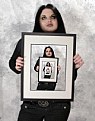
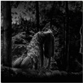
Critique By:
Ron Clark (K:506)
1/6/2006 6:16:13 PM
Excellent shot. The mood is dark and seems animalistic. Lighting and contrast do an excellent job creating this atmosphere. I would, however, suggest one change. The composition does not seem just right. The subject is good but the frame of the photo seems off just a bit. I would suggest that the model be more to the right (or camera turned more to the left) to place the model off center but on the right side of the frame. I think this would help to create a sense of balance in the photo.
|
| Photo By: Rusli Effendy
(K:211)
|
|
|
Critique By:
Ron Clark (K:506)
1/3/2006 4:06:40 PM
This is a very interesting picture. The eye is led down the hallway to the end. The lights reflected off the floor add to the visual image. I would suggest cropping the sides more. Frame the hallway a little better. Just a suggestion.
|
| Photo By: m.c.lopez&lalage
(K:148)
|
|
|
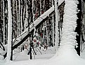
Critique By:
Ron Clark (K:506)
1/2/2006 1:31:17 PM
Well taken photo. Snow always seems to make a picture interesting. The only real color in this is the leaves clinging to the tree. You get the feel of a black and white image with splashes of color. Very nice.
|
| Photo By: Tim Long
(K:9228)
|
|
|
Critique By:
Ron Clark (K:506)
1/2/2006 1:22:23 PM
Very interesting shot. The lens distortion adds to the picture.
|
| Photo By: cessy karina
(K:14205)
|
|
|
Critique By:
Ron Clark (K:506)
12/20/2005 2:08:51 PM
Thank you very much for the comment. I checked the first page of your portfolio (short of time) and see that you know how to shoot a landscape. Some excellent work there. I will be back to look at it some more and will keep in touch. Keep up the work.
|
| Photo By: Ron Clark
(K:506)
|
|