|
|
Critique By:
tom rumland (K:14874)
3/7/2005 6:31:30 PM
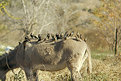
hugo??? you there? i tried emailing you at gm*** but no response. i guess you're not checking it lately? zap me an email if you get a chance....
take care,
tom
|
| Photo By: Hugo de Wolf
(K:185110)
|
|
|
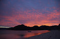
Critique By:
tom rumland (K:14874)
3/7/2005 5:58:44 PM
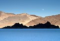
chris, outstanding! the valley blessed you with an incredible view. although, i find it interesting that the silt looks like salt because of the blue cast. i'm curious what it would look like if you could've corrected the blue cast and darkened the sky a little bit. other than that, and if i forget what i know about the place, an excellent composition. love the sharp contrast between the grandstand and the mountains behind. and that moon is the kicker. well done!
take care,
tom
|
| Photo By: Chris VenHaus
(K:30)
|
|
|
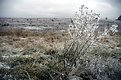
Critique By:
tom rumland (K:14874)
1/13/2005 4:40:02 AM
lea, wow! what an amazing tree! your "about" says it's in baltimore. i'm curious as to where in baltimore this is. i live in northern va and take the occasional trip up to "ballmer" to see shows and whatnot but i would love to see this. your composition is a bit central but it works. the tree, with it's undulating branches and multicolored leaves creates a tie-dye of sorts which deserves to open up from a central point. i can certainly see why it is your favorite tree. it looks an awful lot like my favorite tree ;^) i haven't posted it because i'm not too sure of the composition. i'll have to revisit it and see if i should post it. regardless, great shot!
take care,
tom
ps - thanks for your recent comment. much appreciated. i have actually been staring at your tree for a few days prior to your comment to me. i'm simply fascinated by it....
|
| Photo By: Lea Mulqueen
(K:7396)
|
|
|
Critique By:
tom rumland (K:14874)
1/12/2005 12:42:25 AM
tm, very clean and simple. excellent abstract! as usual, i'm amazed by your eye. btw, i didn't know you were hanging out under bridges these days ;^)
take care,
tom
|
| Photo By: Todd Miller
(K:16464)
|
|
|
Critique By:
tom rumland (K:14874)
1/11/2005 8:28:20 PM
hugo, you already know how i feel about this series. i will comment but want to wait and see what the response is as i'm very interested. little hint: outstanding! one of your best, imho.
take care,
tom
|
| Photo By: Hugo de Wolf
(K:185110)
|
|
|
Critique By:
tom rumland (K:14874)
1/11/2005 7:14:52 PM
michael, excellent shot! good job balancing detail in the moon and maintaing background. the blue cast of the sky really works. reminds of the song "mountains of the moon". although i agree with hugo regarding the cropping of the catus tops in the lower left, i'd try it a bit differently... how's this?
take care,
tom
|
| Photo By: Michael Kanemoto
(K:22115)
|
|
|
Critique By:
tom rumland (K:14874)
1/9/2005 7:37:14 PM
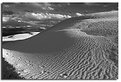
don, thanks for the "about". before i read it my first thought was "too sharp, don, too sharp!" ;^) nice composition and detail. i love the layers on the dune. held in place by the recent rain, i assume. i also like the look of foot prints. they look solidified or embedded permamnently in the dune. shame that they lead me off the frame instead of into it. not sure how you could've done that and maintained your composition, tho. great shot!
take care,
tom
|
| Photo By: Don Loseke
(K:32503)
|
|
|
Critique By:
tom rumland (K:14874)
1/9/2005 7:32:13 PM
todd, see? i'm always learning from you... dig the title; very fitting. btw, any idea what settings you used? specifically aperture?
take care,
tr
|
| Photo By: Todd Miller
(K:16464)
|
|
|
Critique By:
tom rumland (K:14874)
1/9/2005 7:19:33 PM
john, thanks for the comment and tip. i will certainly give it a try next time. as you probably know from reading my comments above, the sky is the one thing i had a lot trouble with. actually, i have trouble with color correction in general. i think it's time to read up on it....
take care,
tom
|
| Photo By: tom rumland
(K:14874)
|
|
|
Critique By:
tom rumland (K:14874)
1/7/2005 6:33:09 PM
outstanding composition, john. it seemed to me to be a panorama pitched to right and suspended in a black frame. imagine my surprise when i opened it and saw this. dead-on horizon encased in a tilted frame. genius...
take care,
tom
|
| Photo By: John Lamb
(K:9687)
|
|
|
Critique By:
tom rumland (K:14874)
1/7/2005 6:28:33 PM
barrie, i love this! so peaceful. it induces a sense of hope in me somehow. great photo!
take care,
tom
|
| Photo By: Barrie Cranston
(K:172)
|
|
|
Critique By:
tom rumland (K:14874)
1/7/2005 6:26:28 PM
verena, interesting shot(s). i looked at both a few times and found that the knot itself is a bit more interesting in the other one. however, the vodafone sign is much more intrusive in the other one and distracts me greatly. here it is more subdued and i had to look for it to see it. it didn't jump out at me. also, the diagonal lines (cables?) in this one form a much more pleasing pattern. it also less cluttered. the primary mass of cables (the knot) is also better placed in this composition. this one is my favorite. it inspires quite a bit of curiosity. and here it is: what is it? a sculpture? or an unfinished telephone cable job?
|
Photo By: Verena Rentrop
(K:15233)

|
|
|
Critique By:
tom rumland (K:14874)
1/7/2005 5:59:41 PM
michael, very funny! like flies on a deer. btw, have you picked out our next experiment?
take care,
tom
|
| Photo By: Michael Kanemoto
(K:22115)
|
|
|
Critique By:
tom rumland (K:14874)
1/7/2005 5:58:10 PM
michael, this one is a beauty! reminds me of growing up in the dominican republic. i can almost smell the food cooking in a deep-frier.
take care,
tom
|
| Photo By: Michael Kanemoto
(K:22115)
|
|
|
Critique By:
tom rumland (K:14874)
1/7/2005 5:54:38 PM
stefan, very nice color arrangement! a feast for the eyes. normally i'm not very keen on replacing skies because it generally looks fake. but it works here very well as it balances out the composition and completes the rainbow of color. this one is going in my favorites!
take care,
tom
|
| Photo By: Stefan Engström
(K:24473)
|
|
|
Critique By:
tom rumland (K:14874)
1/7/2005 5:50:48 PM
amna, beautiful composition. love your use of negative space.
take care,
tom
|
| Photo By: Amna Al Shamsi
(K:21795)
|
|
|
Critique By:
tom rumland (K:14874)
1/7/2005 5:49:00 PM
michael, i like this one as well. although i tend to like the next one a bit better as it shows a bit more context. however, the effect of the ice is very interesting (i love days like this so long as i don't have to drive). it somehow changes the barbwire from it's usual predisposition as a warning and turns it into something more akin to a christmas ornament. what with the way the icicles formed in even spacings. very nice!
take care,
tom
|
| Photo By: Michael Kanemoto
(K:22115)
|
|
|
Critique By:
tom rumland (K:14874)
1/7/2005 5:45:08 PM
michael, i love this composition. very nice dof turning the background into texture. i like that it's not a simple, static texture but a more interesting visual varying in color and form. very well done!
take care,
tom
|
| Photo By: Michael Kanemoto
(K:22115)
|
|
|
Critique By:
tom rumland (K:14874)
1/7/2005 5:33:55 PM
hugo, very nice! i like this view of HK as it's not as "popular". don't really see it from this angle very often (at least i have not). i think the humidity helps here in a number of ways: adding mood and more importantly, allows you to shot this at f/3.5 with an improvised support (sans tripod). if it was clear the softness in the background would (might) become more obvious or out-of-place. very well done! i'm still amazed at your ability to pull these off (esp. at night!).
take care,
tom
|
| Photo By: Hugo de Wolf
(K:185110)
|
|
|
Critique By:
tom rumland (K:14874)
1/7/2005 5:27:01 PM
tm, i recall squarepusher I but when i went to compare them i couldn't find it anymore. the "entry" is there but the thumb is missing. what did you change? made it b&w? but that's neither here nor there... what i want to know about is your new mugshot ;^) what the hell is that??? ;^)
take care,
tr
|
| Photo By: Todd Miller
(K:16464)
|
|
|
Critique By:
tom rumland (K:14874)
1/5/2005 7:42:12 PM
add half a pound of (large) colored dots. shake well. enjoy extra dots!
keep shakin' tm...
tr
|
| Photo By: Todd Miller
(K:16464)
|
|
|
Critique By:
tom rumland (K:14874)
1/5/2005 7:04:34 PM
sean, wonderful shot! i dig the effect caused by the slow shutter. keeps the water in relative motion and captures the spray really nicely. i would love to see a bit more of the spray on top, tho.
take care,
tom
|
| Photo By: sean slavin
(K:3488)
|
|
|
Critique By:
tom rumland (K:14874)
1/5/2005 6:59:08 PM
hugo, this is amazing! incredibly sharp for this type of shot. remember my san diego shots? :^) i hardly ever leave home sans tripod, as you know, but i'll have to remember this trick. love the way the blue color from the lights at the top of the buildings is diffused by the mist. interesting too how the lights on the mountain form a nice little outline in the background. i gotta try this again.... well done!
take care,
tom
|
| Photo By: Hugo de Wolf
(K:185110)
|
|
|
Critique By:
tom rumland (K:14874)
1/5/2005 6:33:25 PM
bart, thanks! your sepia version looks interesting. i'd love to see it larger. could you email it to trumland at gmail dot com?
take care,
tom
|
| Photo By: tom rumland
(K:14874)
|
|
|
Critique By:
tom rumland (K:14874)
1/5/2005 4:11:51 AM
ursula, moody landscape fits this very well! the contrast bump really makes it.... well, moody ;^) very nice composition. i like the opening in the bushes which leads me to the flock of ducks (is it called a flock? or flight?) with those interleaved and gradually disappearing mountains in the background. i feel the chill and taste the coffee. excellent work!
take care,
tom
|
| Photo By: Ursula Luschnig
(K:21723)
|
|
|
Critique By:
tom rumland (K:14874)
1/5/2005 4:01:45 AM
tm, call me crazy but i would've sworn that i saw a recent upload from you. windowlicker somethingorother? what happened?
this is very "tm". you somehow find a way to make symmetry work for you.
good to see you back,
tr
|
| Photo By: Todd Miller
(K:16464)
|
|
|
Critique By:
tom rumland (K:14874)
1/5/2005 3:56:57 AM
patrick, great catch! i love the motion and the color in the clouds. i think that patch of blue really makes it move. if it wasn't there, the explosive quality wouldn't be the same. great shot..
take care,
tom
|
| Photo By: P D
(K:559)
|
|
|
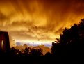
Critique By:
tom rumland (K:14874)
1/5/2005 3:44:33 AM
beautiful shot, joe. power lines and all.... i love the convergence of the different types of light. looks almost candlelit.
take care,
tom
|
| Photo By: Joe Stewart
(K:1908)
|
|
|
Critique By:
tom rumland (K:14874)
1/5/2005 3:41:20 AM
sean, outstanding shot! great perspective. love the almost silhoutted surfer against the misty shoreline exploding off that wave. shades of an old-school surfer mag cover.
take care,
tom
|
| Photo By: sean slavin
(K:3488)
|
|
|
Critique By:
tom rumland (K:14874)
1/5/2005 3:38:08 AM
sean, this is outrageous! still trying to wrap my mind around the concept of boogieboarding a 10-12' shore break in a foot of water. these kids today have no fear ;^) great shot!
btw, i can't see grant's attachment but i can tell you that your photo looks fine to me. the only blown highlight i see is a small patch directly in front of the surfer (right where he is looking). wish grant's attachment was still there so i could give you a better description.
take care,
tom
|
| Photo By: sean slavin
(K:3488)
|
|