|
|
Critique By:
John Charlton (K:5595)
1/2/2003 3:20:18 PM
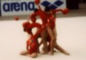
Hi Drecci. Glad to see you posting more of these soft focus gymnast photos. I like the bottom half of this photo but the background on the top half is just too busy and distracting.
If only they were more isolated similar to what you did in http://www.usefilm.com/showphoto.php?id=20383
|
| Photo By: Drecci GISLAADT (anagram
(K:558)
|
|
|
Critique By:
John Charlton (K:5595)
1/2/2003 8:12:03 AM
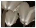
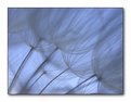
No. That's not mine. But the picture shows that the image is not that hard to duplicate. I would like to state for my part that I have never seen this or any similar image before I took my own. I guess (ahem..) great minds think alike.
I'd say that Mr. Aisenstein's photo could have been improved upon if he hadn't cut the bottom part of the flower off. the photo also looks a little unsharp but that might just be the posting.
And while the two photographs seem remarkable in their similarities, being similar views of the same type of flower at the same stage of development, I'd say mine has the better composition and quality of light.
The latter is perhaps a result of a higher angle of view which caused more light to reflect off the water. This lightened the background tones revealing the silky smooth water upon which the flower floats. Indeed, it was the quality of the light even more than the flower itself which drew my eye to this scene.
|
| Photo By: John Charlton
(K:5595)
|
|
|
Critique By:
John Charlton (K:5595)
12/31/2002 12:53:06 PM
Here's the original for comparison.
|
| Photo By: John Charlton
(K:5595)
|
|
|
Critique By:
John Charlton (K:5595)
12/31/2002 10:13:09 AM
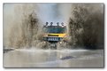
Sensational scene well captured.
Wish you hadn't cut the bicyclist so tight on the right. These little human figures have huge significance in such a simple composition. I am also a bit distracted by a few dust spots in the sky. I know that's being picky but this is a way above average photo and deserves the very best you can give it.
|
| Photo By: Darrin James
(K:3944)
|
|
|
Critique By:
John Charlton (K:5595)
12/31/2002 8:09:01 AM
Thanks to everyone who commented on this and the other two Hummer photos.
No Eric, I'm sorry to say I didn't get to drive one, but I ssure had a blast photographing them and jumping out of there way as they came at me.
You'd think this would have been the choice for a front page photo in our local newspaper, but the editor chose the accompanying photo instead. Go figure.
|
| Photo By: John Charlton
(K:5595)
|
|
|
Critique By:
John Charlton (K:5595)
12/30/2002 5:55:41 PM
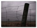
I think BRAVE might not be the first word that comes to mind, but you did a great job of capturing this moment. I agree with Steve in that a little less breakwall and a little more surf might have made the image even better.
|
| Photo By: John Black
(K:1047)
|
|
|
Critique By:
John Charlton (K:5595)
12/30/2002 5:50:18 PM
Another nice one Tony. Just a bit too big to see on my monitor all in one view, but it's a great image.
|
Photo By: Tony Smallman
(K:23858)

|
|
|
Critique By:
John Charlton (K:5595)
12/30/2002 5:43:55 PM
This image reminds me of an advertising cartoon from some years ago in which too ducks are flying even closer together than these two with a caption underneath suggesting that we should Fly United.
The timing on this is what makes it unique. I wonder if you were to make it into a silhouette if it wouldn't make a good graphic.
|
| Photo By: Kilroy Was Here
(K:177)
|
|
|
Critique By:
John Charlton (K:5595)
12/30/2002 5:38:10 PM
Fantastic. Is that the finish line just in front of him? If so, double fantastic. Great composition.
|
| Photo By: Greg Wolkins
(K:3)
|
|
|
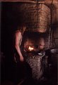
Critique By:
John Charlton (K:5595)
12/30/2002 5:32:59 PM
Your photograph makes me wish I had been there. This man, this place, the light, it's all there.
Unfortunately you missed it. Rusty's comments are on the mark, but I'd say he is being kind about the composition which needed more consideration before you took the photo.
Go back if you can. Look at the blacksmith working and see how the photograph might suggest itself to you before you look through the camera. If going back is not possible, use this image as a mental excercise. Think about how you might have captured the scene better and consider this one that got away.
|
| Photo By: eric van sark
(K:15)
|
|
|
Critique By:
John Charlton (K:5595)
12/30/2002 5:17:36 PM
I like this dream tree of yours Terry. A very effective presentation.
I take it the blur towards the edges is a result of the pinhole, but have you done anything in the darkroom to produce the almost solorized gradation of tones?
|
| Photo By: Terry King
(K:163)
|
|
|
Critique By:
John Charlton (K:5595)
12/30/2002 5:10:51 PM
Not your average sunset shot!
|
| Photo By: Darrin James
(K:3944)
|
|
|
Critique By:
John Charlton (K:5595)
12/29/2002 4:24:38 PM
I was looking at this earlier, but was waiting to hear your response to the alternate version.
I agree with both Thibault and Bill about the boarder. I also agree that the boarder gives the image scale and that's important too.
But you've got such a great image here and that boarder is just in the wrong place at the wrong time. If only you had waited another second or two so that the boarder were isolated against the snow of the hill. Taking him out or even moving him might seem drastic, but unless you got another version of this scene, that may be your best bet.
|
| Photo By: harry reid
(K:73)
|
|
|
Critique By:
John Charlton (K:5595)
12/29/2002 4:13:17 PM
Thanks Bill. Just as a side note, you can now buy this stairway to heaven. The land went up for sale a few months back.
|
| Photo By: John Charlton
(K:5595)
|
|
|
Critique By:
John Charlton (K:5595)
12/29/2002 4:08:59 PM
Hi again Marc;
Not much of a surprise that you found this photo a little soft. It is an extreme crop of the attached picture. The front wheel of my Mazda Protege 5 reflected in the water of a sunny November afternoon.
As for ratings, I have decided to ignore them completely form now on. I will not rate anyones photos again, nor will I pay any attention to this system which I beleive is not helping to develop the spirit of Usefilm in any meaningful way.
|
| Photo By: John Charlton
(K:5595)
|
|
|
Critique By:
John Charlton (K:5595)
12/29/2002 3:57:50 PM
I have tried Marc. I can't get anything better out of it. As you can see from the original which I have attached here, there was not much to start with. In addition to the histogram equalization mentioned above, I applied the highest level of automatic colour saturation allowed to me in Paint Shop Pro, not once, but twice. The gradiant of background colour is a fairly good representation of the colours in the sky which were fading from sunset-reds to the blue-black of falling darkness overhead.
|
| Photo By: John Charlton
(K:5595)
|
|
|
Critique By:
John Charlton (K:5595)
12/29/2002 3:43:08 PM
Thanks to everyone who commented on this photograph since it was posted. As Marja said, this image is dreamy and captivating. That is exactly what this moment meant to me. The colour of the background is the colour of the sky. I could not bear to toss it away. The contrast is that of a dreamscape. I tried other versions but this is how it was and how it must remain.
|
| Photo By: John Charlton
(K:5595)
|
|
|
Critique By:
John Charlton (K:5595)
12/29/2002 3:33:19 PM
Thank your Tony and Marc. Sounds like we can expect a flurry of multiple exposures sometime in the near future.
Marc et all; I am excited and honoured by your reactions to this photograph. It is very gratifying coming from an audience of my peers.
|
| Photo By: John Charlton
(K:5595)
|
|
|
Critique By:
John Charlton (K:5595)
12/29/2002 2:53:31 PM
This is great. Big truck - little kitten. My only suggestion here is that there is just a bit too much truck; more than is needed to get the point across. I would have framed it a little tighter or cropped a bit off the top of the photo.
|
| Photo By: Katty Houston
(K:42)
|
|
|
Critique By:
John Charlton (K:5595)
12/29/2002 2:49:08 PM
Great job of getting up close and personal with your freind here. My advice is to become more aware of your background. Where you place your camera in relation to your subject will dramatically change what shows in the background. Ideally, the background should be uncluttered and even in tones so as to not distract from your main subject. You might also try prefocusing your lens if that's possible. Good luck and good shooting.
|
| Photo By: Katty Houston
(K:42)
|
|
|
Critique By:
John Charlton (K:5595)
12/29/2002 2:38:16 PM
Thanks Tony. That's weighty praise indeed coming from you. I really respect your talent and your opinions. You made my day with this comment.
Likewise to you Kev. Glad you like the shot. As imitation (not really the same thing as theft) is the sincerest form of flattery, I consider myself flattered. Thank you.
|
| Photo By: John Charlton
(K:5595)
|
|
|
Critique By:
John Charlton (K:5595)
12/29/2002 9:05:37 AM
I see that I have failed to provide a useable copy of this photo as the save as funtion has been disabled on the attachments.
If you do wish to play with this image contact me directly at john.charlton@sympatico.ca
|
| Photo By: John Charlton
(K:5595)
|
|
|
Critique By:
John Charlton (K:5595)
12/29/2002 8:58:15 AM
Thank you Marc for taking the time to view and comment on my photographs. I will pay close attention to your suggestions.
My concern with this image was to pay hommage to the artist's work without copying his style directly or suggesting my quick and easy digital techniques were a match for his painstaking attention to detail.
As you can see above, Derek's work is monochromatic. That's why I hesitated to make the image black and white and instead went for a colour version.
I am attaching the original image which has had nothing done to it other than being resized. Please feel free to play with it if you like. I would be interested in seeing what you might come up with.
|
| Photo By: John Charlton
(K:5595)
|
|
|
Critique By:
John Charlton (K:5595)
12/28/2002 8:45:49 AM
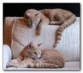
Thanks Antonio, Sheila and Sue for your comments. Jenny (bottom) and Cougar (top) are indeed very sweet cats. We got them at a very young age (10 weeks) after their mom disappeared from thier birth home.
The other photo I was talking about is Quick View # 29179.
Sue, you caught me. I confess. I altered the background for my own selfish purposes. Send out the digital police. After cropping the original and adjusting the contrast, there wasn't much to look at in the background so I cloned out the remaining detail which I felt was a little distracting. I've attached the original for comparison.
|
| Photo By: John Charlton
(K:5595)
|
|
|
Critique By:
John Charlton (K:5595)
12/27/2002 12:34:33 PM
Quite a contrast from your previous post. I think you did everything right to improve on this version. (ie. reduce background clutter and isolate subject)
|
| Photo By: Bengt Nordborg
(K:24)
|
|
|
Critique By:
John Charlton (K:5595)
12/26/2002 11:06:53 AM
Amazing. A great photograph. I find it a little airy at the top, but it's a small quibble.
|
| Photo By: Douglas Herr
(K:83)
|
|
|
Critique By:
John Charlton (K:5595)
12/26/2002 11:04:51 AM
A slow shutter speed hurt you here but you caught Sophie's attentiveness perfectly and that's the charachteristic you saw and went after. Keep shooting. This is a great start.
|
| Photo By: Ray Gould
(K:1539)
|
|
|
Critique By:
John Charlton (K:5595)
12/26/2002 10:44:54 AM
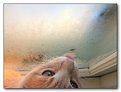
Cats are indeed wonderful creatures and fine companions. Thanks for your comments.
The fuzz you see on the bottom left of this photo is Cougar's fuzzy little tummy fur as he presses up against the window pane. He is sitting on a narrow window ledge with me peaking down on him from above.
|
| Photo By: John Charlton
(K:5595)
|
|
|
Critique By:
John Charlton (K:5595)
12/26/2002 10:39:31 AM
Very effective use of lighting. I like how the animal stands out so strongly against the black background. I suspect your original photo looks even sharper than this. Am I right?
|
| Photo By: Bengt Nordborg
(K:24)
|
|
|
Critique By:
John Charlton (K:5595)
12/26/2002 10:17:05 AM
I'll second that guess. A fibre optic lamp of some sort.
As for the photo, it needs more tonal range. There should be a solid black somewhere in this photo. The grey frame on the outside isn't helping the presentation either. It just emphasizes the muddy shadows.
|
| Photo By: Sujit Nandi
(K:555)
|
|