|
|
Critique By:
Ian Crean (K:14866)
8/20/2005 12:02:04 AM
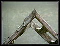
Really lush and makes for a good reflected nature abstract, espcecially strong if you crop away the bottom to remove the light corner which although it gives a reference to the sky, distracts. The real action is in tones and transition of dark to light laterally across the frame.
|
| Photo By: Bill Henry
(K:192)
|
|
|
Critique By:
Ian Crean (K:14866)
8/19/2005 11:38:39 PM
There's something hypnotic and demonic about this, your eyes just hold the viewers eyes fixedly, a challenge to look away. Different, and SO different to your recent office portraits. Have a great trip to India, and do try to keep the curry out of your beard, it stains something rotten. Now that would be scary, flourescent yellow streaks! Ian
|
| Photo By: Angelo Villaschi
(K:49617)
|
|
|
Critique By:
Ian Crean (K:14866)
8/19/2005 1:18:54 PM
Whilst we inevitably mourn, the end of a long lfe well lived is a cause for celebration and your shot pulls off something incredible, something I've never quite seen before, something comforting and accepting, and your words perfectly capture what comes off the screen but even without words your sensitivity and intimacy and as photographer and a welcome loved one radiate over the scene. I think that could be the magic part, the photographer is emotionally involved, and your daughter is getting incalculably valuable lessons in love and respect. I admire this piece of work. Ian
|
| Photo By: Jennifer Lord-Palmer
(K:2596)
|
|
|
Critique By:
Ian Crean (K:14866)
8/19/2005 12:04:20 PM
Superbly done Emre, not just a caught reflection but a well planned out spacial composition, and of course wonderful gritty true B&W tones and grain. Really makes me hope we never see the absolute death of film, there will always be a artistic place for it. Ian
|
| Photo By: emre devseren
(K:66)
|
|
|
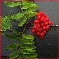
Critique By:
Ian Crean (K:14866)
8/19/2005 11:40:26 AM
I like the bits of remaining tree bark giving a hint at how this would have looked before it decayed.
|
| Photo By: Neil Niamh White
(K:9165)
|
|
|
Critique By:
Ian Crean (K:14866)
8/19/2005 11:29:51 AM
I like this find, like siblings or partners, one male, one female. The pallete behind the subject is so perfect in colour, the editing glow (I imagine) also works artistically well. Excellent Marco.
|
| Photo By: Marco Cassé
(K:165)
|
|
|
Critique By:
Ian Crean (K:14866)
8/19/2005 7:50:07 AM
Goodness, already? Fine capture, love the half light and the vivid red, and those boppers.
|
| Photo By: Jennifer Lord-Palmer
(K:2596)
|
|
|
Critique By:
Ian Crean (K:14866)
8/17/2005 11:47:35 PM
Terrific John, minimalist in colour and subject matter yet full of life ad movement. The birds make a random pattern in the frame which could hardly be better if you had cut and pasted them all yourself! Makes a great abstract and also a graphic study of the storks in flight.
|
Photo By: AJ Miller
(K:49168)

|
|
|
Critique By:
Ian Crean (K:14866)
8/16/2005 10:47:31 PM
Hi Ian, the UF upload size limit is 800 pixels in the longest dimension (vertical or horizontal).
About the photo you mention, like almost all my shots, just one careful click needed, however the dog did have to get some practice in so I could set myself up for it! Cheers, Ian
|
| Photo By: Ian Miller
(K:9190)
|
|
|
Critique By:
Ian Crean (K:14866)
8/16/2005 10:18:03 PM
What a great find, very eye catching subject and colour, it is the opposing angles of the posts which really make this work and intrigue the brain to guess if the bridge would hold up under some weight. A nice one to see on the home page today, good work.
|
| Photo By: Cesar Augusto Carvalho
(K:982)
|
|
|
Critique By:
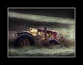
Ian Crean (K:14866)
8/16/2005 11:14:33 AM
Great find, I like the light as it picks out the old tractor in the frosty grass. The conditions make a perfect setting for this great find.
|
| Photo By: carlo balestreri
(K:15)
|
|
|
Critique By:
Ian Crean (K:14866)
8/16/2005 9:59:09 AM
Very well balanced image, her gaze is directly opposed to the light spot which creates virtual diagonals through the frame mentally contrasting with the horizontal lines. If she was looking any other way it would unbalance the image without recomposing. Very nicely posed, good location.
|
| Photo By: Afriadi Hikmal
(K:2216)
|
|
|
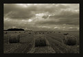
Critique By:
Ian Crean (K:14866)
8/16/2005 9:54:45 AM
I like what you've done with this. the scene is quite cliched but somehow the elements here combine to give a sense of motion as if the bales are rolling under their own steam toward the horizon. The fact that the foreground bales are not in line helps that perception. Good depth, good sky, and you managed to make it dark without closing out too much detail. Ian
|
| Photo By: Satori 77
(K:713)
|
|
|
Critique By:
Ian Crean (K:14866)
8/15/2005 9:28:51 PM
Oh yes, I really go for this. Great range of B&W tones, really well worked from the colour neg. Terrific perspective makes the most of the wide angle and the beautiful curves take you away gently at the top in contrast to the hard detail of the tail light and rust below. Keeps my attention. Ian
|
| Photo By: Ryan McMillen
(K:1218)
|
|
|
Critique By:
Ian Crean (K:14866)
8/15/2005 9:21:54 PM
Troy, it took me an age to discern the bee, I think because my eye was drawn by the blown highlights in the white flowers. As the rest of the frame is quite dark it makes me wonder if the problem is with a too contrasty edit rather than in the original exposure. The colour correction looks good though, nice true greens and whites. Worth having a look at that original and seeing if you can balance highlight and shadow details. Ian
|
| Photo By: Troy
(K:105)
|
|
|
Critique By:
Ian Crean (K:14866)
8/15/2005 9:14:49 PM
Makes a good ad shot for Mr Minkoff (something sinister sounding about that name, makes me think of mink and fur and knives, best not to think so much!). Beautifully crafted wares, and lethal too. Hope they end up in careful hands.
|
| Photo By: Ashley Hays
(K:2100)
|
|
|
Critique By:
Ian Crean (K:14866)
8/15/2005 8:45:52 PM
I like your perspective Sam, I'm a sucker for this kind of aero shot. Beautifully simple lines and curves in the design of this classic fighting machine.
|
| Photo By: Sam
(K:20)
|
|
|
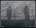
Critique By:
Ian Crean (K:14866)
8/15/2005 8:42:33 PM
George has nailed it and I would add that without the title as a cue one can imagine it as a shadow on a gently breeze blown linen curtain. I am glad you resisted the temptation to put into into higher contrast, as many would, probably me included. This is really subtle and better than even you think! Yes, I like it. Ian
|
| Photo By: PHIL HALL
(K:269)
|
|
|
Critique By:
Ian Crean (K:14866)
8/15/2005 8:35:45 PM
The bright green and red stands out well against the neutral grey fence colour, the peeling paint and panel lines, especially the one through the berries really strengthen the graphic and rusticity of the image. Nice job Danny.
|
| Photo By: Danny Brannigan
(K:19523)
|
|
|
Critique By:
Ian Crean (K:14866)
8/15/2005 8:31:20 PM
Sheila, I love this perspective making her look like a table top porcelain figurine. Very nicely posed, a natural show off I think! The high contrast, probably from the 400 film does seem to make too much redness under her eyes, and I think the approach recommended by Ruta could help. I would also fill the top left corner by cloning from the grass, also the small white intrusion top right, and so remove those distractions. Something good and worthwhile going on here, always good to see child portraits taken with a bit of imagination. Ian
|
| Photo By: Sheila Carson
(K:5924)
|
|
|
Critique By:
Ian Crean (K:14866)
8/15/2005 7:26:08 PM
It's posted too small to really enjoy Ian but still I can see why it's a favourite of yours, your own summary just about covers my thoughts too.
|
| Photo By: Ian Miller
(K:9190)
|
|
|
Critique By:
Ian Crean (K:14866)
8/15/2005 9:14:47 AM
Beautifully structured image with the bold splash of red, lots of details and questiosn about use of the items. A very good location shot, magazine stuff.
|
| Photo By: Sebastian Zachariah
(K:3382)
|
|
|
Critique By:
Ian Crean (K:14866)
8/15/2005 7:03:29 AM
There's an earthy, organic feel to this, like a finding a bright bird of paradise plant in a swamp or expansive, and I like too the light shifting between opposite corners. Excellent work, and worthy SC, PD.
|
| Photo By: jan thomassen
(K:243)
|
|
|
Critique By:
Ian Crean (K:14866)
8/14/2005 10:56:33 PM
Makes me want to get out and walk to breath the mist, nice atmosphere here, a good crop at the top to make this a more widescreen format might works wonders. Good foreground details.
|
| Photo By: Filiz Oztas
(K:48)
|
|
|
Critique By:
Ian Crean (K:14866)
8/11/2005 6:45:48 PM
Love that Buck Fush poster! The guy seems to be interested yet keeping his distance as if not wanting to appear too interested in the wares on offer, or maybe just incredulous at what has become of his village! The bike adds a great touch, ex bike as you say, and seems somehow perfectly in its place as if it was there since before the freaks moved in (thoughts of man in sorrow). Interesting though now, eh. And what sensational tones and managed high contrast.
great job here Thilo. Ian
|
| Photo By: Thilo Bayer
(K:50358)
|
|
|
Critique By:
Ian Crean (K:14866)
8/11/2005 6:37:32 PM
Great find, well balanced image, and the dull conditions allow the colours to blend well without competing. Lovely old car which looks to be in good condition.
|
| Photo By: N M
(K:4879)
|
|
|
Critique By:
Ian Crean (K:14866)
8/11/2005 5:59:56 PM
Gabry, I love the shot and she is beautiful. I thought the eyes looked a bit soft and then saw that this is accentuated because the towel and fingers reveal the point of focus is in front of her face leaving her eyes and mouth softer then the tip of her nose and nostrils. It's a technicality which may or may not be important, may or may not have been what you wanted to achieve but does look like autofocus which didn't quite work. I don't have autofocus on my camera so would have manually focused on the eyes, or gone for a aperture/shutter selection which would have kept the whole face sharp, but you may have selected a different focus option for effect. Sorry to go on Gabry, it's just a clumsy way to say I would prefer such a shallow focus to pinpoint the eyes not the nostrils! In the end it still makes lovely photo, and she is so photogenic. Ian
|
| Photo By: Gabriella Carta
(K:22879)
|
|
|
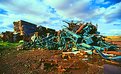
Critique By:
Ian Crean (K:14866)
8/8/2005 1:16:09 PM
I like this kind of subject, hints of former glories in the dereliction, makes me wonder how long wit will remain here rusting away or if will come to some use through canibalising or recycling. The strong colour cast is a bit unsuitable to this eye, but that's your choice and it's a great slide. Ian
|
| Photo By: Wayne Harridge
(K:18292)
|
|
|
Critique By:
Ian Crean (K:14866)
8/5/2005 6:42:31 AM
CB, at 50mm you could get knocked over as he swings that guitar around. Terrific moment captured, classic stuff.
|
| Photo By: Carlheinz Bayer
(K:14220)
|
|
|
Critique By:
Ian Crean (K:14866)
8/3/2005 3:45:15 PM
Lovely scene of simple life in a beautiful place. At first sight they look mlike holiday chalets but then you realise they are residential buildings for people who no doubt depend on the lake for their livelihood. The scan looks a bit flat but that can be improved as I'm sure the original slide will be fine. Try putting up at www.trekearth.com too where it would be well received.
|
| Photo By: Kursat Oner
(K:1580)
|
|