|
|
Critique By:
Roderik Koenders (K:2740)
11/9/2003 12:51:38 AM
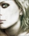
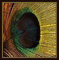
Good shot of such a difficult subject. Would the background have been too distracting if it was all black?
|
| Photo By: Aleksandra Zvonar
(K:4623)
|
|
|
Critique By:
Roderik Koenders (K:2740)
11/9/2003 12:49:32 AM
Good shot. Nicely composed.
|
| Photo By: ppdix
(K:17069)
|
|
|
Critique By:
Roderik Koenders (K:2740)
11/8/2003 2:14:12 PM
Excellent shot. The child's face is a bit out of focus.
|
| Photo By: Dan Arthur
(K:4280)
|
|
|
Critique By:
Roderik Koenders (K:2740)
11/8/2003 10:42:00 AM
Very nice shot, gives a nice authentic kind of feel.
|
| Photo By: Amna Al Shamsi
(K:21795)
|
|
|
Critique By:
Roderik Koenders (K:2740)
11/7/2003 7:48:01 AM
Nice shot, technically. It seems as if your model doesn't think so though. Is she about to faint?
|
| Photo By: Marian Coman
(K:132)
|
|
|
Critique By:
Roderik Koenders (K:2740)
11/7/2003 7:43:48 AM
Great portrait. Soft yet with a punch. Very originally cropped as well. Too bad you didn't give away some of your production techniques...
|
| Photo By: Tamara L
(K:1387)
|
|
|
Critique By:
Roderik Koenders (K:2740)
11/2/2003 1:45:32 PM
Great, no excellent shot! And the highlight works very well. Though in your version it seems a bit unnatural, try not to make it pure white (or isn't it?).
|
| Photo By: Toini Blom
(K:2039)
|
|
|
Critique By:
Roderik Koenders (K:2740)
11/2/2003 1:27:52 PM
Great shot. A very wise look on the face of such a small person. Watch this guy, he is going for it, you can tell it by the look in his eyes! :-)
|
| Photo By: Thomas Paul
(K:111)
|
|
|
Critique By:
Roderik Koenders (K:2740)
11/2/2003 1:24:31 PM
Great shot! I love the expression and those bright blue eyes. There just seem to be 2 whitish kind of parts over her hair that really disturb the field of view when you look at this picture. It almost makes me go cross eyed. Did you do that on purpose?
|
| Photo By: dariusz piekarz
(K:126)
|
|
|
Critique By:
Roderik Koenders (K:2740)
11/2/2003 10:40:15 AM
Very good shot. I've been looking through your portfolio a bit and really like it. I should go looking around more for some nice abandoned barns ;-).
|
| Photo By: ppdix
(K:17069)
|
|
|
Critique By:
Roderik Koenders (K:2740)
11/2/2003 10:27:49 AM
She is doing a very good job. Was it necessary to change the colour of her right eye, or is that just a glitch in the light? If not why didn't you change to other eye accordingly? The hair seems a bit oversharpened. If you want to draw the attention to the (already very sharp eyes and lips) why also sharpen the hair so much. That kind of distracts from the 'look'.
|
| Photo By: David R. Fink
(K:1792)
|
|
|
Critique By:
Roderik Koenders (K:2740)
11/2/2003 9:57:44 AM
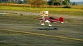
I love aeroplanes so I like this picture. But some things could be done to make the picture more exciting for non-plane lovers. The white piping and pump (?) are abit distracting. Also, while we know the plain is flying you don't see any motion at all. The picture is not alive, while it is a very 'living' subject. Since you've got a nice telelens next time it would maybe be nice to picture it from the front when it lands (keep a safe distance, but that's where the tele parts kicks in..).
BTW, what do you mean with SP on your recent comment on the panorama? And yes I did darken the sky a bit by contrast masking/curves.
|
| Photo By: Charlotte Shockey
(K:2146)
|
|
|
Critique By:
Roderik Koenders (K:2740)
11/2/2003 5:20:24 AM
Very good shot. I like the way the light is catched in their eyes. Maybe a photo at which they look into their eyes, a profile as you may, would be nice?
|
| Photo By: Lorinda Millar
(K:2580)
|
|
|
Critique By:
Roderik Koenders (K:2740)
11/2/2003 4:13:40 AM
Excellent work in PS. Very original. The only 'thing' might be that the tip of the beak of the bird is a bit washed out.
|
| Photo By: P.Fun Bülow
(K:2)
|
|
|
Critique By:
Roderik Koenders (K:2740)
10/30/2003 1:28:38 PM
I think I'll have to visit Maastricht a bit more often ;-). Maybe you could try to let her eyes catch some light, but that's just MHO since I like eyes.
|
| Photo By: frans jacobs
(K:42)
|
|
|
Critique By:
Roderik Koenders (K:2740)
10/30/2003 3:15:40 AM
Very good macro. Have you tried cropping the image even more so only the head of the spider will be visible? I think that would give an entirely different view. Good job though.
|
| Photo By: Gert Arijs
(K:52)
|
|
|
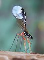
Critique By:
Roderik Koenders (K:2740)
10/30/2003 12:57:01 AM
Wonderful shot! What a strange insect. Excellent DOF.
|
| Photo By: Roland Rainer
(K:241)
|
|
|
Critique By:
Roderik Koenders (K:2740)
10/29/2003 12:41:29 PM
The diamond would be Fraser Island. If you've been there you'd know what I meant by the title of this photo. Maybe later on I'll post more photo's of Fraser Island so you can enjoy its splendor.
|
| Photo By: Roderik Koenders
(K:2740)
|
|
|
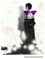
Critique By:
Roderik Koenders (K:2740)
10/29/2003 9:59:13 AM
Very well done. I've got only one comment, you might want to let the picture blend more with the surrounding background. Let the top/left and right border all end with white so it seems the image is a real part of this webpage and not just a square recatangle put upon it...
|
| Photo By: Andrea Silas
(K:230)
|
|
|
Critique By:
Roderik Koenders (K:2740)
10/27/2003 1:49:27 PM
Beautiful macro. Great timing. Too bad the tip of the water 'fountain' isn't sharp too.
|
| Photo By: Neil A
(K:297)
|
|
|
Critique By:
Roderik Koenders (K:2740)
10/27/2003 1:47:41 PM
Great shot. Beautiful colours. Good lighting.
|
| Photo By: Jytte Kristensen
(K:446)
|
|
|
Critique By:
Roderik Koenders (K:2740)
10/27/2003 1:46:25 PM
Beautiful photo. Especialy the person puts everything into perspective. Great touch, good work.
|
| Photo By: Bulent Ahiskal
(K:1251)
|
|
|
Critique By:
Roderik Koenders (K:2740)
10/27/2003 1:38:48 PM
Good composition. The edges between the tulips and the sky seem a little too well defined. I assume it is a composition made on the computer. Consider blurring the edges a bit so they blend more with the sky.
|
| Photo By: jal s
(K:105)
|
|
|
Critique By:
Roderik Koenders (K:2740)
10/27/2003 1:18:11 PM
Very compelling photograph. Good job. The colours are a bit washed out though, consider tweaking them a bit in photoshop. You can do the job with curves.
|
| Photo By: Talal Salaam
(K:15)
|
|
|
Critique By:
Roderik Koenders (K:2740)
10/27/2003 1:14:38 PM
Very good colours. They almost look a bit unnatural. Some parts look kind of washed out, they are too bright which makes it hard to look at (especially the legs). Have you tried cropping that, I still think it would be a nice picture if it only has your head and arm in it.
|
| Photo By: Angela Gustafsson
(K:78)
|
|
|
Critique By:
Roderik Koenders (K:2740)
10/27/2003 8:14:58 AM
You could try some contrast masking and a USM(30%,250 pix,0pix). This always works very well for me.
|
| Photo By: Marianne Gordon
(K:507)
|
|
|
Critique By:
Roderik Koenders (K:2740)
10/27/2003 7:58:36 AM
Stunning photograph. Congratulations with the Editor's choice. I would really be interested in what you mean by 2 images composited to increase depth of field.
|
| Photo By: Mark Plonsky
(K:560)
|
|
|
Critique By:
Roderik Koenders (K:2740)
10/27/2003 6:03:30 AM
Very original. How did you take it?
|
| Photo By: stephen chong
(K:519)
|
|
|
Critique By:
Roderik Koenders (K:2740)
10/27/2003 6:00:34 AM
Good idea. This 'historic' moment was indeed worth a photograph. Combining these 2 media, film and tv results in some interesting photos.
|
| Photo By: Samira P. Silva
(K:0)
|
|
|
Critique By:
Roderik Koenders (K:2740)
10/27/2003 1:10:14 AM
Very nice shot. Good sharpness, good touch with removing one of the leaves. Did you remove the background on the computer or was it naturally this black?
|
| Photo By: Gianluca Canello
(K:469)
|
|