|
|
Critique By:
Martin Paul (K:140)
9/18/2003 11:20:14 PM
Very beautiful. I love the colour of the snow. But is the horizon level?
|
| Photo By: Lorenzo Parisi
(K:6277)
|
|
|
Critique By:
Martin Paul (K:140)
9/18/2003 11:18:19 PM
It's a shame the trees were not more evenly spaced. But there is not much you can do about that! Otherwise the tone, colour and composition on this are very fine.
|
| Photo By: Rolf Rock
(K:2964)
|
|
|
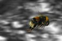
Critique By:
Martin Paul (K:140)
9/18/2003 2:21:17 AM
Billiana,
I can assure you that the bee was VERY alive! 
Regards,
Martin Paul.
|
| Photo By: Martin Paul
(K:140)
|
|
|
Critique By:
Martin Paul (K:140)
9/18/2003 1:46:49 AM
I love its originality!
|
| Photo By: Paolo De Maio
(K:34932)
|
|
|
Critique By:
Martin Paul (K:140)
9/18/2003 1:45:20 AM
Thank you Paolo! :-)
|
| Photo By: Martin Paul
(K:140)
|
|
|
Critique By:
Martin Paul (K:140)
9/18/2003 12:18:57 AM
This is outstanding!
|
| Photo By: Ronnie Gaubert
(K:3700)
|
|
|
Critique By:
Martin Paul (K:140)
9/17/2003 11:59:45 PM
Impressed. Almost looks like liquid metal.
|
Photo By: Rose Hooper
(K:899)

|
|
|
Critique By:
Martin Paul (K:140)
9/17/2003 2:25:47 AM
I REALLY like this. A masterpiece!
|
| Photo By: Toini Blom
(K:2039)
|
|
|
Critique By:
Martin Paul (K:140)
9/17/2003 2:21:04 AM
Very good indeed Great vantage point.
|
| Photo By: Rolf Rock
(K:2964)
|
|
|
Critique By:
Martin Paul (K:140)
9/17/2003 2:18:58 AM
Brilliant! But tell me this is serious Photoshop work?!
|
| Photo By: Paolo Pagnini
(K:1022)
|
|
|
Critique By:
Martin Paul (K:140)
9/15/2003 11:12:15 PM
Congrats on POTD! Great capture too!
|
| Photo By: Aleksandra Zvonar
(K:4623)
|
|
|
Critique By:
Martin Paul (K:140)
9/10/2003 11:56:55 PM
That really appeals to me, love the light!
|
| Photo By: Jason Anderson
(K:-24)
|
|
|
Critique By:
Martin Paul (K:140)
9/10/2003 1:00:52 AM
Congrats! It's amazing.
|
| Photo By: Marie Billing
(K:1620)
|
|
|
Critique By:
Martin Paul (K:140)
9/9/2003 1:42:33 AM
Hi Chris,
No this is not a composite. It's probably because the sky has been coloured blue that it appears that way? I have had a few people thinking the house was added in the background but it wasn't.
Regards
Martin.
|
| Photo By: Martin Paul
(K:140)
|
|
|
Critique By:
Martin Paul (K:140)
8/27/2003 12:31:43 AM
Great! Love the textures and colour. Broom is a nice touch too.
|
| Photo By: marco biancardi
(K:10582)
|
|
|
Critique By:
Martin Paul (K:140)
8/27/2003 12:16:38 AM
Like this a lot.
|
| Photo By: Guelfo Ajello
(K:7519)
|
|
|
Critique By:
Martin Paul (K:140)
8/27/2003 12:00:07 AM
Very good. But a little flat for my liking.
|
| Photo By: Debra Griffin-Ibrahim
(K:7119)
|
|
|
Critique By:
Martin Paul (K:140)
8/26/2003 11:52:39 PM
I love how this is framed. Colour is good too.
|
| Photo By: Julio Caballero
(K:849)
|
|
|
Critique By:
Martin Paul (K:140)
8/26/2003 11:50:24 PM
Yes, this is awesome!
|
| Photo By: Aleksandra Zvonar
(K:4623)
|
|
|
Critique By:
Martin Paul (K:140)
8/26/2003 11:44:45 PM
Nice composition and details.
|
| Photo By: Vitaly Titov
(K:121)
|
|
|
Critique By:
Martin Paul (K:140)
8/26/2003 11:33:24 PM
Good symmetry and original. Would be better without the waves and rocks. I think they unbalance it.
|
| Photo By: Joann Winborn
(K:12550)
|
|