|
|
Critique By:
JL Photography (K:288)
7/8/2003 5:03:28 PM
Wonderful photo...I love how you framed this shot....so much to look at, so many stories.
|
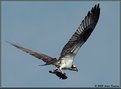
| Photo By: Joao Vasconcelos
(K:2163)
|
|
|
Critique By:
JL Photography (K:288)
7/8/2003 5:01:24 PM
The intense stare makes up for the lack of focus (which I assume was the intent...). Love the lighting. Thanks for being different!!
|
| Photo By: Julie Buckwald
(K:526)
|
|
|
Critique By:
JL Photography (K:288)
7/8/2003 4:55:12 PM
Great capture!!!! (Sucks to be that fish.....)
|
| Photo By: Andre Knudsen
(K:124)
|
|
|
Critique By:
JL Photography (K:288)
7/8/2003 4:54:33 PM
Very sharp...great contrast of colors. The horizon/plane is off kilter a little.
|
| Photo By: Robert Whiteman
(K:2201)
|
|
|
Critique By:
JL Photography (K:288)
7/5/2003 1:06:40 PM
Too much Photoshop to understand what the shot is.
|
| Photo By: Mats Lindfors
(K:9)
|
|
|
Critique By:
JL Photography (K:288)
7/5/2003 1:00:14 PM
Perfect and well executed. This is better than any stock photography or catalog shot I've seen. BRAVO.
|
| Photo By: Flavio Ortolan
(K:907)
|
|
|
Critique By:
JL Photography (K:288)
7/5/2003 6:54:27 AM
This is perfect and flawless. Bravo!
|
| Photo By: DON H
(K:770)
|
|
|
Critique By:
JL Photography (K:288)
7/5/2003 6:51:57 AM
Great portrait. Need to fix the skin tones and remove some of the green that's there, maybe brighten the levels a wee bit and you've nailed it.
|
| Photo By: Karen Siebert
(K:12076)
|
|
|
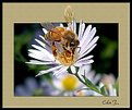
Critique By:
JL Photography (K:288)
7/5/2003 6:46:43 AM
Macro is good, the PS effects are interesting, but the bee is somewhat out of focus.
|
| Photo By: Colin Fitzpatrick
(K:1428)
|
|
|
Critique By:
JL Photography (K:288)
7/5/2003 6:40:10 AM
GREAT and honest portrait. We lose his chin a little, but that's a small nitpick. Great idea and wonderful emotion.
|
| Photo By: Martin Pesta
(K:559)
|
|
|
Critique By:
JL Photography (K:288)
7/5/2003 6:39:11 AM
Doesn't convey the total emotion of the day, but a small snippet. Still think it's a good photo journalism shot.
|
| Photo By: garlic joe
(K:170)
|
|
|
Critique By:
JL Photography (K:288)
7/5/2003 6:36:56 AM
Great concept. I'm a fan of shadows but there are is just a little too much here. A little more light across the subject (just a little) and it'll be perfect. Great concept and composition, tho.
|
| Photo By: Benjamin Tharin
(K:146)
|
|
|
Critique By:
JL Photography (K:288)
7/4/2003 5:43:07 AM
Nice pic...white seem a little blown out, and I'd like to see more of her face. A good photo, tho.
|
| Photo By: Bob Stapleton
(K:575)
|
|
|
Critique By:
JL Photography (K:288)
7/2/2003 7:52:26 PM
WOW!!!! Can you say, "National Geographic"??? Awesome!
|
| Photo By: andrew vonbank
(K:2811)
|
|
|
Critique By:
JL Photography (K:288)
7/2/2003 7:49:03 PM
The composition is off on this one....too much stuff going on at the bottom. Focus on just the sign next time...try putting it in sepia, too....I think that would spice it up.
|
| Photo By: Steve Dallape
(K:23)
|
|
|
Critique By:
JL Photography (K:288)
7/2/2003 7:47:11 PM
Gorgeous...bravo. This should be hanging on a wall somewhere.
|
| Photo By: SammaeL Emre
(K:74)
|
|
|
Critique By:
JL Photography (K:288)
7/2/2003 7:45:51 PM
Your 80mm lens can't cut a macro shot like this. The detail is lost, but a pretty scene. Good shallow DOF, tho....
|
| Photo By: Edward Thomas
(K:286)
|
|
|
Critique By:
JL Photography (K:288)
7/2/2003 7:44:21 PM
Disturbing image which makes it work. Wish it was shaprer but it's a powerful message regardless.
|
| Photo By: Terry Irwin
(K:979)
|
|
|
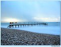
Critique By:
JL Photography (K:288)
7/2/2003 7:43:14 PM
Nice concept....more effective in color? The surface scratches distract a little....
|
| Photo By: f z
(K:291)
|
|
|
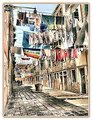
Critique By:
JL Photography (K:288)
7/2/2003 7:41:36 PM
Nice shot....remove some of the blue using PS (You can see the blue in the building)....the colors will pop further, and give more detail to the ocean.
|
| Photo By: Mark Peterson
(K:3452)
|
|
|
Critique By:
JL Photography (K:288)
7/2/2003 7:39:51 PM
Gorgeous backlit headshot...love it.
|
| Photo By: Marcelo Bruno Cechenello
(K:2)
|
|
|
Critique By:
JL Photography (K:288)
7/2/2003 7:38:00 PM
I dunno....good snapshot of the niece, but somewhat disturbing given her age vs message of the shirt. If this were a shot protesting such a message, I would get it. But looking at Buzz's previous work, this seems to be a snapshot of a great kid, with poor judgement in attire. This critique is about the image and its purpose...and I'm not sure this sould be revered as a good snapshot. I dunno...this one just bothers me. What the heck do I know....
|
| Photo By: buzz kill
(K:1808)
|
|
|
Critique By:
JL Photography (K:288)
7/2/2003 4:44:00 PM
I'm proud to be the first to comment on this wonderful portrait. Shapr, crips, full of emotion. One can't help but think this kid is the greatest. Light on her left arm distracts but that's a nitpick.
Great!
|
| Photo By: Shannon Richardson
(K:1004)
|
|
|
Critique By:
JL Photography (K:288)
7/2/2003 4:42:39 PM
The reason I love this shot, is that I can't take a sunset shot worth a damn. Reason being, I always screw up the plane, and tilt it. You nailed it...great job.
|
| Photo By: Bob Whorton
(K:2740)
|
|
|
Critique By:
JL Photography (K:288)
7/2/2003 4:19:08 PM
A wee bit out of focus. Love the light.
|
| Photo By: IVAN VESKOVIC
(K:1)
|
|
|
Critique By:
JL Photography (K:288)
7/2/2003 4:16:01 PM
Good shot; the colors don't seem to pop, though. Can you fix on PS?
|
| Photo By: josé carvalho
(K:10)
|
|
|
Critique By:
JL Photography (K:288)
6/30/2003 6:32:28 PM
It is a bit washed out....could use some contrast and sharpness. Great model, just watch out for the bags under her eyes. I'd like to see this one again upon improvement.
|
| Photo By: IVAN VESKOVIC
(K:1)
|
|
|
Critique By:
JL Photography (K:288)
6/30/2003 6:28:47 PM
Photoshop works here.....excellent!
|
| Photo By: Alberto Agnoletti
(K:12811)
|
|
|
Critique By:
JL Photography (K:288)
6/30/2003 6:27:09 PM
Stunning, stunning, stunning. I haven't seen a shot this good in a long time. WOW....
|
| Photo By: Jeffery Scott
(K:168)
|
|
|
Critique By:
JL Photography (K:288)
6/30/2003 6:23:21 PM
If this was b/w, it would be a throw back to 40s glamour. Lovely shot, and makes you dream.
|
| Photo By: William R Eastman III
(K:2141)
|
|