|
|
Critique By:
Neil Cowley (K:125)
11/10/2003 5:55:43 PM
Adding a specular source to the models back would have separated the hair from the background with more energy. Well captured nontheless.
|
| Photo By: James Weber
(K:305)
|
|
|
Critique By:
Neil Cowley (K:125)
11/10/2003 5:54:06 PM
Just enough light into the eyes, good choice of light eyeshadow to highlight under the eyebrows and keep the eyes from fading out. If you had a small spot or fresnel might have been even more interesting to bring it into one side or the other to put a touch of highlight across the face and chest. I think adding a little highlight and shadow from a specular source would have given it a touch of mystery that would have given the photo more 'holding' power due to the increased complexity.
|
| Photo By: James Weber
(K:305)
|
|
|
Critique By:
Neil Cowley (K:125)
10/23/2003 6:02:06 AM
Best composition out of the bunch. Great lighting.
|
| Photo By: Eskil Olsen
(K:19)
|
|
|
Critique By:
Neil Cowley (K:125)
10/23/2003 5:59:19 AM
This didn't stick last time.
|
Photo By: Randy Stokes
(K:1549)

|
|
|
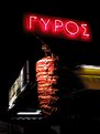
Critique By:
Neil Cowley (K:125)
10/23/2003 12:32:02 AM
Well seen despite whatever cultural baggage goes along with it.
|
| Photo By: Kosmas Lazaridis
(K:943)
|
|
|
Critique By:
Neil Cowley (K:125)
10/23/2003 12:29:14 AM
Rescuing photos through photoshop doesn't make good photos.
|
| Photo By: nathan combs
(K:2242)
|
|
|
Critique By:
Neil Cowley (K:125)
10/23/2003 12:24:29 AM
Looks good for a catalog description.
|
| Photo By: Phillip Cohen
(K:10561)
|
|
|
Critique By:
Neil Cowley (K:125)
10/23/2003 12:21:22 AM
The Gehstalt of the colors is poor. Meaning the distribution of hues is not balanced well. Try the Hue pallate, and select different colors saturating and unsaturating them, shifting their hue etc. until you have a more pleasing result.
PS. I had all my flower photos developed at walmart and scanned them with my nikon scanner. Its more likely your tripod and shutterspeed that made it blurry. You can get more acutance out of a soft scan by using a step down sharpening method. Start at R:20px A:20% T:0 and sharpen with three or four passes decreasing your radius and increasing your amount.
|
| Photo By: Daniel S. Garcia
(K:13946)
|
|
|
Critique By:
Neil Cowley (K:125)
10/22/2003 8:40:01 PM
I think if there were a shorter depth of field and dark background, where the eye was lit. But the hair was sharp you'd have a very mysterious photo. As is, I think the composition and contrast fight each other.
|
| Photo By: Randy Stokes
(K:1549)
|
|
|
Critique By:
Neil Cowley (K:125)
10/22/2003 8:36:36 PM
well seen
|
| Photo By: nathan combs
(K:2242)
|
|
|
Critique By:
Neil Cowley (K:125)
10/9/2003 8:00:55 AM
Try an unsharp mask with a percent of 10-20, radius of 20 and threshold of 0. I think that would give the image the POP to feel a little more immediate.
|
| Photo By: Eskil Olsen
(K:19)
|
|
|
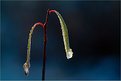
Critique By:
Neil Cowley (K:125)
10/9/2003 7:58:18 AM
Happenstance or regular occurance? Reminds me of fall mornings here wehre the lakes are foggy from evaporation.
|
| Photo By: Fred Strømme
(K:32)
|
|
|
Critique By:
Neil Cowley (K:125)
10/5/2003 8:37:44 PM
strong, but too aloof
|
| Photo By: Robert Fox
(K:208)
|
|
|
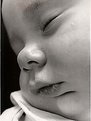
Critique By:
Neil Cowley (K:125)
2/6/2002 1:53:24 PM
OK, here's the details. I took this shot while still a student. My son eben was 4 months old, born in January this was may so we let him nap on a blanket in some spotty shade. I was using a self created reflector - cardboard with spray adhesive attaching the less shiny side of aluminum foil. The reflector was positioned high and right for a very high angle and very soft light. The combination of the agle and the source brought out the very delicate texture of baby skin - which is mostly lost in the JPEG. But the lighting was still successful. I don't have good photos of my june born daughter because the studio strobes wake her up, its definately better to use natural light.
|
| Photo By: Neil Cowley
(K:125)
|
|
|
Critique By:
Neil Cowley (K:125)
1/30/2002 5:55:27 PM
I got this close, this print is full frame 35mm. I shot it using my 60mm nikon, a reflector and my bogen tripod with an extension arm.
|
| Photo By: Neil Cowley
(K:125)
|
|
|
Critique By:
Neil Cowley (K:125)
6/10/2001 10:53:04 PM
Well, I'd say that's a pretty good critiue. Get rid of everything above the man to put emphasis on the reflection. It would make it a much more deliberate image.
|
| Photo By: Lisa Brainard
(K:743)
|
|