|
|
Critique By:
Jamie Ferguson (K:6284)
8/14/2003 5:28:51 AM
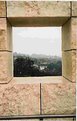
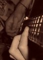
What were you trying to do?
|
| Photo By: Michelle Lo
(K:59)
|
|
|
Critique By:
Todd Broadbent (K:2204)
7/19/2003 8:45:58 PM
I regretfully have to say this does not do it for me. Some of your other pieces are interesting.
|
| Photo By: Michelle Lo
(K:59)
|
|
|
Critique By:
Chris Lauritzen (K:14949)
6/13/2003 7:42:11 AM
Michelle,
I really like the idea you tried here but I have noticed a couple of things wrong. First and foremost is the image is tilted to the left. It is very easy to miss that when shooting. Second thing I see is a green line running across the picture. This might be a poblem with your camera. Does it show up on other shots? Third thing is the jpg comprssion is making the image look unsharp. If possiable try using the highest resolotion your camera will allow.
|
| Photo By: Michelle Lo
(K:59)
|
|
|
Critique By:
Chris Lauritzen (K:14949)
6/12/2003 11:53:23 AM
Michelle,
Interesting computer effect, it looks like something out of thee 70's. Keep playing that's the fun part :-)
|
| Photo By: Michelle Lo
(K:59)
|
|
|
Critique By:
michaelle . (K:3807)
6/12/2003 4:21:06 AM
Michelle,
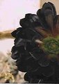
This seems like a very interesting subject... however, the pixelation in the image makes it very hard to critique. Was this originally a large image that was severly cropped? Ok, well for what I can see, the light seems very good, and the exposure seems to be right there. There is true black in the flower as well as hightlights which is not an easy thing to accomplish. The muted green in the center of the flower is lovely, as well. The composition is very nice, however, the background is distracting, and I would suggest an even tighter crop (not of this image, a re-shoot would be needed) to eliminate the darker "rocks" and the "line" rising out of the top of the flower. This is such a unique subject (one does not usually see black flowers), please try to re-shoot. Set the camera on macro mode, set the camera 10 or so inches away from the flower on a tripod and let it rip... but most of all... have fun!
|
| Photo By: Michelle Lo
(K:59)
|
|
|
Critique By:
Fabio Keiner (K:81109)
6/9/2003 12:38:13 AM
if you only would have cropped it better!
it destroys the excellent mood and atmosphere of your still
:
which is fine, dark and extravagant!
|
| Photo By: Michelle Lo
(K:59)
|
|
|
Critique By:
coskun o (K:1812)
6/8/2003 12:14:09 AM
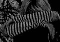
I think, this photograph needs a better lighting adjustments... her face is too dark... and probably the hair and the stripes of the dress should be more attracting which needs a higher contrast. you may achieve a better contrast and brightness by adjusting in PhotoShop or a similar (even a simpler) software.
|
| Photo By: Michelle Lo
(K:59)
|
|
|
Critique By:
Suvomoy Mitra (K:8369)
6/2/2003 12:25:05 AM
Strange feel....high strain on eyes...looking, looking.
|
| Photo By: Michelle Lo
(K:59)
|
|
|
Critique By:
Subha Pindiproli (K:10108)
5/29/2003 11:42:51 PM
need to increase color saturation here.. photo looks dull.. with less colors..
|
| Photo By: Michelle Lo
(K:59)
|
|
|
Critique By:
Mustafa KIZIL (K:2591)
5/29/2003 11:12:05 PM
beautiful
|
| Photo By: Michelle Lo
(K:59)
|
|
|
Critique By:
pippo giuseppe (K:16421)
5/29/2003 10:59:05 PM
ottima!!
|
| Photo By: Michelle Lo
(K:59)
|
|
|
Critique By:
Leslie Cohelan (K:20807)
5/29/2003 10:49:12 PM
I think this could be a great image...the webs appear a bit too bright (overexposed)...and I think if there were more contrast and a bit more saturation of the colors that would help...what I really like is the composition...it's unique and the old neglected feel adds substance to the image...it just needs a boost, whether it be contrast , lighting or color..I'd like to see you take this again with the exposure a little less and then bring it into the light...also consider a black and white...
|
| Photo By: Michelle Lo
(K:59)
|
|
|
Critique By:
luisa vassallo (K:28230)
5/29/2003 10:45:05 PM
direi che la protagonista della tua foto è la luce. Bello il soggetto: la vita oltre ogni tentativo di soffocamento ... bella.
|
| Photo By: Michelle Lo
(K:59)
|
|
|
Critique By:
Al S (K:5131)
5/28/2003 11:12:40 PM
great effort!
was the blur intentional? if it wasn't then adjust the focussing or mount the camera on a tripod if your shutter speed is not fast enough!
cheers!
|
| Photo By: Michelle Lo
(K:59)
|
|
|
Critique By:
Katie Ray (K:1618)
5/23/2003 2:32:17 AM
Great image!!! i love the angle. nice work 
|
| Photo By: Michelle Lo
(K:59)
|
|
|
Critique By:
chris meyer (K:597)
5/22/2003 11:14:12 AM
Fun candid, but that's it.
|
| Photo By: Michelle Lo
(K:59)
|
|
|
Critique By:
Arjen VandeMerwe (K:796)
5/21/2003 11:31:02 PM
You caught a nicemoment for memory, but not a photo for displaying. If you want to bring out the braids, another angle would be better. The on camera flash is not flattering lighting, and does not do justice to the girls. If you want to portray them open shade, or window lighting is better.
|
| Photo By: Michelle Lo
(K:59)
|
|
|
Critique By:
Fabio Keiner (K:81109)
5/19/2003 1:31:05 AM
this one is daring
but true
!
|
| Photo By: Michelle Lo
(K:59)
|
|
|
Critique By:
Heidrun Z. (K:551)
5/18/2003 11:38:02 PM
)
|
| Photo By: Michelle Lo
(K:59)
|
|


 talukder")