|
|
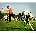
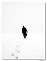
Critique By:
Sandy Stein (K:936)
4/16/2007 1:49:58 AM
Great composition and camera location. I think something should be in focus though.
|
| Photo By: yagmur kizilok
(K:-37)
|
|
|
Critique By:
Sandy Stein (K:936)
3/22/2006 6:20:12 PM
I like the composition very much. The sharp focus and fine detail in the bass works very well. However, the backlit hair on his arm, the halo around his arm, and the blown out area of hair on the right side of his head are major drawbacks.
|
| Photo By: giovanni guido marchi
(K:27040)
|
|
|
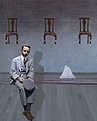
Critique By:
Sandy Stein (K:936)
3/22/2006 5:57:17 PM
Good concept the repetition of geometric forms and the relections. However the photo falls down with the washed out sky. There is lots of detail there that some PS would help. The park bench is a nice touch but the utility box, the sofa and love seat, and the fence on the lower right have to go.
|
Photo By: Joe Ciccone
(K:3684)

|
|
|
Critique By:
Sandy Stein (K:936)
9/24/2005 9:26:38 PM
I like the pose of one character superimposed on the other. The composition, including just the lower part of the umbrella works very well in tying the two together. The lighting though is a strong negative, mainly the blown out highlights on the right and top. Also I would have liked to see more contrast between her face and his hand. Good overall though.
Sandy
|
| Photo By: Francesca Cadeddu Concas
(K:7443)
|
|
|
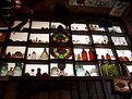
Critique By:
Sandy Stein (K:936)
8/28/2005 5:59:27 PM
I think this would work better with some major cropping. Eliminate all of the bottom and top up to the bottles. same on the sides. This would creat some mystery as to the setup we're viewing. The lighting would also be more dramatic. Lots of potential here.
Sandy
|
| Photo By: Leanne Johnson
(K:80)
|
|
|
Critique By:
Sandy Stein (K:936)
8/28/2005 5:51:41 PM
You're right, the light is strange. I see a puddle on the ground in front of the barn, could the streaking light be moisture in the air? The photo is framed well. The blown out driveway, shrubs on the left and some of the hillside are major drawbacks. I always find it good practice to bracket any shot that has a difficult lighting situation.
|
| Photo By: osvaldo rima
(K:6862)
|
|
|
Critique By:
Sandy Stein (K:936)
8/28/2005 5:40:59 PM
Sorry Endre, this shot was taken a year ago. I remember because of the lighting and wanting a silhoutte I used auto exposure with a plus 1 stop compensation and bracketed. Thanks for the comment.
Sandy
|
| Photo By: Sandy Stein
(K:936)
|
|
|
Critique By:
Sandy Stein (K:936)
6/14/2005 2:10:14 AM
Beautiful pose and lighting. I love how the hair disappears except for a few highlights. However, the out of focus eyes bother me. I'd rather see the eyes in sharp focus and the lips soft. Well done.
|
| Photo By: riflesso Greta
(K:444)
|
|
|
Critique By:
Sandy Stein (K:936)
6/1/2005 2:21:41 PM
Andi, This is a beautifully composed and executed portrait. I love the tone and superb lighting. However, I think you could give the model a bit more mystery by cropping so the top of the hair is off the print. Also, a bit less of the very dark part of the left side shadow. Dynamite job though.
|
| Photo By: Andi Ionita
(K:765)
|
|
|
Critique By:
Sandy Stein (K:936)
5/31/2005 9:47:25 PM
Beautiful. I love the blown out area leading to the wonderfully lit and focused area. The big drawback as I see it is the truck. It just doesn't belong.
Sandy
|
| Photo By: Shizuka Goto
(K:346)
|
|
|
Critique By:
Sandy Stein (K:936)
5/31/2005 9:39:04 PM
You executed very well, with the seat in A-1 sharp focus. The dof also works well. What doesn't, is the overall composition. Half the picture is a sharply focusd rusty seat with wonderful detail. The other half is blurry green foliage. If you are going to use only the seat, this needs at least, a different angle.
|
| Photo By: Chad Parish
(K:335)
|
|
|
Critique By:
Sandy Stein (K:936)
5/31/2005 9:31:46 PM
Wonderful photo. But I find a bit to contrasty. On my screen the highlights are almost blown out. I know there's more detail there.
Sandy
|
| Photo By: Matej Maceas
(K:24381)
|
|
|
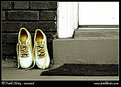
Critique By:
Sandy Stein (K:936)
5/25/2005 2:07:54 AM
I like the way the sneakers stand out, but their arrangement is too contrived.
|
| Photo By: FatiH KirtisH
(K:1181)
|
|
|
Critique By:
Sandy Stein (K:936)
5/25/2005 1:57:02 AM
Roberto,
Great shot. So crisp. I think a crop of the top so no black shows above the screen and the bottom at the edge of the stage, creating a thinner panoramic. Just a thought.
Sandy
|
| Photo By: Subata Kitano
(K:2717)
|
|
|
Critique By:
Sandy Stein (K:936)
5/25/2005 1:44:58 AM
Joao,
Could be a wonderful scene. The harsh lighting is a killer. There is so much detail missing in the highlights. The front of the building with the arch would probably be a better view at this time of day as it is shaded.
Sandy
|
| Photo By: João Pedro Carvalho
(K:213)
|
|
|
Critique By:
Sandy Stein (K:936)
5/25/2005 1:39:08 AM
very nicely composed. I like the fact that rt side of the napkins are off the edge. I'd like the entire photo more if the upper napkin wasn't so blown out.
|
| Photo By: joyce tomas
(K:161)
|
|
|
Critique By:
Sandy Stein (K:936)
4/11/2005 3:23:43 AM
One of the best photos I've ever seen on Usefilm. I looked at it for five full minutes. Bravo!!!
|
| Photo By: fabien vidal
(K:65)
|
|
|
Critique By:
Sandy Stein (K:936)
4/11/2005 3:13:25 AM
Wonderful image, superb timing. The soft focus of the boy adds the feeling of motion very well. Your position really brings home the relative size of the subject.
|
| Photo By: Claude H.
(K:1560)
|
|
|
Critique By:
Sandy Stein (K:936)
2/23/2005 5:14:23 AM
Beautiful photo. The lighting and composition and choice of vertical format are wonderful. The pole, however, I find detracts from the balance of this terrific immage.
|
| Photo By: Roberto Arcari Farinetti
(K:209486)
|
|
|
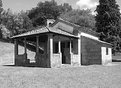
Critique By:
Sandy Stein (K:936)
1/7/2005 5:05:17 AM
Scott, I like the scene very much. I do feel there is way too much sky though. Try a crop of at least 50% of the sky leaving more of a panoramic view and proportion of sky to earth of about 4 to 1. Keep shooting. Sandy
|
| Photo By: Scot Fields
(K:6)
|
|
|
Critique By:
Sandy Stein (K:936)
3/3/2004 7:38:47 PM
L. Lucas,
This is more a comment on your posting habits rather than on one photo. The idea is to be a bit discriminating and post only the photos that you feel exemplfy the scene, mood, or situation that you tried to capture. To post every photo you take does a diservice to you as the photographer and us as the viewers. Thanks for your future consideration.
Sandy
|
| Photo By: Lucas L
(K:12145)
|
|
|
Critique By:
Sandy Stein (K:936)
3/2/2004 2:41:38 PM
Way too much contrast. It hurts my eyes. Maybe it's the Vodka and the contrast is fine. But in any case, it's not one of your best.
Sandy
|
| Photo By: nilo machado
(K:322)
|
|
|
Critique By:
Sandy Stein (K:936)
2/23/2004 7:12:37 AM
Well done. The blur of the hand really captured the moment and that's what this photo is about. I would have liked to see the complete tire and foot of the right rider but I understand that the timing was more important than fine tuning the composition.
Sandy
|
| Photo By: Steven Arthur
(K:140)
|
|
|
Critique By:
Sandy Stein (K:936)
2/22/2004 5:27:29 PM
Nice capture. While there are elements here I could critize, until I can do better, I'll leave that to others. A pleasure to view.
Sandy
|
| Photo By: Sandra Berry
(K:8352)
|
|
|
Critique By:
Sandy Stein (K:936)
2/22/2004 5:03:06 PM
A masterpiece of surrealism. I've gone back to it several times to see if the impact decreases. It doesn't. Great work.
Sandy
|
| Photo By: Kym Skiles
(K:1520)
|
|
|
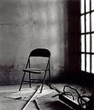
Critique By:
Sandy Stein (K:936)
2/22/2004 4:45:59 PM
Kym,
While this is about as good as it gets, both technically and emotionally, I always have to find something that would make it better, atleast for me. Kind of like makeing love. In this case, it's the back of the chair. The total blackness, as if a silhouette, does not work for me. I need to see a bit, even a hint of a bit, of detail in this area. That being said, let me finish with, this is a superb photograph and you deserve all the cados you've received.
Sandy
|
| Photo By: Kym Skiles
(K:1520)
|
|
|
Critique By:
Sandy Stein (K:936)
2/20/2004 3:31:15 PM
You can only be taught the technical part of photography. The important part has to come from the photographer. You've got it, The EYE of a photographer. Great Photograph.
Let's see a lot more of this quality.
Sandy
|
| Photo By: Tobiah Deutsch
(K:2432)
|
|
|
Critique By:
Sandy Stein (K:936)
2/19/2004 11:56:27 AM
I don't usually add a comment unless I have something more to say than "Great shot" or "Well Done", but in this case the photo is too good not to Say "Great Shot" "Very Well Done". It had to be good the first time. You can't bracket this one.
Sandy
|
| Photo By: Ilona Wellmann
(K:101)
|
|
|
Critique By:
Sandy Stein (K:936)
2/18/2004 6:54:20 PM
Too much light on the left side of the face. There is so much here to see and you've made it washed out on one side and without character on the other.
|
| Photo By: Egidija Smilingiene
(K:3227)
|
|
|
Critique By:
Sandy Stein (K:936)
2/18/2004 6:29:39 PM
Stephane,
I feel like the guy in the Emperors New Suit story. All these raves and I don't see it more than a manipulated shot. But I'm stuck where I am. Is the wind suppose to be lifting her skrit? What is the Fashion being referred to by some of the viewers. If the world see's this as great, I guess it's great. Don't send the horny guy her number.
Sandy
|
| Photo By: stephane Bourson
(K:326)
|
|