|
|
Critique By:
Matej Maceas (K:24381)

8/20/2004 6:39:32 PM
Cool expressions, weird skin tones.
Shot from the hip?
|
| Photo By: Oliver Dienst
(K:452)
|
|
|
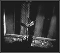
Critique By:
Matej Maceas (K:24381)
8/20/2004 6:34:48 PM
Best image of the roll so far.
I do suspect, though, that you overdeveloped this roll. Dark shadows and very few midtones, so there's not much opportunity to print it down further, but the highlights remain without detail (at least on the scan). If you have such high-contrast light, consider reducing the development time a bit - that should hold the highlights better. Or use slower film.
|
| Photo By: Elangovan S
(K:10675)
|
|
|
Critique By:
Matej Maceas (K:24381)
8/20/2004 6:15:54 AM
This is more of a general question than related to this particular image, but I am curious how safe it is to turn your back to the camera for more than a few seconds. Isn't there a risk that you'll count to ten, turn around, and find the camera gone?
|
| Photo By: Roger Williams
(K:86139)
|
|
|
Critique By:
Matej Maceas (K:24381)
8/18/2004 2:34:47 PM
Richard, you bring up an interesting point. To what extent is or is not the border a part of the image? Are there images that obviously benefit from being presented with a particular border / matting? Does a stunning image remain stunning regardless of the manner in which it is presented?
In my particular case, one of the reasons I print borders on images taken in the streets is to show that the image has not been cropped - an irrational matter of pride that does not have to do as much with the image itself (though I admit I like these borders from an aesthetic point of view) as with the author's intentions and perceptions with regard to the creation of the image.
|
| Photo By: Matej Maceas
(K:24381)
|
|
|
Critique By:
Matej Maceas (K:24381)
8/18/2004 2:25:40 PM
Glad you perceive it that way. As I said in my reply to Michele, mood is exactly what I was trying to get during the toning stage. Toning is fun! (And in a very morbid way, so is selenium toner - you accidentally spill some on your skin, and five seconds later, you have to spit it out. Not as bad as concentrated fixer, though. I've finally decided to buy rubber gloves.)
|
| Photo By: Matej Maceas
(K:24381)
|
|
|
Critique By:
Matej Maceas (K:24381)
8/18/2004 2:19:32 PM
I would say the softness is simply bad technique, by no means desired at the time of shooting :-)
|
| Photo By: Matej Maceas
(K:24381)
|
|
|
Critique By:
Matej Maceas (K:24381)
8/17/2004 1:32:05 PM
Funny scene, but it does not have the same visual appeal as most of your other work.
|
| Photo By: Oliver Dienst
(K:452)
|
|
|
Critique By:
Matej Maceas (K:24381)
8/17/2004 1:29:18 PM
I don't think it works at the moment, it strikes me as too messy. I think you would get a better result if you came much closer and concentrated on details of the red fibres, or on the border between the red and the net.
|
| Photo By: Bjorn Beheydt
(K:12096)
|
|
|
Critique By:
Matej Maceas (K:24381)
8/17/2004 6:15:02 AM
You're very welcome and thank you for the dedication. I like the photo and am looking forward to seeing more.
BTW, if you decide to get an enlarger after all, you'll find that MF film is a *pleasure* to make BIG prints from :-)
|
| Photo By: Elangovan S
(K:10675)
|
|
|
Critique By:
Matej Maceas (K:24381)
8/13/2004 6:29:58 PM
My apologies for this hormonal outburst, but a couple of hours later, I still can't look into this woman's eyes without feeling something of the 'thunderbolt' as described in The Godfather. You have captured something special here - a fraction of a second where her eyes seem to be focused six inches behind my forehead, knowing everything, and in her face an expression of amusement and POWER. Man, this is scary stuff, and it's only a photograph! What would it be like in real life?! I am not joking when I say that I am split between wanting to say "post more, more, more of her" and "no more, she's scaring the hell out of me".
|
| Photo By: Bjorn Beheydt
(K:12096)
|
|
|
Critique By:
Matej Maceas (K:24381)
8/13/2004 1:01:56 PM
Bjorn, you must have nerves of steel. If I were offered a sight like this, I wouldn't remember what a shutter is ;-)
I know, I know, comment on the photo, not on the model...
Was there any particular reason for the framing, I mean the head-room/foot-room ratio? Not a criticism, just a question.
|
| Photo By: Bjorn Beheydt
(K:12096)
|
|
|
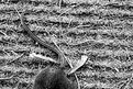
Critique By:
Matej Maceas (K:24381)
8/12/2004 5:01:29 PM
There's something about death that is present in your "7 in One Blow?" photo (which remains one of my favourite images at Usefilm) but not here, at least not at the same level. Having said that, I'm not quite sure *why* that difference is there.
It could be that unlike with the fly trap, where death came in the form of a sophisticated artificial device that was in a certain sense elegant and smooth and sort of sterile, here the mouse seems to have died in a dirty natural environment of natural causes - an ordinary death that no-one stops to think about (*). The death of the flies as depicted in the image was visually fascinating, whereas the death of the mouse seems to have been boring. It *could* also have been violent - thanks to the fact that you have excluded most of the actual mouse from the frame, this possibility is left to the viewer's imagination. The question is - would the viewer want to see the rest of the mouse if violence had been the cause of its death? Probably not - chances are the view would be far removed from the positive aesthetic quality of the fly trap.
(*) Of course, by stopping to write the above, I have fully contradicted myself. Funny, isn't it? :-)
Soooo... Would I consider putting the image on my wall? No. But for better or worse, it sure has acted as a good stimulant for my thought processes - an experience I appreciate very much.
Now onto the dreaded film vs. digital debate. If you like B&W so much, why did you switch from T-MAX to electronic ones and zeroes? The tonal qualities can't stand comparison.
|
| Photo By: Tobiah Deutsch
(K:2432)
|
|
|
Critique By:
Matej Maceas (K:24381)
8/12/2004 3:43:11 PM
Good lord, you cut the negatives? Why not get a bigger album - or some other storage module - instead?
|
| Photo By: Roger Williams
(K:86139)
|
|
|
Critique By:
Matej Maceas (K:24381)
8/12/2004 2:43:39 PM
Looks like the promising start of a new series :-)
There seems to be a scratch running from her nose across the cheek, and also down towards the lips - is it only on the print (hopefully!) or on the negative? I think it's worth checking out and taking care of.
|
| Photo By: Bjorn Beheydt
(K:12096)
|
|
|
Critique By:
Matej Maceas (K:24381)
8/12/2004 2:39:35 PM
Yes, something like that. I cannot quite describe it in words, but it does convey a different feeling, doesn't it?
|
| Photo By: Roger Williams
(K:86139)
|
|
|
Critique By:
Matej Maceas (K:24381)
8/12/2004 2:14:20 PM
Just an idea for you to consider: how about completely cropping off the sky? I think it would give a noticably more "intimate" mood.
|
| Photo By: Roger Williams
(K:86139)
|
|
|
Critique By:
Matej Maceas (K:24381)
8/12/2004 2:08:08 PM
Please please please attach the version with the surprised face :-)
|
| Photo By: Roger Williams
(K:86139)
|
|
|
Critique By:
Matej Maceas (K:24381)
8/11/2004 6:18:31 PM
I think a part of the problem with appreciating the bride's willingness to help others on her special day is that, as far as I can tell, it is not obvious from the image that it's the bride who is doing the helping. In fact I automatically assumed that it was the other way around. After looking at the image again, I don't see anything that would suggest that it was one way or the other way - so in thinking that the bride is being helped, I was jumping to conclusions based on expectations of what is usual, rather than on the image itself. But this also makes your interpretation a result of knowing the circumstances rather than purely looking at the image.
What I *do* see, without ambiguity, is the "her day" that you mention. She looks relaxed, content, happy. I think it is exactly that positive energy that keeps drawing my eyes to the bride's face, despite the fact that compositionally it's on even terms with the woman on the right.
|
| Photo By: Tobiah Deutsch
(K:2432)
|
|
|
Critique By:
Matej Maceas (K:24381)
8/11/2004 5:26:54 PM
Thank you Ian, your comments are very much appreciated.
|
| Photo By: Matej Maceas
(K:24381)
|
|
|
Critique By:
Matej Maceas (K:24381)
8/11/2004 5:23:05 PM
I meant dodging them on the print. In other words, does the negative have detail in the faces? Just a rhetorical question, given that you like the existing print.
|
| Photo By: Jerry Englehart Jr.
(K:114)
|
|
|
Critique By:
Matej Maceas (K:24381)
8/11/2004 5:19:43 PM
Does this fit the project?
|
| Photo By: Ron Browne
(K:1282)
|
|
|
Critique By:
Matej Maceas (K:24381)
8/11/2004 5:18:36 PM
I very much prefer the version with the seagull, where one almost can't tell if the seagull is somehow stuck in a hole inside it or perching on top of it or what.
|
| Photo By: Bjorn Beheydt
(K:12096)
|
|
|
Critique By:
Matej Maceas (K:24381)
8/11/2004 5:14:13 PM
This comes as a bit of a surprise, as I am more used to see exterior images in your portfolio. But I like the photo; the toning and crop (especially the crop) and everything.
|
| Photo By: Ray Heath
(K:4559)
|
|
|
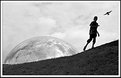
Critique By:
Matej Maceas (K:24381)
8/11/2004 5:12:15 PM
The cloud reflections on the sphere look like craters, making it look like a big moon rising from beyond the horizon. A good angle you have chosen.
Strange as it may seem, I am not at all sure whether the running boy is alive, or a statue. Which is it?
|
| Photo By: Christian Barrette
(K:21125)
|
|
|
Critique By:
Matej Maceas (K:24381)
8/11/2004 5:09:31 PM
This image doesn't speak to me all that much.
|
| Photo By: Tobiah Deutsch
(K:2432)
|
|
|
Critique By:
Matej Maceas (K:24381)
8/11/2004 5:08:36 PM
Interesting composition. In one sense it works, it's dynamic, it makes me look at the bride, then follow the line of her gaze to the centre of the image where the hands meet, then to the older woman's face, and by the same route back to the bride. On the other hand, I naturally tend to perceive the bride as the most important element of the photo, and the presence of the other elements makes me feel as if this perception of mine was incorrect. This feels kind of strange.
I'm not a big fan of blown highlights, though I'm not sure how much choice you had in the matter...
|
| Photo By: Tobiah Deutsch
(K:2432)
|
|
|
Critique By:
Matej Maceas (K:24381)
8/11/2004 5:07:48 PM
Of your three latest uploads, I like this one the most. Although there are two people present in the frame, the attention is all on the bride's friend/assistant, and her thorough concentration on what she is doing. The success of this photo is that it shows enough while not showing too much - we can recognize the bride, but her role is only secondary, contextual, providing meaning to the other woman, of whom this is a well done portrait. Do you think that pointing the camera more to the right, so as to show a bit more of the woman, would have been even better?
|
| Photo By: Tobiah Deutsch
(K:2432)
|
|
|
Critique By:
Matej Maceas (K:24381)
8/11/2004 5:05:03 PM
Indeed, I'm not ecstatic over the mouth, but I'll get used to it :-)
Good work on the hands, the skin tones look better now. But what's up with the colour blur just above your wrist? The same effect on the t-shirt seems fine, but on the forearm I just don't think it makes any sense.
One more nitpick for you to consider: isn't the ear just a little too pink, compared with the rest of the visible skin areas?
|
| Photo By: Aurore Lynch
(K:1687)
|
|
|
Critique By:
Matej Maceas (K:24381)
8/10/2004 4:27:18 PM
Gotta love that newspaper :-)
|
| Photo By: rami rami
(K:2201)
|
|
|
Critique By:
Matej Maceas (K:24381)
8/10/2004 4:16:55 PM
Does she need to look like somebody else? I think not :-)
What's up with the background, on the right side it looks kind of strange...
|
| Photo By: Jamie Ferguson
(K:6284)
|
|