|
|
Critique By:
Matej Maceas (K:24381)

9/1/2004 9:32:41 AM
Christian, it was nice to see your work on the front page.
I've been comparing the two versions of this photo. I prefer the shadow details in the colour version, but on the other hand, I agree with Hugo that this one has a much stronger mood. Difficult choice; maybe this version but with more open shadows would be best?
|
| Photo By: Christian Barrette
(K:21125)
|
|
|
Critique By:
Matej Maceas (K:24381)
9/1/2004 9:31:20 AM
Hi Ray, nice printing technique with the plastic sheet, I tried anti-reflex glass once for a similar effect but it was too harsh (at least for that particular image).
The print appears rather dark, judging by the shadows it seems to have been a bright, sunny day so the overall greyness is visually confusing. Did you print it down on purpose or do we have a major monitor-setup difference?
|
| Photo By: Ray Heath
(K:4559)
|
|
|
Critique By:
Matej Maceas (K:24381)
9/1/2004 9:30:55 AM
This idea has been executed so many times, it's difficult to come up with an original variant. My favourite shadow selfportrait is this: http://www.usefilm.com/image/9081.html
|
| Photo By: Ray Heath
(K:4559)
|
|
|
Critique By:
Matej Maceas (K:24381)
9/1/2004 9:28:55 AM
You'll have more control if you shoot in colour mode and then convert the image using the Channel Mixer (or its PSP8 equivalent).
By the way, didn't you shoot with a Digital Rebel?
|
| Photo By: Anthony Gargani
(K:4527)
|
|
|
Critique By:
Matej Maceas (K:24381)
8/30/2004 6:14:23 PM
Quite impressive.
|
| Photo By: Bea Friedli
(K:10189)
|
|
|
Critique By:
Matej Maceas (K:24381)
8/30/2004 6:07:33 PM
Better in terms of retained details, but it suffers from a green cast. You can remove this cast via a Levels layer, individually adjusting the Red, Green and Blue channels' histogram.
|
| Photo By: Effie White
(K:1147)
|
|
|
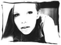
Critique By:
Matej Maceas (K:24381)
8/29/2004 6:53:38 PM
This is pretty cool, perhaps the tonality could use a little tweaking (especially the highlights/bright greys; doing this in broad daylight might also yield good results, go ahead and try) and the composition is somewhat central (not necessarily bad, but still it might be interesting to explore several different options with slightly less space on the right), but to me it's the best shot of what you've shown from this shoot. Good idea, mysterious, interesting. Well done, do more like this.
|
| Photo By: Effie White
(K:1147)
|
|
|
Critique By:
Matej Maceas (K:24381)
8/29/2004 6:53:07 PM
In the spirit of "Be brutal. Be honest." I have to express my curiosity at the fact that this is your favourite of the shoot. She looks like "Oh my god I'm being photographed, what am I going to do". Not the most flattering expression for a portrait :-)
On another note, 300 shots sounds to me like quite a lot for the first photoshoot session. Perhaps slow down a little? But I can understand the excitement of using a new camera :-)
|
| Photo By: Effie White
(K:1147)
|
|
|
Critique By:
Matej Maceas (K:24381)
8/29/2004 6:51:00 PM
Why so very dark?
|
| Photo By: Effie White
(K:1147)
|
|
|
Critique By:
Matej Maceas (K:24381)
8/29/2004 6:50:24 PM
I suspect more shadow detail and perhaps some interesting foreground subject could help improve the photo. Or perhaps you could just crop away the bottom and keep only the top third.
|
| Photo By: Jack Knudson
(K:40)
|
|
|
Critique By:
Matej Maceas (K:24381)
8/29/2004 6:49:53 PM
This really made me smile :-)
|
| Photo By: Rosiness Ma
(K:629)
|
|
|
Critique By:
Matej Maceas (K:24381)
8/29/2004 6:09:12 PM
I tend to disagree with Maria, the composition is quite static as is so often the case when the only subject is dead in the centre.
|
| Photo By: Franz Thoma
(K:3365)
|
|
|
Critique By:
Matej Maceas (K:24381)
8/29/2004 6:53:59 AM
Cool, thanks for the info. Must have been a lot of fun :-)
|
| Photo By: Aurore Lynch
(K:1687)
|
|
|
Critique By:
Matej Maceas (K:24381)
8/28/2004 11:14:07 AM
I don't see anything that's in focus, was that intentional?
|
| Photo By: Bjorn Beheydt
(K:12096)
|
|
|
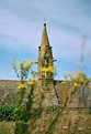
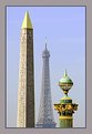
Critique By:
Matej Maceas (K:24381)
8/28/2004 11:11:04 AM
Three eras, one symbol - quite amusing :-)
I can see the slight lack of focus on the rightmost element, and it acts as something of a visual riddle, the reason being that with the given composition, the side elements appear to be at roughly the same distance from the camera (no haze effect as with the Eifel tower).
Nice work.
|
| Photo By: Christian Barrette
(K:21125)
|
|
|
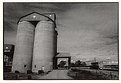
Critique By:
Matej Maceas (K:24381)
8/24/2004 6:22:39 AM
Work. I started my new job two months ago :-)
|
| Photo By: Christian Barrette
(K:21125)
|
|
|
Critique By:
Matej Maceas (K:24381)
8/23/2004 3:46:43 PM
Maybe in this case it would be best to let the shadows go completely black instead of this unrevealing dark grey, thereby also retaining more detail in the sunlit tiles.
|
| Photo By: Paul Compton
(K:785)
|
|
|
Critique By:
Matej Maceas (K:24381)
8/23/2004 3:43:36 PM
Is there a chance of getting some detail out of those trees? I think it would benefit the photo.
|
| Photo By: Christian Barrette
(K:21125)
|
|
|
Critique By:
Matej Maceas (K:24381)
8/23/2004 3:40:13 PM
Your work is one of the few cases where I appreciate PS alterations, especially the colour modifications you make to enhance the mood. But the blur here looks too unnatural to me. Do you have a different version of this image?
|
| Photo By: Rafael Torcida
(K:1926)
|
|
|
Critique By:
Matej Maceas (K:24381)
8/23/2004 3:37:49 PM
Moving my eyes over the image makes me feel like *I* am moving. Cool. I find it slightly too dark, though.
|
| Photo By: Rafael Torcida
(K:1926)
|
|
|
Critique By:
Matej Maceas (K:24381)
8/23/2004 3:31:12 PM
Forgot to mention I like the perspective very much.
|
| Photo By: Christian Barrette
(K:21125)
|
|
|
Critique By:
Matej Maceas (K:24381)
8/23/2004 3:27:18 PM
Looks like a very enjoyable place.
I think I would print this one much lighter and then burn in the top to get the highlights in place.
|
| Photo By: Christian Barrette
(K:21125)
|
|
|
Critique By:
Matej Maceas (K:24381)
8/23/2004 3:16:41 PM
Great expression, really natural. Minor nitpick: less zoom to include the missing bit of the cap's visor and the edge of his ear (you can always crop later). Major nitpick: it could use better separation in the shadows, to allow the pupil and the iris to be discerned (maybe dodging would help).
|
| Photo By: Anthony Gargani
(K:4527)
|
|
|
Critique By:
Matej Maceas (K:24381)
8/22/2004 8:20:51 PM
Regarding C41 monochrome films, I think Ilford's XP2 is actually not so bad (I mean the film itself, not lab-made prints from it), but I agree regular B&W is best :-)
|
| Photo By: Sara Cosby
(K:2704)
|
|
|
Critique By:
Matej Maceas (K:24381)
8/21/2004 7:19:50 PM
You are right, of course. I finally ought to learn to retouch. (Any idea why retouching markers are so terribly expensive?) 35mm I've learned to clean properly, but getting dust off MF and LF is still a challenge.
|
| Photo By: Matej Maceas
(K:24381)
|
|
|
Critique By:
Matej Maceas (K:24381)
8/21/2004 7:12:44 PM
Yeah, it would be better if we could see the prints... scanners have a way of producing images that are completely unlike the actual photo.
|
| Photo By: Elangovan S
(K:10675)
|
|
|
Critique By:
Matej Maceas (K:24381)
8/20/2004 6:39:32 PM
Cool expressions, weird skin tones.
Shot from the hip?
|
| Photo By: Oliver Dienst
(K:452)
|
|
|
Critique By:
Matej Maceas (K:24381)
8/20/2004 6:34:48 PM
Best image of the roll so far.
I do suspect, though, that you overdeveloped this roll. Dark shadows and very few midtones, so there's not much opportunity to print it down further, but the highlights remain without detail (at least on the scan). If you have such high-contrast light, consider reducing the development time a bit - that should hold the highlights better. Or use slower film.
|
| Photo By: Elangovan S
(K:10675)
|
|
|
Critique By:
Matej Maceas (K:24381)
8/20/2004 6:15:54 AM
This is more of a general question than related to this particular image, but I am curious how safe it is to turn your back to the camera for more than a few seconds. Isn't there a risk that you'll count to ten, turn around, and find the camera gone?
|
| Photo By: Roger Williams
(K:86139)
|
|
|
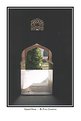
Critique By:
Matej Maceas (K:24381)
8/18/2004 2:34:47 PM
Richard, you bring up an interesting point. To what extent is or is not the border a part of the image? Are there images that obviously benefit from being presented with a particular border / matting? Does a stunning image remain stunning regardless of the manner in which it is presented?
In my particular case, one of the reasons I print borders on images taken in the streets is to show that the image has not been cropped - an irrational matter of pride that does not have to do as much with the image itself (though I admit I like these borders from an aesthetic point of view) as with the author's intentions and perceptions with regard to the creation of the image.
|
| Photo By: Matej Maceas
(K:24381)
|
|