|
|
Critique By:
Werner van den Oudenhoven (K:207)
4/29/2003 7:50:49 AM
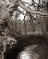
It looks like the old oak is pasted onto the background. Correct me if I'm wrong. There seems to be a halo around the tree.
|
| Photo By: Kevin Salter
(K:649)
|
|
|
Critique By:
Werner van den Oudenhoven (K:207)
4/27/2003 6:09:48 AM
Very nice colour contrast.
|
| Photo By: holly xu
(K:3)
|
|
|
Critique By:
Werner van den Oudenhoven (K:207)
4/27/2003 5:56:37 AM
Great job. Excellent colours.
|
| Photo By: jean E marre
(K:1577)
|
|
|
Critique By:
Werner van den Oudenhoven (K:207)
4/27/2003 5:55:06 AM
Good work!
|
| Photo By: Subha Pindiproli
(K:10108)
|
|
|
Critique By:
Werner van den Oudenhoven (K:207)
4/27/2003 5:42:18 AM
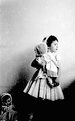
Very emotive B&W work. A bit too high contrast, shadows too dark.
|
| Photo By: josé girbes
(K:374)
|
|
|
Critique By:
Werner van den Oudenhoven (K:207)
4/27/2003 5:40:09 AM
Nice B&W. Shadow parts a bit too dark IMO. There should be some detail there.
|
| Photo By: Jun Ma
(K:511)
|
|
|
Critique By:
Werner van den Oudenhoven (K:207)
4/26/2003 4:46:57 AM
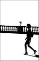
Very 70ies. Perhaps if you could level the balustrade and seperate it a bit of your subject, you would end up with a perfect image.
|
| Photo By: m.c. lopez
(K:14766)
|
|
|
Critique By:
Werner van den Oudenhoven (K:207)
4/26/2003 4:42:59 AM
Technical very good work. I would have liked to see your composition a bit less symmetrical. Moving your shooting point a few meters to the right could greatly improve the view.
|
| Photo By: Andreas Schroeder
(K:221)
|
|
|
Critique By:
Werner van den Oudenhoven (K:207)
4/26/2003 4:38:39 AM
Appealing view. Very impressionistical. Pity of the cabin (or whatever it is)in the back, it's a bit distracting.
|
| Photo By: Andrew Haworth
(K:356)
|
|
|
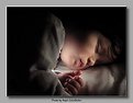
Critique By:
Werner van den Oudenhoven (K:207)
4/26/2003 4:28:27 AM
Very appealing image. Your main subject should have been a bit sharper IMO, especially the face. The leg in the left bottom corner is a bit distracting too. I wouldn't suggest to clone it away, but darken it somewhat could help.
|
| Photo By: Florian Scheiblbrandner
(K:49)
|
|
|
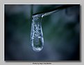
Critique By:
Werner van den Oudenhoven (K:207)
4/26/2003 4:12:40 AM
Very good lighting. IMO cropped a bit too much at the bottom and at the left side. On the right side there should be some more cropping. Good work.
|
| Photo By: Colin Fitzpatrick
(K:1428)
|
|
|
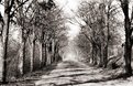
Critique By:
Werner van den Oudenhoven (K:207)
4/23/2003 6:30:20 AM
Mama, don't take my PlusX away: who needs Kodachrome to create expressive images? Another example of magnificent B&W work8
|
| Photo By: Suvomoy Mitra
(K:8369)
|
|
|
Critique By:
Werner van den Oudenhoven (K:207)
4/23/2003 4:59:03 AM
A classic "High Key" photo. Technical: a bit too much "USM" (resampling noise?) and DOF not optimal, especially in the region of the lips. Well done.
|
| Photo By: Toini Blom
(K:2039)
|
|
|
Critique By:
Werner van den Oudenhoven (K:207)
4/20/2003 2:43:49 AM
Comes right out of a fairy tale. I wonder what the dreams are all about!
|
| Photo By: Hayri CALISKAN
(K:16195)
|
|
|
Critique By:
Werner van den Oudenhoven (K:207)
4/20/2003 2:37:29 AM
You've got a good eye for detail. A bit more DOF/sharpness and you'll end up with a perfect image.
|
| Photo By: Hayri CALISKAN
(K:16195)
|
|
|
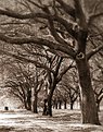
Critique By:
Werner van den Oudenhoven (K:207)
4/20/2003 1:59:30 AM
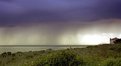
Very striking colour contrast. I would have cropped off the right part because of the absence of leaves on those trees. You would end up with a square image which in this case are the ideal proportions.
|
| Photo By: Mark Godfrey
(K:49)
|
|
|
Critique By:
Werner van den Oudenhoven (K:207)
4/20/2003 1:44:45 AM
The head should have been a bit higher in the image, showing some more neck. The fence could have been used better to "frame" the subject. Of course, it isn't like you could give instructions to your model for a perfect pose. Overall good work.
|
| Photo By: Rui Leitão
(K:6321)
|
|
|
Critique By:
Werner van den Oudenhoven (K:207)
4/20/2003 1:19:22 AM
Very Easterly. With the bird disease spreading in our low countries, perhaps it will become a rare view!
|
| Photo By: mario mario c
(K:5347)
|
|
|
Critique By:
Werner van den Oudenhoven (K:207)
4/20/2003 1:14:56 AM
Very original. Looks a bit tilted. I would have liked to see the lonely man somewhat more prominent in the view. A bit closer with a wide angle lens could (?) do the job.
|
| Photo By: Ronny Van Eeckhoutte
(K:12734)
|
|
|
Critique By:
Werner van den Oudenhoven (K:207)
4/20/2003 1:06:38 AM
Looks just like an old, eroded, medieval castle. Frankensteinish. Could be a little bit sharper, though, and exposure seems not so perfect.
|
| Photo By: Alberto Agnoletti
(K:12811)
|
|


")