|
|
Critique By:
Jeff Cable (K:3599)
12/2/2002 7:28:54 AM
I was dumb about this image Raymond. Although your about gave no clues as to the time of day, 2 seconds at f2.8 on an ISO sensitivity of 400 should have told me the story.  )) ))
There is no right exposure but in the absence of trying for a particular effect, most people would wish to see a complete range of tones from black to white. If you meter with in camera metering, try to meter from very close to your main subject (you could substitute your hand if you cannot get near enough) and remember that the meter wants to turn what it sees into a mid grey colour in monochrome work. Decide if you want the subject to have better detail in the shadows and open the aperture a couple of stops. It raises the tone of the subject's skin to a value of between 7 and 8 (see bottom of page tonal scale) and the shadows will be more open.
It is up to you to decide where to place the most important tones in your image. I have heard general rules of thumb like "expose for the shadows and the highlights take care of themselves" but in the end only you can decide where to place the values you are interested in.
Cheers!
Jeff
|
Photo By: Raymond Andringa
(K:963)

|
|
|
Critique By:
Raymond Andringa (K:963)
12/2/2002 6:09:42 AM
Jeff - Thanks for the input. One thing I may not have made clear in my ?about? on this picture was that it was taken in near total darkness. What is thought to be the sun is actually a small light on the top the ferry terminal dock. Since this picture was taken, a few other people have taught me more about better metering so that I don?t blow out my highlights and darken my shadows too much. I see in your adjustments how better lighting and further adjustments can bring out more detail in the shadows. I?m looking forward to getting back out there and practicing some more. Thanks again.
|
| Photo By: Raymond Andringa
(K:963)
|
|
|
Critique By:
Jeff Cable (K:3599)
11/29/2002 4:05:33 PM
Hi Raymond. I like the idea behind this picture. I considered it for quite a time and then decided to make some adjustments which I have attached. What i found most disturbing was the sun in this image. It is very bright and the harsh contrast implies its presence. I thought I would crop it and the format was also more of a square as a result. I also changed the overall light balance to show a little more detail in the shadows. What do you think? It was a well seen image anyway and i like it. Nice work!
Cheers!
Jeff
|
| Photo By: Raymond Andringa
(K:963)
|
|
|
Critique By:
Greg Smereczynski (K:2278)
11/29/2002 12:23:53 PM
great picture, only in my opinion is too much mess around the bucket
|
| Photo By: Raymond Andringa
(K:963)
|
|
|
Critique By:
Raymond Andringa (K:963)
11/28/2002 12:54:34 PM
I see this picture now and I realize just how blurry it is. I guess something was lost when it was sized down to fit on this site. I'll post a sharper image.
|
| Photo By: Raymond Andringa
(K:963)
|
|
|
Critique By:
Raymond Andringa (K:963)
11/27/2002 7:17:27 AM
Each day I learn more and more...Thanks all.
|
| Photo By: Raymond Andringa
(K:963)
|
|
|
Critique By:
ng nn (K:129)
11/27/2002 6:54:49 AM
No, Raymond, barrel-distortion is the propensity among (especially) wide-angle lenses to draw ex-centric, straight lines as curves, curving outwards. If you photograph a rectangle it will resemble a barrel, hence the name.
Some lenses will have what is called pincushion distortion, and here the lines will be curving inwards, giving the rectangle a cushion-look.
The phenomenon you are describing (increasing fuzzyness towards the edges) is due to the rays of light not focussing in the same plane. This increases with widening apertures and will probably go away if you stop down to f8 or f11. The closer to the optical axes the rays of light pass through the lens the less aberration, both chromatic and focus-wise.
|
| Photo By: Raymond Andringa
(K:963)
|
|
|
Critique By:
Raymond Andringa (K:963)
11/27/2002 6:10:20 AM
Mr. Holman - Due to the fact that I was further away from Seattle than I'd like to have been, my focal length was 93mm. I did use a teleconverter (unknown brand, specs. etc.) on some shots but I didn't like the blurry effect on everything near the outer edge of the field (is that barrel distortion?).
|
| Photo By: Raymond Andringa
(K:963)
|
|
|
Critique By:
Raymond Andringa (K:963)
11/27/2002 5:58:00 AM
Mr. Holman, Sir; Yes this was taken from Queen Anne Hill. Kerry Park to be precise. You?re right too in thinking it?s a bit to the right, overlooking Lake Union. I?d like to get closer into Seattle some night and go on a shooting rampage (can I say that?) maybe catch light trails, etc. When I saw your photo from the Space Needle, (http://www.usefilm.com/showphoto.php?id=27412) I knew I?d been bitten.
|
| Photo By: Raymond Andringa
(K:963)
|
|
|
Critique By:
Donald Holman (K:884)
11/26/2002 2:20:53 PM
Ray - welcome to the world of night cityscapes. I recently started experimenting there too (love playing with light trails). Is this shot from Queen Anne Hill? Seems a little off "to the right" to be there, but it's the only place I could think of. I'm hoping for a couple of clear nights this weeks.
|
| Photo By: Raymond Andringa
(K:963)
|
|
|
Critique By:
Donald Holman (K:884)
11/26/2002 2:17:49 PM
Mr. Ray, sir! You've been a busy boy. Oh you digital photographers.
I'd comment on the photo, but I know close to jack about landscapes myself, so. Wondering what focal length this is could be (I forget the specs on the C3000Z)? Thinking it must be pretty low considering the DOF you got at f2.8
|
| Photo By: Raymond Andringa
(K:963)
|
|
|
Critique By:
Deb Mayes (K:19605)
11/26/2002 9:42:40 AM
Ah, well - I'm impressed you were experimenting that way, how else would any of us learn? Reading doesn't entirely get things through my head; somehow I have to do them, too. (Apparently I am doomed to make every mistake possible, but that's me.)
I like both of these; my objection to the first really was minor. I love the way the second one glows though - what a difference a few minutes make. (And I hear you about the Hasselblad.)
|
| Photo By: Raymond Andringa
(K:963)
|
|
|
Critique By:
Raymond Andringa (K:963)
11/26/2002 9:35:36 AM
Deb, Yes I did shoot more as the sun set further; unfortunately the wind picked up a bit and as the shutter speeds decreased, the slightest camera vibration (note to self: invest in more sturdy tri-pod) translated into a blurry image and those were deleted.
One other factor was that I was playing around with different camera settings practicing to see what will work best in the end. The picture I posted was shot at 1/100 sec with an aperture of f2.8 and an ISO of 100. This other image is composed different (Columbia Tower isn?t being blocked by the Space Needle) and it was shot at 1/5 sec., an aperture of f11 and an ISO of 200. (Experimenting with DOF)
I guess it might be easier to have more than one camera set up ready to shoot at various settings in the short light of a setting sun instead of having to make setting adjustments on one camera, but I?m still new to the world of photography and am not ready to take out a second mortgage to buy that Hasselblad I?ve been eyeing...baby steps.
|
| Photo By: Raymond Andringa
(K:963)
|
|
|
Critique By:
Deb Mayes (K:19605)
11/26/2002 8:55:31 AM
Very nice composition, but the shadows seem a little harsh (minor nit). Did you happen to take more as the sun went down farther? I especially like the glow on Mount Rainier in the background -
|
| Photo By: Raymond Andringa
(K:963)
|
|
|
Critique By:
Marleen den Brok (K:374)
11/23/2002 10:45:49 AM
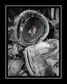
I agree with Kim and Greg. A little bit of light in the other eye would be a big improvement.
|
| Photo By: Raymond Andringa
(K:963)
|
|
|
Critique By:
Kim Culbert (K:37070)
11/21/2002 1:17:37 PM
For me, not knowing too much about gear and whatnot, I had to look really hard into this image to realise that it was a helmet with a picture in it. I would like to see this with one other object that screams "time of battle" laying next to the helmet so that the message comes across a bit more clear. Could be just me, though! This has a wonderful meaning.
|
| Photo By: Raymond Andringa
(K:963)
|
|
|
Critique By:
Jun Ma (K:511)
11/21/2002 11:49:27 AM
It's a striking picture. I think more people should see it and feel it.
PUBLISH IT!!!
|
| Photo By: Raymond Andringa
(K:963)
|
|
|
Critique By:
Greg Summers (K:1115)
11/19/2002 12:27:07 PM
From the thumbnail, it looked as if he was winking - in the full image, it seems his other eye might look etter with more light - pretty cute
|
| Photo By: Raymond Andringa
(K:963)
|
|
|
Critique By:
Raymond Andringa (K:963)
11/19/2002 9:01:20 AM
A reflector...I guess I never really thought about that. I think I was a bit surprised that he was allowing me to take up some of his precious time and I knew I better use that time wisely. Knowing him as I do, I?m sure he would?ve high-tailed it out of the area as soon as his surroundings got to be too "busy" for him. His allowing me to set up the tri-pod is a clear sign that he's slowing down in his old age.
I really do like the idea for a reflector. Thanks Kim. It might be time for a quick trip to the local art supply store.
|
| Photo By: Raymond Andringa
(K:963)
|
|
|
Critique By:
Kim Culbert (K:37070)
11/19/2002 8:38:14 AM
Would Tully sit still while you set up a reflector? A little light in the other eye would really make this image great. All you need is some white posterboard set up on the other side with some desk lamp bounced into it.
|
| Photo By: Raymond Andringa
(K:963)
|
|
|
Critique By:
CJ McKendry (K:1388)
11/16/2002 7:56:24 PM
Now that's a photo that tells the story... great capture!
|
| Photo By: Raymond Andringa
(K:963)
|
|
|
Critique By:
Jason Snipes (K:36)
11/13/2002 3:51:00 PM
Very nice photo, I am from the Gulf Coast so i have seen photos like this before, very common in this are, but yours has very good color and I love the way it is set up.
|
| Photo By: Raymond Andringa
(K:963)
|
|
|
Critique By:
Donald Holman (K:884)
11/13/2002 12:34:35 PM
I like this one I love the deep blue colors of the water and the composition. How the strong post on the left dominates and leads my eye back. Only thing that bothers me is something you can't change and that's the res of the picture here. Would love to see this one bigger. I'm sure you're losing a bit bringing it down to 480pix height. Very nice, Mr. Ray, sir.
|
| Photo By: Raymond Andringa
(K:963)
|
|
|
Critique By:
Sarah Needham (K:2482)
11/13/2002 11:18:55 AM
I like this image. I don't mind the lack of detail in the posts, and like the way they lead the eye.
Sarah
|
| Photo By: Raymond Andringa
(K:963)
|
|
|
Critique By:
Raymond Andringa (K:963)
11/13/2002 10:21:06 AM
Perhaps if I would've used my fill-flash the detail in the front piling would've shown up, yes/no? I'm not a big fan of using a flash so I tend to not even think twice about not using it.
|
| Photo By: Raymond Andringa
(K:963)
|
|
|
Critique By:
Anne E. M. Zang (K:4135)
11/13/2002 10:19:54 AM
I think the composition is very well done. I personally don't think it needs detail in the posts. However, something isn't hitting me quite right...maybe too shadowy and not enough vibrancy of color in the sky? Not sure exactly. Regardless, I think you have natural photographic vision. I hope you keep posting!
|
| Photo By: Raymond Andringa
(K:963)
|
|
|
Critique By:
Philip Sherwood (K:51)
11/13/2002 10:03:57 AM
I love the sky and the idea - but I wish I could see more detail on the posts or that the leftmost one didn't block so much of the sky. But that's just my opinion.
|
| Photo By: Raymond Andringa
(K:963)
|
|