|
|
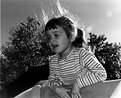
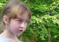
Critique By:
Mr. Arrey (K:11516)
4/1/2003 5:36:37 AM
I love kids and I like this pic. But try to reduce the grains.
|
| Photo By: Peter Caracappa
(K:119)
|
|
|
Critique By:
Eric Goldwasser (K:4294)

3/8/2003 10:59:44 AM
Good use of the filter. Sometimes lens flare is a no-no. But not here! A little fill flash would have helped bring a sparkle into her eyes, but even without this is a great photo!
|
| Photo By: Peter Caracappa
(K:119)
|
|
|
Critique By:
Chris Lauritzen (K:14949)
2/14/2003 7:35:17 AM
Wow what an expression!... bit dark but otherwise a great shot
|
| Photo By: Peter Caracappa
(K:119)
|
|
|
Critique By:
Aaron Charlton Smith (K:625)
2/13/2003 2:06:35 PM
Hah! Cute shot.
|
| Photo By: Peter Caracappa
(K:119)
|
|
|
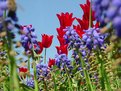
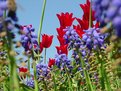
Critique By:
Becky V (K:9699)
2/12/2003 11:49:47 AM
Nice PS work - can't even tell the stem was once there. I definitely think the photo looks better without it. The colours here are wonderful and I like the low angle. I think the strongest part of the photograph is the diagonal line the red and purple flowers make from the upper right to lower left. I find, however, the two blurry flowers in the foreground a little overbearing, and they detract from the rest of the photo. Have you tried cropping them out?
|
| Photo By: Peter Caracappa
(K:119)
|
|
|
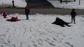
Critique By:
Keith Naylor (K:13064)
2/4/2003 2:29:49 PM
Peter,
this is obviously a really bright winter day, but look at the snow tones in the photo. It needs brightening, and needs some contrast.
Put it into Photoshop and play around with levels and contrast/brightness layers. You will surprise yourself
|
| Photo By: Peter Caracappa
(K:119)
|
|
|
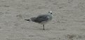
Critique By:
Keith Naylor (K:13064)
12/18/2002 3:58:52 PM
Peter, I find it difficult to give you positive feedback on this, so I hope constructive critisism may help.
Grey bird on grey background, I'm left looking for something unusual to draw my eye - action, pose, viewpoint, texture, colour. I'm sorry I can't see any of these.
Perhaps a lower angle, or actually catching it doing whatever it is it didn't want you to see :-)
|
| Photo By: Peter Caracappa
(K:119)
|
|
|
Critique By:
Adam E. J. Squier (K:9803)
12/17/2002 1:56:47 PM
I like the colors a lot, but there doesn't seem to be a focal point to the image. I'm not sure where to look. The green stalk sort of bisects the photo into two.
|
| Photo By: Peter Caracappa
(K:119)
|
|
|
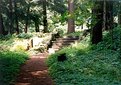
Critique By:
Debbie Groff (K:9569)
10/6/2002 6:14:33 AM
Beautiful picture..looks like a painting.
|
| Photo By: Peter Caracappa
(K:119)
|
|
|
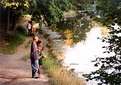
Critique By:
Russ Cooper (K:759)
10/4/2002 8:28:53 AM
What a pretty spot. But what a challenge to get the exposure right, too! Hard to get the detail in the dark areas without overexposing the wall. Maybe one of the experts will have a hint on how to handle that.
|
| Photo By: Peter Caracappa
(K:119)
|
|
|
Critique By:
Jake Sieg (K:673)
9/23/2002 5:21:33 PM
wow, great job with the focusing!! usually i think these type of photos dont look that great - but you proved me wrong! this one is beautiful, great job.
ps. you shouldnt of told us it wasnt intentional 
|
| Photo By: Peter Caracappa
(K:119)
|
|
|
Critique By:
Reynaldo Guimaraes (K:2422)
9/23/2002 2:35:21 PM
Very beautiful, Peter.
|
| Photo By: Peter Caracappa
(K:119)
|
|