|
|
Critique By:
Scott McFadden (K:5663)
9/30/2003 2:55:03 AM
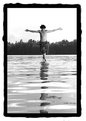
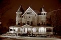
Ted I was drawn to the pretty colours in the thumb like a moth
to flame and I too noticed burning but only in this print.
A great idea if you have access to places like this and the control over the light switch
would be to turn off the light part way through to reduce the burn out.
I think should you trie this again with that and use a selftimer to reduce mirror slap.
|
| Photo By: Ted D'Ottavio
(K:18)
|
|
|
Critique By:
Scott McFadden (K:5663)
9/20/2003 7:05:14 AM
Great composition and good posing have help this image.
The border you have choosen has helped this image
but has also been a double edged sword as it shows up
the lack of a pure black or anthing close really.
adjusting the brightness lower should assist in reducing the
obivious nature of this.
|
| Photo By: Tobiah Deutsch
(K:2432)
|
|
|
Critique By:
Scott McFadden (K:5663)
9/20/2003 6:42:49 AM
ok good you found a frog.
hope you got a closer shot though.
this one loses the frog in the thumb which may defeat the purpose of inspiring others to look harder.
so whilst agreeing with the morality of it I'd have to say its a catch 22 situation.
|
| Photo By: Jytte Kristensen
(K:446)
|
|
|
Critique By:
Scott McFadden (K:5663)
9/5/2003 4:16:25 AM
Great Foreground and nice Composition.
The sky seems a little soft in commparisom.
|
| Photo By: Piotr Bozejewicz
(K:298)
|
|
|
Critique By:
Scott McFadden (K:5663)
8/29/2003 3:02:52 AM
Interesting picture.
I wonder how toning the b+w part would look
|
| Photo By: Uwe Bachmann
(K:10222)
|
|
|
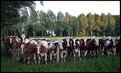
Critique By:
Scott McFadden (K:5663)
5/26/2003 5:30:36 AM
I was slightly cheered by the combination of title and photo here.
They promote a great feeling of curiosity about what it is they are looking at and seem eager as if they are about to be fed.
Typically somone stuck a fence in the way and the poor things are helpless to satisfy the curiosity which made them all look.
technically the post obscures the head but theres little that can be done about that and the wires either.most heads are seen though.
The colours in the cows and grass is really good.
I would like to see.....a panorama of this photo without the sky in it as I believe It doesnt add to the photo.
really I would
|
| Photo By: Titia Geertman
(K:5582)
|
|
|
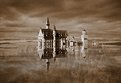
Critique By:
Scott McFadden (K:5663)
5/26/2003 4:13:43 AM
Dramatic lighting in your subject really has helped the emotional apeal as too the toning of the photo.
Things I dont like are the noise but thats just subjective.
and the dead centre composition with the trees that compete fiercely for attention esp being perspectively incorrect.
So I think it got overly complicated
|
| Photo By: vicky ego
(K:1423)
|
|
|
Critique By:
Scott McFadden (K:5663)
5/16/2003 3:14:10 AM
Great composition here and excellent seperation of tones
A little over exposed and it would seem a very over contrasty day.
I would recommend another photo in the exact same spot ect.
done in the just after dawn time or if your too cowardly then at 1/2hour b4 dusk.
The green cast was possibly caused by midday sun on green leaves creating green light. Morning sun will lessen this a little due to its low angle.
|
| Photo By: James Pratt
(K:1567)
|
|
|
Critique By:
Scott McFadden (K:5663)
4/3/2003 4:31:19 AM
Grapes are an excellent subject to practise on.
They stay still dont complain and are an excellent snack between piccys 
The sharpen filter as most of us should know is best used last after resizing and every thing else.
However there are more ways to sharpen then that and Im sure you will be able to find info on that in a book /ie. unsharpmask.
while youre at it look into contrast masking in layers.
the lighting is looking a little flat and a quick change of the levels (providing you have photoshop) will alter this quite a bit.
The concrete structure on the lower right could be removed while youre at it.
Last but by no means least if you shoot in early morning or evening the colour of the image will really come to life.
hope this has helped some
|
| Photo By: Katherine Hagen
(K:2359)
|
|
|
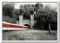
Critique By:
Scott McFadden (K:5663)
4/2/2003 4:51:20 AM
What a Great subject.
Time of day has caused a shadow to be on your cabins.
Also the bridge seems to dominate the show a little.
Id love to see this again in a diffrent light I hope its close by.
|
| Photo By: jack schwab
(K:9)
|
|
|
Critique By:
Scott McFadden (K:5663)
4/2/2003 4:39:40 AM
Your Image is well balanced and reasonably sharp,
problem is this picture has a very bad case of panda eyes.
You may need to add a small reflector or fill flash for the eyes next time.
|
| Photo By: Victoria Stasevich
(K:0)
|
|
|
Critique By:
Scott McFadden (K:5663)
4/2/2003 4:23:47 AM
Ok Im a sucker for this toning treatment.
Great sharpness with the bird good expressions too.
I would prefer to see a little more of the guys eye though.
|
| Photo By: Alex Voronin (Crow)
(K:0)
|
|
|
Critique By:
Scott McFadden (K:5663)
4/2/2003 4:13:39 AM
Interesting image of a plain subject.
Difficult to show an interesting view of such a dull subject.
exposure seems to have let you down just a little esp on the highlights.
|
| Photo By: Jean-François Dupuis
(K:70)
|
|
|
Critique By:
Scott McFadden (K:5663)
4/2/2003 3:09:00 AM
I agree that a smaller dof could have helped.
its a pity the arm obscures the little runners face.
would have loved to see the expression.
|
| Photo By: Rachelle Biggs
(K:628)
|
|
|
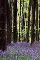
Critique By:
Scott McFadden (K:5663)
3/21/2003 2:25:54 AM
Great colours and excellent exposure.
I really like how the blurr has affected the people.
onto some technicals.
A pity about the lens flare cuased by the fire.but then if you compose a person in sillohette the centre of intrest would be lost.I suggest a lens with good flare resistance.
I think the ladder on the left could be cropped out.
great shadows.
|
| Photo By: ryan bailey
(K:61)
|
|
|
Critique By:
Scott McFadden (K:5663)
3/21/2003 2:05:46 AM
Great action + good technique.
the other elements really dont help at all though.
|
| Photo By: ryan bailey
(K:61)
|
|
|
Critique By:
Scott McFadden (K:5663)
3/18/2003 4:27:37 AM
Great Startburst pattern,
I wonder what the foreground base looked like.
trees grounding would have been nice to have included.
|
| Photo By: Gregory McKnight
(K:543)
|
|
|
Critique By:
Scott McFadden (K:5663)
3/18/2003 4:13:11 AM
very cool ,
the girl on the left could use just a touche more right chin though.
|
| Photo By: William R Eastman III
(K:2141)
|
|
|
Critique By:
Scott McFadden (K:5663)
3/18/2003 3:44:09 AM
Great Simplicity ,
seems to lack detail on the sand upfront.
|
| Photo By: Aiman Nassar
(K:11961)
|
|
|
Critique By:
Scott McFadden (K:5663)
3/18/2003 3:38:59 AM
Great Toning ,very sharp
The front boat/s is just a little too dark.
|
| Photo By: Megan Forbes
(K:4617)
|
|
|
Critique By:
Scott McFadden (K:5663)
3/4/2003 1:17:34 AM
Very amusing.
I especially like the four ears.
The lower base could really use cropping.
or replacing with a warped body.
|
| Photo By: John O
(K:298)
|
|
|
Critique By:
Scott McFadden (K:5663)
3/4/2003 1:05:05 AM
Ok Im Jealous !
As for the image I like the color on the car
and the addition of a human interest.
there are problems with the placement though not that big.
since the headlight makes the ladys butt look just plain wierd.
I prefer to see a ground level or some kind of base.
and maybe the interior mirror could be turned a little more.
Also the model looks a little cramped without head room.
there is a guide of heard of suggesting 2 times the space above the head as below.
|
| Photo By: Gary Graham
(K:18)
|
|
|
Critique By:
Scott McFadden (K:5663)
2/21/2003 1:35:03 AM
Amazing Photo truly spectacular
love the toning, depth and tonal range.
just a tich tilted though thats easy to fix.
and the white spot on the right lower corner is a little blight as is the middle left on border white blurr.
|
| Photo By: Shawn Kellogg
(K:454)
|
|
|
Critique By:
Scott McFadden (K:5663)
2/21/2003 12:07:43 AM
Chris ,
First impression I got here was the color was out sorry.
seems a little too green overall on my moniter.
Love the texure in the clouds they seem to be almost painted.
|
| Photo By: Christopher Thompson
(K:145)
|
|
|
Critique By:
Scott McFadden (K:5663)
2/18/2003 3:49:49 AM
Beautiful capture and great use of a tripod.
Needs a slower film to really define greater color.
Also its starting blow out a little in the middle but a slower film would probably have helped with that too.
There is another idea out there about a black card in front of the lense that reduces the leader trail if you want to.
|
| Photo By: stephen chong
(K:519)
|
|
|
Critique By:
Scott McFadden (K:5663)
2/2/2003 2:41:10 AM
Very good Tribute ,
Im sure the folks familys would be pleased to see this.
As for the image it could do without the shuttle.
though I reckon the starburst is ok.
just seems to dominate the photo and (would proably upset the reletives)
Great title
|
| Photo By: Frank Hettick
(K:119)
|
|
|
Critique By:
Scott McFadden (K:5663)
1/31/2003 4:43:01 AM
another thought
maybe a small section of boot under ?
|
| Photo By: Erik Hansen
(K:26)
|
|
|
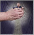
Critique By:
Scott McFadden (K:5663)
1/31/2003 4:41:45 AM
At first I wasn't sure about all the space below the fist.
then I noticed the sand.
I really enjoy this shot and find it very funny.
the only suggestion I could possibly give to assist it
change your background to contrast with every thing.
|
| Photo By: Erik Hansen
(K:26)
|
|
|
Critique By:
Scott McFadden (K:5663)
1/30/2003 3:50:24 AM
a pleasent photo.
just needs a focus point with something to focus on.
too bad if its just not there.
really sharp and exposure seems a little under.
|
| Photo By: Sarah Needham
(K:2482)
|
|
|
Critique By:
Scott McFadden (K:5663)
12/29/2002 4:14:49 AM
jonelle
There are many great ideas out there yours is one
For me I'd have left the brush b+w or partially coloured.
also I'd get rid of some white to the left of subject.
Great shot though and it kinda looks like a shot you would expect to find on a tutorial about digital.
|
| Photo By: Jonelle Cetin
(K:116)
|
|