|
|
|
Dorothy Di Liddo
{K:13787} 2/7/2005
|
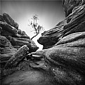
Dang, everyone's fussing so much, I like them both. The B&W for it's stark contrast & abstract quality, and the color for the subtle toning. Dottie
|
|
|
|
|
Gabrielle Willson
{K:7978} 2/2/2005
|
http://www.usefilm.com/image/647111.html
See this Neil for an example of work elsewhere on the site!
|
|
|
|
 Neil Niamh White
{K:9165} 2/2/2005
|
Actually I quite like the idea. But it probably would be better executed against a nice blue or blue/white fluffy cloud background.
My main complaint here is that assuming your camera isn't telling lies, the joists in this building don't appear to be parallel when you compare the top with the bottom. That really irritates (an worries) me, but I suspect the builders rather than you or your camera to be problem!
Neil
|
|
|
|
|
Mary Haywood
{K:362} 2/2/2005
|
MS. Wilson thank you for visiting some of my pictures so I came to see some of your pictures. They are very smart. You have a good photography eye. Why are you so angry with your teacher? I hope maybe he did not give you a bad grade.
Mary
|
|
|
|
|
Diabo
{K:2080} 2/1/2005
|
The bottom of the image (especally the lower left corner) in the b/w version is too featureless.
Too bad about the pale blueish/white background, but the white background in the colorless pic isn't any better.
The color version is more interesting because of the bits of yellow.
|
|
|
|
|
Gabrielle Willson
{K:7978} 2/1/2005
|
And here is the slightly more cropped B& W version.
Which do you like best?
|

|
|


