|
|
|
Shane O'Neill
{K:3054} 1/28/2005
|
Thanks for the comments Tyler.
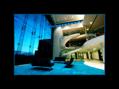
I suppose it boils down to the individual here with regard to the blue frame. A lot of my work on Usefilm will have a coloured frame of some description, I think this focuses the viewer on the actual image itself, maybe this focus would be lost if I left it just black. Usually I will select the most dominant colour within the picture and use this for the frame - its like visual re-inforcement. Sometimes it works and sometimes it odesnt. The biggest issue that people have I find is the actual size of the black frame. I like and I suppose thats all that matters!! - at the end of the day its all feedback.
Rgds,
Shane
|
|
|
|
|
Tyler Robbins
{K:904} 1/26/2005
|
The shot is stellar, very professional looking, could go ina brochure, the black border is ok, but lose the blue fram, it is pretty cliche. I see not everyone agrees with me. It the frame is an element for a bigger layout fine, but as part of a stand alone image it just seems cheap. Love the shot, hate the blue frame.
|
|
|
|
|
Joe Teng
{K:16723} 1/25/2005
|
Amazing! Well done! One of the best i have seen in days! Great colour!
|
|
|
|
|
Cheryl Ogle
{K:24494} 1/25/2005
|
Great shot - I hope they used it. Very nice use of curves and lines. Lovely angle.
|
|
|
|
 Craig Beckman
{K:422} 1/25/2005
Craig Beckman
{K:422} 1/25/2005
|
that is a really nice shot, the blue that comes in from the windows is amazing. great picture!
|
|
|
|
 Roberto Arcari Farinetti
 {K:209486} 1/21/2005
|
outstanding mode and pefect light Shane..
have captured and posted a great architectural shot!
i see a just and balance colors-light!
i like this one and his "pose".. the stairs and the perspective are great!
best reagrds
roby
|
|
|
|
|
Shane O'Neill
{K:3054} 1/21/2005
|
Thanks Hugo,
This is a private hospital, more like a 5 star hotel than a place for sick people! This was a 14 hour shoot to get everything required by the client, luckily the hospital was'nt officially opened.
Rgds,
Shane
|
|
|
|
 Don Loseke
{K:32503} 1/21/2005
Don Loseke
{K:32503} 1/21/2005
|
Wonderful interior shot. Nice work. Don.
|
|
|
|
 Manu
{K:13082} 1/20/2005
Manu
{K:13082} 1/20/2005
|
Frame and inner line help make this shot. The overall composition in the frame are spot on. The only thing that nags me a little is the blue. Is there any way this could be de-saturated without changing the balcony area on the right?
1million euros....for a staircase.....!?
Cheers mate
Manu
|
|
|
|
 Hugo de Wolf
{K:185110} 1/20/2005
Hugo de Wolf
{K:185110} 1/20/2005
|
Hi Shane, Very strong corporate feel about this one; the striking thing is, that it seems abandoned; not a soul in sight. Like the heavy frame and the neon-esque blue line. Works very well in this shot.
Cheers,
Hugo
|
|
|
|
 Nour El Refai
{K:12481} 1/20/2005
Nour El Refai
{K:12481} 1/20/2005
|
the interior design is amazing, i can't believe, the colors and the composition are superb, 7++
|
|


")


