|
|
Critique By:
Nick Moore (K:190)
4/17/2003 10:53:55 AM
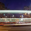
Very cool Megan. I knew you were looking down Whitehall, but the road in the front threw me, but then of course zoomed in everything is compressed together. Great work!.
|
| Photo By: Megan Forbes
(K:4617)
|
|
|
Critique By:
Nick Moore (K:190)
4/14/2003 7:51:01 PM
I love the family lined up as they are, and how the eye starts from the left and ends at the senior member of the family. Colours and exposure are spot on too.
|
| Photo By: T Glow
(K:14955)
|
|
|
Critique By:
Nick Moore (K:190)
4/14/2003 7:42:57 PM
Thanks guys. I forgot to mention that the image I worked on was one I had applied Guassian blur to, purposely to give it a more dreamy look. Maybe that worked better with the origianl Red Tulips than this blue version.
|
| Photo By: Nick Moore
(K:190)
|
|
|
Critique By:
Nick Moore (K:190)
4/14/2003 7:09:59 PM
Adorable photograph. I particularly like the catch light you have caught in his eye, great shot!.
|
| Photo By: Megan Forbes
(K:4617)
|
|
|
Critique By:
Nick Moore (K:190)
4/10/2003 7:11:05 AM
I like the fountain better in this shot because you have eliminated the foreground. The lighting is once again great, but I am not sure about the composition. The crane in the shot could be cloned out, but there is something about the column position that doesn't quite work for me.
|
| Photo By: Megan Forbes
(K:4617)
|
|
|
Critique By:
Nick Moore (K:190)
4/9/2003 7:15:25 AM
Wonderful exposure, really nice soft warm lighting, another great shot of London Megan!. I may crop a little of the forground upto the fountain, but that's just me  . .
|
| Photo By: Megan Forbes
(K:4617)
|
|
|
Critique By:
Nick Moore (K:190)
4/8/2003 11:42:13 AM
The Green line must of appeared on upload, it's not in the image on my computer!.
|
| Photo By: Nick Moore
(K:190)
|
|
|
Critique By:
Nick Moore (K:190)
4/7/2003 1:09:14 PM
Nice shot Dawn and great colours and contrast. I do agree with Trevor that maybe it does need something in the foreground, or a leading line to take the eye upto Garden Rock. Scan looks better!.
|
| Photo By: Dawn Chadwick
(K:347)
|
|
|
Critique By:
Nick Moore (K:190)
4/7/2003 12:57:12 PM
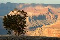
I like the use of the tree in the foreground. Great lighting too!. Is it just hazy or did you purposely shoot with a small DOF?. I have shot in Canyonlands before and know only too well how hazy these canyons get. Great shot Eric!.
|
Photo By: Eric Goldwasser
(K:4294)

|
|
|
Critique By:
Nick Moore (K:190)
4/5/2003 7:19:10 PM
Beautiful Sky, and nice crisp reflections with lots of colour.The image does look a little unlevel, the building on the right isn't vertical. I think the composition is fine as is, but would be interesting to see more sky and less of the Thames.
|
| Photo By: Megan Forbes
(K:4617)
|
|
|
Critique By:
Nick Moore (K:190)
4/1/2003 12:15:09 PM
Howard, your suggestion prompted me to do some PS touch up work, here is the result:
|
| Photo By: Nick Moore
(K:190)
|
|
|
Critique By:
Nick Moore (K:190)
4/1/2003 11:53:10 AM
Beautiful light, composition, and exposure. Great image Don!.
|
| Photo By: Don Martel
(K:551)
|
|
|
Critique By:
Nick Moore (K:190)
4/1/2003 9:46:19 AM
I did use a Grad ND filter for this shot, but it could do with some more PS work as it is an older image.
|
| Photo By: Nick Moore
(K:190)
|
|
|
Critique By:
Nick Moore (K:190)
4/1/2003 9:03:13 AM
Apologies for the scan, it was scanned prior to buying a film scanner.
|
| Photo By: Nick Moore
(K:190)
|
|
|
Critique By:
Nick Moore (K:190)
4/1/2003 8:58:30 AM
Nicely balanced shot, great light! - did you use a flash to light up the forground rocks?.
|
| Photo By: Christian Gennert
(K:964)
|
|
|
Critique By:
Nick Moore (K:190)
3/30/2003 7:27:54 PM
Beautiful strong colours, Velvia has really made the image pop!. It may almost be tempted to turn the shot into a panaramic, and crop some of the blue sky from the top.
|
| Photo By: Mike Hollman
(K:315)
|
|
|
Critique By:
Nick Moore (K:190)
3/30/2003 7:23:43 PM
Even though this image has a fairly busy foreground, I think the colours compliment each other to make everything work. At sunrise this would be awesome, however with a little Photoshop adjustment as is it would really stand out.
|
| Photo By: Dawn Chadwick
(K:347)
|
|
|
Critique By:
Nick Moore (K:190)
3/30/2003 9:41:52 AM
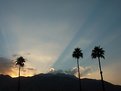
Thought I'd drop by and say hey as you commented on my "snow dunes". You have captured the suns rays perfectly here, and I like the Palms in the shot too!. You probably could crop some from the top and left and right to retain the proportions, but still a great shot as is.
|
| Photo By: Gregory McKnight
(K:543)
|
|
|
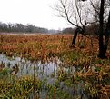
Critique By:
Nick Moore (K:190)
3/30/2003 7:10:17 AM
Nice interplay of greens and browns on the wet ground, signs of new life coming through and a new season. I think I would crop some of the white sky out because it has no interest, also looks like the image is sloping left to right.
|
| Photo By: dave jones
(K:608)
|
|
|
Critique By:
Nick Moore (K:190)
3/30/2003 7:05:31 AM
Lighting is wonderful, and a nice balance of warmth against the coldness of the snow. Well composed shot!.
|
| Photo By: Christian Barrette
(K:21125)
|
|
|
Critique By:
Nick Moore (K:190)
3/30/2003 6:45:34 AM
Nice burst of green that really compliments the red of the roofs. Great composition using the Palms as a frame for the lighthouse. I also like the breakwater above the lighthouse, but may be tempted to crop a touch from the top down to the first breakwater.
|
| Photo By: Jeff Thomford
(K:247)
|
|
|
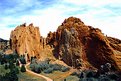
Critique By:
Nick Moore (K:190)
3/30/2003 6:41:06 AM
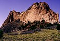
I know GOG very well, and even know where you took this shot from of the Kissing Camels. This view looking down on them maybe doesn't do the size of them justice, but I like that fact you included the people to give some idea of grandeur. Your composition is fairly well balanced, and the lighting is good. The sky looks a little funky, but that may be the scan??. I would also clone out the aircraft trial too.
|
| Photo By: Dawn Chadwick
(K:347)
|
|
|
Critique By:
Nick Moore (K:190)
3/30/2003 6:03:40 AM
I know the exact spot you took this from . I too like the lights curving towards Big Ben, it leads your eye into the shot. Well done.
|
| Photo By: Megan Forbes
(K:4617)
|
|
|
Critique By:
Nick Moore (K:190)
3/29/2003 4:48:20 PM
Wonderful colours in the Sky Megan. We are blessed occasionally with wonderful sunsets similiar to this in Colorado, but I don't ever remember seeing one this spectacular in the UK (where I grew up).
|
| Photo By: Megan Forbes
(K:4617)
|
|
|
Critique By:
Nick Moore (K:190)
3/29/2003 2:40:10 PM
Great night time colours, love the reflection in the Thames of the blues.
|
| Photo By: Megan Forbes
(K:4617)
|
|
|
Critique By:
Nick Moore (K:190)
3/29/2003 12:01:27 PM
I really like how the tops of the trees disappear into the mist; great composition and exposure!
|
| Photo By: Connie Sunderland
(K:376)
|
|
|
Critique By:
Nick Moore (K:190)
3/29/2003 8:52:31 AM
You have a nicely balanced shot as you said, the boatman is well composed. Great exposure too!!. Looks like the scan isn't great, would love to see what the original is like.
|
| Photo By: Kshitiz Anand
(K:4848)
|
|
|
Critique By:
Nick Moore (K:190)
11/21/2002 1:14:51 PM
This is a very moving picture, the B&W and grain really make the shot. I do agree that it's a shame the one bar is obstructing the kittens eye, but still a great shot.
|
| Photo By: Chris Whaley
(K:3847)
|
|