|
|
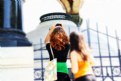
Critique By:
Blake Heiss (K:2197)
3/7/2009 5:32:31 AM
great colors and composition - nice capture
|
| Photo By: Anindya Chakraborty
(K:12765)
|
|
|
Critique By:
Blake Heiss (K:2197)
3/7/2009 5:31:19 AM
I always shoot RAW and for a long time was importing via Canon's DPP (mostly to compensate for noise, etc.) but recently I've been using Aperture and sometimes Lightroom, and I have yet to notice any drop off in quality. 15 MP provides a little more leeway than the 20D I used to rely on, though it's rare that I ever take advantage of the additional size; unless I'm blowing something up to poster size most of my work stays digital or is printed 13x19 or 8X10
|
| Photo By: Blake Heiss
(K:2197)
|
|
|
Critique By:
Blake Heiss (K:2197)
3/7/2009 5:26:12 AM
great reflections; they almost give the effect of spires piercing into the water - nice capture. do you know what caused the halo effect on the hills in the background, most prominently those in the upper right?
|
| Photo By: DONNA SIERK
(K:265)
|
|
|
Critique By:
Blake Heiss (K:2197)
3/7/2009 5:23:50 AM
interesting framing with great texture in the bulb - nice work
|
| Photo By: khalil khosravani
(K:354)
|
|
|
Critique By:
Blake Heiss (K:2197)
3/7/2009 4:53:13 AM
interesting textures in the pain over the wood grain and the rust on the metal, nice work
|
Photo By: vehbi dileksiz
(K:37355)

|
|
|
Critique By:
Blake Heiss (K:2197)
3/7/2009 4:50:17 AM
the candle light gives this shot a very intimate mood, though I wish the photo as a whole were a little less dense, as there are so many great details, like the condensation on the wine bottles, that get lost in that wash of dark. nonetheless, nice work on an interesting concept
|
| Photo By: Cristine Salas
(K:116)
|
|
|
Critique By:
Blake Heiss (K:2197)
3/7/2009 4:40:36 AM
great shot, a little soft, but your composition and the color range in this photo are impressive.
|
| Photo By: Mesut Yilal
(K:3315)
|
|
|
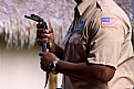
Critique By:
Blake Heiss (K:2197)
3/7/2009 4:38:36 AM
great shot with that subtle implication of "big brother" watching the scene unfold. the only shortcoming I see, and it is of no great importance, is the blowout in the highlight areas where textural detail (e.g. the unique surfaces of the mans clothing) get lost. nice work.
|
| Photo By: K r i s h n e n d u - The NoOne
(K:12059)
|
|
|
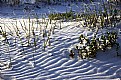
Critique By:
Blake Heiss (K:2197)
3/7/2009 4:35:54 AM
that rippled lighting effect amid those tiny dunes of snow is incredible - such rich texture. The only insight I might offer might be to stop down next time and maintain a little more of that detail throughout the frame, as it is such a shame to lose it in almost all the lower third of this shot. great work nonetheless.
|
| Photo By: Jerry Thompkins
(K:3574)
|
|
|
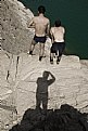
Critique By:
Blake Heiss (K:2197)
3/7/2009 4:33:27 AM
an interesting vantage point that really speaks to the rather precarious position your friends have taken on that precipice
|
| Photo By: pooria asa
(K:1752)
|
|
|
Critique By:
Blake Heiss (K:2197)
3/7/2009 4:30:00 AM
what color! it feels as if it's bursting with a dynamic range of vibrant hues
|
| Photo By: Faisal Almalki
(K:-347)
|
|
|
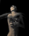
Critique By:
Blake Heiss (K:2197)
3/7/2009 4:28:31 AM
beautiful and almost spectral in a way, giving it a sense of the ghostly intangible...great work
|
| Photo By: Mirjana Antonić
(K:168)
|
|
|
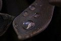
Critique By:
Blake Heiss (K:2197)
3/7/2009 4:27:13 AM
a great reflection and detail in that droplet, excellent use of D.O.F.
|
| Photo By: matthew morgan
(K:1539)
|
|
|
Critique By:
Blake Heiss (K:2197)
3/7/2009 3:51:01 AM
Thank you, Avi, and everyone else for your comments; they are all tremendously appreciated.
|
| Photo By: Blake Heiss
(K:2197)
|
|
|
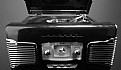
Critique By:
Blake Heiss (K:2197)
2/11/2009 11:40:23 PM
a great setup, not to mention tonal range - the only thing that doesn't seem to be working is the tight crop on the bottom that makes the record player feel incomplete in a way. Nice work.
|
| Photo By: Mark Miller
(K:370)
|
|
|
Critique By:
Blake Heiss (K:2197)
2/11/2009 11:37:23 PM
good shot - might benefit from being cropped down (e.g. there's nothing in the street foreground that is particularly worth keeping.) Other than that, an interesting photo.
|
| Photo By: Craig Nisnewitz
(K:625)
|
|
|
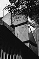
Critique By:
Blake Heiss (K:2197)
2/11/2009 11:35:41 PM
an interesting composition in terms of comparing varied shapes and distinct lines, but with so much there the photo almost becomes too busy visually for it's own good
|
| Photo By: Monsieur Bernardo
(K:356)
|
|
|
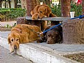
Critique By:
Blake Heiss (K:2197)
2/11/2009 11:32:15 PM
Nice shot. Those might be some of the most sad, or bored, dogs I've ever seen. You'd think having company at least would have kept up their spirits, but maybes is just true that misery loves company. Great work.
|
| Photo By: Monsieur Bernardo
(K:356)
|
|
|
Critique By:
Blake Heiss (K:2197)
2/11/2009 11:29:55 PM
love the use of selective focus - was that in camera or photoshop?
|
| Photo By: Saad Salem
(K:89003)
|
|
|
Critique By:
Blake Heiss (K:2197)
2/11/2009 11:24:55 PM
I don't know what it is, but I do know that it is brilliant. The sharps lines in contrast to the curves are spectacular, not to mention the range in colors, from warm hues like yellow and red, to the almost blue-green sectionals of shadow. Great work.
|
| Photo By: Mark Southcombe
(K:2910)
|
|
|
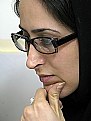
Critique By:
Blake Heiss (K:2197)
2/11/2009 11:22:45 PM
nice shot - could be helped by a little bit of overexposure to maintain some of the detail in the hair.
|
| Photo By: siamak jafari
(K:20075)
|
|
|
Critique By:
Blake Heiss (K:2197)
2/11/2009 11:20:42 PM
great shot and expression on the boy's face. some cropping might help, at least to the point of getting rid of the hand that seems so out of place where it is in the upper right side. In the same vein, there's not a lot going on in the upper left and you can afford to lose some of it.
|
| Photo By: Theron Williams Sr
(K:1459)
|
|
|
Critique By:
Blake Heiss (K:2197)
2/11/2009 11:11:37 PM
Good shot, but has a lot of potential that's not yet been tapped into. The short tonal range is taking away from the photo because as a whole it seems very flat, making the man on the bank in the distance almost impossible to discover. If he is the "subject" of the shot, it has to be lighter, thereby making him more noticeable. If he is not, then the shot becomes much less interesting. Is it supposed to be about the landscape, or the figure's relation to his surroundings?
|
| Photo By: ANANDA NIYOGI
(K:4486)
|
|
|
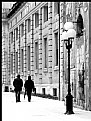
Critique By:
Blake Heiss (K:2197)
2/11/2009 11:07:33 PM
good composition and a great choice going vertical; this photo in a way reminds me of Paul Strand's photo of Wall Street. The only suggestion that I can offer is to try and get a handle on the highlights (mostly the sidewalk) which are blown up to the point that there's very little ground texture. As it is I think it would really benefit if the sidewalk were to have a similar exposure value to the wall of the building.
|
| Photo By: Anna Frosio
(K:2434)
|
|
|
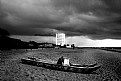
Critique By:
Blake Heiss (K:2197)
2/11/2009 11:04:16 PM
great shot - those clouds are fantastic and the contrast they provide in tonal range against that stark white building and bench in the boat really make this photo.
|
| Photo By: Luciano Caturegli
(K:6609)
|
|
|
Critique By:
Blake Heiss (K:2197)
2/11/2009 11:00:16 PM
Interesting photo, almost reminds me of a Walker Evans' piece I saw years ago of people on the subway in NYC (I could be mistaken); in this case I would almost be tempted to crop out some of the bottom (the text on the side of the train) which is less interesting than the people inside it
|
| Photo By: Linh Ha
(K:120)
|
|
|
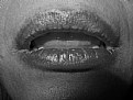
Critique By:
Blake Heiss (K:2197)
2/11/2009 10:57:59 PM
a great attempt but there are a few things to take into consideration next time - d.o.f adjusted to where the detail and textures in the lips are the clear focus of the photo, and this might just be my own personal preference, but the fast fall-off in the bottom two corners gives the photo an almost uncomfortable instability that in an overall sense drags the eye away from the lips, where it should be, and downward. that being said, there's a lot of potential here for making a great photograph. keep up the good work.
|
| Photo By: derin deniz
(K:3544)
|
|
|
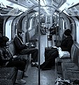
Critique By:
Blake Heiss (K:2197)
2/11/2009 10:54:35 PM
a really interesting shot visually, kind of a strange examination of asymmetry (the passengers) against they symmetrical environment. The blue hue does a lot to complement the feel of the piece and gives it almost an eerie sense of isolation amid company. great work.
|
| Photo By: Paul van der Walt
(K:53)
|
|
|
Critique By:
Blake Heiss (K:2197)
2/11/2009 10:50:46 PM
Nice shot; I'm especially fond of the detail that you have managed to capture in the flowers style and stigma.
|
| Photo By: Greg Sava
(K:11999)
|
|
|
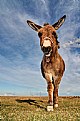
Critique By:
Blake Heiss (K:2197)
2/11/2009 10:49:05 PM
all around great shot - lighting, composition, point of view, shadow and texture in the grass and donkey's fir. Fantastic work.
|
| Photo By: Kralik Dr Jaroslav
(K:3385)
|
|