|
|
Critique By:
Kenny McCune (K:52)
12/9/2003 9:55:33 PM
The "white ribbon like thing" was purely accidental. The flash from the camera caused this strange effect and I didn't want to take the time to remove it.
|
| Photo By: Kenny McCune
(K:52)
|
|
|
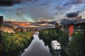
Critique By:
Kenny McCune (K:52)
10/23/2003 1:33:48 PM
This is the by far the best cityscape photo I've seen on this website. Good job!
|
| Photo By: Bernt Carlzon
(K:554)
|
|
|
Critique By:
Kenny McCune (K:52)
10/21/2003 1:29:28 PM
This photo is nice. It feels like it is from a long time past.
|
| Photo By: Debprasad Datta
(K:1545)
|
|
|
Critique By:
Kenny McCune (K:52)
10/21/2003 1:27:31 PM
The colors in this photo are very exciting
|
| Photo By: Christiane Hancock
(K:1618)
|
|
|
Critique By:
Kenny McCune (K:52)
10/21/2003 1:21:54 PM
The photo isn't naturally exciting, but by combining color and b&w you've come up with a nice photo.
|
| Photo By: sandy c. hopkins
(K:17107)
|
|
|
Critique By:
Kenny McCune (K:52)
10/21/2003 1:19:35 PM
I've looked through your different photos and this is by far my favorite. Thanks for commenting on mine.
|
| Photo By: KURT CHAMBERLIN
(K:1598)
|
|
|
Critique By:
Kenny McCune (K:52)
10/21/2003 1:12:48 PM
Where is this?
|
| Photo By: Alina Steiner
(K:64)
|
|
|
Critique By:
Kenny McCune (K:52)
10/20/2003 5:00:52 PM
I really like the colors that come through in this photo.
|
| Photo By: Alexander Hahn
(K:27)
|
|
|
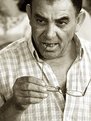
Critique By:
Kenny McCune (K:52)
10/20/2003 4:59:40 PM
The subject has an excellent expression, but I think it could be improved by upping the contrast.
|
| Photo By: Reynaldo Guimaraes
(K:2422)
|
|
|
Critique By:
Kenny McCune (K:52)
10/20/2003 4:57:09 PM
This photo is nice. I would be more drawn in if there were more contrast, but it really is a nice shot.
|
| Photo By: Marcin Kuran
(K:115)
|
|
|
Critique By:
Kenny McCune (K:52)
10/20/2003 4:55:31 PM
Absolutely wonderful, I really don't know anything to suggest for improvement.
|
| Photo By: A. W. Osnafotos
(K:6373)
|
|
|
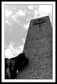
Critique By:
Kenny McCune (K:52)
10/20/2003 4:53:41 PM
I basically like the picture, but I'm not quite sure where my focus should go. The top of the tower and the sculpture are both trying take over the photo.
|
| Photo By: Ordilei Caldeira
(K:2545)
|
|
|
Critique By:
Kenny McCune (K:52)
10/20/2003 4:47:31 PM
The flower is awesome looking. If the background is less saturated and more contrasted it brings out the flower even more.
|
| Photo By: Kshitiz Anand
(K:4848)
|
|
|
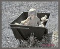
Critique By:
Kenny McCune (K:52)
10/20/2003 4:35:42 PM
It's a nice photo. I really like the expression on the man's face, but I would like it even better with stronger contrast.
|
| Photo By: Salvador Abreu
(K:731)
|
|
|
Critique By:
Kenny McCune (K:52)
10/20/2003 4:30:38 PM
I really love this picture. It brings about stressful, dark emotions simply by the lighting and contrast. Keep it up.
|
| Photo By: Andi Ionita
(K:765)
|
|
|
Critique By:
Kenny McCune (K:52)
10/20/2003 1:53:35 PM
Very well done. The darker side is portrayed very effectively. Thanks for the positive feedback on my photo.
|
| Photo By: sandy c. hopkins
(K:17107)
|
|


")