|
|
Critique By:
Reagen Ward (K:79)
2/5/2004 11:25:33 AM
If you're interested in more info, go to www.blueprintphotography.com.
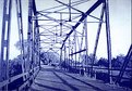
This was a contact print made from a color transparency print of a digicam image. I tend to do large format images with blueprint paper using the paper instead of film, as the paper is a positive medium. Contact prints are easily done but you'd want a large slide to work with.
Enlarging is easy using a variety of devices, including overhead projectors and slide projectors.
Reagen
|
| Photo By: Reagen Ward
(K:79)
|
|
|
Critique By:
Betsy Hern (K:12872)
2/5/2004 11:14:02 AM
I saw your comment in the forums about blueprints and had to take a look, what a great idea! I'm going to have to do some research on this. I imagine you need a neg the same size as the blueprint, so large format here? I used to run hand-drawn pencil ad layouts through a blueprint processing machine (I can still smell the ammonia) in the 70's - whoa! am I that old?! I worked as a layout artist for a retail chain and everything was done with a pencil, no computers. We made blueprints, or ozalids of the layouts as a quick method of duplication, the layouts were very large and this was the cheapest way to get large copies. Now that I think about it, why not negs? You should write an article for this site, I'd love to read it and I imagine many others would, too. Thanks so much for the new idea. Oh, and this image is great, very cyanotypish. I like the way your eye is drawn through the bridge and off into the far horizon. You got a great range of blue tones through this so I imagine it was a sharp neg.
|
| Photo By: Reagen Ward
(K:79)
|
|
|
Critique By:
Dennis (K:259)
12/27/2003 2:39:57 PM
You have a very good series of photos. I was wondering if you have seen the recent book by Jeff Brouws called Ready Mades. I think you would enjoy it.
http://www.jeffbrouws.com/readymades/index.phtml
|
| Photo By: Reagen Ward
(K:79)
|
|
|
Critique By:
Dennis (K:259)
12/27/2003 2:24:05 PM
I would prefer that the sign posts were rotated to vertical.
|
| Photo By: Reagen Ward
(K:79)
|
|
|
Critique By:
roger bourland (K:2762)
12/16/2003 10:40:33 PM
love this shot tru americana there is another very cool sign in needles ca.
|
| Photo By: Reagen Ward
(K:79)
|
|
|
Critique By:
roger bourland (K:2762)
12/16/2003 10:39:46 PM
love this shot tru americana
|
| Photo By: Reagen Ward
(K:79)
|
|
|
Critique By:
sandy c. hopkins (K:17107)
12/16/2003 2:35:20 PM
i really like this alot...
nice composition.
|
| Photo By: Reagen Ward
(K:79)
|
|
|
Critique By:
Robin McAulay (K:8908)
9/11/2003 2:39:43 PM
i love tunnel shots and this is no exception - great shot
|
| Photo By: Reagen Ward
(K:79)
|
|
|
Critique By:
Diana Clark (K:73)
9/10/2003 10:54:03 AM
The Photos of my Bridge , try this link i dont know if it will work or not ( I hope so)
http://www.fotopages.com/cgi-bin/view_log.pl
|
| Photo By: Reagen Ward
(K:79)
|
|
|
Critique By:
Naty Z (K:16436)
9/5/2003 10:32:22 PM
i like the effect you got.
|
| Photo By: Reagen Ward
(K:79)
|
|
|
Critique By:
Reagen Ward (K:79)
9/5/2003 9:54:34 PM
I'm glad you liked it! I'd love to see your image; was it also blueprint, or was it traditional? I'll see if I can track down that magazine.
|
| Photo By: Reagen Ward
(K:79)
|
|
|
Critique By:
Diana Clark (K:73)
9/5/2003 4:20:26 PM
Hello. My name is Diana Clark and i just added you to my friends list because I #1 Love your photo of the bridge , #2 I took a photo almost like this one and it was in the art gallery through the Mo. of August, now it is going on an exhibit tour , Was also printed in the Kentucky Monthly magazine for the Mo. of August
|
| Photo By: Reagen Ward
(K:79)
|
|
|
Critique By:
Marcel Laurens (K:3654)
9/5/2003 1:53:08 PM
great composition...
|
| Photo By: Reagen Ward
(K:79)
|
|
|
Critique By:
Gabriella Carta (K:22879)
9/5/2003 1:40:25 PM
original shot
|
| Photo By: Reagen Ward
(K:79)
|
|
|
Critique By:
Matej Maceas (K:24381)

9/5/2003 1:16:41 PM
The only reason I mentioned the category was because looking at the category will tell me something about how you yourself see the photo, what were your intentions when you took the shot, etc.
Since you placed it in 'Transportation', I commented on it as on a transportation photo. If you had placed it in Landscapes, I would have told you that you had failed miserably. If you had placed it in Abstracts, I wouldn't have commented on it, because I don't usually bother to write just 'nice shot'.
Usually, a photo will fit into several categories; you must choose the most appropriate one, with regard to your intentions at shutter-time. Finally, to directly answer your question - yes, I think 'Transportation' is appropriate :-) And welcome to Usefilm!
|
| Photo By: Reagen Ward
(K:79)
|
|
|
Critique By:
Naty Z (K:16436)
9/5/2003 1:10:51 PM
i think Transportation is ok, but I wouldn't care if it was in the wrong one 
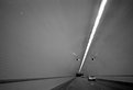
but hey, you shouldn't take pics while driving! it's a good shot, yes with a bit more contrast would be better.
welcome for now and thank you for your comment, it was much more than i could expect for that photo.
|
| Photo By: Reagen Ward
(K:79)
|
|
|
Critique By:
Jose Ignacio (Nacho) Garcia Barcia (K:96391)
9/5/2003 12:52:55 PM
great compostion.I agree with Matej
|
| Photo By: Reagen Ward
(K:79)
|
|
|
Critique By:
Reagen Ward (K:79)
9/5/2003 12:51:53 PM
I think Count Basie. It was Feb 2, and I was in a foul mood after the news of the morning. I drove from Houston to Pensacola that day, and I was driving through the debris trail.
It's amazing how music can effect my photography. Going through my prints and thinking about what music was playing makes me think that I should listen to more jazz and less bluegrass.
|
| Photo By: Reagen Ward
(K:79)
|
|
|
Critique By:
G C (K:12204)
9/5/2003 12:23:22 PM
Cool perspective, love the feel of motion. What was playing on the radio?
|
| Photo By: Reagen Ward
(K:79)
|
|
|
Critique By:
Reagen Ward (K:79)
9/5/2003 12:23:07 PM
I'm new here, and I may have put it in the wrong category. I'd like to ensure that it's properly placed; what do you think? Is Transportation appropriate?
|
| Photo By: Reagen Ward
(K:79)
|
|
|
Critique By:
Ordilei Caldeira (K:2545)
9/5/2003 12:20:00 PM
Good pic Reagan, in the conditions... could be more speed, or in "B". Welcome.
Ordilei
|
| Photo By: Reagen Ward
(K:79)
|
|
|
Critique By:
Reagen Ward (K:79)
9/5/2003 12:15:23 PM
Buzz Kill,
You're right. I improved the contrast in my print; perhaps I should have scanned it instead.
|
| Photo By: Reagen Ward
(K:79)
|
|
|
Critique By:
Matej Maceas (K:24381)
9/5/2003 12:13:03 PM
Considering the speed you were going at, this has very good composition. The lights on the tunnel ceiling were what drew my attention foremost, giving me the impression that the photo is an abstract. I think that in order to make it more of a 'transportation' shot, I'd need the car to jump out at me more strongly and hold my attention for longer. Perhaps that could be achieved by playing around with the toning. But then again, even if I see it as an abstract, it is a good one :-)
|
| Photo By: Reagen Ward
(K:79)
|
|
|
Critique By:
buzz kill (K:1808)
9/5/2003 12:09:31 PM
more contrast would make this shot better
|
| Photo By: Reagen Ward
(K:79)
|
|