|
|
Critique By:
Daniel Headrick (K:570)
7/15/2004 10:01:45 AM
There's few people who'll accept a shot of a TV screen as photography, but others, like myself, argue this.
Some of my most "hot topic" shots have been TV shots...
|
| Photo By: paul lee
(K:45)
|
|
|
Critique By:
Daniel Headrick (K:570)
7/15/2004 9:56:12 AM
Moody and amorphous...
|
| Photo By: matthew hoffman
(K:658)
|
|
|
Critique By:
Daniel Headrick (K:570)
7/15/2004 9:49:50 AM
A great carival of textures... And the right lighting on each!

|
| Photo By: iraklis
(K:29)
|
|
|
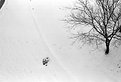
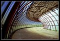
Critique By:
Daniel Headrick (K:570)
7/15/2004 9:46:40 AM
An interesting overhead view...
|
| Photo By: Alex Picel
(K:19)
|
|
|
Critique By:
Daniel Headrick (K:570)
7/15/2004 9:29:49 AM
I automatically dislike the myriad of non-traditional photographic filters that can be applied to a shot within programs such as Corel or Photoshop. But seeing this shot makes me believe that these seemingly useless filters do have purpose. The effect it has on the plastic bag is very interesting, and you can get a suggestion of the floor material underneath. A nice shot, all in all...
|
Photo By: Mark - MarkMedia -
(K:1062)

|
|
|
Critique By:
Daniel Headrick (K:570)
7/15/2004 9:14:32 AM
It took a second before I saw the zoom, but there it was. The traffic lights are a bit flared in the shot. I would recommend retaking this shot from a more oblique angle. By the way, the ambient lighting is excellent.
|
| Photo By: matthew hoffman
(K:658)
|
|
|
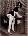
Critique By:
Daniel Headrick (K:570)
7/15/2004 9:11:56 AM
Firstly, the concept is great, the lighting is perfect. Secondly, there are a couple drawbacks to this shot. The placement of the animals looks too predetermined. Also, the color frame really detracts from the shot itself. With a little tweaking this could be a great shot
|
| Photo By: ken krishnan
(K:19102)
|
|
|
Critique By:
Daniel Headrick (K:570)
7/15/2004 9:08:28 AM
Another simply amazing macro. What's funny is that the thumbnail looked scary, but upon seeing the full shot, the little bug's kinda cute.
Great shot.
|
| Photo By: Tadas Trinkunas
(K:5)
|
|
|
Critique By:
Daniel Headrick (K:570)
7/15/2004 9:06:12 AM
I produce pictures like this all the time. You find yourself not wanting to leave the house, so you gather some neat items from around the house and start shooting. Things like this come up. And these are things I like.
Excellent color and excellent lighting.
|
| Photo By: Tommaso Di Falco
(K:23819)
|
|
|
Critique By:
Daniel Headrick (K:570)
7/15/2004 8:58:28 AM
I like this image a lot. The right third of the image seems to have little purpose other than showing the screw-like base of the bulb; I feel like something else should be in that area.
Otherwise great pic. I only wish my camera would look so good in the reflection.
|
| Photo By: Davide Bressanello
(K:3103)
|
|
|
Critique By:
Daniel Headrick (K:570)
5/16/2003 12:55:17 PM
You have the emotion bottled! The two faces to the left of the main subject look like a progression of the emotion from left to right. I don't think there could have been a better shot... Great work!
|
| Photo By: Felipe Rodríguez
(K:9200)
|
|
|
Critique By:
Daniel Headrick (K:570)
5/16/2003 12:49:53 PM
This shot really intrigues me. It has a very "scanned" feel to it, but it clearly gives a different perspective to somewhat ordinary sea objects. The lighting has a very strange effect. It almost looks like some sort of textbook illustration. I like it!
|
| Photo By: Micki Greenrose
(K:38)
|
|
|
Critique By:
Daniel Headrick (K:570)
5/16/2003 12:46:38 PM
Too many people complain about purposeful overexposure, so I understand why you explained it. In this case it really makes the shot. The combination of the lighting and exposure give great sheen and texture to the hair and lips. A beautiful model. And don't let anyone tell you that the bit of greenery to the right is distracting, it's inclusion in the composition gives a sense of depth to what would be an otherwise flat shot. Great, great job!
|
| Photo By: Rita jensen
(K:184)
|
|
|
Critique By:
Daniel Headrick (K:570)
5/16/2003 12:34:07 PM
There are so many great things about this shot. What first caught my eye was the girl's pose. She conveys herself quite well. Her pose and expression seem true and honest. The DOF is great, wonderful separation of subject and background. I especially like the flat lighting and violet monochrome. Very good work!
|
| Photo By: Robin Fox
(K:2)
|
|
|
Critique By:
Daniel Headrick (K:570)
5/16/2003 12:30:06 PM
I like this shot, but I'm not sure why. The layers look a little artificial, but if this was done in the darkroom, then kudos to you!
|
| Photo By: siusiu ming
(K:0)
|
|
|
Critique By:
Daniel Headrick (K:570)
5/13/2003 11:29:08 AM
Less is definitely more in this case. The color is unworldly and beautiful. The short DOF is perfect. Congratulations!
|
| Photo By: Detlef Nerstheimer
(K:74)
|
|
|
Critique By:
Daniel Headrick (K:570)
5/12/2003 6:42:13 AM
Malcolm:
Thanks for your comment. I too like the flatness of the photo and you're probably right, if it were in the abstract section, it may not be such an issue...
By the way, as far as the grid pattern is concerned: I took this shot at night with only the room light (in the kitchen). How the grid pattern emerged is something beyond me. I didn't use a screen or anything. This shot was one out of about fifty, and only this one displayed the pattern. Weird, huh?
|
| Photo By: Daniel Headrick
(K:570)
|
|
|
Critique By:
Daniel Headrick (K:570)
5/7/2003 5:26:14 PM
Great color, mood and texture! Composition and cropping is highly original!
|
| Photo By: Helena K Karlsson
(K:23)
|
|
|
Critique By:
Daniel Headrick (K:570)
5/7/2003 5:23:46 PM
Wonderful, wonderful, wonderful! The color and perspective are excellent. Also, it's nice to see a frame around the image that adds to the photo...
|
| Photo By: Maurilio Ultramari
(K:8200)
|
|
|
Critique By:
Daniel Headrick (K:570)
5/1/2003 12:57:12 PM
Wonderfully haunting!
|
| Photo By: Andrew Polushkin
(K:311)
|
|
|
Critique By:
Daniel Headrick (K:570)
4/30/2003 11:20:24 AM
Excellent composition and contrast. This shot reminds me of a fashion spread I saw once in an Italian Vogue several years back. Lovely texture! Very nice.
|
| Photo By: Rita jensen
(K:184)
|
|
|
Critique By:
Daniel Headrick (K:570)
4/30/2003 11:10:39 AM
Great shot, great model. Very original. I'd like to see the brick wall a bit blurred, it seems a bit too crisp.
|
| Photo By: Ross Mckinnon
(K:1172)
|
|
|
Critique By:
Daniel Headrick (K:570)
4/30/2003 11:06:23 AM
Great, great, great photo. The form and composition are excellent. The lighting gives the model an almost mannequin-like appearance. I love it!
|
| Photo By: Toini Blom
(K:2039)
|
|
|
Critique By:
Daniel Headrick (K:570)
4/30/2003 10:50:09 AM
This is a very nice shot. Reminds me of the work of Holly Warburton, who paints photographs. The image is a bit pixelated, but that may be the net. Beautiful color, although the grey near the bottom is a bit distracting from the rest of the picture. Otherwise, quite lovely.
|
| Photo By: Toni Petersen
(K:2404)
|
|
|
Critique By:
Daniel Headrick (K:570)
4/30/2003 10:46:40 AM
Nice shot. Focus is a bit off. The title automatically evokes a different interpretation of an otherwise dull space. Nice.
|
| Photo By: Dee Carvalho
(K:12)
|
|
|
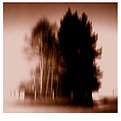
Critique By:
Daniel Headrick (K:570)
4/29/2003 2:48:19 PM
I've passed over this thumbnail several times, then finally decided to comment on it. Great color and lighting. Reminds me of the Quay Brothers' "Institute Benjamenta". Their depiction of the forest was very similar... Nice.
|
| Photo By: Peter Burda
(K:4807)
|
|
|
Critique By:
Daniel Headrick (K:570)
4/29/2003 2:37:19 PM
The lighting is great, the thumbnail made me click on it!
|
| Photo By: William R Eastman III
(K:2141)
|
|
|
Critique By:
Daniel Headrick (K:570)
4/28/2003 9:47:58 PM
WONDERFUL!!!!
|
| Photo By: Ilona Wellmann
(K:101)
|
|
|
Critique By:
Daniel Headrick (K:570)
4/28/2003 8:54:18 PM
Hayri:
What message did you get from this pic? I wasnt' really thinking of one at all. Just a pic I wanted to take...
|
| Photo By: Daniel Headrick
(K:570)
|
|
|
Critique By:
Daniel Headrick (K:570)
4/28/2003 7:57:29 PM
Great color, composition, lighting... Great, great, great!
|
| Photo By: Bobbie C.
(K:1425)
|
|