|
|
Critique By:
R M D (K:686)
8/4/2003 7:37:41 PM
I really like the stone fence in this shot; maybe you can go back and take some more shots just of it.
|
| Photo By: Amy Drake
(K:996)
|
|
|
Critique By:
R M D (K:686)
7/26/2003 9:27:32 AM
did you do much in the way of mods to your holga, to minimize the light leaks, before you shot your first roll?
|
| Photo By: Amy Drake
(K:996)
|
|
|
Critique By:
R M D (K:686)
7/26/2003 9:26:18 AM
stark, beautiful. it sure didn't take you long to get the hang of holga!
|
| Photo By: Amy Drake
(K:996)
|
|
|
Critique By:
R M D (K:686)
7/9/2003 10:44:44 AM
Interesting off-center composition
|
| Photo By: Fabio Keiner
(K:81109)
|
|
|
Critique By:
R M D (K:686)
7/9/2003 10:42:42 AM
When I saw the thumbnail, my first thought was "did he play with saturation?" now I see you did; not a bad thing for this shot. I like the angle; it would have been too dry shot straight-on.
|
| Photo By: matthew kinslow
(K:2525)
|
|
|
Critique By:
R M D (K:686)
7/9/2003 10:24:38 AM
Great colors in a shot that often plays out in shades of muted gray.
|
Photo By: Roberta Elena Dragan
(K:345)

|
|
|
Critique By:
R M D (K:686)
7/6/2003 8:10:42 PM
This is a strong image, I like the sparseness of the walls, the detail of the wood grain on the floor.
|
| Photo By: DeeDee Newman
(K:172)
|
|
|
Critique By:
R M D (K:686)
7/5/2003 1:59:26 PM
Many layers of semi-translucent colors; wonderful!
|
| Photo By: Ursula I Abresch
(K:6515)
|
|
|
Critique By:
R M D (K:686)
7/5/2003 9:52:27 AM
Molto bene! I might have tried a couple positioned with the sun at my back, vs. with the sun at my shoulder. Nice capture of motion!
|
| Photo By: Amy Drake
(K:996)
|
|
|
Critique By:
R M D (K:686)
6/24/2003 10:45:19 PM
L'immagine molto piacevole, ma io sono impauriti per la donna; perchè gli animali stanno mangiando i suoi capelli?
|
| Photo By: Amy Drake
(K:996)
|
|
|
Critique By:
R M D (K:686)
6/19/2003 11:15:08 AM
Great, crisp B&W imagery; your portfolio is outstanding!
|
| Photo By: Andrea Parker
(K:187)
|
|
|
Critique By:
R M D (K:686)
6/16/2003 10:58:14 PM
Great macro detail!
|
| Photo By: Priyadarshi Sinha
(K:7238)
|
|
|
Critique By:
R M D (K:686)
6/16/2003 10:55:45 PM
Great visual composition; the horse and rider seem focused on the same thing.
|
| Photo By: Amy Flemming
(K:778)
|
|
|
Critique By:
R M D (K:686)
6/16/2003 10:53:07 PM
I like the square crop. Could be a tad sharper.
|
| Photo By: Deleana Davison
(K:9)
|
|
|
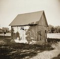
Critique By:
R M D (K:686)
6/15/2003 10:23:08 PM
The sky in the upper left corner is a bit of a visual unbalancer, but otherwise, I like the shot.
|
| Photo By: Amy Drake
(K:996)
|
|
|
Critique By:
R M D (K:686)
6/15/2003 10:17:27 PM
Great colors (did you turn up the saturation a click?) and perfect crop make this shot special.
|
| Photo By: Amy Drake
(K:996)
|
|
|
Critique By:
R M D (K:686)
6/15/2003 10:15:50 PM
Great monochrome detail, Amy
|
| Photo By: Amy Drake
(K:996)
|
|
|
Critique By:
R M D (K:686)
5/29/2003 6:39:46 PM
What's wrong with getting wet (in the creek, that is)? I like the landscape orientation for this content.
|
| Photo By: Amy Drake
(K:996)
|
|
|
Critique By:
R M D (K:686)
5/29/2003 6:38:21 PM
I like the square crop, and the balance of earth to trees, top to bottom. Balanced.
|
| Photo By: Amy Drake
(K:996)
|
|
|
Critique By:
R M D (K:686)
5/22/2003 9:40:15 AM
Great job capturing their facial expressions. A bit blown out in the upper right, but otherwise, well done!
|
| Photo By: Dr. Rafael Springmann
(K:89517)
|
|
|
Critique By:
R M D (K:686)
5/22/2003 9:36:29 AM
A very nice black and white study. The tracks in the foreground aren't quite straight, and aren't quite tilted; somewhat disconcerting. Otherwise wonderful. Crisp detail!
|
| Photo By: Niko Pietinen
(K:1060)
|
|
|
Critique By:
R M D (K:686)
5/20/2003 9:42:35 PM
I like the composition, but the shadow in lower left is a bit distracting.
|
| Photo By: Jose B
(K:42)
|
|
|
Critique By:
R M D (K:686)
5/20/2003 9:40:04 PM
Good detail in this monochrome study.
|
| Photo By: Larry Edwards
(K:843)
|
|
|
Critique By:
R M D (K:686)
5/18/2003 10:39:35 PM
I like the composition, the blur, the over-saturated colors, the impromptu nature of the shot. Reminds me of a Lomo.
|
| Photo By: Juli Morioka
(K:24)
|
|
|
Critique By:
R M D (K:686)
5/14/2003 10:12:30 PM
You captured the personality of the oak quite well. The ultraviolet work on the palette makes it seem other-worldly.
|
| Photo By: Carol Watson
(K:5185)
|
|
|
Critique By:
R M D (K:686)
5/14/2003 9:32:32 AM
The faces seem to be over-lit, with reflections in the eyes, probably as a result of the low ambient light situation.
|
| Photo By: Megan Forbes
(K:4617)
|
|
|
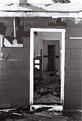
Critique By:
R M D (K:686)
5/14/2003 9:30:50 AM
The sky is a little blown out, at the top. But othewise, I like the detail of the shingles, and the peek into the mess inside.
|
| Photo By: Scott Ostrom
(K:672)
|
|
|
Critique By:
R M D (K:686)
5/14/2003 9:29:42 AM
A great study of the interesting details in life we often miss.
|
| Photo By: Balogh Laszlo
(K:148)
|
|
|
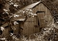
Critique By:
R M D (K:686)
5/13/2003 10:25:29 AM
A bit blown out by the diffused sunlight at the top, but otherwise an interesting POV.
|
| Photo By: Amy Drake
(K:996)
|
|
|
Critique By:
R M D (K:686)
5/13/2003 10:23:18 AM
Maybe just a wee bit too bullseye/centered, but otherwise, I like it.
|
| Photo By: Amy Drake
(K:996)
|
|


")