|
|
Critique By:
Cheryl Jacobs (K:122)
5/26/2009 5:57:07 AM
How funny to see this image pop up after five years. Sophia is now nine years old.
|
| Photo By: Cheryl Jacobs
(K:122)
|
|
|
Critique By:
Cheryl Jacobs (K:122)
8/8/2008 5:44:50 PM
LOL! Funny stuff. Well done.
|
| Photo By: . franco
(K:83)
|
|
|
Critique By:
Cheryl Jacobs (K:122)
8/6/2008 9:53:27 PM
Just the right amount of mystery. Well done.
|
| Photo By: RC. Dany
(K:64104)
|
|
|
Critique By:
Cheryl Jacobs (K:122)
10/19/2004 11:24:11 PM
Robbie, it's a great image to play with -- hope you don't mind my having a go at it.
I love square format, but this one might be better as a tight vertical. Here's what I'm seeing, although there are lots of variations that would work. I'm a bit clumsy in photoshop, as I'm a darkroom devotee, but this is roughly what I see.
I actually nixed the hassey and stuck with the Bronica. I found it to be just as good in nearly every area, and I like that it is lighter weight. Also, the peripherals and lenses are so much more affordable than Hasselblad that I just couldn't justify the expense of the latter.
|
| Photo By: J Dillon
(K:1426)
|
|
|
Critique By:
Cheryl Jacobs (K:122)
10/19/2004 10:31:51 PM
Beautifully, beautifully well done. I like that this image is not about gratuitous nudity, but rather encorporates the nude figure as a logical part of the whole scene. The tones and composition are lovely, and the DOF is perfect.
- CJ
|
| Photo By: Pascal Renoux
(K:4077)
|
|
|
Critique By:
Cheryl Jacobs (K:122)
10/19/2004 10:27:34 PM
This image deserves more attention than its received. I love her expression, and the gaze at who-knows-what.
Personally, I would love to see this image with a rather severe crop -- say, cropping just at the bottom of the strings, midway through the chest, and pulling in the sides a bit. I'd also burn the background down a bit to make her skin and eyes the brightest thing in the frame. I think the result would be a more expressive, more effective image. The crop would also eliminate the sort of awkward posture and at-elbow crop.
Anyway, a very nice image with a lot of potential. Like you, I love a lot of grain when matched with the appropriate subject, and I think your choice of 3200 here was a good one.
- CJ
|
| Photo By: J Dillon
(K:1426)
|
|
|
Critique By:
Cheryl Jacobs (K:122)
7/10/2004 8:56:37 PM
Very nicely done, Robert. Perhaps you might want to pull down the midtones a bit -- darker tones would match the serious expression a bit better.
- CJ
|
| Photo By: Robert Medina
(K:296)
|
|
|
Critique By:
Cheryl Jacobs (K:122)
6/19/2004 12:53:16 AM
Thank you very much. No post-production work was done, though, other than to make the scan look resemble the print as closely as possible. This film, when properly exposed and printed, gives a beautifully smooth tonality.
|
| Photo By: Cheryl Jacobs
(K:122)
|
|
|
Critique By:
Cheryl Jacobs (K:122)
5/18/2004 7:55:36 AM
Thanks for the comments. I personally like the mom's hand supporting the back of the baby's head. The baby is very young and needs her head supported, and I think including in the image adds to the mood. I do appreciate the comment, though.
|
| Photo By: Cheryl Jacobs
(K:122)
|
|
|
Critique By:
Cheryl Jacobs (K:122)
5/4/2004 3:25:57 AM
Ron, no apology needed.  I understood your comment, and just wanted to make sure others did too. I love it when one of my images reminds people of their children, or their own childhood. It's a great compliment when my work recalls happy times and memories. Thanks for the clarification. I understood your comment, and just wanted to make sure others did too. I love it when one of my images reminds people of their children, or their own childhood. It's a great compliment when my work recalls happy times and memories. Thanks for the clarification.
|
| Photo By: Cheryl Jacobs
(K:122)
|
|
|
Critique By:
Cheryl Jacobs (K:122)
5/4/2004 12:14:37 AM
Thanks for your comment, Ron. Of course, I want to clarify for anyone viewing my portfolio that you must mean that you have a similar image of your daughter, as this image of a neighborhood girl was indeed made by me. Please feel free to check my portfolio for another of this girl (the other 'Alone' image.)
|
| Photo By: Cheryl Jacobs
(K:122)
|
|
|
Critique By:
Cheryl Jacobs (K:122)
4/23/2004 5:53:58 AM
Thanks for your comments. Not a snapshot, though.
|
| Photo By: Cheryl Jacobs
(K:122)
|
|
|
Critique By:
Cheryl Jacobs (K:122)
2/28/2004 2:38:23 PM
Mandy, thanks for your recent comments. As for software, I really don't use it except for just scanning prints. All the work is done by hand in the darkroom. I just enjoy it more and am better at it than I ever will be on a computer.
|
| Photo By: Cheryl Jacobs
(K:122)
|
|
|
Critique By:
Cheryl Jacobs (K:122)
2/26/2004 12:48:21 AM
Great, great shot. And a very cute set of legs!
(I can say that because she's my kid.
|
| Photo By: trish reda
(K:82)
|
|
|
Critique By:
Cheryl Jacobs (K:122)
2/24/2004 4:27:08 PM
Ummm... it didn't look like anything in color. LOL. I currently work exclusively with B&W film. I can tell you, though, that in my opinion, the image would lose a lot of its appeal if it had been made in color. But that's just my own bias.
|
| Photo By: Cheryl Jacobs
(K:122)
|
|
|
Critique By:
Cheryl Jacobs (K:122)
2/23/2004 10:10:28 PM
LOL!! Everyone, meet the model, Trish Reda, who is obviously quite taken with herself.
Actually, Trish is a friend of mine and a wonderful photographer in her own right. This shot of her was taken during a break in the session we were shooting. We took lots of breaks!
Thanks for all the comments.
- CJ
|
| Photo By: Cheryl Jacobs
(K:122)
|
|
|
Critique By:
Cheryl Jacobs (K:122)
11/24/2003 6:23:55 AM
Yes, all bills are paid.
But there is no phone cord.
|
| Photo By: Cheryl Jacobs
(K:122)
|
|
|
Critique By:
Cheryl Jacobs (K:122)
11/23/2003 5:19:41 PM
Wonderful and familiar. Sweet but not too sugary. And beautiful tones.
|
| Photo By: Rodrigo Tardioli
(K:254)
|
|
|
Critique By:
Cheryl Jacobs (K:122)
11/11/2003 12:32:03 AM
Thank you very much. It was developed in ID-11 (full strength) for somewhere around 70 minutes, with agitation for the first full minute. It was underdeveloped, though; next time I'll let it sit for a few hours.
Actually, it was handheld. I hate tripods. I hold my elbows in to my sides, and breathe continuously. At 1/15 and 1/30, I am quite consistently able to get reasonable sharpness, while still getting the softness I like.
|
| Photo By: Cheryl Jacobs
(K:122)
|
|
|
Critique By:
Cheryl Jacobs (K:122)
11/8/2003 8:45:49 AM
Luisa, ringraziarlo. Ã? stato fatto per un amico nuovo che ispira me senza fine.
|
| Photo By: Cheryl Jacobs
(K:122)
|
|
|
Critique By:
Cheryl Jacobs (K:122)
11/8/2003 8:31:46 AM
Thank you. No, not a mistake. I would never post a mistake.
|
| Photo By: Cheryl Jacobs
(K:122)
|
|
|
Critique By:
Cheryl Jacobs (K:122)
11/7/2003 10:14:50 PM
John, after appreciating so many of your comments on my images....
...it's very nice to meet you.
|
| Photo By: John Strazza
(K:11535)
|
|
|
Critique By:
Cheryl Jacobs (K:122)
11/1/2003 12:49:26 PM
This is one that I missed that deserves so much more attention than it's been given. The tonality is wonderful, forgiving the slight hot spot under the bodice of the dress. Mood is palpable. Excellent.
|
| Photo By: Lisa Paully
(K:1735)
|
|
|
Critique By:
Cheryl Jacobs (K:122)
10/4/2003 9:40:37 AM
Oops! Not an 800mm. *lol* That should be 80mm, of course.
|
| Photo By: Cheryl Jacobs
(K:122)
|
|
|
Critique By:
Cheryl Jacobs (K:122)
10/3/2003 11:57:25 AM
Thank you for the comments. This location does get wonderful natural light. This family was wonderfully expressive, which always makes it easier.
Jim, thanks! I really love what I do, and I'm always glad to hear that the passion is coming through.
|
| Photo By: Cheryl Jacobs
(K:122)
|
|
|
Critique By:
Cheryl Jacobs (K:122)
9/10/2003 7:45:00 AM
Karen, here's the process:
First, I made an initial print with very low contrast (filter #0) and I diffused it slightly with nylon over the enlarger lens. On this initial print, using pencil on the back, I sketched in and smudged (to avoid obvious line marks) any area that needed to be darkened. I darkened the corners of the print, sketched in her neckline that was disappearing, and added some detail in the white dress. I then contact printed this to make a paper internegative. On the paper interneg, I used the same process, only this time the pencil marks would serve to lighten particular areas. I lightened her arm, which had gone very dark, her face for the same reason, lightened up the whites of her eyes and added light on her nose and jwline. I lightened up tiny highlights in her hair and certain portions of the dress, just enough to "turn the lights on." I added the glow of light around her. Although you probably can't make it out in the scan, I also signed my name in pencil in the LRHC of the print. I then contact printed this again to make a final positive print, which I then blue toned.
As a note of interest, someone has suggested that the image would be improved by the model looking down rather than at the camera. I'm not sure how I feel about that yet, but with a paper neg, the fun thing is that I can easily 'close' her eyes if I want, just by penciling the back of the two negs. I can now contact print this image at will -- none of my usual detailed dodging and burning.
|
| Photo By: Cheryl Jacobs
(K:122)
|
|
|
Critique By:
Cheryl Jacobs (K:122)
9/10/2003 6:37:09 AM
Thanks for all the comments. Elin, I'm considering making another print with her eyes closed. Since this is a paper negative, it's quite easily accomplished and the retouching does not effect the actual negative. Such a fun process!
I should mention that the blue tone is a bit stronger on the scan than in the original. I should have desaturated it slightly to make it exactly match the print. That's what I get for posting it at 2:30 AM!
|
| Photo By: Cheryl Jacobs
(K:122)
|
|
|
Critique By:
Cheryl Jacobs (K:122)
8/25/2003 7:54:21 PM
Actually, detail in this image is intentionally lost. Sometimes (in my opinion, of course) a technically perfect print can fail to make a great impact. The negative is straight-forward, fully detailed, and mid-day bright. This is my interpretation, which conveys the feeling I intended much better. Thanks for the comments.
|
| Photo By: Cheryl Jacobs
(K:122)
|
|
|
Critique By:
Cheryl Jacobs (K:122)
7/2/2003 10:17:41 AM
Darn. Didn't see that line. Actually, I almost never use PS for anything other than dodging / burning. I allowed myself to use it here because I can get the effect easily in the darkroom -- and I was too sleep deprived to do another print. That'll teach me!
|
| Photo By: Cheryl Jacobs
(K:122)
|
|
|
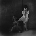
Critique By:
Cheryl Jacobs (K:122)
6/9/2003 11:53:07 AM
Thanks for your comments. Mary, no need to wonder about the lighting. I'll share. =) The was made with only available light (99% of my images are). The girls are positioned in front of a concrete wall, under an overhang. There is light coming in from both the left and right sides. I positioned the girl in white closer to the light, since I wanted her to be brighter, and I let the other girl fall into shadow. A bit of natural fill light was provided by another concrete wall directly behind me. The look was nice, but needed a bit more drama, which I added in the darkroom. I printed dark, burning in the edges a bit, and also slightly burning down the darker girl. It's actually a little flat in tone -- this isn't a final print yet.
|
| Photo By: Cheryl Jacobs
(K:122)
|
|