|
|
Critique By:
Cemal Ekin (K:2309)
8/2/2006 1:18:28 AM
Very interesting, otherworldly surrealistic effect. It is at once appealing and repelling. The tones work well to create the strong moody look. The rickety old pier seems to be standing perhaps supported by ghosts. Good work.
Cemal
|
| Photo By: Aykan OZENER
(K:5996)
|
|
|
Critique By:
Cemal Ekin (K:2309)
8/2/2006 1:11:26 AM
White on white is quite effective, vignetting also adds. Very nicely done.
Cemal
|
| Photo By: Alexey Sapa
(K:27174)
|
|
|
Critique By:
Cemal Ekin (K:2309)
8/2/2006 1:04:13 AM
Nice panning action, good colors, nice work.
Cemal
|
| Photo By: Mike Allebach
(K:391)
|
|
|
Critique By:
Cemal Ekin (K:2309)
8/2/2006 12:49:09 AM
If it were not for the few trees, this could be boring. But they add the needed upright, dynamic elements and thus, interest. I like the colors, the sky is imposing, and the light shaft coming down increases the drama. Very nicely done.
Cemal
|
Photo By: Ingrid Mathews
(K:7277)

|
|
|
Critique By:
Cemal Ekin (K:2309)
8/2/2006 12:44:41 AM
I believe this is called Turk's Head Lily. It is a fine rendering of the detail and tones, with a possible exception of the stamens loaded with pollen. Normally, there would be significant color contrast that would deliniate them from the background, but in B&W that disappears. Perhaps a different method of B&W conversion would retain that contrast. Nicely done.
Cemal
|
| Photo By: Jimmy Perez
(K:1694)
|
|
|
Critique By:
Cemal Ekin (K:2309)
8/2/2006 12:34:47 AM
Nice impressionistic abstract. The movement works well, so do the colors. I wish the center of rotation were not, well, in the center. Nicely done.
Cemal
|
| Photo By: Aiman Nassar
(K:11961)
|
|
|
Critique By:
Cemal Ekin (K:2309)
8/25/2004 3:48:54 AM
Hello Nancy,
I stumbled on this photograph by pure luck and am pleasantly surprised to see a reference to my article. I am very happy to have been of some help.
Cemal Ekin
|
| Photo By: Nancy O'Sullivan
(K:63)
|
|
|
Critique By:
Cemal Ekin (K:2309)
12/6/2003 6:38:00 PM
Bejeweled by nature.
Cemal
|
| Photo By: Beverly Gustafson
(K:1572)
|
|
|
Critique By:
Cemal Ekin (K:2309)
12/6/2003 6:36:29 PM
Looks like another feather on your cap Mary Sue. Kidding aside, it does remind me of a metallic feather. Interesting texture.
Cemal
|
| Photo By: Mary Sue Hayward
(K:17558)
|
|
|
Critique By:
Cemal Ekin (K:2309)
6/11/2003 9:15:30 AM
Merhaba Sahin,
Fotograf ilginc, Antalya'ya uzun yillardir gitmedim, anlasilan epeyce degismis. Poz suresi biraz daha az olabilir bu fotografin, boylece karanlik cokmesi daha da iyi belirir gibi geliyor bana.
Iris fotografima biraktigin "cemal aga" mesajindan buldum fotograflarini. Ben Usefilm'i birakiyorum, daha dogrusu biraktim. Eger diger fotograflarimi gormek istersen asagidaki adrese gidebilirsin:
http://www.cemalekin.com/photography/
Selam
Cemal
|
| Photo By: sahin s
(K:1872)
|
|
|
Critique By:
Cemal Ekin (K:2309)
6/6/2003 8:46:27 PM
Nice colors, the saffron colored turban provides a nice glow and complements the rest of the colors in the photo. The lighting is a little too hars for my taste. Probably a camera mounted flas was used which could be softened by a diffuser to prevent the hot spots from occuring. The straight head-on angle is fine but the cropping is a little too tight for my eyes.
Cemal
PS. I do not rate photos.
|
| Photo By: Jose Ignacio (Nacho) Garcia Barcia
(K:96391)
|
|
|
Critique By:
Cemal Ekin (K:2309)
6/2/2003 9:04:54 AM
Captures a fleeting moment, that is nice. The bright door on the right and the reflection of the sky on the window on top left grab my eye jumping from the boy to the door to the reflection. I think if the bright door on the right and the top two window panes at the top are cropped out the resulting photo will be much stronger.
If you look at the photograph as it is, your eyes will likely jump from the kid's sweater to the door on the right and then to the window panes at the top. Now, adjust your browser window so that these elements are covered you will see that your eye gets fixed on the kid.
Cemal
|
| Photo By: In Transit
(K:29432)
|
|
|
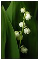
Critique By:
Cemal Ekin (K:2309)
6/1/2003 9:34:08 PM
I have a large patch of lily of the valley in my backyard, but this year due to rain I haven't had a chance enjoy them. They are great photographic subjects too. I like your photograph a lot but it seems to have a little too much yellow on the leaves. Generally, they are a bit deeper and have more blue in the greens. The extra yellow also shows on the white flowers.
Enjoyable.
Cemal
Note: I do not rate photographs.
|
| Photo By: In Transit
(K:29432)
|
|
|
Critique By:
Cemal Ekin (K:2309)
5/31/2003 1:27:23 PM
Nice rhodedendrons (I think) but the white is restrained a little too much for my taste. The flowers look closer to gray than white. At the expense of having a few blown out highlights, I would bring the whites higher. I will try to set the middle of the closest petal at the bottom to 244-244-244 (RGB) which will probably blow out some areas to 255-255-255 (RGB). This, I think, will bring the whites to their deserved prominence.
Probably this could have been averted by using a diffuser to cut down the harsh lighting while taking the photograph.
Enjoyable but can be better. (I do not rate photos.)
Cemal
|
| Photo By: Ken McDonald
(K:4343)
|
|
|
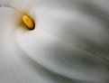
Critique By:
Cemal Ekin (K:2309)
2/28/2003 4:01:29 PM
Greg,
I like this photograph very much. It gives a feeling of falling water from a luminous center. The effect is quite strong for me and it works well. You ahve also found a golden spot with the placement of the center part of the flower. A fitting visual pun.
Cemal
|
| Photo By: Greg Summers
(K:1115)
|
|
|
Critique By:
Cemal Ekin (K:2309)
2/27/2003 11:49:54 AM
I photographed a similar variety of cyclamen a few years ago. They are extraordinarily interesting to photograph. You have done a very good job of capturing its spirit. I like the backlighting that emphasizes the translucency in the petals. The flaming color and shape are striking.
You can take a look at what I did with it at:
http://studentweb.providence.edu/~acekin/photography/cyclam en08.html
Cemal
|
| Photo By: Enzo Molino
(K:531)
|
|
|
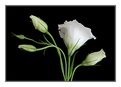
Critique By:
Cemal Ekin (K:2309)
2/22/2003 7:02:43 PM
Karen, this is another loevely rendering of lisianthus and the level of sharpening is just right.
Cemal
|
| Photo By: Karen Johnson
(K:2951)
|
|
|
Critique By:
Cemal Ekin (K:2309)
2/21/2003 8:07:01 PM
Ah, the lovely cyclamen nicely interpreted. The colors and form one can see in a pot of cyclament are truly remarkable. You found an interesting angle that captures the shape, form, and the color of the flower rather nicely.
Cemal
|
| Photo By: Mike Allebach
(K:391)
|
|
|
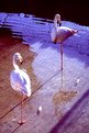
Critique By:
Cemal Ekin (K:2309)
2/21/2003 7:58:48 PM
I don't quite get the title considering that these are flamingos. The color and exposure are both off quite a bit. Composition could be interesting if the other elements are right.
Cemal
|
| Photo By: Aiman Nassar
(K:11961)
|
|
|
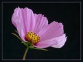
Critique By:
Cemal Ekin (K:2309)
2/21/2003 7:56:48 PM
Cosmos is a comoon flower but you have given us an uncommon view of it by simply plucking a few petal off of it. It looks almost like a cross section of the flower. Nice lighting although there is a little hot area on the lower right corner of the flower. I enjoyed it.
Cemal
|
| Photo By: Karen Johnson
(K:2951)
|
|
|
Critique By:
Cemal Ekin (K:2309)
2/20/2003 9:49:42 PM
Overall a nice photograph. I think the hat is an interesting element in the photograph and sheding some light on its rim would contribute to the image. Her left hand is unresolved. It looks like she is in mid action with her hand. The shadow of her nose is too strong on her upper lip, perhaps a reflector might help. If she rotated her had a tiny bit more to her left then the tip of her nose would not break the nice curve made by her face agains the deep shadow. Her shirt is buckling too much and attracting attention there unnecessarily. Probably because of the angle, the collar of her shirt appears pulled to the left (her) giving her an unduly unkempt appearance. Perhaps a tight fitting top will take care of that.
Keep clicking.
Cemal
|
| Photo By: David Chang-Sang
(K:680)
|
|
|
Critique By:
Cemal Ekin (K:2309)
2/20/2003 9:28:24 PM
Is "Bitter moon" another name for cyclamen? This is an interesting study of the flower with its form and texture. Often we see the charming color and do not pay much attention to form and texture which could be very interesting in their own right. It is a nice play of light and shadows. Enjoyable.
Cemal
|
| Photo By: Aneta Kosiorek
(K:16)
|
|
|
Critique By:
Cemal Ekin (K:2309)
2/20/2003 9:23:54 PM
Very, very nice. I like this one the best among your dahlia photographs. Although the pair of dahlias are also lovely, this one shows the true flower. I like the diagonal positioning of the image and the foliage showing. They add quite a lot.
You have a wonderful collection of flower photographs and probably a strong candidate to win the photo contest. (Watch out for Mary Sue!)
Cemal
|
| Photo By: Karen Johnson
(K:2951)
|
|
|
Critique By:
Cemal Ekin (K:2309)
2/20/2003 9:16:06 PM
Lovely, it shows the playful nature of lisianthus as its colors change like magic. It has very graceful lines, very good color, and lighting. The sharpness is just right.
Cemal
|
| Photo By: Karen Johnson
(K:2951)
|
|
|
Critique By:
Cemal Ekin (K:2309)
2/20/2003 9:07:46 PM
I love lisianthus, it has lovely form and deilcate colors. You have captured both very well in this photograph. To my eyes, it appears a little over-sharpened. I may attribute some of the sharp highlight to lighting but not all, especially when the bright edge is in the shadow. But, again, I may be wrong.
Cemal
|
| Photo By: Karen Johnson
(K:2951)
|
|
|
Critique By:
Cemal Ekin (K:2309)
2/18/2003 4:31:44 PM
Lovely flower but the background distracts the eye. For my eye, it is too strong a color, too close to the subject in hue, and too bright. A darker background, even in the same hue, will work far better for me. This image will also make a stunning B&W conversion I think.
Cemal
|
| Photo By: Karen Johnson
(K:2951)
|
|
|
Critique By:
Cemal Ekin (K:2309)
2/16/2003 12:59:33 PM
Oh, that's what it is. I might have a simple process that may somewhat alleviate this kind of problem. Here it goes:
1. Make a duplicate layer of the flattened image in Photoshop
2. Press Ctrl-A to select all, then Ctrl-C to copy
3. Switch to Channels palette
4. Using the little arrow on the top right of the panel make a new channel, call it Alpha 1
5. Press Ctrl-V to paste the image from the clipboard. It will be B&W.
6. From the menu follow, Filter/Stylize/Find edges. You will see all the edges kind of traced
7. Press Ctrl-I to invert the image
8. Press Ctrl-M to bring up the Curves tool, pull up 234 to 241, then pull down 175 to 50. (If this sounds a bit cryptic, as you do this, it will become obvious.) THe idea is to really increase the contrast. By all means, play with the two point values I mention here. Click OK when satisfied.
9. From the menu follow, Filter/Blur/Gaussian blur, and use a value appropriate for the image size. Smaller the image smaller the value. For a 400x600, I would try 1.2 or so.
10. Now, click on the RGB channel, you should see the original image. Then, Ctrl-click on the Alpha 1 channel. This will select the areas that should be sharpened, mostly limited to the edges where sharpening is most necessary and not select smooth-toned areas.
11. Optionally, press Ctrl-H to hide the selection marching ants. I find it easier to judge the level of sharpening without that distraction.
12. Now fire up the Unsharp mask. For small images, try a radius of 0.3 and amount 250-500. Adjust the radius until the sharpening looks excessive and then lower the radius.
It is much faster and easier to do this than to explain the process. In the end, you should not have any appreciable sharpening in smooth areas with insignificant detail.
I hope this helps.
There are Photoshop actions that you can obtain, free or low cost, that will do something similar to this. I personally prefer to do it manually so that I can control the process every step of the way.
Cemal
|
| Photo By: AJ Haselwood
(K:2148)
|
|
|
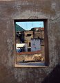
Critique By:
Cemal Ekin (K:2309)
2/16/2003 10:09:59 AM
Picture window, that's what it is. A very fine example of framing the main subject. Here, both the wall in the foreground with the opening and the rooftops in the background are very interesting. I like the colors and the overall feeling in the image.
Out of curiosity, are there some birds flying over the large green rooftop on the left or is it an interesting cloud formation?
Highly enjoyable.
Cemal
|
| Photo By: AJ Haselwood
(K:2148)
|
|
|
Critique By:
Cemal Ekin (K:2309)
2/16/2003 9:15:19 AM
They are looking down at the Monolith, right? It could be a scene from "A Space Odyssey." You do science ficton/fantasy very well.
Regards
Cemal
|
| Photo By: Frank Hettick
(K:119)
|
|
|
Critique By:
Cemal Ekin (K:2309)
2/15/2003 6:28:09 PM
Very nice portrait, Phillip's points notwithstanding. I think his suggestions will make it a much better rounded photograph. The lighting, exposure, and sharpness are spot on for me.
Cemal
|
| Photo By: scott whitelaw
(K:111)
|
|