|
|
 Chad Parish
{K:6440} 3/14/2009
Chad Parish
{K:6440} 3/14/2009
|
Excellent detail and vibranr color. Makes me hungry just looking at them!
|
|
|
|
 Jeanette Hägglund
{K:59855} 1/7/2007
Jeanette Hägglund
{K:59855} 1/7/2007
|
Lovely colours against each other.....how they highlight the complement colour. Mmmm, i would like one :))
Jeanette
|
|
|
|
 Sam Kh
{K:19017} 8/21/2005
Sam Kh
{K:19017} 8/21/2005
|
nice composition and very atractive cherry
well done
|
|
|
|
|
Claude Tenot
{K:9960} 8/20/2005
|
Parfaite composition....cher maître...c'est un petit joyau de photographie
|
|
|
|
|
Bruce Harper
{K:5305} 8/18/2005
|
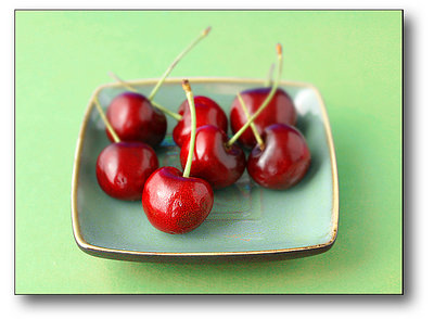
The original image with the green background works better for me, ties the background in with the green of the stalk on the primary cherry.
|
|
|
|
|
Lassitude
{K:416} 8/18/2005
|
I vote for the second version.
|
|
|
|
 Judi Liosatos
{K:34047} 8/14/2005
Judi Liosatos
{K:34047} 8/14/2005
|
Nice. Good stock photo.
Judi
|
|
|
|
Chelsea Burke
 {K:5750} 8/13/2005
|
Hmmm...I'm voting for the original green, makes the red cherries stand out a bit more. And I'm still wanting a little more depth of field on that focus.
|
|
|
|
|
Petros Stamatakos
{K:12101} 8/13/2005
|
Here's the alternative version that Terrence refers to...
|

|
|
|
|
|
Terrence Kent
{K:7023} 8/13/2005
|
petros and i would like the usefilm public to make the call, which version is the bees knees?
|
|
|
|
 p e t a .
{K:18700} 8/12/2005
p e t a .
{K:18700} 8/12/2005
|
a very appealing combination of colours.
|
|
|
|
 Alisa Mudge
{K:12511} 8/12/2005
Alisa Mudge
{K:12511} 8/12/2005
|
I can easily see this in a Martha Stewart magazine. It even has her green. Nice matching of the stems.
Alisa
|
|
|
|
 Paolo Corradini
{K:59552} 8/12/2005
Paolo Corradini
{K:59552} 8/12/2005
|
great details and colors! like an image for magazine!
Paolo
|
|
|
|
 Hamdy Reda
{K:874} 8/12/2005
Hamdy Reda
{K:874} 8/12/2005
|
wonderful colors
|
|
|
|
 Hugo de Wolf
{K:185110} 8/12/2005
Hugo de Wolf
{K:185110} 8/12/2005
|
Hi Petros, Eventhough I would've expected a slightly wider DOF, I do think this solution grows on me. The deep red of the cherries stands out beautifully with the pastel green tones. At first, I wasn't so sure, but after a while, I have to reconsider that thought. It works well. Interesting approach, using the single vanishing point. Instinctively, I think one would opt for at least two points, but this approacht creates a stronger focal point on the nearest cherry. Good stuff
Cheers,
Hugo
|
|
|
|
|
Mary Sue Hayward
{K:17558} 8/12/2005
|
I like the use of dof here. The cherries look fresh and tasty. (I also love the little shallow dish, but that is due to my china addiction.)
The background seems a little too yellow-green for the blue-green of the dish, but maybe that is too picky. However, the out-of-focus quality of the background is perfect.
|
|