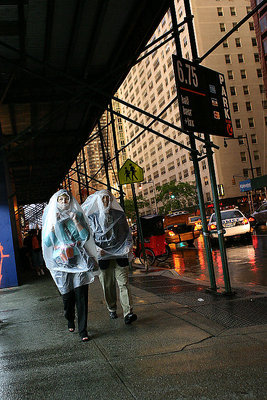
Re: cropping-I see what you mean, I'll try and play around with it a bit more. It could stand to loose a little on the left side I think (this is in front of an open parking garage).
Re: Lighting-this was taken around 8pm right after a thunderstorm. What you are seeing on the building are the last fading rays of sunlight breaking through the clouds off to the left. Just prior to this shot it was pitch black. I didn't think it took away from the shot so I left it in.
Thanks again, for the time you took to comment and make suggestions. It's nice to get some real help on my shots.
I needed to open up this photo about three times in order to consolidate my thoughts about it (too much work in the recent months, causing me to be too lazy to properly think during my free time). Hopefully by now I will be able to write something at least a bit intelligent. Here's what struck me:
- Light. I like the warmth of the yellow, orange and red car lights that, together with the large dark area in the top left, gives the photo a night type of atmosphere. There's a certain quality about streetshots taken at night that appeals to me. (Night would also be consistent with the title - but then, I don't pay much attention to titles.) The light in the top right quadrant lessens the impact, because it looks more like daylight (which I think it actually is).
- Two people walking towards you, two walking figures on the roadsign. An obvious element, but worthy of mentioning explicitly. Such 'accidental' similarities are always nice.
- Weird 'fashion' combined with a tilted angle. Good combination.
- Just slightly too much space at the bottom. Not sure I should offer such criticism, given the way I feel about cropping my own work :-) Anyway, I think a crop off the bottom would strengthen the diagonal composition. See below.