|
|
 Angelo Villaschi
{K:49617} 7/4/2005
Angelo Villaschi
{K:49617} 7/4/2005
|
Tom,
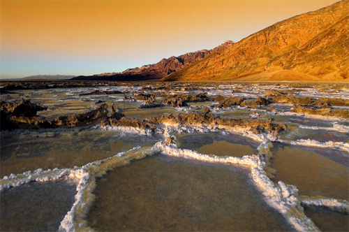
Good photo. I like the foreground salt formations leading the eye into the picture. I also like the sloping hill on the right and I think you may have made more use of it. The empty sky to the left is crying out for an interesting cloud formation.
Your treatment of the photo has nice contrast and colours. Now I'm off to see the other two...
|
|
|
|
 Naomi Weidner
{K:6636} 4/29/2005
Naomi Weidner
{K:6636} 4/29/2005
|
I just stumbled onto your experiment. I like the idea very much. Although there are aspects I like of each I think I prefer this one, as the most "natural", which is probably not an accurate judgement, since I wasn't on the site when the original photo was taken. Anyway, this one feels the most natural to me. -- Naomi
|
|
|
|
Alastair Bell
 {K:29571} 1/9/2005
|
Nice shot here Tom. Love the colours and the perspective. I think I prefer your rendition to the other two. Hugo's is a little dark to my taste and Michael's is a bit oversaturated for me. I thought I might have a try too with something a little different... I was aiming fr a late afternoon feel so here goes.....
|

Evening Glow |
|
|
|
 tom rumland
{K:14874} 1/9/2005
tom rumland
{K:14874} 1/9/2005
|
john, thanks for the comment and tip. i will certainly give it a try next time. as you probably know from reading my comments above, the sky is the one thing i had a lot trouble with. actually, i have trouble with color correction in general. i think it's time to read up on it....
take care,
tom
|
|
|
|
|
John Lamb
{K:9687} 1/8/2005
|
Of the 3 Tom this is my preferred image, although I would tone down the 'digital blue, in the sky. I general l suck out 5 units of cyan and darken 5 units and 10 units of blue and darken 10 units to give the NZ sky a more natural look. It's a very subjective thing, different strokes for different folks. Interaction like this are one of the joys of on-line photo galleries. Regards John
|
|
|
|
|
Stefan Engström
{K:24473} 1/7/2005
|
I saw these when you posted them and studied them with interest but could not make up my mind as to which I prefered so abstained from commenting. What I found interesting what how the three of you put different weight to sky/rocks/foreground and how strongly saturation plays in our perception of the photo. One thing I found interesting was how the detail in the rock depends very much on the treatment - it is very clear in Hugo's version, a little less so in yours, and Michael's version loses a lot.
|
|
|
|
 Hugo de Wolf
{K:185110} 1/7/2005
Hugo de Wolf
{K:185110} 1/7/2005
|
Hi Tom, I've been following the reactions with alot of interest, and I think we have created a very intriguing experiment...:)
If I were to chose between the three, I think I would go for this one. You mentioned the colour of the sky being slightly off, and maybe you have a point here, but I was too conservative on the levels, basically all over, creating the dullest of the three. Michaels version is the most exaggerated, possibly compensating for the loss of senses (smell, feel, etc), which would've worked well if posted as a stand alone.
I do share your opinion, that the best of the tree has elements of each of our versions in it, but I also like Barts suggestion. I would go for B&W, though, and it needs to be said, that the atmosphere of any monochromatic image is different, and easier to achieve (in most cases) than staying as closely as possible to the original shot.
I found it very challenging, and also quite difficult to improve an already very good shot. Maybe next time, we should allow ourselves to go more into extremes; allowing such things as sepia and compositie images, but staying within the thin grey area between Photography and Digigraphy, and not crossing that border.
Definately something to repeat....:)
Cheers,
Hugo
|
|
|
|
|
Mark Beltran
{K:32612} 1/6/2005
|
This is what I prefer, because it's the most lifelike. But then, lifelike is all in the mind's eye anyway. So I guess by re-wording it, it's the closest to how I perceive it based on my personal experience in that region. Thanks for your thoughts on the two Holga studies! You really must get one for Death Valley. And it's funny you mentioned shooting in bursts, because it's so true. I once discussed that fact in one of the forums or critiques. I go through recharging periods when I produce nothing, but I'm actually processing thoughts, images and ideas. It's definitely a cycle.
|
|
|
|
|
tom rumland
{K:14874} 1/5/2005
|
bart, thanks! your sepia version looks interesting. i'd love to see it larger. could you email it to trumland at gmail dot com?
take care,
tom
|
|
|
|
|
Bart Aldrich
{K:7614} 1/5/2005
|
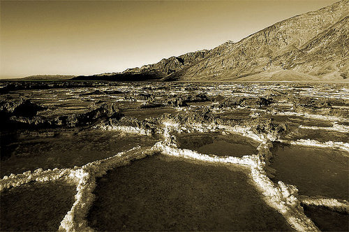
A very interesting and revealing series. Hope you don't mind, but I've done a sepia version.
|

|
|
|
|
|
Bart Aldrich
{K:7614} 1/5/2005
|
A very interesting and revealing series. I've done a sepia version. I will send it you if you'd like to see another take on it. Your email address?
|
|
|
|
 Verena Rentrop
{K:15233} 1/5/2005
Verena Rentrop
{K:15233} 1/5/2005
|
I opened all the three shots in tabs to get a good overview...finally I'm close to Patricks opinion that a mixture of all three version would create 'THE' version...
but I like the idea of working on the same shot from different perspectives...so will follow this project
Cheers,
Verena
PS: but when deciding between the existing I go for this version...
|
|
|
|
 Debarshi Duttagupta
{K:26815} 1/5/2005
Debarshi Duttagupta
{K:26815} 1/5/2005
|
I liked this one from the 3 shots posted.
|
|
|
|
 Patrick Di Fruscia
{K:486} 1/5/2005
Patrick Di Fruscia
{K:486} 1/5/2005
|
Just beautiful Tom!! Nice to see your interpretation of Badwater. Brings back memories and I love it
|
|
|
|
|
tom rumland
{K:14874} 1/5/2005
|
ursula, thank you, so much! i see you went back-and-forth a bit with it ;^) glad to see that it got you thinking and that you took the time to compare and comment. on all of them no less....
i think that's what happened to your other comment. it's under one of the other versions ;^)
take care,
tom
|
|
|
|
|
tom rumland
{K:14874} 1/5/2005
|
TM!! good to see you around. hope the new year see's you well. i've been busy with the xmas thing and on vacation so i haven't been on for a while. i'm a bit embarassed... i haven't gotten to the photo shop yet ;^) i "need" to go badly as it's time to renew my passport. i know i said this before but i'll be headed there later this week. i'll let you know when it's on it's way. which reminds me: you moved, didn't you? email me your new addy so it doesn't end up in the wrong place.
as to this photo: thanks! glad you dig it. exactly the sort of insight we were looking for. it is an interesting experiment. i like seeing what the different opinions and points of view are. interesting how everyone looks at them differently. i myself like different things about all 3. it wasn't until i saw all 3 side-by-side that i realized that the real photo lies somewhere in between. kinda neat, dontcha think?
take care,
TR
ps - still working on the beta band. it's growing on me but in small doses. reminds me of my experience with soundgarden. that took a year before it kicked in good for me ;^)
|
|
|
|
|
tom rumland
{K:14874} 1/5/2005
|
patrick, of course i don't mind. thank you for taking the time. this is precisely what i was looking for. i do like what you've done although it is hard to measure on the smaller attachment. looks like a contrast adjustment in the foreground and a darkening of the sky? i'm curious what steps you took...
btw, i agree with you. i like different bits of each. i think i might have to combine them for a future upload ;^)
take care,
tom
|
|
|
|
 Ursula Luschnig
{K:21723} 1/4/2005
Ursula Luschnig
{K:21723} 1/4/2005
|
I just returned to this pic and saw,that my comment is not here...
It is really a very difficult task,you gave us ...as the photo itself is superb,and all captures are excellent. I like the idea a lot..but it's hard to decide for one pic,as I like this one and Hugo's very much... :)
Regards,Ursula
|
|
|
|
|
Todd Miller
{K:16464} 1/4/2005
|
well Tom, interesting experiment. i looked at the thumbnails and clicked on the one i liked best, which was this one. i think the tones of this one appear to have the best combination of lifelike and eye-catching. MK's version looks too fake to me, and HW's doesn't strike me as much as this version. I think the mountains and sky both have more impact in your version. great idea!
ps. how did that print ever turn out??
TM
|
|
|
|
 P D
{K:559} 1/4/2005
P D
{K:559} 1/4/2005
|
I hope you don't mind, I thought I'd take a try. I thought it was in between the three. Might be hard to see as an attachment though.
Patrick
|

|
|


![bathwater [TR]](http://images.imageopolis.com/images/2/5/6/8/2568/657482-medium.jpg)