|
|
|
Patrick Jacobson
{K:29151} 10/16/2004
|
Thanks alot Judi.. =) Magnus, the model, will be happy also with your comment! Take care.. =))
Cheers
Patrick J
|
|
|
|
 Judi Liosatos
{K:34047} 10/16/2004
Judi Liosatos
{K:34047} 10/16/2004
|
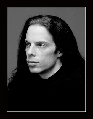
He has a beautiful face Patrick. And you have captured it well. The definition and the feeling in this portrait is superb.
I also wanted to thankyou for your wonderful comment on my image.
Judi
|
|
|
|
|
Patrick Jacobson
{K:29151} 10/14/2004
|
Kul att du uppskattar fotot min vän.. =) Magnus, modellen, kommer bli glad av din kommentar!
Ha det bra!
Patrick J
|
|
|
|
 Jeanette Hägglund
{K:59855} 10/13/2004
Jeanette Hägglund
{K:59855} 10/13/2004
|
A dramatic face and dramatic contrast which I found match your friend very well.
Jeanette
|
|
|
|
|
Patrick Jacobson
{K:29151} 10/12/2004
|
Thank you for your comment and analyze Biliana! In the room the light was very poor.. so i had to use a flash.. i did some adjustment in Photoshop as well. The light arent that good i agree with that!
Cheers
Patrick J
|
|
|
|
|
B:)liana
{K:30945} 10/12/2004
|
Great portrait dear Patrick.but it seems that the face/eyes are slightly out of focus and not so sharp, as the top of the head is more focused!?!?!
and the light on the face, forehead is strange, it is not so white but more gray??? how come???
But great portrait!
Kisses, Biliana
|
|
|
|
|
Patrick Jacobson
{K:29151} 10/11/2004
|
Thanks alot Maria Jose Barres.. =) Im glad you liked them! Take care and keep up your good work! =)
Ciao
Patrick J
|
|
|
|
|
Maria José Barres
{K:11276} 10/11/2004
|
Great serie of portraits patrick! They are very good!
greetings.
|
|
|
|
|
Patrick Jacobson
{K:29151} 10/11/2004
|
I will for sure continue doing portrait.. must learn alot more though! =) Ill keep working!
Thanks for your fine comment Emily my friend!
Cheers
Patrick J
|
|
|
|
|
emily savva
{K:21113} 10/11/2004
|
personally i really like this one... the black clothes and hair along with the grey background leave the face to be the only protagonist in the image... again he has a very serious expression but it has a far softer result than the previous one.... very good work... keep on shooting portraits... emy :)
|
|
|
|
|
Patrick Jacobson
{K:29151} 10/11/2004
|
Thats a great idea Jeff.. i didnt think of that at all.. will try better next time! =) Thanks for your inputs and help
Cheers
Patrick J
|
|
|
|
|
Patrick Jacobson
{K:29151} 10/11/2004
|
Thanks alot Orazio for your fine comment! =) Keep up the good work. =))
Ciao
Patrick J
|
|
|
|
 Orazio Minnella
{K:49417} 10/11/2004
Orazio Minnella
{K:49417} 10/11/2004
|
Beautiful shot.Great portrait.Nice tone.Regards..Orazio
|
|
|
|
|
Patrick Jacobson
{K:29151} 10/11/2004
|
Thanks Omar for your comment.. aye.. This one can be better for sure! =) Havent done many portrait before though.. 10 perhaps in my lifetime! hehe
Cheers
Patrick J
|
|
|
|
|
Omar Rifaat
{K:10141} 10/10/2004
|
Patrick, after reading above comments (especially Hugo's) I agree that this is a good photo, but could be a great one with some small changes. But I too am not expereinced with protraits, so this is good learning for me too!
Take care,
Omar
|
|
|
|
|
Patrick Jacobson
{K:29151} 10/10/2004
|
Thanks alot arwa and everyone else that commented.. =) Im very happy you guys comment and try to help! Im new at portraits and have a long way ahead of me until reaching some really good results! =)
Cheers!
Patrick J
|
|
|
|
 Emgy Massidda
{K:60358} 10/10/2004
Emgy Massidda
{K:60358} 10/10/2004
|
Also this one is very nice. I would have liked to see a tighter crop, though.
The shot is sharp and the tones, just great
Superb work!!!!
Emgy
|
|
|
|
|
arwa abdullah
{K:34415} 10/10/2004
|
I really appreciate how u care for every single detail in your pics! The fact that your model is wearing a black shirt really makes this one work more than the others! Theres nothing to distract us form his face!
Simple and great 7/7
|
|
|
|
 Witold Spiess
{K:2874} 10/10/2004
Witold Spiess
{K:2874} 10/10/2004
|
excellent contrast between the model & the background. good lighting. the crop is classic - the best in project I vote! cheers, witold
|
|
|
|
 Saeed Al Shamsi
 {K:47735} 10/10/2004
|
Excellent shot,well balanced image,very net,super,Saeed
|
|
|
|
|
Jeff Fiore
{K:11277} 10/10/2004
|
Excellent job! Huog gave you some great suggestions. As far as the slightly off-center crop, I agree with Hugo. As a rule of thumb for off-center compositions, I usually "open" the direction they are looking and "close" the opposite direction, this will give a more dynamic image. The only thing I would like to add is lower your light a few inches, your light is a little too high and you get shadows in the eyes, lowering a bit will open up the eyes more.
|
|
|
|
|
Rebecca Raybon
{K:26654} 10/10/2004
|
Great tonal range here, Patrick. I like it. I think when considering portraits, if you ever did this professionally, you have to consider that they will be matting and framing these, thus the need for the it being centered. As for as posting here and not for framing, I think it's wonderful.
|
|
|
|
|
Patrick Jacobson
{K:29151} 10/10/2004
|
Thanks alot Verena for your comment.. =) Aye.. you are right.. one cant learn to much.. or be fully learned! There is always something new that can be found... =)
Cheers!
Patrick J
|
|
|
|
 Verena Rentrop
{K:15233} 10/10/2004
Verena Rentrop
{K:15233} 10/10/2004
|
Hi Patrick,
reading Hugos comment, at least I agree with his number three, more contrast in the black part.
Agree with you, never stop learning about something, like portraits, but the last four examples are really good, perhaps I'm not the best judge, but they are IMO.
Cheers,
Verena
|
|
|
|
|
Patrick Jacobson
{K:29151} 10/10/2004
|
Thanks alot for your comment and analyze! Im glad you try to help me to improve..=) I had very poor light so i used a flash, Nikon Sb-800. The light could have been better.. i agree on that. I havent done many portrait yet so i have much to learn!
Thanks for your help! =)
Patrick J
|
|
|
|
 Hugo de Wolf
{K:185110} 10/10/2004
Hugo de Wolf
{K:185110} 10/10/2004
|
Hi Patric, very well captured portrait, and a very high quality. A few thoughts, though. I think placing the lightsource a bit more to your side would've created a bit more depth in the profile. Also, I think the expression is a bit posed / forced. Thirdly, As I think this is a studio type of shot, I think some more contrast in the black parts would do justice to the overall appearance. Last, the composition, with the visage left of the center looking left creates a rather closed composition; which makes it look rather narrow on the left, if you see what I mean. Some more head room on the left would balance the composition, IMO.
Of course, there's much more to this shot than those thoughts or critisism; The tonal range is excellent, and I think it's expertly exposed. Crisp and sharp, and I do think it's a good shot.
Cheers,
Hugo
|
|