|
|
 Jon O'Brien
{K:11321} 9/8/2004
Jon O'Brien
{K:11321} 9/8/2004
|
Good call on the cropping - I would say that your posted version is much more startling than the original concept. Also - I agree with Kostas re: the blurred foreground. This is a really ugly picture, Arcturus. But in a good way :-]
|
|
|
|
 Arcturus Wolfe
{K:299} 9/8/2004
Arcturus Wolfe
{K:299} 9/8/2004
|
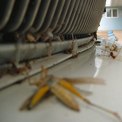
The original idea was to have lack of focus in the background and a larger framing, drawing the eyes mostly to the in focus grasshopper corpses in the center area. I found the original picture lacked the "feel" I was looking for because the larger framing meant more of the distracting blue motel in the background. When I cropped most of the motel out, It changed the primary focus of the photo to the blurry corpse in the foreground and gave the entire thing a different feel. Here is the original.
|

|
|
|
|
 Kostas Tzanetos
{K:22012} 9/8/2004
Kostas Tzanetos
{K:22012} 9/8/2004
|
couldnt your camera focus closer,Arcturus? anyway,my first reaction when i opened this was to ask for a sharper foreground,but soon afterwards i realized that the effect is enhanced by the focusing choice...i like the way my eye moves away from the blurred grasshoper to its dead relatives in the background...there's a morbid atmosphere that makes this image interesting ;-)
regards,
kostas
|
|
|
|
 Ian McIntosh
{K:42997} 9/4/2004
Ian McIntosh
{K:42997} 9/4/2004
|
:0
|
|
|
|
|
Jon O'Brien
{K:11321} 9/4/2004
|
Marvellously disgusting and very imaginative in a very demented kind of way. Almost makes you feel sorry for the grasshoppers.... NOT!
I do think that the blue building and parking thingers in the background tend to pull one's attention away from the main image. This might have worked better against a more neutral background or if an editing program was used to desaturate that area.
|
|