|
|
 Sam Andre
{K:12484} 8/19/2004
Sam Andre
{K:12484} 8/19/2004
|
too bad about the loss of detail due to the conversion because i like the composition very much.
|
|
|
|
 Ian McIntosh
{K:42997} 8/11/2004
Ian McIntosh
{K:42997} 8/11/2004
|
Fascinating dicsussions here Thilo.
I like what Carlheinz did but on seeing your comment about wanting to maintain some innocence in the shot swing back to your original. The shadows add the irony enough.
|
|
|
|
 Gayle's Eclectic Photos
{K:91109} 7/22/2004
Gayle's Eclectic Photos
{K:91109} 7/22/2004
|
hi,Thilo - well now i see that my original comment is back and yes,i did include the "N" word as did 6 other comments which were not removed...interesting censorial control exercised on this site...regards,gayle
|
|
|
|
 Thilo Bayer
{K:50358} 7/22/2004
Thilo Bayer
{K:50358} 7/22/2004
|
Dear Angelo,
thanks for sharing your creative thoughts with us. great story!
Thilo
|
|
|
|
|
Thilo Bayer
{K:50358} 7/22/2004
|
Dear John,
as Neil said: no problem at all ;-)
Thx for your comment, Thilo
|
|
|
|
|
Thilo Bayer
{K:50358} 7/22/2004
|
Dear Gayle,
actually, I have no idea what happened. Perhaps you filled in some key words that cause a ban. Did you chose anything like "nazi"?
Take care, Thilo
|
|
|
|
|
Gertrud Gozner
{K:14222} 7/22/2004
|
great composition!
|
|
|
|
 Angelo Villaschi
{K:49617} 7/22/2004
Angelo Villaschi
{K:49617} 7/22/2004
|
Thilo,
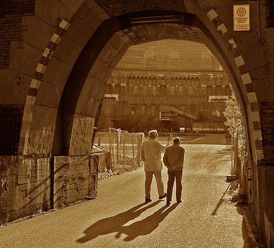
I like your original version the best, followed by Carlheinz's. However, I think the colour's relevance is quite subtle and the image works mainly thanks to its components (lines and shapes and light) rather than the particular hue.
What I see are two old men walking into an enclosed area, yet there is a strong light coming out. They are looking and talking about something we cannot see, because the wall shields it, and all we can do is want to walk through the haevy gate. I like the way you have used the gate to frame the picture.
The shadows do seem to be fighting. But reading about the description, maybe they are not fighting each other, but fighting against walking into the place, or fighting against the light.
|
|
|
|
|
Gayle's Eclectic Photos
{K:91109} 7/22/2004
|
Thilo,i am confused..i left a comment earlier and now it shows my rating,but no comment???????????????...i don't think it was offensive,and if anything perhaps it was educational..can you help me find out what is up?..regards,gayle
|
|
|
|
|
Uwe Bachmann
{K:10222} 7/22/2004
|
nö, ich find das mit der von dir gewählten tonung thilo schon ganz passend und gelungen (womit ich mich mal ausnahmsweise nicht dem guten hugo uneingeschränkt anschließe....ausnahmsweise...). das mit den schatten ist echt bemerkenswert, als ob sie ein eigenleben entwickelt hätten. das licht ist auch bemerlenswert stimmig, kommt trotz dieses "dunkeln" ortes doch scheinbar direkt aus ihm heraus....
gutgut...
vg, uwe
|
|
|
|
|
Gayle's Eclectic Photos
{K:91109} 7/22/2004
|
I only know about "street thugs who wore brown shirts and did the nazi party's dirty work before the SS became what they were/are"..so,if this is similar to that brown then tone is most appropriate and conveys what the title intends..sets the stage/flavors the mood..i would like to think that these two men are discussing how this can never happen again..good shadows/tone/comp/title..regards,gayle
|
|
|
|
|
Neil Dolman
{K:26883} 7/22/2004
|
> No Problem John. I admire the fact that you've said here that you learned something - thats something we could all do :) The Nazi's were also known as the "brown shirts" and this brown that Thilo has chosen is very close to "Nazi" brown.
Cheers and my best wishes
Neil
|
|
|
|
 Clifton Jones
 {K:10688} 7/22/2004
|
Beautiful tone quality...excellent lighting and composition...great shot...
Clifton...I've been away working on images for a photo exhibit my family is giving me in the near future...wish me luck...
|
|
|
|
|
[[dead account]]
{K:6692} 7/21/2004
|
I think the mark of a great image is the debate it can inspire.
I had no idea the color was related to the Nazis, so now it makes total sense to me.
|
|
|
|
|
Thilo Bayer
{K:50358} 7/21/2004
|
Hey Neil,
great that you stood up and voted against the alternatives. hey, that's democracy ;-)
you're probably right about the nazi related color - we have some "unfair" advantage here. but anyway, it's great to see some different opinions. that's more I hoped for.
Thx for your critics. will keep the contrast thing in mind. The pain with PS is: the more you learn, the more you have to bear in mind ;-)
Thilo
|
|
|
|
|
Neil Dolman
{K:26883} 7/21/2004
|
Hi Thilo, OK so i'm going to stick out my neck again today.
I prefer your version to all the others. I don't think that people make the connection of brown with the Nazis, like maybe you or i do - it has something to do with the language i think. So this finesse which you have included gets a little lost here on Usefilm :( Shame.
As for your treatment, i didn't understand John's comment at all, for me it is only slightly coloured and that is definitely sepia or maybe he has a different dictionary definition to me. B&W is OK, but you miss out on the Nazi thing, Carlheinz's version is not bad but too blue for me and with Hugo's version i can't get friendly with at all, too hard and oversharpened.
Anyway i'm here to criticise/comment on your work not theirs :)
I just think it lacks just a touch of contrast, the rest i would leave - it is by far the best version so please don't change it.
So i guess i'll get attacked again now...Oh well.
Best wishes
Neil
|
|
|
|
|
Thilo Bayer
{K:50358} 7/21/2004
|
OMG, a third rework! That's pure flattering for my little picture here ;-) and such a great variety of input...
Your version is the most powerful one, that's for sure. Nothing I would dare to post, I have to admit. My self-confidence would not in the least be that high to upload the image. you created a path of light, and that sucks the viewer right in the middle - and makes him curious what's inside the monument. very focused, discarding unnecessary detail, maximizing shadows. thinking about a new title... like "facing the light". well done, Hugo, great that you took some time and played around with the picture.
Take care, Thilo
|
|
|
|
|
Thilo Bayer
{K:50358} 7/21/2004
|
Dear fave-bro,
wow, a second rework on my subject. seems to polarize the critics here ;-)
I like the toning and the crispness (some sharpening filter, I guess? or multiply the layer?). I have some problems with the bold areas you create. But they should work for your composing. You create a higher focus on the enlightened middle. good job!
Thilo
|
|
|
|
|
Thilo Bayer
{K:50358} 7/21/2004
|
Dear Carmem,
I have to admit that I didn't realize the projects' real sense until now. Thanks for the hint!
Cheers, Thilo
|
|
|
|
|
Thilo Bayer
{K:50358} 7/21/2004
|
Dear Kevin,
you may interprete that as a salute. I leave this to your imagination =)
I'm glad to make you think. That's the greatest honor to me.
Thilo
|
|
|
|
|
Thilo Bayer
{K:50358} 7/21/2004
|
Dear Erik,
thanks for the inspiring comments and to actually work with my introduction ;-)
Take care, Thilo
|
|
|
|
|
Thilo Bayer
{K:50358} 7/21/2004
|
Dear John,
great to have such creative guys here that spend time for reworks. that's an honor to me. actually, I like your version. on the other hand, I wanted to create a image that tends to create an "innocent" mood. and for me, it must be a near-brown toning (to give the viewer a small hint for the nazi monument). Anyway, thanks for the time spent on this picture. Appreciate that a lot.
Take care, Thilo
|
|
|
|
 Hugo de Wolf
{K:185110} 7/21/2004
Hugo de Wolf
{K:185110} 7/21/2004
|
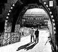
Hi Thilo, I've read the comments you received with much interst, and I agree with John's comment ablout the tone. B&W is a good choice, and so is Carlheinz's rework, wich is more in line what I had in mind... A third option would be a B&W version with a very hard contrast. (see attached, I'm curious to learn what you think...) The result is not pretty nor beautiful, but I think it emphasises the atmosphere.
Cheers,
Hugo
|
|
|
|
|
|
Carlheinz Bayer
{K:14220} 7/21/2004
|
Hope the upload works this time!!!
|

|
|
|
|
|
Carlheinz Bayer
{K:14220} 7/21/2004
|
Very nice! Like it...and will post "my" version, too. Cheers! C.
|
|
|
|
|
Maria José Barres
{K:11276} 7/21/2004
|
Excellent Thilo! 7+
|
|
|
|
|
Carmem A. Busko
{K:48785} 7/21/2004
|
I seems a new BIP coming...or an EC ...
Why don?t you change to month?s project, shadows?
Great capture!
Congrats, Thylo!
Carmem
|
|
|
|
|
Kevin Collier
{K:19076} 7/21/2004
|
It that a raised arm salute??? From your comment aboout the unfinished monument to the Nazi's it could be considering their age -- you got me thinking -- I like the color as sepia over the BW version but prefer it toned down to a hint of sepia..like the shot..K
|
|
|
|
 Erik Neldner
{K:10846} 7/21/2004
Erik Neldner
{K:10846} 7/21/2004
|
Thilo,
I love the color tones. It warms up an ominous location. The energy flow brings us into the colliseum. Will we return?
Nice!
|
|
|
|
 Burak Tanriover
{K:16610} 7/21/2004
Burak Tanriover
{K:16610} 7/21/2004
|
excellent tones,the shadows add a lot to this beautiful composition, best regards,Burak
|
|
|
|
|
[[dead account]]
{K:6692} 7/21/2004
|
I think this is a great moment and a truly wonderful shot, but I don't like this color. For me, it's too yellow and saturated to capture the feeling of the image.
I would love to see this with just the barest hint of color-- maybe blue or the slightest sepia-- or even black and white.
In any case, I think this is a cool moment.
|

|
|


")


")


