|
|
|
Alice M
{K:1425} 12/4/2006
|
well done
|
|
|
|
 Giuseppe Guadagno
 {K:34002} 10/31/2006
|
Beautiful forgraound out-of-focus and lovely color contrastblue/green. In my fav..
Giuseppe
|
|
|
|
|
Giuseppe Guadagno
{K:34002} 7/5/2006
|
I steal this too.
Thanks.
Giuseppe
|
|
|
|
 Sam Andre
{K:12484} 6/13/2004
Sam Andre
{K:12484} 6/13/2004
|
For You Blue
Because you're sweet and lovely girl I love you,
Because you're sweet and lovely girl it's true,
I love you more than ever girl I do.
I want you in the morining girl I love you,
I want you at the moment I feel blue,
I'm living ev'ry moment girl for you.
I've loved you from the moment I saw you,
You looked at me that's all you had to do,
I feel it now I hope you feel it too.
Because you're sweet and lovely girl I love you,
Because you're sweet and lovely girl it's true,
I love you more than ever girl I do.
I really love you.
|
|
|
|
|
John Barclay
{K:3650} 6/6/2004
|
Unless your left handed like me and then ... oh nevermind... :)
|
|
|
|
 ppdix
{K:17069} 6/6/2004
ppdix
{K:17069} 6/6/2004
|
I do the same John. It actually makes more sense to grab a mag with your right hand and use your thumb to let the pages flip back...
:-)
|
|
|
|
|
John Charlton
{K:5595} 6/5/2004
|
Left to right or right to left preferences aside, how our eye travels through an image will be make little difference as long as we are kept inside the frame.
The effect of ppdix's reversed version lessens the problem of our eyes being led out of the composition (at least for our western eyes), but doesn't solve the problem that there are still two competing subjects to contend with.
Another point to be made about directional preferences is that many people like myself tend to read newspapers and magazines from back to front. How screwed up is that?
|
|
|
|
|
John Barclay
{K:3650} 6/5/2004
|
http://www.usefilm.com/image/419628.html
Got ya. Please go to the above image and let me know your thoughts on it.... Oriental feeling aside :)
|
|
|
|
|
ppdix
{K:17069} 6/5/2004
|
I understand your R to L concept, John.
But for English speaking people, it is easier to start from the Left. Unless u are Israeli or Arabic or Japanese, I guess, we give mental priority to the left side of things.
Have u ever picked up a Japanese magazine? The cover is on "our" backpage and it feels weird. Also remember the left part of the brain is the artistic one...
Oh, and by the way, I am not quite an educator.
:-D
Cheers
Patrick
|
|
|
|
|
John Barclay
{K:3650} 6/5/2004
|
Oh and by the way.. thank you for your effort and the education!
|
|
|
|
|
John Barclay
{K:3650} 6/5/2004
|
I think your right on this one ppdix.. Although on some images I'm not one to stick to the left to right thing... Sometimes I like to add that bit of visual irony that makes you think for just a bit... I have one that is the back of a red gerbera daisy that flows better from right to left for me... WOrks both ways but I've printed it the r to l...
|
|
|
|
|
John Barclay
{K:3650} 6/5/2004
|
Man you are terrific! Now this is just what this site should be! Talk about feedback! I'm totally with you. I've struggled to really like this image and you have helped me understand why! I think it's a good idea just not well executed... my version that is. Thanks so much for the visual help for the visually callenged!
|
|
|
|
|
ppdix
{K:17069} 6/5/2004
|
Hiya John. I tried that... Somehow it didn't work for me.
How about my version?
Cheers
ppdix
|
|
|
|
|
ppdix
{K:17069} 6/5/2004
|
I agree with John Charlton.
For the most part, we all read from left to right and start at the top of the page. If i were to "read" this photo, the top has more impact and it overpowers the focused flower on the center of the image.
I downloaded your image and tried cropping the top off.. It didn't work for me. Then I flipped it and suddenly it made more sense.. Attached is the flipped image. What do u think?
Cheers
ppdix
|

eulb gnileef |
|
|
|
|
John Charlton
{K:5595} 6/5/2004
|
My preference would be to eliminate these lines by choosing a slightly different position or by cropping them out like this.
|

|
|
|
|
|
John Charlton
{K:5595} 6/5/2004
|
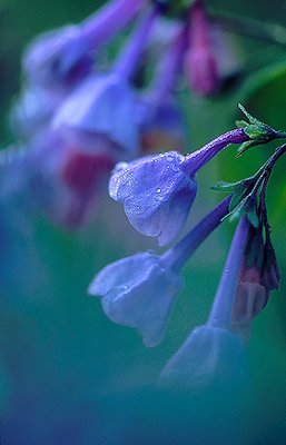
Just to add my two cents worth here, I think this is a truly wonderful image, but my eye is pulled away from the main subject by the blossoms in the background... that wouldn't be too bad except that the lines of those blossoms (see arrows in attached post) actually exit my eye right out of the frame.
Of course, the in-focus flowers pull my eye back in but the conflict between the forground (being the sharp area in the centre) and the background remains unresolved.
I don't see a problem at all with the blurry bits at the bottom and lower left of the frame. They create balance and style which raize this floral well above the average.
|

|
|
|
|
|
John Barclay
{K:3650} 5/12/2004
|
Great feed back Kim, thank you!
|
|
|
|
|
Kim Culbert
{K:37070} 5/10/2004
|
I think the only part of this that I find awkward is that bottom bloom... how it merges into the foreground and the detail is lost in the bottom bell. I think that this has a lot of power and creativity and the natural soft framing works well to add to it. Perhaps a slightly higher angle to just capture the curve of that bottom petal...
Love the colours, and the repeating patterns in the flowers in the bg.
|
|
|
|
|
Günter Koth
{K:13841} 5/8/2004
|
Wonderful coors and details and of course an excellent use of DOF. Brilliant macro shot, John. Congrats...Günter.
|
|
|
|
|
John Barclay
{K:3650} 5/8/2004
|
Exactly the feedback I was looking for. Your comments are very valid the eye will ALWAYS go the the brightest spot first and then the sharpest.. you can't help it. That said middle bulls eye subject matter as pointed out by Derek is often not the strongest composition. Even with that said I too do not find it to distracting in this case... Thanks for your time!
|
|
|
|
|
Linn Currie
{K:24426} 5/8/2004
|
My dear John :-) You are asking a total amateur! All that I can give you is my honest (and truthful) opinion - if that is good enough for you? :-)
The centre flower doesn't bother me at all - because I am assuming that is what you intended with this image? This particular flower comes in groups of blooms, right? So I would think it would be more difficult (than usual) to isolate one bloom into sharp focus and not the others, just milimetres away. I know it is possible, in the hands of professionals (not saying you are not one).
When I first laid eyes on the image (and I never read comments before I comment) I looked straight at the centre flower as that is what caught my eye. If I had shot this image, it would be exactly as you did - to isolate one bloom and to have a soft focus in the fore- and background.
At the end of the day John, it is all about whether YOU achieved what YOU intended in the first place. You felt good about this image and proud of it - otherwise you would not have posted it to UseFilm, right? :-)
It is always good to hear constructive criticism and hear how other photographers would have shot the same image. It makes one think about different ways and styles - and that is good. I have learnt a lot and try to copy what I have seen others do. One day, I might succeed :-))
I'm not sure whether this is what you wanted to hear? but know this ... this is a stunning image and you must be proud of it :-)
Bye,
Linn
|
|
|
|
|
John Barclay
{K:3650} 5/8/2004
|
Thank you Linn, you are so very kind. Does the one sharp blossom being in the center bother you like Derek. I think he makes a valid point. I see it as a repeating pattern of the foreground and the out of focus background flowers with the foreground being a group of flowers and not just the sharp one. That said Derek's comment might me right on. Interested in where your eye takes you... to the middle or not?
|
|
|
|
|
Lou Dina
{K:12194} 5/8/2004
|
Very striking image John. I like the soft look and the rich, saturated hues. Nicely done. Lou
|
|
|
|
|
Linn Currie
{K:24426} 5/8/2004
|
John, this is exquisite! It's already in my fav folder and the other images went "What?! A BLUE image??!!" because ... you see ... I am very partial to pink and blue is not a favourite colour of mine
However, this image of yours could just be the thing I need to become converted! :-))
I love this ... the soft tones (which work incredibly well together), the sharpness of the raindrops, the magnificent DOF - it's a total WOW! and you deserve to be commended. Well done - and you have my 7
Linn
|
|
|
|
|
John Barclay
{K:3650} 5/8/2004
|
I wish all could be as honest as you Derek! Thanks for the excellent critique.
|
|
|
|
 Steve Rosenbach
{K:8338} 5/8/2004
Steve Rosenbach
{K:8338} 5/8/2004
|
I really like this technique, John, and the intense blue is wonderful.
Best regards,
SteveR
|
|
|
|
|
Teresa Moore
{K:11063} 5/8/2004
|
Beautiful color, and the softness worked well. Very nice image.
|
|
|
|
|
Derek Kennedy
{K:2270} 5/8/2004
|
I understand what your trying to do with the flowers in the extreme foreground, but not sure it works that well with this shot - I think it's a little too much, also, it places the main subject (the flower in focus) too centered.
I do like the colours and the detail of the centered flower with the water drops.
|
|
|
|
|
Riny Koopman
{K:19998} 5/8/2004
|
blue is blue
regards riny
|
|