|
|
|
Peter Carucci
{K:1672} 8/10/2003
|
Nice composition, and clever manipulation in PS. Keep up the good work, Debbie.
|
|
|
|
|
Toni Martin
{K:5092} 11/14/2002
|
Lovely, Debbie. Very nice work in PS.
|
|
|
|
|
Debbie Groff
{K:9569} 11/13/2002
|
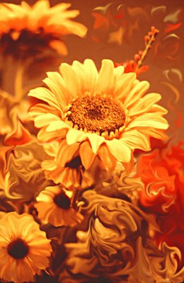
Kim, Yes the flower is a bit soft, this is what I do when I'm upset with myself for not having a 'perfect' dadgum flower:) LOL @ myself. Glad you like the composition and ShopJob:)
Yes, Vincent these are the colors of the 60's or early 70's. Thank you for the comments. I always love getting them. Debbie
|
|
|
|
 Vincent K. Tylor
{K:7863} 11/13/2002
Vincent K. Tylor
{K:7863} 11/13/2002
|
Looks like a 60s album cover. Nice shot and idea!
|
|
|
|
|
Kim Culbert
{K:37070} 11/13/2002
|
Love what you've done with the background... very creative and pleasing to the eyes! The one main flower seems either a bit too hot, or maybe a bit unsharp to me. It jumps from the screen, which is great, but the detail between petals isn't there. Still, a lovely composition!
|
|