|
|
|
Patricia Eifel
{K:5097} 7/22/2003
|
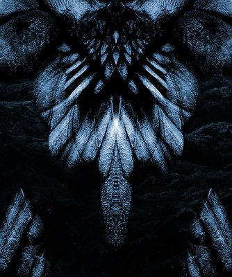
A beautiful and very evocative image even to one who is not a connaisseur of Giger. I am also amazed to see the different paths your imagination has taken you from the Place St. Michel. I have passed that sculpture dozens of times...next time I will see it differently. Thanks Jim!
|
|
|
|
|
Dave M
{K:9043} 7/22/2003
|
Jim, I'd very much like to see the color version posted outright in a larger form. On one hand, the color seems to be less abstract than the version posted here. But on the other, this toning does not seem to capture the mood you are going for, I suspect. Great work.
|
|
|
|
|
peta jones
{K:12615} 7/22/2003
|
My resident H.R. Giger aficionado says the blue is more 'him'. You wished a more dark menacing feel, the blue certainly seems to give that impression more so than the more natural colours. It really pops more and becomes obvious when you place both images side by side. This blue version looks like it is touched by moonlight...emerging from the deep blackness.
|
|
|
|
|
MaryBell
{K:32791} 7/22/2003
|
Jim,
I like the color version better too. This one is cooler and more remote. The brown and green tones are warmer (hotter) and consequently more dangerous imo.
The symmetry is good - the stoney feathers are great, and the best detail is the vague symbols on the serpent's head - they could be alien symbols and that suits this and your intent perfectly imo.
Mary
|
|
|
|
|
Anna
{K:2994} 7/22/2003
|
Jim this image is fashinating but I also think that it?s a little dark. Somehow I like the brown version better because it shows more details. Thanks ones more for your useful explanations.
|
|
|
|
|
Marion Luijten
{K:6141} 7/22/2003
|
Even before I read your comment I had to think of Giger...I've seen the Tarot deck he designed...it's a bit scary. And I know of at least two Tarot readers who don't want to use the deck and even keep it stored in a different place than their other decks.
Do you know the work of Björn Oldssen (I think he is/was on Sig)?
He made Photoart in the style of Giger too.
Your image is great! maybe a tad too dark in some parts. Could you send me the color version by mail, Jim? I'm really interested to see it larger. Thanks!
:)
|
|
|
|
|
Fabio Keiner
{K:81109} 7/22/2003
|
good pics normally get bad ratings at sites like photosick or alike
:)
it's rather a proof of their quality, imho
I personally like the colored version better: it got that creepy, hauting giger-look
but this version also works well: cooler&colder
:)
very fine, your reworking, I'll try to learn from it
!
|
|
|
|
|
Vincent Mo
{K:857} 7/22/2003
|
I like the symmetry here. It reminds me of a phoenix rising from the ashes. making this b/w must have made a big difference, because I don't see how this image could have gotten such bad ratings!
|
|
|
|
|
Terry McCully
{K:9221} 7/22/2003
|
Like the feathers from the back ot the crow..Great shooting yet again...And thanks for the details!
|
|
|
|
|
Ronny Van Eeckhoutte
{K:12734} 7/22/2003
|
Great...
|
|
|
|
|
Jim McNitt
{K:11246} 7/22/2003
|
Color version of "Darkness"
|

|
|