|
|
 Heloiza Averbuck
 {K:2488} 6/17/2008
|
Beautiful work! Amazing colors...:)
Congratulations,Hugo!
Heloiza
|
|
|
|
 Phillip Minnis
{K:13131} 11/26/2006
Phillip Minnis
{K:13131} 11/26/2006
|
Congratulations, Hugo, on your Photographer of the Day award! Very much deserved! :)
Cheers
Phil
|
|
|
|
|
Hesham Abouzekry
{K:15927} 11/26/2006
|
sooooooooooo wonderful great work.
direct to my favorite to study it carefully.
H.A
|
|
|
|
 Riham Essam
{K:4931} 11/26/2006
Riham Essam
{K:4931} 11/26/2006
|
L O V E L Y
Work ..:)
Congraaaaaaattttsssssss
Best Regards,
Riham Essam
|
|
|
|
 Cleveland Smith
{K:7006} 11/25/2006
Cleveland Smith
{K:7006} 11/25/2006
|
Hugo, congratulations on Photographer of the Day award, very well deserved.
|
|
|
|
 Roberto Arcari Farinetti
{K:209486} 11/25/2006
Roberto Arcari Farinetti
{K:209486} 11/25/2006
|
and congrats..
roby;)
|
|
|
|
 Michael Kanemoto
{K:22115} 11/25/2006
Michael Kanemoto
{K:22115} 11/25/2006
|
Well, what do you know? Phoyographer of the day that's pretty exciting. Congratulations and hope that you're not too horribly busy right now.
|
|
|
|
 taran
{K:1284} 11/25/2006
taran
{K:1284} 11/25/2006
|
Captured perfectly my friend... each stands on its own, and together its marvelous. cheers,t
|
|
|
|
 Brenda Guiles
{K:6128} 11/24/2006
Brenda Guiles
{K:6128} 11/24/2006
|
Now this is impressive! I Love how you put the elements together like this, and all of them are such stunning images! I would not be surprised to see your work in such magazines as Smithsonian or National Geographic. This collage of color is just wonderful! Do know that I think any one of these images could stand on it's own merit. Congratulations on the award given here! :)
|
|
|
|
 Chris Hunter
{K:25634} 6/15/2006
Chris Hunter
{K:25634} 6/15/2006
|
Overall the photos fit the concept well.
I think perhaps "sky" & "earth" are abit similiar in color, maybe having more variety between the middle two choices could improve.
Maybe, fire could be represented by a bright red/orange sunset, and sky with deep blues and bright white clouds? Then you could have browns and greens for earth, and blue/green/grays for water, having a mix of four seperate colors for each image.
As an aisde, I should have some shots from the 100th Newport to Bermuda Race start in Newport tomorrow, I will let you know how it turned out.
It's always an interesting mix of boats, and this will be the largest fleet ever making the trip down across the Gulf Stream.
Cheers,
Chris
|
|
|
|
 Hugo de Wolf
{K:185110} 6/14/2006
Hugo de Wolf
{K:185110} 6/14/2006
|
Thanks for the feedback, always nice to hear from you!
Cheers,
Hugo
|
|
|
|
|
Hugo de Wolf
{K:185110} 6/14/2006
|
Hi Mary, sorry for the late reply, been rather busy. Thanks for the elaborate feedback, very much appreciated.
The fire one bothered more, and that's why I made the alternate, more abstract version.
As to the sky, I can only agree with you there, and I kindof went for the difficult choice; it's a mixture between fire and water. Cropping the image isn't really an option, I believe. If you scroll down, you'll find some alternate versions of this series.
I think it's exactly the "lack of knowledge and techniques" (using your words - reading your comment, i tend to have a different opinion on that...:)) what defines a good critique, and besides, these things are so very subjective, they cannot be made quantifiable by approaching it through an analytical approach (althoug I think that's my pitfall - I tend to overanalyse....)
Thanks again, very useful, and a very good critique!
Cheers,
Hugo
|
|
|
|
 Alessandro Capelli
{K:34805} 6/9/2006
Alessandro Capelli
{K:34805} 6/9/2006
|
Wonderful image Hugo! My congratulation! The colors are awesom!
bye
ale
|
|
|
|
|
Phillip Minnis
{K:13131} 6/6/2006
|
Hugo, I really enjoy looking through your great collages!
This one contains some wonderful images! Great colours, fabulous compositions! An absolute delight to view!
Cheers
Phil
|
|
|
|
|
Mary Brown
{K:71879} 6/6/2006
|
Hi Hugo. It's me again. I decided I like this one better as it more presesnts the beauty of the 4 elements in the world around us not just the isolated elements.
MAry
|
|
|
|
|
Mary Brown
{K:71879} 6/6/2006
|
Hi Hugo. My first impression is 'what a great idea' and what great pictures. This is probably because I have been throwing the idea of a 4 elements picture around in my head, but not able to come up with a presentation format. The pictures, mostly fit. However, for fire, I'd personnally like to see some actual fire, not just a negative aftermath of one. I guess, in my head, I see the 4 elements as positives although I am well aware each can also cause distruction. The order is fine. For question 4, as mentioned I would prefer a more helpful, life sustaining fire. Also, perhaps for Sky; one with more percentage of the picture being Sky. This is a beautiful picture, but my eye is drawn to the reflection in the water as much as to the sky. I think the title is great. Question 6 is where I begin to feel much less able to help. I am not sure on improvements other than those already stated. As far as preference, I like them both for different reasons. The other is more directly stated. It is a straightforward presentation of the 4 elements. I like that. (BTW, I really like the track in the sand.) This one is more of an everday view of how we live with the 4 elements. I like that, too. Other than the first one lacking a little oomph, each is a great picture with wonderful colours and details. The touch of golden in each helps tie them together as a series. These are well thought out and well presented. Overall, it is grand, lovley, and very eye pleaasing.
I like your idea of asking specific questions. Being new to this, I am well aware that I lack knowledge of techniques and traditionally followed 'rules'. I just go on what is pleasing to my eyes and/or thought provoking (which I guess is the ultimate end result of any art).
MAry
|
|
|
|
 John Loreaux
{K:86210} 6/3/2006
John Loreaux
{K:86210} 6/3/2006
|
Hello Hugo,Just wanted to say thanks for Your comments!
I was just admiring this wonderful group of photos and how they fit nicely into the fire,sky. earth, water theme so well!
I suppose You could have a molten lava shot or something actually burning , but the photo of the charred trees actually works very well here!
Anything with red flames would have clashed with the red clouds in the sky photo so It was a good choice!
Overall the group of photos is well balanced and for Me works perfectly!
Nice job Hugo! Take care!...............John
|
|
|
|
 Ace Star
{K:21040} 6/1/2006
Ace Star
{K:21040} 6/1/2006
|
beautiful series! lovely work brother :)
really liked it
wish you all the best
|
|
|
|
|
Hugo de Wolf
{K:185110} 5/30/2006
|
Hi Ursula, thank you very much for the feedback, very much appreciated! As to the different style of air and water compared to fire and earth, I completely agree, the feel is different, and it's why I gave them alternated positions in the series to begin with.
You really should give yourself more credit, nothing incompetent about your analysis and thoughts, and opinions (as well as thoughts) can, IMO, Never be incompetent! Your thoughts, like the many others have been (and are) very helpful to me in progressing with this series!
Cheers,
Hugo
|
|
|
|
 Ursula Luschnig
{K:21723} 5/27/2006
Ursula Luschnig
{K:21723} 5/27/2006
|
Hi Hugo,
here you have given us a huge task ...and I am trying to keep it short .
my first impression: how gorgeously represented elements.2 : yes.To 3 :in my opinion
air and water are different in style and expression from fire and earth.The latter i feel more subliminal and indirect...versus the direct way of showing air and water. Concerning earth I am not sure if it represents earth for me 100%,in my imagination it is something dark and dump...earthly .
Title :yours
7: Very difficult to say which one...maybe the 1. series (travel),but I am unable to explain why...
I hope you don't mind my incompetent opinion, your ambitious concept is brilliant !
Cheers,Ursula
|
|
|
|
|
Hugo de Wolf
{K:185110} 5/24/2006
|
Hi Maurizio, Thanks for the feedback, and your contribution in the discussion. Very helpful, and it's great to read your thoughts. I think elaborating on this using those icky substances would be very cool indeed, and it opens a whole new set of ideas. I'll definitely keep that one in mind!
Cheers,
Hugo
|
|
|
|
 Maurizio Massetti
{K:30463} 5/22/2006
Maurizio Massetti
{K:30463} 5/22/2006
|
1- my first impression was for the originality of your work. 2- yes, it fits, but not like "Ancient elements of alchemy". 3- yes. 4- maybe the first. 5- "The four channels". 6- integrating this work with a new one, like a " phlegm, yellow bile, black bile, and blood", the four humours of Hyppocrates... 7-this one.
|
|
|
|
 Mireille Heirendt
{K:7258} 5/20/2006
Mireille Heirendt
{K:7258} 5/20/2006
|
Hi Hugo,
1)threatening for #1, peaceful for #2, well-balanced for #3 and powerful for #4
2)of course it does
3)yes, they do
4)they all fit very well (I might suggest a shot of a fire/flame for #1 as you are "only" documenting the result of this natural power caused to the earth; this might avoid two earth photos)
5)your title is perfect; an alternative might be "Nature's moods" or "Moody nature"
6)you do have improved this series by having followed "my" suggestion
7) although I like the effect(s) caused by the lensbaby, I prefer this series for the preservation of as many details as possible
Thanks for sharing this outstanding documentation with us-keep it going, it's wonderful!!!
Mireille
P.S. the moods enumerated under 1) could also be applied to human beings (not only to nature)
|
|
|
|
|
Hugo de Wolf
{K:185110} 5/20/2006
|
Hi Chris, thanks for your comment. It has become more difficult in respect to achieving the same comment count as before and quite a lot has changed, but also for the better, I believe; there are many new faces around, which make things also quite interesting.
Cheers,
Hugo
|
|
|
|
|
Chris Spracklen
{K:32552} 5/20/2006
|
It's great to see that you're still loading up fabulous images to Usefilm, Hugo, and that they are getting something like the attention they deserve. I've just commented to Roger Williams that, on the whole, the levl of comments appearing on my old friends' upload has declined sharply since I last dropped in, though your have kept very high. Well done!
My best regards and thanks for the comment,
Chris
|
|
|
|
|
Bruce Harper
{K:5305} 5/16/2006
|
Hi Hugo
I like the way you have managed to find another flowing line to join the death valley image into the series - well done. That image says much more 'earth' and 'wilderness' to me than the previous. However I don't think it flows as well as the original. I haven't had a chance to llok at all the alternatives, but from the thumbnails, the more abstract ones do appear to have potential too.
|
|
|
|
 Henrik Hanselmann
{K:658} 5/15/2006
Henrik Hanselmann
{K:658} 5/15/2006
|
Hello Hugo! Nice pictures! I'll try to be as critical as i can. it's probably been said before though. If you dont show fire in the first image, you shouldnt show the exact words in the other three. The second one i tend to look at the sunset more than the sky. third one i would prefer a more closeup one of earth, and maybe without trees, last one is ok.
|
|
|
|
 Joggie van Staden
{K:41700} 5/15/2006
Joggie van Staden
{K:41700} 5/15/2006
|
Great stuff Hugo - Lovely images, all four. I think a lot has been said - I really did not have time to read all the comments, scanned some of them quickly, so forgive me if I repeat something already said. On the theme I would like to add my perspective:
1. I see the earth, sky (sun moon & stars) and sea as the cradle and/or great arena where everything in nature plays itself out. Stable, solid, sure.
2. The elements for me include fire, wind, rain, snow, waves, floods, lightning etc. In other words the dynamic, powerful physical forces - they cause dramatic changes, often in short time-span. They are sporadic and forcefull.
3. The living sphere (biosphere) - plants, animals, birds, fish, humans. Always changing, very dependant, utilising, healing, adapting - mostly subtle but often brutal.
To me the challenge would be to portray these elements/spheres - flowing from one to the other (smooth, silent, gradual) or in juxtaposition (clashing, contrasting, evoking tension). I realise it would not be that easy - but a challenge I myself would like to work on. Regards!
Joggie
|
|
|
|
 Thilo Bayer
{K:50358} 5/15/2006
Thilo Bayer
{K:50358} 5/15/2006
|
Hi Hugo,
This is impressive stuff my friend. I appreciate the brillance and detail you achive here with your landscape composings... I have to change my mind about nature shots being potentially boring. =) Well, I will go for Cornwall this summer and will hopefully find some great places like you found.
All in all, this series is by far the best for me. The concept is freakin awesome.
Thilo
|
|
|
|
|
Roberto Arcari Farinetti
{K:209486} 5/15/2006
|
oh... good morning hugo,
well... i have seen all your work-different, your series, is so god to see that the suggestion push to see differrenti realizations!
have all the best my fiend..
cheers
roby
|
|
|
|
|
Mohsen Moossavi
{K:425} 5/15/2006
|
Excellent capture
Good colorcomposition & view, too.
Best wishes: Mohsen
|
|
|
|
|
Hugo de Wolf
{K:185110} 5/14/2006
|
Hi Jeanette, In looking back on the various alternatives, I think I'll go for the original version too. The other concept, zooming in more, requires a more abstract approach, which inevitably will result in a different selection of images.
But never the less, your comment got me thinking, and was part of the basis of the last in this series, although I think I could continue this one for another three...:)
Thanks again,
Cheers,
Hugo
|
|
|
|
|
Hugo de Wolf
{K:185110} 5/14/2006
|
Hi again Lubi...
Of course there isn't anything wrong, I was just curious; thanks for the explanation. The "breath of nature" remark is a very interesting one, It also introduces a new element in each of them, for which I like to thank you...:)
Cheers,
Hugo
|
|
|
|
 Lubi Star
{K:3903} 5/14/2006
Lubi Star
{K:3903} 5/14/2006
|
Hi again Hugo...
not a particular reason for choosing this kind of panoramic format in my crop just a personal taste... think that images of nature "breath" more freely in it... and i don't find anything wrong in focusing in the aesthetics of each individual image as long as the end result gives me a sense of continuity in a collage since that is its initial purpose... to tell a story... and to me it was a successful effort...
best regards...
Lubi
|
|
|
|
 Jeanette Hägglund
{K:59855} 5/14/2006
Jeanette Hägglund
{K:59855} 5/14/2006
|
Hi Hugo,
now when i have seen how that might be i think your first version is better, cause i like the second image in the serie much better in the original outfit without a hard crop. I have to think of that this seen on the screen is smaller then a enlargement would be on a wall or a medium big poster. By cropping the nice pattern that contiue from one to another also disappeard in the second one. So go for the original one!
Jeanette
|
|
|
|
|
Meldijana Omerbegovic
{K:4079} 5/14/2006
|
Hello Hugo,
I'm glad to hear that you liked the feedback of many people ,which were , as I could read ,of the highest marks, and that you had benefit of them.
We are looking forward to see and enjoy your next interesting photos.
Have a nice Sunday
Cheers
Meldijana
|
|
|
|
|
Hugo de Wolf
{K:185110} 5/14/2006
|
Hi Chitra, Reading back your first comment and my reply, I think I didn't phrase myself properly - it's the word "too" that I should've omitted. Rephrasing: To me, the first one is stronger - as a series, because it's closer to the initial challenge, combining wild with travel. The change of course to depict that with the four elements is stronger in it's storytelling, and even creativity, I suspect, but more the result of my mind running wild than anything else...
The final set(s) of images will be printed, without frame; I think I'll make the final selection when I can compare the prints on their technical quality too.
After replying to everyone yesterday, I started compiling the next series, which is even more removed from the initial challenge (wild meets travel) and is slolely based on the Alchemy of the four elements, and I think that one will be far less ambiguous. It basically follows everything you recommend, but in hindsight, that is - I only received your reply when I selected the images. I'm working on the final tweaks now, and expect to have the series online by tomorrow.
Thansk again, this has been an incredibly helpful excersise, I would've never dreamed this whole concept would evolve this much - Really appreciate it!
Cheers,
Hugo
|
|
|
|
|
Hugo de Wolf
{K:185110} 5/14/2006
|
Hi Meldijana, thanks again, I'm working on the third series of four, and I think I have found the solution to the fire image; It's quite different than I had planned before, and that's why I'm so thankful for all the feedback, it really helps me build this series and make it stronger and more powerful. Much appreciated!
Cheers,
Hugo
|
|
|
|
|
Chitra T
{K:797} 5/13/2006
|
Hugo, I was wondering if I was clear enough in my first comment, It looks like I wasn't. Saw so much more extra input from you now, I should give it another try. Firstly what I didn't make clear was that the first set of images are strong on their own very well as individual photos, but it is putting them together *as elements* and seeing them together in that light gave them more meaning than what would've been seeing them just like that. In your first take, how well they represented the elements was a bit ambiguous but now with your alternate composition, approaches and choices you've made it much stronger.
I think you've nailed it with your alternative composition (longer format), making it more abstract and coherent, more about elements than individual nice images. I think it is good in a series for the images to be not strong on their own. Here is what would be very strong imho...
1. The alternate composition, may be some space in between wouldn't hurt.
2. 'lava-like' alternate that you have shown for fire works better. More hint of fire the better, if you have one. I was also thinking of hot-springs or a picture of camp fire with more focus on fire and some silhouetted wild landscape at the back.
3. The newer alternative you have with placid sky (with more emphasis on sky and only little bit of land, but do include part of land). While the sky strewn with clouds is nice, it would only make it a little more ambiguous.
4. For the earth, moving rocks of death valley that you've shown (the one without the mountain in the background) will be perfect imo. Love the curve in it too.
5. Water fall for the water element. Although water fall might be a cliche, I think it wouldn't feel that way here in the series, especially with alternate composition. Lends itself well for the longer format.
Other pictures are strong as good photos, but my suggestions are more towards making 'the elements' series stronger. The first series is kind of my favorite because I like the off-beat nature of it, the symbolism and liberating/wandering quality.
|
|
|
|
|
Meldijana Omerbegovic
{K:4079} 5/13/2006
|
Hello Hugo,
One more beautiful image.. you are right this combination is also very interesting, water can be destructive too,or in this case more modeling the environment...
but I was wondering why ancient Greeks noted fire as a basic element...as people needed a lot of time to uncover the secret of starting it..but if we remember that it can be started by hot sunshine reys,the volacanos and the lightning..it's quite obvious.Maybe the image of a real fire and not the state after it could have different impression..
In other words..your series are quite interesting and intriguing.Very nice work.
Cheers
Meldijana
|
|
|
|
|
Hugo de Wolf
{K:185110} 5/13/2006
|
Hi Andre,
Thanks. I'm currently torn between two approaches; either leave it as is, as I don't have a suitable shot to replace the "fire", or go for the abstract version. I gather you're a follower of the latter?
I agree, with faking the smoldering in the trees, I would probably do more harm to it than add to the message.
I just wish I had the chance of shooting an active vulcano, but I guess that'll have to wait...:) Maybe it's for the better. I don't think my camera, let alone myself are very well suited for those kinds of temperatures...
I have about a dozen alternative series based on this scene; I'm now in the process of narrowing down the selection to one final range of four, and then I'll move on to something completely different again... this one has kept me awake for several weeks now...:)
Cheers, and once again, thanks for the feedback, very useful / helpful!
hugo
|
|
|
|
|
Hugo de Wolf
{K:185110} 5/13/2006
|
Hi Erik, thanks for the explanation. I see what you mean. Not sure if by changing the sequence I'd affect the flow in the lines between the four images, though. There's just too much to chose between...:)
Much appreciated, I'm really happy with all the help and suggestions!
Cheers,
Hugo
|
|
|
|
|
Hugo de Wolf
{K:185110} 5/13/2006
|
Thanks for narrowing down the choices, again, Gerhard. can't say I'm really surprised, I had my doubts about the alternative to begin with.
Cheers,
Hugo
|
|
|
|
|
Gerhard Hoogterp
{K:4863} 5/13/2006
|
Qua photo is one is less, but its more clear it's about fire.
I think that's also the/my problem with the original "fire" piece. it's too long after the fire.. the black is worn off and it looks more like pins sticking out of the ground, than that it clearly burned trees..
As for the common trees; the water photo doesn't really have trees either.. just a little green on the shore..
|
|
|
|
 Erik Neldner
{K:10846} 5/13/2006
Erik Neldner
{K:10846} 5/13/2006
|
hugo,
it's not that i thought each shot should have sky, but rather that the ones which do might be better served by being seperated in the 4 part panel.
cheers,
erik
|
|
|
|
 Andre Denis
{K:66407} 5/13/2006
Andre Denis
{K:66407} 5/13/2006
|
Hugo,
I think of all the alternatives that you have posted, the one in the reply to Paul is probably the one that works the best. Here is my reasoning.
The close-ups of the result of fire and isolated sky. really helps to define the elements. I think that is important.
The only real shame for me is that the burned trees are not smoldering. I don't think the other "fire" alternatives do the set of images justice.
A thin solid border as suggested by someone else probably would further help to define the elements.
The alternate version in the reply to Paul does stay true to a natural look. However, you might be able to get around the "fire" dilema with some Photoshop trickery. But, if you did that, all four would have to be altered abstractly to match.... Now we are getting way out there into different territory again.
One thing for sure, there is an amazing amount of possibility in this project. You could spend years on it if you wanted to.
Ps
One of the alternatives for fire (parched soil version) gave me another idea for the fire image. Have you visited any active volcanoes lately??
Andre
|
|
|
|
|
Hugo de Wolf
{K:185110} 5/13/2006
|
Hi Marcus, I really don't know what to say, except to express my utmost gratitude; That's quite a feather you stick up that tiny place....:) Very much appreciated!
Considering all feedback I've received on this one, I'm really torn between two approaches here - either leave it as is, or tweak a few images and compositions to create a more abstract approach. Maybe I'll follow both...
It's really the 80-20% rule that applies here, the final 20% of improvement takes 80% of the time, and I'm probably too much of a perfectionist (that is striving for perfection, not saying it is perfect) I do know that I don't think I've ever put so much time in a series as I have in these...
Thanks, once again!
Cheers,
Hugo
|
|
|
|
|
Hugo de Wolf
{K:185110} 5/13/2006
|
Thanks, Roby! You're being too kind, though.... I've attached quite a few alternative series, and this one is pretty much under construction. Thanks for the feedback!
Cheers,
Hugo
|
|
|
|
|
Hugo de Wolf
{K:185110} 5/13/2006
|
Hi Anna, Thanks for the excellent feedback! Reading your comment, it struck me what I failed to see myself. The element of travel is a bit too vague, and more based on my personal experiences during that trip than on visualising "travel".
The depicted journey through the elements (see also Maxime's explanation, which is what I intended to create) might just be a bit far fetched, and requires a lot of imagination on the viewers' part.
I think swapping the first two images would work - it would probably even introduce a stronger coherence between the tonal ranges and dominant hues in each of the photos.
As to the mixing of elements in the second (at least that's what I think you refer to), you have a point. I've attached a few alternative images, but I think most of those suggestions are more of a disruption of what I see as consistency between the images and individual compositions than an improvement. I think the closest thing possible is the suggestion Lubi made, a more abstract approach.
Have to pounder on the Alchemy title a bit. I see what you mean, yet it only requires more imagination on the viewers' part...
That's the kind of improvements I'm thinking about too. If you scroll through the alternative versions, I've made a start already, and I might just have to redo the entire series, following a more abstract approach. That might take a while, and I'll have to get back to you on that...
Thanks again, Extremely helpful critique!
Cheers,
Hugo
|
|
|
|
|
Hugo de Wolf
{K:185110} 5/13/2006
|
Hi Meldijana, thanks for your feedback. I agree with you on the first image; in it's message, the fire doesn't quite fit within this series. Good call. I think it should be more balanced; maybe even showing the destructive powers of water too. I'm not sure it's the best choice, but with the attached image, I just want to sketch the alternative feel of water. What do you think?
Cheers,
Hugo
|

Alternative - Water |
|
|
|
|
Hugo de Wolf
{K:185110} 5/13/2006
|
Hi Lubi,
Very insightful comment, and a very inspiring one. Not only excellent to read your views and the match to what I had / have in mind, but also the subtleties in your explanation strike gold.
I really like the suggesiton for a different crop; It's what it needs, as it introduces a more abstract element (pun in tended), allowing a stronger focus on the four elements, in stead of diverting it to the aesthetics of each individual image. Very good call, and thanks for showing me; When I read your comment in my inbox, I thought you had a different crop in mind (per attached; I think that could work too, yet I believe yours is stronger), and the surprise of your approach is very refreshing. Just curious: is there any particular reason behind the slightly landscape format of each photo? My second thought, upon seeing your version was one of surprise; I would instinctively have squared each image - probably holding on too tightly to the "rules" - another reason I find yours stronger...
Thanks a lot, Very helpful!
Cheers,
Hugo
|

Alternative - Composition |
|
|
|
|
Hugo de Wolf
{K:185110} 5/13/2006
|
Hi Erik, thanks for the feedback. Keeping the sky in all four images crossed my mind when I was selecting the images, but I just couldn't get a match. I uploaded an alternative for the "Earth" one, including the sky, but I just don't have any decent water photos which also feature sky.... A very valid point, thanks!
Cheers,
Hugo
|
|
|
|
|
Hugo de Wolf
{K:185110} 5/13/2006
|
Hi Doyle,
To be honest, I still haven't made up my mind as to which series I prefer; Eventhough I think the images used for this one are aesthetically better than the previous ones, I think the previous series is more consistent. Specifically because the first image (fire) is the weakest link here. So, it's good to get a different view and imput!
The blend throughout the images is what I think works best in this series; fire - fire in the sky - sky, and so on. It's why I didn't crop out the trees in the second, as that creates a prelude to the third, IMO.
I agree, the title is my responsability; won't ask that one anymore, but I appreciate the Elements of.... addition.
As to the border, I'm not quite sure I see what you mean; the tone (black) is consistent throughout the images; I still have to work on colour / tonal matching before I send this out to the printer; the images will be shown / presented without frame, though. Think that would be the most subtle option.
I'm actually very happy with your outspoken preference, and eventhough I haven't decided yet, I'm leaning towards the previous one, but now I will most definitely give it a second thought. Not that I need to make a selection, but I'd like to. Both are still pretty much "under construction", and I think I'll make the final decision when I have both printed. Probably let my wife make the final pick; wives are always right, I've learned.
Once again, thanks a lot, Your efforts and critique are definitely been very helpful again!
Cheers,
Hugo
|
|
|
|
|
Hugo de Wolf
{K:185110} 5/13/2006
|
Hi Andre, thanks for the feedback; In the mean time, I've attached quite a few alternatives for practically all photos. I struggled with the fire one too, it's the weakest of the lot. As to the sky, I'm not sure if I like that alternative; the composition loses its reference with trees a bit, and removing more water would IMO not be very benificial to the compostion. Curious to learn your views on the alternative images...
Cheers,
hugo
|
|
|
|
|
Hugo de Wolf
{K:185110} 5/13/2006
|
Hi Bruce, thanks for the feedback. the fire one is the one I'm struggled with; I'd rather hav some real fire too, but luckily (depends on how you look at it) the forest fire was long since put out.
Following Jeanettes (and Paul's) advice, I have also found an alternative approach to the fire issue. Although I think the water in the "sky" photo isn't too bad, and I rather like the composition, I think enlarging the photo to show only the sky also works; but maybe not as strong as the original...
As to the feel of wilderness, this part of Slate Peak was signposted as "wilderness reservation", but I see what you mean. I rather like the Death Valley idea. Initially, I tried to preserve the geographical location within these shots, but maybe I should allow myself some slack. Not easy to select a DV shot and preserve the flowing line through the four images, though. In the attached pic an alternative; What do you think: Does it make the series stronger?
Thanks again for the feedback, much appreciated!
Cheers,
Hugo
|

Alternative - Earth |
|
|
|
|
Hugo de Wolf
{K:185110} 5/13/2006
|
Thanks Shane, I rather liked that touch too. I'm still working on the sequence, though, and hope I can preserve it...
Cheers,
Hugo
|
|
|
|
|
Hugo de Wolf
{K:185110} 5/13/2006
|
Hi Maxime,
Thanks for the elaborate feedback, I really appreciate it!
I understand what you mean, and you're not the only one to comment on the first (fire) and second (sky) I rather like the idea of changing the sequence, placing water first, than earth, perhaps followed by fire, and the sky as last image. It would also mean changing the photos you mention. Very good idea. In the attached image, I uploaded an alternative, maybe that's better? I have a feeling the Fire is still a bit weak. It's why I placed it as third image, but still...
By the way, I see you deleted your portfolio! Why? What happened? Anything wrong? I sure hope not!
Cheers,
Hugo
|

Alternative - Sequence and Sky |
|
|
|
|
Hugo de Wolf
{K:185110} 5/13/2006
|
Very good suggestion for the title, Piero! Thanks! Definitely one to keep!
Cheers,
Hugo
|
|
|
|
|
Hugo de Wolf
{K:185110} 5/13/2006
|
Hi Paul, thanks for the feedback. I have to agree on the fire, it was the most difficult one to chose, and a lot of people have picked up on that; within the series, it's the weakest shot. I've attached a few alternatives for the first one. Jeanette's comment is pretty close to your observation Per attached, the version I also attached to her comment. Any better? There are also a few alternatives which contain a fire (or better: smoke, but you know what they say about smoke), which IMHO are not much of an improvement, as it breaches with the fit with the others. Curious what you think...
Cheers,
Hugo
|

Alternative - Fire and Sky |
|
|
|
|
Hugo de Wolf
{K:185110} 5/13/2006
|
Hi Giulio, I agree it's rather big... Next one, I promise will have more normal proportions...:) Thanks!
Cheers,
Hugo
|
|
|
|
|
Hugo de Wolf
{K:185110} 5/13/2006
|
Hi Lisa, Good call on the differences between life (mother nature) and disaster, haven't thought of that difference yet.
I agree, lava would've been nice, but I tried to stay as close to one geographical location as possible. The burnt forest being on the way to slate peak, North Cascades, as is the third image; second and fourth are Mt. Rainier NP. Maybe I shouldn't be so "up tight" and expand a bit more; Have a few lava fields I shot in Iceland, and I think Death Valley, the desersts of Morocco or Iran would be nice as a substitue for "Earth".... Per attached an alternate version, with an "icelandic" substitute for the first one - as close to lava as I could find. The third is obviously also different, and another DV racetrack playa shot. Any better?
Thanks for the feedback!
Cheers,
Hugo
|

Alternative - Fire and Earth |
|
|
|
|
Hugo de Wolf
{K:185110} 5/13/2006
|
thanks Nicole; should look familiar to you, as all images are taken in the North West, with the second not far from your Mt. Rainier photo; it's reflection lake, without the mountain. I appreciate your remark on the flow / continuing line within the four photos; I rather like how that turned out too...:)
Cheers,
hugo
|
|
|
|
|
Hugo de Wolf
{K:185110} 5/13/2006
|
Hi Chitra,
I agree with you on the first one, it requires much more creativity on the viewers part to distinguish the connection with fire. What you're looking at is the result of a huge forest fire.
As to illustrate Fire with the sunlit sky, that too crossed my mind. I tried to integrate at least one other element of an other photo in each element (fire contains sky or earth, sky contains water and fire, earth contains fire (lighting - perhaps too subtle) and the connection with water (the bedding of streams) and water itself contains earth again. admittedly, a bit far fetched.
In terms of consistency and story telling abilities, I think the other one is stronger too, as a whole. I do think that this series contain more balanced, and frankly, better images, that would also work as a stand alone.
I'm still composing the third (and last) in this series, and the way things look now, it will be an entirely different set of subjects and interpretation.... Hopefully, I have that one ready by monday...:)
Cheers, and thanks for the valuable feedback!
Hugo
|
|
|
|
|
Hugo de Wolf
{K:185110} 5/13/2006
|
Hi Max, I'm using mindmapping very often in my work, but this is the first time I actually apply the technique in photography in order to compose a series of images.
The fire definitely is the tricky one in this series. I attached an alternative version of the Fire image to my reply to Gerhard, And another crop of the same image, introducing the more human aspects you also refer to in your association to this photo. I have my doubts if it's an improvement, but I rather like the thought...
The revoving, connection between the individual photos was rather intentional; each element is mixed with another... It sure helps, the series is evolving graduately into something that I hope will be even stronger, thanks!
Cheers,
Hugo
|

Alternative - Fire & Human touch |
|
|
|
|
Hugo de Wolf
{K:185110} 5/13/2006
|
Hi Jeanette, This may sound weird, but I actually appreciate you dindn't read all of the about, it makes your feedback less biassed and thus very useful; I'm really happy you caught on to the continuing pattern, it's what I tried to achieve, and that without knowing the entire background is a huge compliment!
Interesting thought on the close up of the burned trees, and a very good one. I think it changes the whole series, but might be even stronger. In the attached file the way I interpret your comment; is this what you have in mind? Or should I have "zoomed" in more on the third and fourth image too?
Thanks, very helpful and insightful feedback!
Cheers,
Hugo
|

Alternative - Close up |
|
|
|
|
Hugo de Wolf
{K:185110} 5/13/2006
|
Hi Sal, I can only agree to the background - good point! I'd go for a slightly more neutral and warm hue, but yeah, I think you nailed it, thanks! Did you pick that colour cause it's the remaining tone if you reduce the size to 1x1 px? I tried that, and it looks very close to your choice....:) In the attached image a slightly changed tone.
Cheers,
Hugo
|

Alternative - Background |
|
|
|
|
Hugo de Wolf
{K:185110} 5/13/2006
|
Hi Paolo,
I like your interpretation of the four images, a whole new view on things, and probably a stronger one... Cool! Thanks for the feedback, very useful!
cheers,
Hugo
|
|
|
|
|
Hugo de Wolf
{K:185110} 5/13/2006
|
Hi Petal, Thanks for the feedback. I agree, the interpretation of the elements require some creativity on the viewers' part. I think what's "between" the images also plays a role here: the fire (Flat? Hmmm.... It was as shot; a burned forest usually doesn't have much colour in it...:)) and sky - mixed: fire in the sky. Then sky and earth - it's the trees that create the connection here, as well as the warm light - dusk and autumn also have a corresponding element in it. Then, earth and water - eventhough dry, you'll clearly see the bedding of the streams in the third, the corrosion created by running water. I've already uploaded an alternative in my reply to Gerhard and there are a few more coming....
Thanks for the feedback, I think I agree that eventhough the individual shots are stronger, the stortytelling is more confusing in this one, making it weaker as a story on a whole...
Cheers,
Hugo
|
|
|
|
|
Hugo de Wolf
{K:185110} 5/13/2006
|
Hi Randy, that's an interesting connection, and I see what you mean. In all fairness, I never intended to create that connection between the two series of four, but it's definitely something to elaborate on. I might even have to reconsider the third series of four...:) Thanks for the feedback!
Cheers,
hugo
|
|
|
|
|
Hugo de Wolf
{K:185110} 5/13/2006
|
Hi Gerhard, thanks for the feedback. I struggled with the fire one, as I don't have many firy shots that fit this theme. The trees, however, are a common subject, and are represented in each of them in various phases. I see what you mean, and you're not the only one to comment on that....
Per attached an alternative for the first one, wonder what you think of that one - a better fit? I have my doubts about it...
Cheers,
Hugo
|
Alternative - Fire |
|
|
|
 Marcus Armani
{K:36599} 5/13/2006
Marcus Armani
{K:36599} 5/13/2006
|
Wow! Amazing, The feedback on this is going to be outragous, how you can use so many opinions to accomplish your goal is genius.
My empressions may not be as deep as many but I do think carry some weight.
My first impression at first look was leaning more towards adventure and a almost Elemental Ecstasy.
I do for one think the Images fit the theme perfectly which I can explain.
As oppose to many I found a sense of danger viewing the clearly visable burnt out forest, because it has already been burnt is not a valid point to not feel a sense of danger, because the forest is already burnt it is clear the power of fire and the end result leaves me with a sense that although there is no real perticular danger In the scene the thought planted in the mind is that this could occur at any like place thus leaving me with a sense of danger.
The second scene Is clear to me looking beyond the perfect landscape photo, that the sky with the water gives a nice sense of adventure, as what lies ahead is unknown, and I can see venturing into this unkown which is always adventurous, The sky and light in the distance is what give me this feeling, but withoug the water I dont think it would have the same impact.
The 3rd scene which is a perfect depection of our earth in a nutshell with open plain in the foreground and autumn colored trees followed by thriving plush forest in the distance works great, I do find it a bit hard to find it to be wild in the sense I typically relate that to life, or wildlife, something with a hearbeat in the scene would be perfect.
The last scene Is a perfect depiction of water period, The river flowing through the rock is perfect as this is the first thing I think of when I think of water, a nice river and clear water running downstream. To but it simply If I were shown this photo by someone and they asked what I saw I would reply WATER.
I think the images are in perfect order. I also think the 1st 2nd and 4th are perfect and there is not much if anything you can really do to improve on them following your element chart.
I see some viewers do have a problem with the first scene and the lack of fire, which I dont as the aftermath of a fire to me is as powerful as the fire itself.
I will close saying this series is near perfect and each and every photo Is a work of art, and the fact that you have the creativity to take these shots put them togeather and make people think as they view is a testament that you are a artist!
|
|
|
|
|
Hugo de Wolf
{K:185110} 5/13/2006
|
Hi Ciprian, Thanks for your comment; I'm waiting to send this off to the printer until I manage to develop it one step further - as with the previous one, all comments have been very helpful in allowing me to evolve the theme and fine-tune the selection of images. Thanks!
Cheers,
Hugo
|
|
|
|
|
Roberto Arcari Farinetti
{K:209486} 5/12/2006
|
the elemets are so good my dear hugo.. i have a little delay but is alwaysa apleasure to see your work!
.. above all the last, great sequence and studio-idea!!!
really appreciate dthis compo and this eloquent element the dangerous fire.. for the strong water!!!
also the skjy captured is so good, so similar to my old "sunset in fire".. i like also the "sister earth"..
have all the best
roby
7
|
|
|
|
 Robert Kocs
{K:89085} 5/12/2006
Robert Kocs
{K:89085} 5/12/2006
|
HI Hugo!
My first impression of this was that these are very
impressive full of great colours and fine scenes.
The combination is as 4 main ancient elements are
superb! I do like your concept and very well presented.
For me like the first & last one, because these meaning the fire & water.
Both are always opposite, the fire is power & dynamism, the water is emotions.
The captures are well presented the meaning and the feeling what they're mean.
I think so this is a great idea and original concept.
Another fine work from you!
Take it up & more nice images share for us!
Have a nice day dear Hugo!
Robert
|
|
|
|
 a n n a
{K:1451} 5/12/2006
a n n a
{K:1451} 5/12/2006
|
hello hugo, answers to your questions:
1. first impression - pure visual delight.
2. combination/theme - not entirely sure. I wouldn't associate the first image with the travel theme as such, but it does represent fire (or, at least the effects thereof).
3. order - if we look at how ancient greek philosophers associated the four natural elements with seasons, the order is then;
spring/air
summer/fire
autumn/earth
winter/water
In this case, you've had to substitute air with sky. if you really want to be anal about it, swap the first two images around ;) but in my opinion, it would make no difference.
4. images that don't fit - yes. in all honesty, because there are aspects in both the sky and water images that compete, or rather, dominate - i.e. the dark landscape silhouette in sky and the boulders in water - the individual element themes are being swallowed up, thus confusing the flow/order.
5. title - Alchemy of course :)
6. improvements - dig deeper into your image stock (or take new ones) to find images that undeniably represent the natural elements as well as having an association to the corresponding season? just an idea really.
7. series preference - that's a tough question to ask since both are interesting studies in their own right. I'll have to sit on the fence here, I'm afraid :)
anna.
|
|
|
|
|
Hugo de Wolf
{K:185110} 5/11/2006
|
Thanks, Al, Reply is in another email. (notification just came in)
Cheers,
Hugo
|
|
|
|
|
al shaikh
{K:15790} 5/11/2006
|
Testing email comment notification
|
|
|
|
|
Meldijana Omerbegovic
{K:4079} 5/11/2006
|
Beautiful and lovely photos ,except the first one which is technically excellent,but speaks on devaststion of some forms of life..yes,youćll say thatćs life and this is the point for the beginning of new life in later period..and that's probably true..but still it looks sad..and has different atmosphere in regard to the others..
Kind regards
Meldijana
|
|
|
|
|
Lubi Star
{K:3903} 5/11/2006
|
Hi Hugo
Once again I have to express my compliments for the whole conceptual and apparently personal effort you put into assembling this series of photos
Admittedly, the title is more straight forward depicted in the pics (compared to the previous collage) and I think the gradual transition from one element to another is being successful
small details help towards that direction
from the burned wood emanating strongly the danger Fire incorporates to the fire in the sky (which is of course smoother in colors and shown as a soul soothing view in contrast to the catastrophe and proud sadness of the burned trees)
maybe not so much in an adventurous way but more like the relaxation and contempt after traveling
then, from the silhouettes of the trees the viewers eye move to the trees themselves (before the fire) from a high and distant perspective that still holds fraction feelings of the Air and urge towards the continuation of the journey in the empty landscape (I would call this one Freedom
one could yell his lungs out and only the trees would hear it!)
and finally (my favorite of the 4, I admit) Water
flowing harmoniously
give life to the surroundings
help the traveler quench his thirst and sooth his ears with subtle music
To me it is more like the antithesis between travel and rest that makes the collage successful and pleasing in more than one way
one suggestion would also be a tighter crop in all 4 pics and concentrate merely on the colors
I attach a rough example to explain my point
All in all, a great work backed up with the appropriate conceptual background
Regards
.
Lubi
|

|
|
|
|
 AlZahraa Sulie
{K:7255} 5/11/2006
AlZahraa Sulie
{K:7255} 5/11/2006
|
you deserve an Award on this. not only the shots are good, but the concept which take them to a whole new perspective.
Good work,
Cheers!
Z.S
|
|
|
|
|
Michael Kanemoto
{K:22115} 5/10/2006
|
hugo -
I'm going to wait until all four are up for a full write up, but I wanted to let you know that this one seems to be more successful because of the variety in colors/texture/lighting and yet the common style (they are all hugoesque).
|
|
|
|
|
Erik Neldner
{K:10846} 5/10/2006
|
hugo,
beautiful images. i would find the series ore powerful if the shots featuring the sky were spread out through the series of 4 to give the overall composition a bit more balance.
cheers,
erik
|
|
|
|
 Doyle D. Chastain
{K:101119} 5/10/2006
Doyle D. Chastain
{K:101119} 5/10/2006
|
Hugo:
1. My first impression of this was that I really liked it. I knew immediately what the theme was even before reading the rather detailed about and commentary that you left. This one is MUCH better than the previous one!
2. The images do, indeed, fit the theme; although there is room for improvement here. I think the creative spark in this one is pure genius, my friend.
3. Not only do the images fit perfectly in this order, but throughout history the elements always seem to have been listed in this same order. It resonates well and the order, in my opinion, should be left as it is.
4. I think the first - while problematic - just doesn't work. The shot is where fire once WAS but now is NOT. It is land with a footprint of fire and the echo has continued thoughout the comments that you should try sun, lava, actual fire, etc. A challenge you will no doubt overcome. The second, while maligned for the presence of water bothers me not one wit . . . the image is clearly of sky and (I might add) a brilliant idea for the 2nd to be fire in the sky image to blend seemlessly from the first image of fire (when you get one). Three and four are dead-on perfect!
5. Title? Your job, I would have used something like "Elements of Nature".
6. I like the idea of a border but earth tone is out . . . it plays favorites subconsciously with one of the elements as would blue, red/orange and green. Black . . . the color of the cosmos is certainly the choice here - almost the only one besides white and I think the better choice.
7. Clearly I prefer this. The other had technically beautiful pictures but the theme (at a glance) was not discernible. While good, they looked like the cover of road atlases and theme could have been construed in a variety of ways. This one is quite clear and obvious. I love this one, can you tell?
Lastly, yes, you do ask a lot. Worse, I typed the whole comment here, inadvertantly lost it, and yet again re-typed it! While you ask a lot; you give a lot too. I have always appreciated the comments and help you have provided, so ask away my friend. I can only offer my honesty and humble brilliance intellectually but I do hope this helps.
Regards,
Doyle I <~~~~~
|
|
|
|
|
Andre Denis
{K:66407} 5/10/2006
|
Hi Hugo,
First I would like to say that all of the above images could stand on it's own quite easily.
I have similar comments to some of the other viewers.
I do think the series might be better served if you included a "fire" image that actually showed a burning or smoking forest (obviously not the easiest thing to come by)
I also agree with a few of the people who said that the "sky" image could have been sky only rather than a 60% sky image.
The motion blur of the "water" image is a nice touch and a great book-end for it would be a first image of flames and smoke.
Anyway, just a few little observations.
Andre
|
|
|
|
|
Hugo de Wolf
{K:185110} 5/9/2006
|
Hi Rob, small heh? Guess that's one of the donor benefits. The image I uploaded is over 2200 px x 740 px in size, barely to be called small...:) Even had someone complaining the full size image is too big...
Per attached the large version; enjoy!
thanks for your comment, good to hear from you again!
Cheers,
Hugo
|

Large version |
|
|
|
|
Bruce Harper
{K:5305} 5/9/2006
|
1. First impression is the strength of the composition of the four images, the flowing lines between them and the gold colour linking the quite disparate images into a unified whole.
2. Numbers 2 & 4 fit well in the theme, I don't agree with some of the other comments about leaving out the water in the sky image, I think the reflections of the sky in the water add to it. The burnt trees I am not so keen on as a depiction of fire, would much rather see the actual flames rather than the after effect. The third image depicting earth I'm not sure about, it doesn't depict 'earth' to me, and it doesn't have the feeling of wilderness as the mind map is indicating you are after - its too nice! Perhaps something from the Death Valley series would work?
3. The order works for me because of the flowing lines creating a link between them. I don't think there is a particular order in the theme so you needed to have something else to set the order.
4. I think I've already answered that; 1 & 3 fit the composition, but not as well to the theme as the others.
5. I have enough problems giving my own images titles ;)
6.
7. This one is better, I think the images fit together more strongly.
|
|
|
|
 Rob Ernsting
{K:8899} 5/9/2006
Rob Ernsting
{K:8899} 5/9/2006
|
Fantastic views and captures. A pity they are so small.
|
|
|
|
|
Shane O'Neill
{K:3054} 5/9/2006
|
Hi Hugo,
Without carving up the details of this shot (I have to cut the grass outside!) I would just like to say that the curved line running through the 4 images is absolutley brilliant.
Well done,
Shane
|
|
|
|
 m ,
{K:15872} 5/9/2006
m ,
{K:15872} 5/9/2006
|
Dear Hugo!
I am going back to my job and have to sail someday in this week if everything will be alright. I will try to visit your lovely collection anytime I get a chance in a port somewhere, somehow, sometime! Pls. without any hesitation response if you feel I am wrong in my interpretation. I enjoy sharing the mind and experience in particular when talking about the arts.
Best regards: Maxime
|
|
|
|
|
m ,
{K:15872} 5/9/2006
|
I have always followed your art-collected works Hugo even though I did not dare writing any comment. With your response to my last comment youve given me the courage appearing my essence here too. As Ive mentioned I avoid discussion about technical subject matter, because I cannot observe any wrong and it is really nonsense to say just something when I know you have better experience than me in the world of the photography.
Now about my flavour! I know well you dont mind when I share it! I would change the last two pictures at the left side. Why! From the right side, I see the water with great details. The image is so obvious I can even listen to sound of the water. Then Ill reach a beautiful and colourful field. Behind the field I observe the trees. If I would walk from corner to corner the field, I should arrive into ground of the trees at the back of the field. Isnt it? Her I can see the sky! Beautiful surrounding with a wonderful perspective! I would walk out to the top of the hill, than I could an endless view in the front of my eyes. To me also an interpretation walking from a morning (because of fresh and clear water) to reach the sunset in the evening! A day walking across our marvellous nature!
My best complement dear Hugo
|
|
|
|
|
Andre Denis
{K:66407} 5/9/2006
|
Hi Hugo,
Another interesting composition. I wll be back later on today with a detailed critique. If I start now, I'll be late for work :)
Andre
|
|
|
|
 Piero Somma
{K:13399} 5/9/2006
Piero Somma
{K:13399} 5/9/2006
|
right sequence hugo (for me!)...maybe water in sky theme make a little noise..."element of life"
for title...
great work "maestro" hugo!
ciao
|
|
|
|
 Orazio Minnella
{K:49417} 5/9/2006
Orazio Minnella
{K:49417} 5/9/2006
|
Great and creative collage.Nice composition and colors.
Hugs....Orazio
|
|
|
|
 Paul's Photos
{K:35235} 5/9/2006
Paul's Photos
{K:35235} 5/9/2006
|
excellent work Hugo.. the first thing that I would comment on is that the sky photo includes water. I wish it was only the sky. When i looked at the images without reading your about, I was trying to figure out your theme. Now that you told me, I understand the first photo as well. Too bad you could not have an actual photo of fire (maybe a campfire :)) or if not fire, a close up of a burned tree. To fit your theme, the first photo is not obvious at the intial glance... I would crop the second one to only show the sky (which is amazing!). The last two photos fit well in my opinion. All of the photos are great and could stand individually on their own.... good creative work
|
|
|
|
 Roger Williams
{K:86139} 5/9/2006
Roger Williams
{K:86139} 5/9/2006
|
The mind map is a great help in understanding what you are up to. I think I'll wait to comment until you have some more photos showing. Look forward to seeing them.
|
|
|
|
 Giulio Rotelli
{K:28441} 5/9/2006
Giulio Rotelli
{K:28441} 5/9/2006
|
it's hard to critique this kind of work: the idea is great and so well realized. Every single photo is perfect, in the composition, in the colours and in the details definition. The panoramic view give it a stronger impact, and for this I have the only critique: too big, even for my work's apple cinema display..... ;-)
|
|
|
|
 Fatemeh Rahimi
{K:13523} 5/9/2006
Fatemeh Rahimi
{K:13523} 5/9/2006
|
wow! so creative!
|
|
|
|
|
So Cal Photograhper
{K:18529} 5/9/2006
|
The water image is my favorite. Absolutely beautiful. I love how you have captured the four elements of fire, sky, earth and water. It's a shame that the fire one is the burned out remains of trees.
The sky, earth and water photos seems to be more works of mother nature vs a disaster.
Although you'd have to be there to photograph it, I think it would have been perfect had you been able to place an image of lava flow for fire.
I went back to look at the location of where the image was taken which is the North West Pacific. So lava flow for fire is out of the question if this is the North West Pacific.
Anyways, the lava flow. I like the idea behind it. I hope you understand what I mean by it.
|
|
|
|
 N.R. Miller
{K:946} 5/9/2006
N.R. Miller
{K:946} 5/9/2006
|
First, the pictures definitely fit the theme, and the title is perfect. I think all 4 pics work well together. I especially like how the horizon line continues and undulates across all 4 images. Great work!
|
|
|
|
|
Chitra T
{K:797} 5/8/2006
|
Hugo, nice to see the next one in the series.
It is a good one, which is more powerful as a series than as stand alone images. I couldn't get the interpretation of the 'fire' before I read your mapping. I was wondering... what would be the significance of dead trees? May be it is a bit subtle (for people who live on the east coast or elsewhere) or may be I got a bit dense :-) The others work well, third one IMO is the strongest in terms of aesthetics, originality and illustrating the earth element. 'Water' is ofcourse obvious. Since I had gotten confused with the 'fire' element I was thinking if you are trying to illustrate fire with an intense sunlit sky considering sun as a ball of fire (could work that way too, I guess). Not to distract you from your perceptions, for the 'sky', I was expecting an image with a placid blue sky with a perspective that puts more emphasis on sky (like you've done), strewn in with a few thin clouds just enough to give it dimension (without making it much about clouds) for the 'sky' element. Just a different opinion. I like this series but I couldn't help comparing it with the previous one which feels much stronger to me between the two. Looking forward to the next one :-)
|
|
|
|
 Massimo Di Maggio
{K:-53658} 5/8/2006
Massimo Di Maggio
{K:-53658} 5/8/2006
|
Hi Hugo, I just read your mindmap, it seemed to be to be back to school ;) I tried to associate the four elements with your image, in my opinion Sky, Earth and Water are fully recognizable and fit perfectly with your project, Im not sure about the Fire
I make these association with the four elements (of course in an absolutely personal way):
Fire --> passion, emotions, bravery, power
Sky --> freedom, intellect, music, poetry
Earth --> nature, home
Water --> fantasy, dreams, art, sex :)
The first image let me think to the sky or to the earth again, I must say I dont know that place, but when I look at this photo, I dont think to the fire.
I dont know if this can help, but I found its a very exciting issue!
Bye
Max
|
|
|
|
 João F * Photography
{K:41945} 5/8/2006
João F * Photography
{K:41945} 5/8/2006
|
Hi Hugo great idea great combo/compo well done my dear friuend !!
jio
|
|
|
|
|
Jeanette Hägglund
{K:59855} 5/8/2006
|
HI and such nice collage of images here. I have not really red all of your about - BUT, first of all i like your feeling of "rythm" in the way you ordered them, if you see what i mean. From one to another photo i see a pattern that continue.... and that is one of the reasons that it works so well....like a tread from 1 to 2 and so on. Then i like way you have represented sky, earth and water. Fire is also good but could be a more closeup cause it´s not as obvious as the others .... what i mean is that i would like to see more of the black coal on the tree´s ... But it works very well as it is.
Whats wild to me? Good question. When it´s anout water i have to say that a storm is really wild. To be on a ship and not knowing if you gonna make it or not, to have problems to walk around in the ship and knowing it getting worse and worse ... seeing the huge waves and seeing the water swallow the ship ...that is really wild to me.... but as the nature has many surprices and it´s sublimity, and more, all make it wild - so it´s more a question of how we are as persons and how much we need to feel this special feeling.... and more....
Jeanette
|
|
|
|
|
Salvatore Rossignolo
{K:13559} 5/8/2006
|
Hugo, as usual, this is a great work of artistic photography. The order is not only logical but harmonious as well and I might add that the shifts in color from one image to the next is very pleasing to the eye. My only "improvement" would have been to change the framing color from white to a neutral earth tone like below. Please tell me what you think.
Sal
|

|
|
|
|
 Paolo Corradini
{K:59552} 5/8/2006
Paolo Corradini
{K:59552} 5/8/2006
|
so different elements
first image = dead
2 -hope
3 -life
4 - desire...
good composition!
|
|
|
|
 Petal Wijnen
{K:50989} 5/8/2006
Petal Wijnen
{K:50989} 5/8/2006
|
Whereas the first, third and fourth image were immediately 'clear' to me, the second one is a bit of a mix... because it also contains water... Futhermore if I look at your 'mindmap' only the last pic totaly 'fits'... the danger part in the first is long gone, the adventure and wild part... well IMHO you have to search for them (real good). This concludes my input on the theme... now for the shot themselves: I find the first a bit 'flat' both in colors as in depth. The second is a fine sunset shot, great colors and reflections, nice one. The third... I really like the build up... from bare land, then a few trees, then some more and bigger and finally the forrest in the background... great, also the colors and shadows are fabulous... The fourth is a 'classic long shutter water shot' and a nice one, fine colors and good composition... All in all a nice project, but I'm curious with what other pics you'll come up... ;-D
|
|
|
|
 Jose Ignacio (Nacho) Garcia Barcia
{K:96391} 5/8/2006
Jose Ignacio (Nacho) Garcia Barcia
{K:96391} 5/8/2006
|
anathoer beauty. marvelous work. a delight. outstanding. 7
|
|
|
|
 Randy Lorance
{K:24769} 5/8/2006
Randy Lorance
{K:24769} 5/8/2006
|
My first reaction to this set after seeing the first, is of the four roads leading to these four locations, in the order they are placed.
Of the two, I favor this second installment for the beauty of nature displayed, a nice colorful assortment representing the four elements. But these first two, 'traveling' and 'wilderness', make such a tight fit together, that is how they should be seen.
Randy
|
|
|
|
|
Gerhard Hoogterp
{K:4863} 5/8/2006
|
While air and water are clear enough, fire and earth are a little to much alike. It's also not *that* clear that the first image are burned trees..
That's not to say that the combination (and the seperate images) aren't great.. They are all very nice pictures in their own.
Nice idea btw..
|
|
|
|
|
Ciprian Ilie
{K:13571} 5/8/2006
|
Wonderful collage of particularly stunning photos. I particularly like no 3 and 4. The combination of colours if superb. Love the full view, I bet this would make a great print. Looking forward to seeing the others.
Regards,
Ciprian
|
|
|
|
|
Hugo de Wolf
{K:185110} 5/8/2006
|
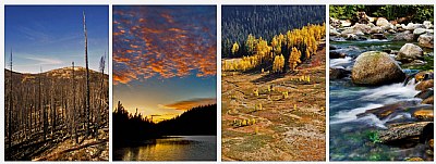
With the attached image, I've described what I wanted to depict with this series. You'll find the basic idea in the about, and tried to depict this in an somewhat uncontroversial way. I have a few questions I'm struggling with In the mindmap attached to this comment, there's a more elaborate description of what I intended to create. The presentation itself is not an issue. It's about the imagery and the mood I tried to create...
I would appreciate your feedback on the following:
1. What's your first impression?
2. Does the combination of images fit the theme?
3. Do the images fit together in this order?
4. Are there any images that do not fit in your opinion?
5. How would you title this series?
And, most helpful,
6. How can i improve this series?
7. Which one do you prefer? This one or the previous series?
I realise I ask a lot, but any help is greatly appreciated!
Cheers,
Hugo
|

The Elements - Mindmap |
|