|
|
 Martin .
 {K:24957} 6/18/2006
|
Kathy,
Godspeed to the both of you and your brothers!
I only play with the best shots posted. I'm sure you'll get over the plains... LOL ...
I'm just an Illinois boy. All of our woods were very colourful, back then. Now I've been in Texas for 25 years and everything is burned up... Go figure?
Happy Fathers Day to you and yours,
Martin
|
|
|
|
 Kathy Hillard
{K:25721} 6/18/2006
Kathy Hillard
{K:25721} 6/18/2006
|
Hi Martin,
Susie and I are indeed sisters...she's the greatest!
Thanks for taking the time to play with this shot. Since I'm more of an "undersaturated" rather than "oversaturated" kind of gal this version is a bit over the top for me, but it's always fun to see someone elses ideas!
Kathy
|
|
|
|
|
Martin .
{K:24957} 6/18/2006
|
Kathy,
OMGosh, I didn't know you were Susie's sister until today... Congrats on a wonderful capture indeed...
I hope you don't mind my playing about with your work, but I can't help myself... LMAO ...
My best to you and yours,
Martin
|

A dash of this and a bit of that? |
|
|
|
 Mireille Heirendt
{K:7258} 5/20/2006
Mireille Heirendt
{K:7258} 5/20/2006
|
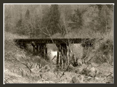
Great capture of this railroad tressle-perfect composition and tones. The sepia version is definitely the best!
Mireille
|
|
|
|
 Alison DuFlon
{K:36566} 4/26/2006
Alison DuFlon
{K:36566} 4/26/2006
|
Very beautiful full of great detail and what a great composition. Alison
|
|
|
|
 m ,
{K:15872} 4/23/2006
m ,
{K:15872} 4/23/2006
|
An impressive image with very nice details and lovely lightness! It is a very sympathetic view with this perspective you shot it!
Best regard: Maxime
|
|
|
|
 Joggie van Staden
{K:41700} 4/23/2006
Joggie van Staden
{K:41700} 4/23/2006
|
Lovely composition and tones Kathy - almost look like a scene out of war. Very well taken and presented.
Joggie
|
|
|
|
 Rashed Abdulla
{K:163889} 4/23/2006
Rashed Abdulla
{K:163889} 4/23/2006
|
wonderful landscape and very impresive composition, great contrast here and beautiful tone, all of the best my friend
|
|
|
|
 1301307 60
{K:44058} 4/23/2006
1301307 60
{K:44058} 4/23/2006
|
Nice find Kathy, I like the tones you used here, it gives a feeling that is an old photo found in your granpas personal property chest.. : ) There's something in the shrubs and bushes that is attractive when in monochromatic, I think its the fine lines seen. I prefer this one over the colored version..
regards...
|
|
|
|
 Brian Fillmore
{K:4016} 4/22/2006
Brian Fillmore
{K:4016} 4/22/2006
|
I like this photograph. It has an orginal appearance. The tree limbs in all different lengths in the foreground really add to overall feeling.
|
|
|
|
|
Roberto Okamura
{K:22851} 4/22/2006
|
Excellent landscape Kathy!
Beautiful sepia work!
Roberto.
|
|
|
|
 vanessa shakesheff
{K:68840} 4/22/2006
vanessa shakesheff
{K:68840} 4/22/2006
|
Like the colour version as well ,the b&w looks more dramatic and the colour a peaceful look,.. it,s wonderful how they can have such a different feel by changing colour..nessa
|
|
|
|
 Ali Naghizadeh
{K:19600} 4/22/2006
Ali Naghizadeh
{K:19600} 4/22/2006
|
Great shot dear KAthy.. Wonderful composition.. Well desaturated and cropped..
My best regards,
aLi
|
|
|
|
|
Alicia Popp
{K:87532} 4/22/2006
|
Bello puente entre tanta vegetación... en verano lo cubren!!!. Felicitaciones!!!
|
|
|
|
 Eb Mueller
{K:24960} 4/21/2006
Eb Mueller
{K:24960} 4/21/2006
|
I like this vintage look, Kathy! As usual, you retain interesting foreground detail and tonality.
Eb
|
|
|
|
|
Mahamed Ariffin
{K:7114} 4/21/2006
|
The monotone version is better, of course! I definitely love this one!
|
|
|
|
 stingRay pt.4 .
{K:250401} 4/21/2006
stingRay pt.4 .
{K:250401} 4/21/2006
|
Both versions are great my dear Kathy but with the mono toned version you get a better feeling of the history that the tressle might be steeped in...Cowboys and gunfights....well maybe not but mental pictures of the oldtime locomotives and rolling stock certainly come to mind. I like the portrait presentation of the colour version, it suits the subject well, but those wonderful mono tones are the winning touch. Well done sweetie....2 for the price of 1...I love a good bargain. My very best wishes to you as always....Ray
|
|
|
|
 josep alsina
{K:19880} 4/21/2006
josep alsina
{K:19880} 4/21/2006
|
Bonita fotografía, un poco otoñal y con unas tonalidades sepia excelentes. Un cordial saludo de
Josep
|
|
|
|
 missy mullins
{K:677} 4/21/2006
missy mullins
{K:677} 4/21/2006
|
what a great old timey feel....kinda spooky too..i like the first one the best..
|
|
|
|
|
DELETE ACCOUNT
{K:5655} 4/21/2006
|
A simple shot, but well done. I think I like the posted version better than the color.
|
|
|
|
 Andre Denis
{K:66407} 4/21/2006
Andre Denis
{K:66407} 4/21/2006
|
Hi Kathy,
You know I'm a sucker for toned B&W so I probably would go with the one you posted. Now, If you could just get some beavers to cut those trees out of the line of site of the bridge :)
ps
Another thing you might like is to de-saturate the color version right down so that there is only the faintest hue of green coming from the trees. I find this works nicely sometimes. De-saturate to very low colour and then increase the darkness and a little contrast. The mood will change again. It's all up to you :)
Andre
|
|
|
|
 Kelly Duntley
{K:13889} 4/21/2006
Kelly Duntley
{K:13889} 4/21/2006
|
As much as I really don't appreciate mono tones, this is fantastic. Leaves more of a spectral old feel to the photo. The tones fits this capture perfectly. A splendid job you did!!!
Kelly
|
|
|
|
 Don Loseke
{K:32503} 4/20/2006
Don Loseke
{K:32503} 4/20/2006
|
Hi Kathy, I really like the tones that you have created in this picture. I do find that the bridge is pretty centered. The background looks like a painting.. Nice work. Don.
|
|
|
|
 Dave Stacey
{K:150877} 4/20/2006
Dave Stacey
{K:150877} 4/20/2006
|
Excellent capture of this relic, Kathy! I like the b/w version, as it enhances the feeling of a rustic, and bygone era.
Dave.
|
|
|
|
 Markus Scholz
{K:23722} 4/20/2006
Markus Scholz
{K:23722} 4/20/2006
|
Very nice image, creating the illusion of an old photograph. I like the color version too, with the fresh green starting to grow.
Regards, Markus
|
|
|
|
 Michael Schuier
{K:4804} 4/20/2006
Michael Schuier
{K:4804} 4/20/2006
|
Beautiful shot. I love the tones in it. the contrast is just right for the bridge. Did you have a walk to find this, because it looks like you found a pretty little place only a few people are able to see.
Michael
|
|
|
|
 Robert Kocs
{K:89085} 4/20/2006
Robert Kocs
{K:89085} 4/20/2006
|
Oh my God, that's a really fine work, but coloured
version is good, I think b&w version is full of
artistry details and full of scary feeling. So good!
Absolutely nice photograph, great work, wery well done my friend!
Take care!
Best wishes dear Kathy!
Robert
|
|
|
|
 Gabriela Tanaka
{K:16594} 4/20/2006
Gabriela Tanaka
{K:16594} 4/20/2006
|
Dear Kathy, I looked at both versions and read all comments and, I must say, I definitely prefer the B&W version. It has character, it has impact, it has artistry.Well done!!!
Gabriela
|
|
|
|
 Caterina Berimballi
{K:27299} 4/20/2006
Caterina Berimballi
{K:27299} 4/20/2006
|
I'm gonna go for the colour version on this one Kathy. My thinking behind it is that the tones you have here are somewhat similar to those occurring in the colour version naturally anyway. So with the inclusion of some green from the trees and a smattering of life in the foreground, the scene takes on a new charm. Another reason for my preference is the orientation. The vertical composition gives more sense of height, space and openess.
Both interpretations of this scene are wonderfully presented, as usual :) and, aside from the slight blowout from the highlights beyond the tracks, flawlessly captured and composed.
But you know what? At the end of the day, it all comes back to what you want to convey, what mood/look/feel you hope to achieve. If it's simply a matter of colour vs tone, then putting it to a vote *may* help you decide between the two. But then you still may be left with some dissatisfaction if the 'popular' version doesn't adequately express your intent...
Cheers
Rina.
|
|
|
|
 Susie OConnor
{K:34798} 4/20/2006
Susie OConnor
{K:34798} 4/20/2006
|
This looks REALLY good! The color version is nice too with the pops of green. I can just see this on the cover of a CD or book. (A mystery book no doubt!)
Good angle and perspective. And good on you guys for traipsing out there!  ) )
Nice post, I've got a feeling about this one....
Suz
|
|
|
|
 Laura Spell
{K:24080} 4/20/2006
Laura Spell
{K:24080} 4/20/2006
|
Very well composed, with good tones and details. I like the color version best.
|
|
|
|
 Steve Aronoff
{K:18393} 4/20/2006
Steve Aronoff
{K:18393} 4/20/2006
|
The color version is nice, Kathy, but it just doesn't have the impact of the B&W version. This one's fantastic!! You might just tone down the brightness of the water ever so slightly. Other than that it's perfect!
Steve
|
|
|
|
|
sherif hussein
{K:13815} 4/20/2006
|
Wonderful capture I like both versions
Sherif
|
|
|
|
 Gregory McLemore
{K:35129} 4/20/2006
Gregory McLemore
{K:35129} 4/20/2006
|
Soft and lovely, smooth tones and very pleasing presence.
|
|
|
|
|
Kathy Hillard
{K:25721} 4/20/2006
|
A color version
|

|
|