|
|
 Joel Aron
{K:14920} 4/10/2006
Joel Aron
{K:14920} 4/10/2006
|
jo,
thank you very much! (I love the B/W as well!)
j
|
|
|
|
 João F * Photography
 {K:41945} 4/9/2006
|
I like this one in B&W too my friend Joel!!
Cheers
joão
|
|
|
|
|
Joel Aron
{K:14920} 4/6/2006
|
Thank you Phil!
I too enjoy Hugo's spark in his comments!
cheers,
-joel
|
|
|
|
 Phillip Minnis
{K:13131} 4/6/2006
Phillip Minnis
{K:13131} 4/6/2006
|
Oh, Joel, I like this in B&W. It's a great image. I read Hugo's comments with interest. I really enjoy his critiques!
Cheers
Phil
|
|
|
|
|
Joel Aron
{K:14920} 4/6/2006
|
thanks again jim!
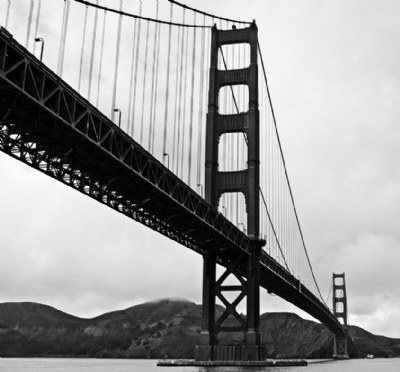
ya know... i was about to punch the background up, and the image was so wounded from trying to get contrast out of an overcast shot (see the color version).. that it just started to fall apart in the mids. Even went to the color version to get as much as possible out before the desat. Was just one of those images that forced me back to the bridge again today! ..and i'm going to go tomorrow... till I get it right! ..at least the sun was out.
thanks again for your help and comments! cheers,
-joel
|
|
|
|
|
Jim Goldstein
{K:21230} 4/6/2006
|
When looking at the thumbnails of your portfolio this really stood out among your other bridge shots. I think the B&W works well. I think adjusting the curves of your image might give you a little better contrast and tonal values. That would help the bridge pop a bit better against the cloudy background.
|
|
|
|
|
Joel Aron
{K:14920} 4/5/2006
|
Thank you Petal! So glad you like this! I aimed for that cold B/W that you see in all the old bridge photo's.
So excited about the re-shoot..The sun is out today, and I'll try and get there *just* at sunset... and I brought the tripod this time ;)
Thanks for your support!
cheers,
-Joel
|
|
|
|
|
Joel Aron
{K:14920} 4/5/2006
|
Thank you so much Jeanette!
This one is a tough one! ...but a great challenge!
I'm going to stop under the bridge again today for a re-shoot...with my tripod to help with a little more exposure ;)
thanks again! you too, have a great week!
cheers,
-joel
|
|
|
|
 Petal Wijnen
{K:50989} 4/5/2006
Petal Wijnen
{K:50989} 4/5/2006
|
Oh yes, me like... ;-D!! Great in B&W, too bad the somewhat dramatic sky is 'flattened' out a bit now, but you got the tones/levels/details on the bridge right. Excellent crop... more balanced image this way... and that 50's feel is definitely there... I think you found a good solution for now, but a reshoot... yes, I wonder with what beauties you'll come up... LOL!!
|
|
|
|
 Jeanette Hägglund
{K:59855} 4/5/2006
Jeanette Hägglund
{K:59855} 4/5/2006
|
I prefer this composition then the other, even though i guess you haven´t remake the shot but crop it. The bridge i prefer in colour though, but as it is i know why it´s in B/W 
Have a great week!
Jeanette
|
|
|
|
|
Joel Aron
{K:14920} 4/5/2006
|
Good fun! You said it! This is a very terrible drug.
I agree with you so much about the indepth discussion. Without a candid, open tear down of an image, we'll never learn. It's hard to recognize when someone is honest in a comment box. You...I trust.
Evey picture I open up on my screen, I learn what to do next time. in this case.. bring that wider lens and a tripod! As soon as I posted the image, and saw it on the site, *that* is when I knew I was going to go back there on my home from work tomorrow!
I attempted more midtone contrast in the sky, and found that due to the tighter crop (that I likes more than sky) it fought with the dominating bridge. I let the values come almost all the way up, so there's information still there, but doesn't show well here.
This kind of photo discussion is very good! Thanks Hugo!
cheers,
-joel
|
|
|
|
 Hugo de Wolf
{K:185110} 4/5/2006
Hugo de Wolf
{K:185110} 4/5/2006
|
Hi Joel,
Think this is already a much better solution where the "smudginess" and composition are concerned. Although the blue whiff of smoke under the bridge is less noticeable, I believe this concised composition focuses stronger on the bridge, as well as on the low cloud cover.
Yet, it also makes the minor lens distortion more noticeable and I think a bit more mid-tone contrast in the sky would make it a bit more threatening. Another thing is that with the nearest bridge head just slightly to the right of the centerline, the solution with the suspension wires crossing the top edge of the photo is more noticeable too. It makes me believe that a "true" portrait formatted image aspect is something to seriously consider next time you manage to head out there...
I know I'm impossible to please...:) But I enjoy this type of indepth discussion on the various suggestions on a photo. Good fun!
Cheers,
Hugo
|
|