|
|
|
BRUNELLA FRATINI
{K:356} 3/14/2007
|
bellissimo scatto, come tutte le foto del tuo portfolio del resto, sarebbe ottimo per un libro di botanica..complimenti
|
|
|
|
 James Cook
{K:38068} 6/2/2006
James Cook
{K:38068} 6/2/2006
|
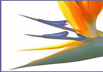
I like the solid white background, but the colors in the bird of paradise are washed in this image.
|
|
|
|
 rob rob
{K:-175} 4/4/2006
rob rob
{K:-175} 4/4/2006
|
Bellissima composizione e colori stupendi. Complimenti!
|
|
|
|
|
D. & Go
{K:612} 3/20/2006
|
ciao Giuseppe
questa macro è spettacolare, ho alcuni fiori di questa famiglia in attesa di apertura, a breve li fotograferò
saluti e complimenti
D.& Go
|
|
|
|
 Giuseppe Guadagno
 {K:34002} 3/16/2006
|
Grazie per la tua attenzione, Silvia.
Ho fatto una visita alla tua casa in costruzione e ho visto belle cose; anche bei fiori.
Saludos.
Giuseppe
|
|
|
|
|
Giuseppe Guadagno
{K:34002} 3/16/2006
|
Yes Mark, I can see that in your "Lily - sunset illumination". So I can tell you that I too prefer the more contrasted one, as always I do. I made this little inquiry for a confirmation that people, in floral picture, want to see plenty of lights and vivid colors. And this is the result obtained, once again.
Thanks for your appretiated comment, Mark.
Cheers.
Giuseppe
|
|
|
|
|
Giuseppe Guadagno
{K:34002} 3/16/2006
|
The two versions gathered almost the same preferences, but the last comments have given an advantaige to the light one, that you prefer.
Thanks for your appreciate attention, Mel.
Cheers,
Giuseppe
|
|
|
|
|
Giuseppe Guadagno
{K:34002} 3/15/2006
|
Thanks Kenneth for the attention. I've seen your place and admire splendid thinks also in the floral field; endeed splendid. I'll come back often to visit your home.
Cheers.
Giuseppe
|
|
|
|
|
Giuseppe Guadagno
{K:34002} 3/15/2006
|
Thanks very much Michael for your interest in my picture. Now I have the results of my short inquary: the preferens are almost the same in number. It'is problably a question of taste: for colours or for light contrasts.
I've visited your place: you have a beautiful home! But it seems lacking a garden as I haven't found any flower! When the first?
Cheers.
Giuseppe
|
|
|
|
|
Giuseppe Guadagno
{K:34002} 3/15/2006
|
Romy, you don't see me butI often come to your home looking for your new entries. The last are splendid, the flower too.
Thanks for your appretiate attention.
Ciao.
Giuseppe
|
|
|
|
|
Giuseppe Guadagno
{K:34002} 3/15/2006
|
Thanks for your attention. Now I visited your home and admired meny interesting pictures; but not a flower. May I hope to see one sometime?
Ciao Gokhan.
Giuseppe
|
|
|
|
|
Giuseppe Guadagno
{K:34002} 3/15/2006
|
Steve, thanks for your interest. I waited to have a result for my little enquiry. In fact, the two versions have almost the same number of fans. Probably it depends only by the individual taste: preminence to colours or to contrast of lights.
Thanks once more.
Giuseppe.
|
|
|
|
 Silvia Castañeda Puchetta
{K:342} 3/12/2006
Silvia Castañeda Puchetta
{K:342} 3/12/2006
|
Espectacular Giusepe! Felicitaciones!
Por mi parte prefiero esta,
Un saludo cordial.
Silvia
|
|
|
|
|
Mark Gurkin
{K:174} 3/12/2006
|
Giuseppe,
A beautiful very artistic series of flora. All well executed. My taste tend towards the low key with is color shifts. It to me is slightly more drsmatic. The other is as well done just not my personal taste.
Best Regards,
Mark
http://picforlife.blogspot.com/
|
|
|
|
 Jeanette Hägglund
{K:59855} 3/11/2006
Jeanette Hägglund
{K:59855} 3/11/2006
|
I like this one even more, the colours are more bold and staturated. The arrows even more visible, good work !!!
Jeanette
|
|
|
|
 Allen Aisenstein
{K:5652} 3/11/2006
Allen Aisenstein
{K:5652} 3/11/2006
|
I prefer this image. It's quite striking. Excellent work! Thanksvery much for viewing and commenting on my photos. Regards, Allen
|
|
|
|
 Ms. Mel Brackstone
{K:5285} 3/10/2006
Ms. Mel Brackstone
{K:5285} 3/10/2006
|
A beautiful flower, I like this for the colours, but feel the background is too bright. Well shot, nice and sharp.
|
|
|
|
 Kenneth Roine
{K:3538} 3/10/2006
Kenneth Roine
{K:3538} 3/10/2006
|
Both are very beautiful. I like the high key over the low key. The colors are enhanced by the bright background.
Ken
|
|
|
|
 Susie OConnor
{K:34798} 3/10/2006
Susie OConnor
{K:34798} 3/10/2006
|
Hi Giuseppe,
I do prefer the low key version. I think the colors are a little more vibrant. They are both beautiful...I love the subject matter itself.
Another great post and addition to your portfolio.
|
|
|
|
 Gregory McLemore
{K:35129} 3/9/2006
Gregory McLemore
{K:35129} 3/9/2006
|
Truly a work of art, belongs in a Gallery, masterful work my friend.
|
|
|
|
 no longer a member
{K:10557} 3/9/2006
no longer a member
{K:10557} 3/9/2006
|
As a personal preference, I like this one much better because the colors appear more vibrant as related to the high-key lighting. Great abstract material and very well executed. Maybe consider shooting this somewhere in between, but like I said this would be a persal preference.
Very creative and refreshing.
Many complments, Mike
|
|
|
|
|
Romy Fabian Garmaz
{K:17105} 3/9/2006
|
Giuseppe
un gran trabajo, muy bello.
Romy
|
|
|
|
 Rashed Abdulla
{K:163889} 3/9/2006
Rashed Abdulla
{K:163889} 3/9/2006
|
very impresive piece of photography here , great contrast and perspective with wonderful colors and details , all of the best my friend
|
|
|
|
 Gökhan KARAMAN
{K:8878} 3/9/2006
Gökhan KARAMAN
{K:8878} 3/9/2006
|
wonderfull macro image beautifull colours...
|
|
|
|
 Steve Aronoff
{K:18393} 3/9/2006
Steve Aronoff
{K:18393} 3/9/2006
|
They're both lovely, Giuseppe. Personally, I prefer the low-key version. I like the sublety of its colors. The high-key one is a bit bright. I would have preferred a toned-down background. And the low-key version doesn't have the pixelization around the edges that are evident in the crop of the high-key version. But I do like them both.
Steve
|
|