|
|
 Tim Long
{K:9228} 4/15/2004
Tim Long
{K:9228} 4/15/2004
|
A very good point on the framing. I agree that a more delicate treatment would work better with this one. Thanks for your suggestion!
|
|
|
|
|
Ragnhildur Ragnars
{K:1573} 4/15/2004
|
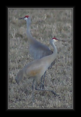
Very gentle image. I like the placement of the birds. The tones are wonderful and I agree with you that they should blend with the background. The only jarring point has nothing to do with your image but rather how you have framed it. I find this frame too clunky and harsh for such a delicate image. A very narrow black frame would look better IMO or even take the red from the cranes and have a narrow red frame.
|
|
|
|
|
Tim Long
{K:9228} 4/1/2004
|
Thanks for your comments. While I understand your observations on the background, the monochromatic quality is exactly the point and an important part of the image. Sandhill Cranes, like most wildlife, are found in places where their coloration conceals them, and I sought to capture that rather than create a contrast that wasn't there. The contrast of head plumage provides the focal point I wanted. There is so much hyper-saturation and hyper-sharpening seen in photography today that I find the subtlety of color and texture here refreshing. Thanks again for looking and for leaving your comments!
|
|
|
|
 Saeed Al Shamsi
 {K:47735} 4/1/2004
|
Very interesting image apart from the background should be different tone,al most hiding the main object,saeed
|
|
|
|
|
Bob Tomerlin
{K:5460} 3/30/2004
|
The thumbnail doesn't do this one justice. The only weak point for me is that the color of the background is so close to that of the cranes. But a nice idea well presented.
|
|