|
|
Critique By:
michaelle . (K:3807)
5/11/2002 7:18:10 PM
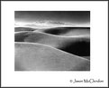
I know it's not much of a critique, but all I can say is Beautiful!
|
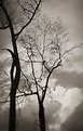
| Photo By: Jason McClendon
(K:19)
|
|
|
Critique By:
michaelle . (K:3807)
5/9/2002 4:59:00 AM
I really like the perspective on this one. Definately a very creative and unique reflections shot. I'm not sure what the thing is in the back window, but I find it somewhat distracting from the overall reflection of the tropical season in the window. Really well seen!
|
| Photo By: José Lins
(K:1544)
|
|
|
Critique By:
michaelle . (K:3807)
5/5/2002 6:01:33 AM
Beautiful image! Very well envisioned and executed... I love the perspective and the colors.
|
| Photo By: Henri Gustav Eftevand
(K:10)
|
|
|
Critique By:
michaelle . (K:3807)
5/5/2002 5:57:01 AM
It's amazing what surprises these little plastic cameras can spit out... or at least for me they are always surprises  I really like the feel of this image. Wonderful. I really like the feel of this image. Wonderful.
|
| Photo By: Sean Franzen
(K:0)
|
|
|
Critique By:
michaelle . (K:3807)
4/29/2002 5:17:53 PM
Halid,
I think the exposure on her forehead is perfect... if you went much darker, you would loose the contrast with those haunting eyes. Beautiful.
|
| Photo By: Halid Izzet
(K:373)
|
|
|
Critique By:
michaelle . (K:3807)
4/29/2002 3:43:15 PM
I like your choice of shallow DOF for this and how the poppies dissolve into the horizon. Very nice!
|
Photo By: Tony Smallman
(K:23858)

|
|
|
Critique By:
michaelle . (K:3807)
4/26/2002 5:14:18 PM
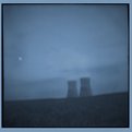
Jason,
What a mood! What a way to set a tone... really cool image.
|
| Photo By: Jason McClendon
(K:19)
|
|
|
Critique By:
michaelle . (K:3807)
4/17/2002 10:06:15 PM
Knowing how skitterish Cardinals can be, i want to congratulate you on your patience Neat shot...
|
| Photo By: CJ McKendry
(K:1388)
|
|
|
Critique By:
michaelle . (K:3807)
4/16/2002 6:07:58 AM
Mary,
Very neat idea... I like the graphic feel to this one, and the piece in the back adds nice depth. As a nit-pick... it would be interesting to see what this image would look like if the chess pieces were on a chess board instead of the bare wood (just section that is currently wood... leave the rest of the background as is). The squares would have added to the graphic nature of the image. But then again I could be missing the whole point. Kudos on the image.
|
| Photo By: Mary
(K:2)
|
|
|
Critique By:
michaelle . (K:3807)
4/15/2002 8:49:34 PM
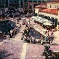
Chris,
I think you are having just WAY too much fun... hahaha...
|
| Photo By: Chris Blaszczyk
(K:610)
|
|
|
Critique By:
michaelle . (K:3807)
4/13/2002 3:28:56 PM
Neat! looks a little soft, but that could just be the scan... very well seen...
|
| Photo By: Yan McLine
(K:0)
|
|
|
Critique By:
michaelle . (K:3807)
4/9/2002 7:59:47 AM
Phillip,
I'm not very experienced with portraiture, so please take my comments with a grain of salt. I like the lighting, very nice... soft and even. The only thing that is bothering me is that I want her eyes. Her head and her shoulder are primarily open to the camera, and her eyes off to the corner do not seem to match. Maybe more of a 3/4 profile shot would work with the eyes. Well, again, that's just my inexperienced two cents.
Michaelle
|
| Photo By: Phillip Filtz
(K:1792)
|
|
|
Critique By:
michaelle . (K:3807)
4/4/2002 6:33:14 AM
Marc,
The touch-ups done on this were not that difficult. First, I adjusted the curves, lightening the foreground to a more acceptable range.(I ignored the sky completely as it was already blown out). Then I adjusted the levels to bring the shadows back in. After making these adjustments - I did the real "cheating". I used the eye dropper tool to pick the lightest shade of blue from the upper left hand corner. Then I used the magic wand to select the absolutely white sky. I enlarged the selection by 3 pixels. Next I selected the fill tool and set the opacity to 50% and tolerance to 30 and filled the selection with the blue color producing the "blue sky". Finally, I did a little dodging and burning.
Regarding the sky thing... when you have to actually "make" a blue sky for any picture, it is probably best to go back and re-shoot on manual or with different light as this type tweak is considered a little over the top even to those that use PS on a regular basis to adjust their pictures
Michaelle
|
| Photo By: Marc Robin
(K:3385)
|
|
|
Critique By:
michaelle . (K:3807)
4/3/2002 10:33:43 PM
I agree with you that trying to reach the perfect range within in a picture using film is the ultimate challenge, and useing PS too much to "touch up" a picture can make one feel like they are "cheating". However, I have found that PS can only make a good picture better and not a bad picture good, and I feel that this picture IS good. With that in mind, please accept my PS modified version of this shot as more food for thought than anything else.
|
| Photo By: Marc Robin
(K:3385)
|
|
|
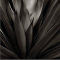
Critique By:
michaelle . (K:3807)
4/3/2002 9:01:16 PM
Beautiful! Dark wonderful textures... my kind of picture Congratulations, EC very well deserved.
|
| Photo By: Steve Kompier
(K:4629)
|
|
|
Critique By:
michaelle . (K:3807)
3/23/2002 10:11:13 AM
Bill,
Please, please, please, post how to do this. I have tried to do the Polaroid manipulations, but have managed to do nothing but ruin alot of pictures This, and your other polaroids are fantastic!
|
| Photo By: Bill Krul
(K:5597)
|
|
|
Critique By:
michaelle . (K:3807)
3/23/2002 7:51:10 AM
What a great catch!
|
| Photo By: Thomas Holden
(K:15)
|
|
|
Critique By:
michaelle . (K:3807)
3/21/2002 8:05:43 PM
Mary,
This location has lot's of promise! You must go back and I agree with you, sunsets are especially hard to take because of both the metering and the patience it takes to get "it right". With this location in mind, let me see if I can help with some suggestions (please forgive the elementary nature, but I do not know your comfort level with this camera):
First, with the CP 950 in M rec mode go into the menu and adjust your settings for the following:
1) White balance on cloudy (sounds funny, but it warms the colors) or auto
2) Contrast at normal
3) Spot metering
Now, for the shot, point the camera off to the left of the sun and just above the tree line and slightly push down on the shutter button. While still putting slight pressure on the shutter button, recompose your shot so that it is in the frame the way you like it and press the shutter button all the way down. This should give you a much more balanced contrast to your picture. Unfortunatly, because the CP950 does not have very good color saturation, you may have to increase the saturation in a digital photo editor in order to achieve the colors you are looking for.
With regards to some other tips on the picture, first, the sun is still too high in the sky, and that is one of the reasons why the sunset colors are not as intense as you may like. Try waiting until the sun is just over the trees (and even dipping below the tree line) before shooting the pic. Secondly, if possible, the bottom of the picture looks a little cramped. If possible, (check your framing) point the camera down a little more when you do your final composing of the picture to pull in a little more of the water and foreground. Finally, play play play with all of the menu settings in M Rec mode. I have found with my CP that many settings when combined with each other, will give you really beautiful colors, DOF, etc...
Sorry for the book, but I hope I helped. Have fun! Looking forwards to your next post.
Michaelle
|
| Photo By: Mary
(K:2)
|
|
|
Critique By:
michaelle . (K:3807)
3/20/2002 5:07:54 AM
Very elegant shot. I really like how the multiple layers of lines flow though the picture.
|
| Photo By: Andy Graham
(K:38)
|
|
|
Critique By:
michaelle . (K:3807)
3/18/2002 5:42:58 PM
Chris,
Nice to see a different side of you (hmmmm). Great fun shot!
|
| Photo By: Chris Blaszczyk
(K:610)
|
|
|
Critique By:
michaelle . (K:3807)
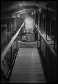
3/18/2002 5:40:38 PM
Neat shot! i really like the intensity of the yellow against the monochrome tunnel. It carries the eyes right through the picture. The only nit pick i have would be the little white specs on the roof of the tunnel. I'm sure they are supposed to be there, but once i noticed them, they seemed to compete with the converging lines.
|
| Photo By: Daniel L Quigley-Skillin
(K:1383)
|
|
|
Critique By:
michaelle . (K:3807)
3/18/2002 5:28:37 PM
Ok... since there have been some comments with regards to the blurred area at the bottom (we won't go into my mind on that one), attached is the "sharp" copy. Do the side by side, and let me know what you think.
|
| Photo By: michaelle .
(K:3807)
|
|
|
Critique By:
michaelle . (K:3807)
3/18/2002 5:02:41 AM
They sure make 'em beautiful these days Wonderful picture. Congratulations again to you and your family.
|
| Photo By: Samuel Downs
(K:7290)
|
|
|
Critique By:
michaelle . (K:3807)
2/21/2002 6:04:23 AM
Great moment.. great story... wonderful shot!
|
| Photo By: Mark Taylor
(K:344)
|
|
|
Critique By:
michaelle . (K:3807)
2/20/2002 5:40:32 PM
I keep coming back to this... one can almost feel those roots trying to push up through the asphalt. Nice!
|
| Photo By: Cole Petersburg
(K:49)
|
|
|
Critique By:
michaelle . (K:3807)
2/16/2002 6:26:10 PM
Really well done... this picture says so many things... beautiful!
|
| Photo By: Mike Pobega
(K:17)
|
|
|
Critique By:
michaelle . (K:3807)
2/16/2002 6:13:21 PM
I agree with scott... i just keep staring at it and wondering it's meaning... very cool...
|
| Photo By: Andy Graham
(K:38)
|
|
|
Critique By:
michaelle . (K:3807)
2/7/2002 7:34:31 PM
Such a good doggie! I hope you gave him a treat after his photo shoot
|
| Photo By: richard trager
(K:111)
|
|
|
Critique By:
michaelle . (K:3807)
2/7/2002 7:24:44 PM
I really like the lines in this. The angles made by the different colors and textures bring it all together. Really nice
|
| Photo By: Andy Graham
(K:38)
|
|
|
Critique By:
michaelle . (K:3807)
2/5/2002 8:44:11 PM
The feeling is really nice to this picture. The colors are wonderful and it definately has a dreamy feeling to it
|
| Photo By: Tony Smallman
(K:23858)
|
|


")