|
|
Critique By:
Jeroen Wenting (K:25317)

3/4/2006 3:10:02 PM
Nice picture of a very shy little critter.
Sadly it seems a bit soft and the tail is blown out, loosing some of what could have been a very good capture indeed.
|
| Photo By: ivor cross
(K:345)
|
|
|
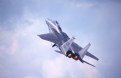
Critique By:
Jeroen Wenting (K:25317)
2/28/2006 7:06:52 PM
Thanks for the comments.
It's actually the Patrouille de Suisse flying at Fairford in formation with a Swiss F/A-18.
Yes, I know and love the Frecce. Sadly I've not been lucky photographing them lately.
|
| Photo By: Jeroen Wenting
(K:25317)
|
|
|
Critique By:
Jeroen Wenting (K:25317)
2/12/2006 8:05:53 AM
Good capture, especially for a camera in that class.
Digital point and shoot cameras are notorious for being extremely slow to respond, making accurate composition of fast moving subjects next to impossible.
A tad more light would have been better probably, letting the white aircraft appear white instead of grey.
Given your camera, a tighter crop would likely have been impossible (don't know its capabilities in that regard), at the moment the aircraft look a bit lost (but not so much as to make them disappear).
Overall a good image taken using limited means, maybe an incentive to go hunting for a DSLR with some long teles if you do this work regularly.
|
| Photo By: Bill Smith
(K:9)
|
|
|
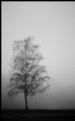
Critique By:
Jeroen Wenting (K:25317)
2/11/2006 9:34:30 AM
Very well done moody image.
Maybe a bit too much space at the bottom, just a sliver of ground might have been even better.
And as said, if everything that has been done before were not allowed we would all have to destroy our cameras immediately.
|
| Photo By: Gayle's Eclectic Photos
(K:91109)
|
|
|
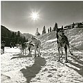
Critique By:
Jeroen Wenting (K:25317)
2/7/2006 6:25:29 PM
Well done, good detail in the snow without loosing too much shadow detail.
Only thing I'm not that happy with is the ring around the sun, makes it look weird.
|
| Photo By: aa as
(K:63)
|
|
|
Critique By:
Jeroen Wenting (K:25317)
2/5/2006 12:56:17 PM
It's a tad soft because 1) my lens isn't the best wide open and 2) I used it of necessity handheld ballancing it on the door of my car.
Light isn't the best, but you take what you can (light was from the right and slightly backlit).
|
| Photo By: Jeroen Wenting
(K:25317)
|
|
|
Critique By:
Jeroen Wenting (K:25317)
2/5/2006 10:34:25 AM
Another of your mediocre images Ann?
Really nicely done, well lit and composed. Maybe a tad too tight, but I don't know the scene and it's quite likely given your skills that this is the best composition given the surrounding terrain.
|
| Photo By: Ann Nida
(K:45248)
|
|
|
Critique By:
Jeroen Wenting (K:25317)
1/26/2006 8:00:50 PM
Great shot of a classic aircraft.
Despite the backlighting you have a lot of detail in there, well executed.
|
| Photo By: hdw Photography
(K:6630)
|
|
|
Critique By:
Jeroen Wenting (K:25317)
1/24/2006 9:55:25 PM
Yes, it is the main landing gear coming up.
I caught the aircraft during takeoff for a display flight.
|
| Photo By: Jeroen Wenting
(K:25317)
|
|
|
Critique By:
Jeroen Wenting (K:25317)
1/22/2006 9:06:19 PM
Nice rich colours.
Sadly the small size causes loss of detail, leaving the entire image look cluttered.
|
| Photo By: al shaikh
(K:15790)
|
|
|
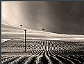
Critique By:
Jeroen Wenting (K:25317)
1/22/2006 12:23:52 PM
I agree with Derek, the cut off legs makes it look incomplete.
I'd also have gone for a tad more exposure as the subjects are clearly underexposed, yet not so much as to become silhoutted (which wouldn't work in this scene in my opinion).
To achieve that greater exposure you might need to provide some means of darkening the sky to prevent the clouds from being blown out (which is already starting in your picture as posted) and the sky becoming a white/grey mess.
|
| Photo By: Ibrahim Adiguzel
(K:12)
|
|
|
Critique By:
Jeroen Wenting (K:25317)
1/22/2006 12:04:21 PM
Looking good, but (there always is a but is there?) I'd go further to the right to eliminate that bright triangular patch on the left (and the little bit of blown out sky at the same time).
|
| Photo By: KEVIN TEMPLE
(K:8657)
|
|
|
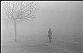
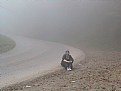
Critique By:
Jeroen Wenting (K:25317)
1/22/2006 12:02:02 PM
Classic street image using a classic camera.
Spontaneous, yet well composed and exposed.
Excellent use of fog to get rid of extraneous details.
|
| Photo By: Tai Dao
(K:416)
|
|
|
Critique By:
Jeroen Wenting (K:25317)
1/22/2006 11:54:08 AM
Good potential here.
I'd have liked to see more sky though, so a lower camera position.
Maybe move the boat almost up to the right border of the frame too.
And shoot on high lattitude black and white film to bring out shadow details.
|
| Photo By: Tiago Estima
(K:179)
|
|
|
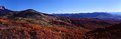
Critique By:
Jeroen Wenting (K:25317)
1/20/2006 6:15:51 PM
Well executed minimalist landscape, and good conversion to black and white too.
Wouldn't change a thing.
|
| Photo By: Pawel Cz
(K:981)
|
|
|
Critique By:
Jeroen Wenting (K:25317)
1/16/2006 10:18:10 PM
Well done, nicely composed and exposed.
Sadly it still looks digital, nothing can recreate the true look of film.
|
| Photo By: Dierk Kruse
(K:315)
|
|
|
Critique By:
Jeroen Wenting (K:25317)
1/15/2006 1:51:36 PM
Thanks for the comments.
By ugly I mean mainly too stylised and too little detail close up for something that size to enjoy at close quarters.
It's the best I could get out of 20 year old film that's been stored at room temperature all that time after going through some half dozen 1960s era X-ray machines.
|
| Photo By: Jeroen Wenting
(K:25317)
|
|
|
Critique By:
Jeroen Wenting (K:25317)
1/15/2006 6:29:08 AM
I like big blue aircraft 
Title is appropriate, even if this machine didn't yet exist even on paper in 1977.
|
| Photo By: David Waxman
(K:35)
|
|
|
Critique By:
Jeroen Wenting (K:25317)
1/15/2006 5:51:15 AM
Wonderful light and composition, makes it clear why getting up before dawn is often a good thing (and makes one wonder once more why it's so darn hard to convince people who are not photographers of that fact).
Shame about the small fence or whatever on the far shore, if I weren't dead set against digital manipulation I'd suggest you clone it out but as it is a retouching brush would do wonders
|
| Photo By: Barry Wakelin
(K:7838)
|
|
|
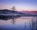
Critique By:
Jeroen Wenting (K:25317)
1/15/2006 5:48:21 AM
Very good lighting. The blue cast on the mountains makes me think you might have done better to use a closer composition incorporating just the pond itself (and the reflections in it) rather than the skyline as well.
|
| Photo By: Barry Wakelin
(K:7838)
|
|
|
Critique By:
Jeroen Wenting (K:25317)
1/13/2006 8:24:09 AM
Composition is excellent as usual Hugo, but you WAY overdid the Photoshop on this one.
It just looks artificial.
|
| Photo By: Hugo de Wolf
(K:185110)
|
|
|
Critique By:
Jeroen Wenting (K:25317)
1/11/2006 10:56:44 AM
I agree with Hugo, this has a lot of potential but as it stands it looks a bit hazy (for lack of words).
Almost like you shot with the sun providing just a bit of glare all over the shot.
|
| Photo By: Bartek M
(K:359)
|
|
|
Critique By:
Jeroen Wenting (K:25317)
1/11/2006 5:35:06 AM
Well lit scene. Something about the composition doesn't quite work for me though, it could well be the angle between the bridge, the river, and the tree.
A different perspective with the bridge running more into the center of the frame would I think have been more pleasing, maybe also taking a wider angle lens so that tree isn't cut off at both bottom and top (which I suspect is the main culprit of my unease).
You may also try some curves to make the sky a bit less bland, it seems to me there's a lot of detail there that is just getting lost in the whiteness.
|
| Photo By: Shelley Kent
(K:62)
|
|
|
Critique By:
Jeroen Wenting (K:25317)
1/11/2006 5:27:49 AM
The black and white is grey concrete
Can't really see much in this. Certainly nicely seen but not something I'd consider for shooting myself, the scene is too messy (yes, I'm a borderline romantic).
The concrete tiles on the terrace seem overexposed.
Technically it's quite nicely done, apart from that it's not really to my liking.
|
| Photo By: chloe schaller
(K:15)
|
|
|
Critique By:
Jeroen Wenting (K:25317)
1/11/2006 5:21:16 AM
Nice motion blur.
Try something different, crop out the still pool at the bottom making the entire image flow.
|
| Photo By: Danny Brannigan
(K:19523)
|
|
|
Critique By:
Jeroen Wenting (K:25317)
1/11/2006 5:18:23 AM
Nice composition, making the viewer feel really small in a very large desert despite the tight composition and lack of great empty space except the sky.
|
| Photo By: Mohamed Banna
(K:34237)
|
|
|
Critique By:
Jeroen Wenting (K:25317)
1/11/2006 5:08:49 AM
IMO it's a bit too busy. I'd crop away everything up to and including the boats moored in the background, leaving just the main subject in place for a more ballanced and quiet composition.
The upper part of the frame would make a rather nice cityscape in its own right, but I do feel that taken together it's too much of a good thing.
|
| Photo By: Fred Lord
(K:4844)
|
|
|
Critique By:
Jeroen Wenting (K:25317)
1/11/2006 5:04:54 AM
Nice composition and excellent depth of field.
Can't help but feeling you used a bit too much sharpening, check especially the registrations numbers on the boats but also some of the tree branches.
|
| Photo By: cessy karina
(K:14205)
|
|
|
Critique By:
Jeroen Wenting (K:25317)
1/11/2006 4:56:20 AM
Surely an unconventional perspective and a nice step away from the normal skyline shots we see so often.
Makes the place seem smaller than it thinks it is.
|
| Photo By: Ralf Denguth
(K:3353)
|
|
|
Critique By:
Jeroen Wenting (K:25317)
1/11/2006 4:52:46 AM
Quite strong image, the branch? sticking into the frame in the top left is a serious distraction though.
I agree with Louise about cropping it agressively, though I'd go for a square crop removing a good bit from the right of the frame and maybe a little bit from the left.
|
| Photo By: YalDa Faratin ( SHaparak)
(K:160)
|
|