|
|
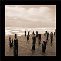
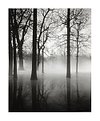
Critique By:
michaelle . (K:3807)
1/11/2003 8:31:39 PM
A little closer crop with some off the left frame and the bottom... does this work better?
|
| Photo By: michaelle .
(K:3807)
|
|
|
Critique By:
michaelle . (K:3807)
1/11/2003 3:30:44 PM
I really like the reflections in the water... and the pinpoints of light that are the stars are a "great touch"... i have had the same scanner for about 9 months now, and while it gives excellent results (after some practice), i still don't get all of the detail in my scans that are in the actual negative (or slide)... even so, I really like this image... the dark contrasting with the muted light of the aurora definately works. Well done.
|
| Photo By: Scott J Machalk
(K:173)
|
|
|
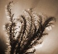
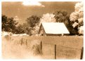
Critique By:
michaelle . (K:3807)
1/8/2003 4:02:32 PM
The highlights on the tree are what really add to this image... the sepia was a good choice to accent the lights and the darks...
|
Photo By: Raymond Andringa
(K:963)

|
|
|
Critique By:
michaelle . (K:3807)
1/8/2003 4:00:04 PM
Nice catch... a little too much blur in the upper right corner for me, but that is just an opinion. I am sure the bride and groom are very happy with this, as it is a well done catch.
|
| Photo By: Suzanne Strenk
(K:98)
|
|
|
Critique By:
michaelle . (K:3807)
1/7/2003 11:59:33 PM
Hi Roy! Good to see you!
Thank you, Alisa, for posting this picture of one of the unseen heros of this site.
Michaelle
|
| Photo By: Alisa Mudge
(K:7511)
|
|
|
Critique By:
michaelle . (K:3807)
1/7/2003 5:11:54 PM
Andrew and Harvey,
Thank you for your comments... They made me smile 
Michaelle
|
| Photo By: michaelle .
(K:3807)
|
|
|
Critique By:
michaelle . (K:3807)
1/7/2003 2:14:34 PM
How fun! I like the perspective, and to think it was done with a pinhole camera... very nice.
|
| Photo By: Terry King
(K:163)
|
|
|
Critique By:
michaelle . (K:3807)
1/3/2003 9:06:00 AM
What a neat subject! and I like the choice of sepia for this, gives it a very nostagic feel... A few things you might want to consider: I'm not sure if it was your intention to tilt the horizon on this, but for me it is distracting, either a little more tilt to emphasize the effect or no tilt would work better. Additionally, the horizon is dead center, and in some cases this works well, in this image it serves to effectively cut the image in half and create a fairly static image. As a suggestion, you may want to crop from the middle of the cloud down (in a square format). That way you don't loose the dramatic underportion of the cloud, but it effectively "pushes" the horizon up to the top 3rd of the frame and also emphasizes the layers that you have going in the image. The frame is a bit too heavy and pulls the viewers eyes away from the subtle tones in the picture. Finally, the sky, while having some detail, needs to be a bit more dramatic (although this is a matter of taste)... a bit of burning the highlights in the clouds and dodging the midtones will help them to pop a little.
This image has potential, play with the crops, the development work (or PS) and the tones and see what you come up with.
Michaelle
|
| Photo By: dave jones
(K:608)
|
|
|
Critique By:
michaelle . (K:3807)
1/2/2003 10:49:46 PM
Sean,
I like the range of tones you have very much, but I'm not sure of the composition. It feels very cramped, and I get the impression that the grass is pressed up against something at the top of the frame. The backlight is nice and I like how it brings out the texture around the grains, but the very dark corner in the bottom left of the frame is a little bothersome. All in all, I wish that my first studio work had turned out as well as this...
Michaelle
|
| Photo By: Sean Fitzgerald
(K:310)
|
|
|
Critique By:
michaelle . (K:3807)
1/2/2003 10:15:56 PM
Neat idea... the composition is well seen... I expect there is more detail in both the highlights and the shadows in the print... but the high contrast works well.
|
| Photo By: josh bomb
(K:51)
|
|
|
Critique By:
michaelle . (K:3807)
1/2/2003 10:08:14 PM
Of this series... this is my favorite with "A Warm Place" as a close second... the nostagic feel created by the composition, tones and textures in the images gives depth and meaning to each. Wonerfully seen and wonderfully developed.
Michaelle
|
| Photo By: james mickelson
(K:7344)
|
|
|
Critique By:
michaelle . (K:3807)
1/2/2003 10:00:53 PM
James! Finally, to see some new images from you is wonderful! I really like the mood of this image, the contrast and the tones add to the starkness of the image. I agree with seeing some texture in the shadow areas as well as wish the print was in front of me to really be able to have the full effect.
|
| Photo By: james mickelson
(K:7344)
|
|
|
Critique By:
michaelle . (K:3807)
12/15/2002 3:30:47 PM
I really like the movement in this one vs the other... This image gives a sense of "being there".
|
| Photo By: Jeroen Wenting
(K:25317)
|
|
|
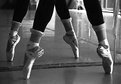
Critique By:
michaelle . (K:3807)
12/15/2002 3:24:16 PM
Joyce,
I really like the lines in this... it took me a minute to see that the reflection in the mirror was tack sharp with a softer focus for the "real" legs and shoes. The side lighting is really nice on the legs and the satin. Very well seen.
|
| Photo By: Joyce O\'Neal
(K:236)
|
|
|
Critique By:
michaelle . (K:3807)
12/15/2002 9:48:36 AM
WOW! beautiful...
|
| Photo By: Terrence Kent
(K:7023)
|
|
|
Critique By:
michaelle . (K:3807)
12/14/2002 10:31:28 AM
I really like this effect, it goes very well with your expression. My only nit would be the two very squares corners right at the corners of your mouth... it cramps the bottom part of your face just a tad too much... Well done.
|
| Photo By: Carmen Fuchs
(K:66)
|
|
|
Critique By:
michaelle . (K:3807)
12/14/2002 9:50:57 AM
hahahahahahaha
|
| Photo By: Larry Edwards
(K:843)
|
|
|
Critique By:
michaelle . (K:3807)
12/14/2002 8:15:32 AM
I commented on this the first time around... and like it so much that I felt it deserved to be commented on this go around also... I really like the depth this image has and the way the reflections "ground" the image. Choice of film was perfect and helped to make this just right. Great mood.
|
| Photo By: Mitchell Miller
(K:3009)
|
|
|
Critique By:
michaelle . (K:3807)
12/14/2002 8:05:44 AM
Very nice... there's a story in this image. Well done!
|
| Photo By: Ian T
(K:114)
|
|
|
Critique By:
michaelle . (K:3807)
11/30/2002 4:31:03 PM
You have captured so much texture in this man's face... so incredible the lines and the lighting... My only nit would be that with so much texture in his face, the stark blank white behind him is almost to contrasting for my taste... I would prefer to see a hint of texture in it (it may very well be there in the print).
|
| Photo By: Wallace Rollins
(K:149)
|
|
|
Critique By:
michaelle . (K:3807)
11/28/2002 4:36:13 AM
Bev,
I really like the indirect lighting on this... it gives it a depth that most florals do not posess. Very well done.
|
| Photo By: Beverly Gustafson
(K:1572)
|
|
|
Critique By:
michaelle . (K:3807)
11/26/2002 3:40:55 PM
Piper,
It's great to see your pictures here on usefilm, welcome! BTW, I agree with you, these are creepy little creatures that we have to deal with in NC alot, too... hat's off to you for getting close enough to take the shot (noticed it was a 105mm macro lens and not a 50mm, haha). Look forward to seeing more of you images (hint... could you post the starfish).
Michaelle
|
| Photo By: piper lehman
(K:256)
|
|
|
Critique By:
michaelle . (K:3807)
11/25/2002 9:24:24 AM
Wonderful first attempt... can't wait to see more.
|
| Photo By: Scott Hamming
(K:106)
|
|
|
Critique By:
michaelle . (K:3807)
11/24/2002 7:25:20 PM
The colors in this are outstanding, I love the deep purple tones... however, the large dark foreground does not add to the image, and competes with the beautiful purple. I hate to say it, but maybe crop out some of the sides and the bottom to balance the image just a tad bit more.
|
| Photo By: Joffre Swait
(K:626)
|
|
|
Critique By:
michaelle . (K:3807)
11/24/2002 7:18:19 PM
This image says alot... as mentioned before, the tilt gives tension and the toning and shading offer the mystery and feeling of the picture. Well done.
|
| Photo By: matt fruge
(K:83)
|
|
|
Critique By:
michaelle . (K:3807)
11/24/2002 9:17:34 AM
Nice graphic lines. While I'm sure the sky was absolutely beautiful, I'm not sure if it would have done well to have this picture in color. It's the starkness and absence of color that give it appeal.
|
| Photo By: Keith Loveday
(K:348)
|
|
|
Critique By:
michaelle . (K:3807)
11/19/2002 3:35:36 AM
WOW! (usually I am not a one word critiquer... but this is gorgeous)
|
| Photo By: Steve Mekata
(K:610)
|
|
|
Critique By:
michaelle . (K:3807)
11/19/2002 3:33:11 AM
Miguel,
This is a beautiful scene...the colors are wonderful and it definately has a "heavenly" feel to it... The blurring filter may be just a tad too much on this, though. If you could re-work it to not have quite so much of the softening and also to tone the purples in the road down a tad, I think the results would be fabulous.
Michaelle
|
| Photo By: Miguel Lasa
(K:62)
|
|
|
Critique By:
michaelle . (K:3807)
11/18/2002 3:59:29 AM
Dawna,
Took a little time to work out the hot spots in the jpeg... let me know what you think.
M
|
| Photo By: michaelle .
(K:3807)
|
|
|
Critique By:
michaelle . (K:3807)
11/17/2002 8:20:11 PM
Gary,
Thank you for your explaination regarding the tilt of the horizon... i now understand exactly what you meant to do. It is a beautiful image (as so many before me have commented on) and again, I can't wait to see more.
Michaelle
|
| Photo By: Gary Martin
(K:579)
|
|