|
|
Critique By:
Jeroen Wenting (K:25317)

11/23/2006 6:51:01 PM
I agree, turkey is best stuffed with fruit and nuts :)
|
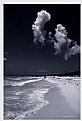
| Photo By: Joe Ciccone
(K:3684)
|
|
|
Critique By:
Jeroen Wenting (K:25317)
11/12/2006 8:04:11 PM
Not bad, but too contrasty.
Whites are blown out, blacks are closed up.
Seems like you are about 1 zone off on each end.
|
| Photo By: Leo Régnier Я£
(K:67696)
|
|
|
Critique By:
Jeroen Wenting (K:25317)
11/12/2006 7:52:18 PM
Excellend composition and tonal range.
Did you use a warming filter on that or apply that later on the computer?
I'd personally have cropped a little more from the bottom to remove those red spots there (whatever they are).
|
| Photo By: Tim Schumm
(K:29196)
|
|
|
Critique By:
Jeroen Wenting (K:25317)
11/5/2006 5:29:31 PM
Brings back memories. I used to breed zebra finches as a kid.
They're true characters.
Nice shot, well exposed. Composition is somewhat unballanced though, too much dead space at the bottom.
|
| Photo By: Chris Boivin
(K:9030)
|
|
|
Critique By:
Jeroen Wenting (K:25317)
9/18/2006 5:03:19 PM
This is not the place for activism, political or otherwise.
No matter how horrid this situation is, we can't tollerate that or else where would we have to draw the line?
|
| Photo By: Ivan Jimenez
(K:9078)
|
|
|
Critique By:
Jeroen Wenting (K:25317)
9/9/2006 7:16:24 PM
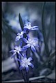
Cute indeed. Very well framed, love the detail of adding a little bunch of wildflowers to complete the effect.
Nice soft tones mask the effect of the slightly unfocussed background, which could otherwise have been a disturbance.
|
| Photo By: Carrie Fuit
(K:204)
|
|
|
Critique By:
Jeroen Wenting (K:25317)
9/9/2006 7:11:07 PM
Nice strong image. Sadly the rockfaces are slightly soft, which reduces the visual impact.
|
| Photo By: John Navarrete
(K:80)
|
|
|
Critique By:
Jeroen Wenting (K:25317)
9/9/2006 7:09:24 PM
Very well executed long exposure.
Shame you have the horizon ever so slightly tilted, or it would have been just about perfect.
Can you give more details about what filters you used and why?
|
| Photo By: Peter Margetic
(K:2084)
|
|
|
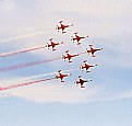
Critique By:
Jeroen Wenting (K:25317)
8/22/2006 10:03:10 PM
Turkish Stars fly ex-Dutch NF-5A and B models.
|
| Photo By: A Vas
(K:326)
|
|
|
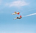
Critique By:
Jeroen Wenting (K:25317)
8/20/2006 2:41:00 PM
Well timed and composed, albeit a bit far off (hardly surprising with the lens you used).
Not very sharp though (coarse grain caused by your choice of film doesn't help there), and it looks a bit overexposed.
|
| Photo By: A Vas
(K:326)
|
|
|
Critique By:
Jeroen Wenting (K:25317)
8/15/2006 8:01:22 PM
Excellent, intimate picture.
Good maintenance of detail in both the dark and light areas, indicating well thought out exposure.
Well chosen DOF causing separation of the foreground without loosing too much in the background, which would have made this scene far less strong than it is.
|
| Photo By: Shirley D. Cross-Taylor
(K:174016)
|
|
|
Critique By:
Jeroen Wenting (K:25317)
8/10/2006 7:27:45 PM
Nicely done. You seem to have overexposed slightly, leading to the blades being somewhat washed out.
The grain is pleasing, maybe make it a bit more visible, making the entire image stronger IMO.
|
| Photo By: Efisio Mureddu
(K:13104)
|
|
|
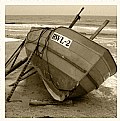
Critique By:
Jeroen Wenting (K:25317)
6/11/2006 6:12:48 AM
Certainly a well composed and lit beach scene, but do watch your horizon line.
It's off by several degrees, completely unnecessary when the horizon is as clearly defined as it is here.
That seriously mars what might otherwise be a candidate for an award.
|
| Photo By: Paolo Corradini
(K:59552)
|
|
|
Critique By:
Jeroen Wenting (K:25317)
6/7/2006 5:30:13 AM
Very nice image indeed. Excellent lighting, good composition.
I won't comment about the hairstyles as they've little to do with the quality of the photograph.
|
| Photo By: Melanie Reynolds
(K:9096)
|
|
|
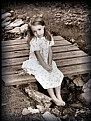
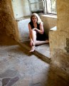
Critique By:
Jeroen Wenting (K:25317)
6/4/2006 9:51:34 AM
As Melanie already said, the look on her face doesn't match the image.
She looks frightened or angry, terrified almost.
|
| Photo By: Phil Cassell
(K:1054)
|
|
|
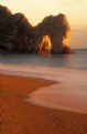
Critique By:
Jeroen Wenting (K:25317)
5/31/2006 8:15:21 PM
Great capture, magic light.
Shame about the slightly tilted horizon, would have been easy to compensate for (or prevent using the spirit levels in any decent tripod).
P.S. how did you get a Lexar CF card to work in an F80?
|
| Photo By: clive Morgan
(K:126)
|
|
|
Critique By:
Jeroen Wenting (K:25317)
5/31/2006 4:39:52 PM
This is one kind of scene that would have been better shot (almost) without people.
The one time I visited the Ataturk mausoleum it was completely quiet, noone else but our small tourgroup was there (I don't know why, maybe it was the time of day, early morning).
The impression was overwhelming.
Try shooting the same composition early morning when the place is very quiet, with just a single person walking up the stairs maybe.
You might also want to try for a bit more exposure, causing somewhat less saturation.
That will make what's already a good photo a great one.
|
| Photo By: Cem Güner
(K:452)
|
|
|
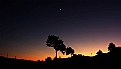
Critique By:
Jeroen Wenting (K:25317)
5/31/2006 4:35:33 PM
Excellent capture of a postsunset sky.
I do see some colour banding though, possibly caused by JPEG compression, which is a shame.
I don't know if it was possible, but placing the trees off center would have made for a stronger composition (in mountains it can of course be very hard to pick your exact composition, but with some cropping you can achieve a lot).
|
| Photo By: Cem Güner
(K:452)
|
|
|
Critique By:
Jeroen Wenting (K:25317)
5/26/2006 5:21:32 PM
One word: dramatic.
I'd have expected a bit more sharpness from a scene shot at f/19 though.
Strong wind or hazy conditions maybe? Or JPEG artifacts?
|
| Photo By: Hugo de Wolf
(K:185110)
|
|
|
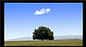
Critique By:
Jeroen Wenting (K:25317)
5/26/2006 5:18:03 PM
Good idea and well seen situation. But it would have been far stronger had you placed the tree off to one side rather than right in the middle of the frame.
While the rule of thirds is no law set in stone, it is usually a very good guideline to follow.
|
| Photo By: Sinan Goksel
(K:1010)
|
|
|
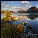
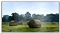
Critique By:
Jeroen Wenting (K:25317)
5/26/2006 5:07:20 PM
Peaceful scenic. The reeds on the right seem a tad underexposed though, and you might have tried to provide some more foreground.
|
| Photo By: Tim Schumm
(K:29196)
|
|
|
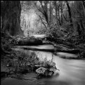
Critique By:
Jeroen Wenting (K:25317)
5/26/2006 5:00:42 PM
You captured the spirit of "forest" quite well.
Maybe a tad cluttered on the right, but that's what dense forests are so it may be a blessing in disguise.
|
| Photo By: Tamara Verbova
(K:492)
|
|
|
Critique By:
Jeroen Wenting (K:25317)
5/26/2006 4:59:32 PM
I'm not too happy with the large centered subject, but apart from that it's a well executed scene.
You shouldn't have added the smoke effect, it detracts. Would have been better to try and get the existing haze and capture that more strongly.
|
| Photo By: Laura Spell
(K:24080)
|
|
|
Critique By:
Jeroen Wenting (K:25317)
5/26/2006 4:56:41 PM
Nicely done closeup, though the background is a bit cluttered.
Maybe a different angle (or choosing another flower) might have provided for a smoother background.
|
| Photo By: Alexis Polegaev
(K:379)
|
|
|
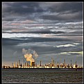
Critique By:
Jeroen Wenting (K:25317)
5/12/2006 5:28:11 AM
yup, it's the new place in Almere.
And the concrete is already cracking in places, despite it having been open for only a few weeks...
|
| Photo By: Jeroen Wenting
(K:25317)
|
|
|
Critique By:
Jeroen Wenting (K:25317)
4/18/2006 7:32:10 PM
Strong image, reminds me of Hitchcock.
The highlight in the top is a bit of a shame, a tighter crop there would have been better.
Slight underexposure helps set the gloomy mood which makes this image.
|
| Photo By: Michael Rydh
(K:111)
|
|
|
Critique By:
Jeroen Wenting (K:25317)
4/12/2006 6:53:15 PM
Nice tranquil scene.
Maybe a tad lacking in colour saturation, but that somehow adds to the overall impression of peace and tranquillity.
Would work well as an advertising poster for a tourist board, or just to hang on the wall in the office or at home.
|
| Photo By: Kiarang Alaei
(K:49415)
|
|
|
Critique By:
Jeroen Wenting (K:25317)
4/5/2006 6:53:20 PM
Cropped maybe a bit too tight, I'd have liked to see some more of the surroundings to bring the scene to life.
But not bad, exposure is good.
The noise doesn't do the image justice though. Were this shot on high ISO black and white film it would have looked a lot better, or else smooth out the noise (or remove by shooting at a lower EI setting on your camera).
|
| Photo By: Mariusz Sprawnik
(K:114)
|
|
|
Critique By:
Jeroen Wenting (K:25317)
4/3/2006 8:47:49 PM
the ruddish yellow light lends a good atmosphere, though IMO the large dark area at the top is a bit too much of a good thing (some detail there would have been better).
Nothing wrong with your composition or choice of subject, both are well done.
|
| Photo By: t marie
(K:302)
|
|
|
Critique By:
Jeroen Wenting (K:25317)
3/28/2006 9:06:07 PM
Looks like a bit of a weird blueish colour cast over the entire image.
Very good composition indeed, but those blues look quite artificial. I'd not want to swim in water that colour 
|
| Photo By: Jose Ignacio (Nacho) Garcia Barcia
(K:96391)
|
|