|
|
Critique By:
Steve Rosenbach (K:8338)
2/10/2006 5:41:08 AM
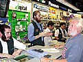
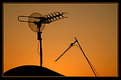
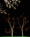
I love this photo, Gene! and I see you have now made it your "profile photo"-excellent.
I've never visited B&H, but I've heard only great things about them. I'd love to go there and hang out for a while to listen to photo-talk in Yiddish!
Actually, now that I think about it, "pixel" sounds like a Yiddish word! The 'l ending is often a diminutive in Yiddish (think "Yentl", diminutive for "Yenta") And what could be more diminutive than a pixel?
|
Photo By: Gene Zonis
(K:6934)

|
|
|
Critique By:
Steve Rosenbach (K:8338)
2/8/2006 8:10:03 PM
Excellent, Gayle. Mrs. King was beautiful spiritually and physically as well. I was a little sad to remember just how young Dr. King was when he was taken from her, and from all of us - only 39! So she was tragically such a young widow and lived without her dear husband for 38 years.
|
| Photo By: Gayle's Eclectic Photos
(K:91109)
|
|
|
Critique By:
Steve Rosenbach (K:8338)
2/2/2006 5:21:54 PM
Hello Kamran,
Beautiful photo and very dignified. I like the way you always treat our elders in a very respectful manner.
Though he is old, the shape of the way his hands drop down from each side of the cane - it looks like a youthful date palm!
Best regards,
SteveR
|
| Photo By: Kamran Bakhtiari
(K:24036)
|
|
|
Critique By:
Steve Rosenbach (K:8338)
2/2/2006 12:07:11 PM
Hello Fahad - this one should be Photograph of the Day! You've done a wonderful job with the composition, using the curve of the camel's neck as a design element - fabulous! Also, your image has a lot of heart and feeling, plus good humor.
Best wishes,
SteveR
|
| Photo By: Fahad Bahada
(K:164)
|
|
|
Critique By:
Steve Rosenbach (K:8338)
1/16/2006 4:19:00 AM
Hello Giulio!
I love your wonderful composition and point of view of this photograph - it's excellent!
And in addition, when I saw it, I had to smile! Thank you for a wonderful photo.
Best regards,
SteveR
|
| Photo By: Giulio Rotelli
(K:28441)
|
|
|
Critique By:
Steve Rosenbach (K:8338)
1/9/2006 4:06:09 AM
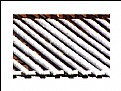
I was attracted to your photo from the thumbnail, and I was not disapppointed to see the large image!
It is elegantly simple and absolutely beautiful. Everything goes togother so well - the diagonal, repeating elements, the cold neutrality of the snow and the grating, and the warm color in the background.
Best regards,
SteveR
|
| Photo By: Mihai Ragea
(K:762)
|
|
|
Critique By:
Steve Rosenbach (K:8338)
1/8/2006 4:16:06 AM
Essential photography, beautifully distilled down to the simplest elements. Abstract yet real at the same time. Also, I'm guessing that the curved roof is of a very old -style building, so a nice observation of blending of old and new.
Wonderful!
|
| Photo By: Mo Hamed
(K:-457)
|
|
|
Critique By:
Steve Rosenbach (K:8338)
1/8/2006 4:12:40 AM
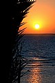
Beatiful, well-balanced composition. I really like the arc of the grasses at left that you used to frame this beautiful sunrise.
Great photo, Mo!
Best regards,
SteveR
|
| Photo By: Mo Hamed
(K:-457)
|
|
|
Critique By:
Steve Rosenbach (K:8338)
12/22/2005 12:04:51 AM
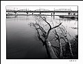
Good job, Matt - that's what I think! Simple and compelling composition
|
| Photo By: Matt Pals
(K:1722)
|
|
|
Critique By:
Steve Rosenbach (K:8338)
12/22/2005 12:00:48 AM
Beautiful composition and tonalities. Also, you "about" wonderfully expressed the feeling that I also got upon first viewing your image.
Best regards,
SteveR
|
| Photo By: wenwei chien
(K:148)
|
|
|
Critique By:
Steve Rosenbach (K:8338)
12/21/2005 11:59:09 PM
I like it! To me, it has a very 1930's-like feel. Also, the tilted frame gives me an impression that things are about to become upset - maybe very bad. It's quite an emotion that came across - did you find a similar reaction or something completely different?
This one deserves a lot of comments - I'm delighted to be the first one!
|
| Photo By: Aleix Oriol
(K:868)
|
|
|
Critique By:
Steve Rosenbach (K:8338)
12/21/2005 11:53:38 PM
Hi Berkin,
Very cool - one of the most unusual "self-portraits" I have ever seen!
Best regards,
SteveR
|
| Photo By: Berkin Unan
(K:34)
|
|
|
Critique By:
Steve Rosenbach (K:8338)
12/21/2005 11:48:47 PM
Hello Salvatore,
I've walked this way many times, but you captured the exhuberent verticality of this set of buildings. "30 Rock" is well-placed as the center of interest, but the other buildings play their part in balancing the image. Great job!
Best regards,
SteveR
|
| Photo By: Salvatore Rossignolo
(K:13559)
|
|
|
Critique By:
Steve Rosenbach (K:8338)
12/21/2005 11:23:21 PM
What an elegant composition, my friend! I also really like your title - like a dream!
|
| Photo By: Kamran Bakhtiari
(K:24036)
|
|
|
Critique By:
Steve Rosenbach (K:8338)
12/21/2005 11:21:25 PM
Wonderful image! Your composition is excellent - the way you placed the eyes of "Santa" and "Schreck", almost in opposite corners, creates a dramatic tension. Also, the 3rd figure with an accordian - is it another Santa? - it's placed so well in the frame.
Best regards,
SteveR
|
| Photo By: Kamran Bakhtiari
(K:24036)
|
|
|
Critique By:
Steve Rosenbach (K:8338)
12/21/2005 11:17:05 PM
Thank you dear friend Kamran! Also, I appreciate that you often see things about my photos that I didn't realize :-) That really does look like an eye on the right!
|
| Photo By: Steve Rosenbach
(K:8338)
|
|
|
Critique By:
Steve Rosenbach (K:8338)
12/16/2005 6:53:00 PM
Great photo, Paul! I like the diagonal flow of the landing gear and its reflection, and the counter-diagonal of the bold red stripe to contrast with the "neutral" polished metal and the concrete. You got this beauty from a very nice angle.
Best regards,
SteveR
|
| Photo By: Paul Lara
(K:88111)
|
|
|
Critique By:
Steve Rosenbach (K:8338)
12/9/2005 11:37:54 AM
Hey, look at us -- on Page One!! :-)
I didn't notice it at first either, and wondered why I had five or six new comments on some of my old photos.
Wishing you all the best,
SteveR
|
| Photo By: Gayle's Eclectic Photos
(K:91109)
|
|
|
Critique By:
Steve Rosenbach (K:8338)
12/9/2005 11:34:40 AM
Hello Wassim - welcome to Usefilm! Thank you for stopping by to look at some of my photos.
This is a very good self-portrait, actually, amazing that it came from your phone.
Hope to see more of your photos here in the near future.
Wishing you all the best, my friend,
SteveR
|
| Photo By: Wassim Tohme
(K:188)
|
|
|
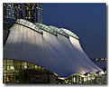
Critique By:
Steve Rosenbach (K:8338)
12/9/2005 3:22:54 AM
Hi Gene - thanks for your kind words - yes, I brought a tripod with me, figuring I'd need one once the sky got dark enough to make a nice contrast with the light coming through the fabric roof. I had to wait between shots until any cars passed by on their spiral down the garage to the exit - I could feel the virbration in the floor every time one passed by ;-)
|
| Photo By: Steve Rosenbach
(K:8338)
|
|
|
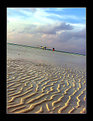
Critique By:
Steve Rosenbach (K:8338)
12/7/2005 8:19:08 PM
This is really beautiful, Gayle. Yes, I see the 3 distinct patterns - the upper area of "smoother" ripples, the grasses, and the lower area of "choppy" ripples - it's amazing how you got this little microscosm - so much going on in such a small space. I really like the way the upper and lower water parts are separated nicely by the grasses. Most people would never notice the difference between the two parts, but you captured it so well.
Best regards,
SteveR
P.S. - I think your choice of sticking with color instead of B&W was a good one for this image.
|
| Photo By: Gayle's Eclectic Photos
(K:91109)
|
|
|
Critique By:
Steve Rosenbach (K:8338)
11/23/2005 4:21:27 AM
very nice use of cross-lighting to bring out the texture of the sand ripples. A very intriguing photo!
|
| Photo By: cytte
(K:2089)
|
|
|
Critique By:
Steve Rosenbach (K:8338)
11/23/2005 3:05:08 AM
beautiful composition and colors, and it conveys a strong emotion. Really wonderful!
|
| Photo By: Kamran Bakhtiari
(K:24036)
|
|
|
Critique By:
Steve Rosenbach (K:8338)
11/23/2005 2:01:58 AM
Beautiful composition, Dan, and I love the way the beak pops out among all that white.
|
| Photo By: Dan Lightner
(K:12684)
|
|
|
Critique By:
Steve Rosenbach (K:8338)
11/23/2005 2:00:09 AM
Just amazing, Dan - you're always thinking of new ideas and ways to improve. What an inspiration!
|
| Photo By: Dan Lightner
(K:12684)
|
|
|
Critique By:
Steve Rosenbach (K:8338)
11/22/2005 3:37:45 AM
Hello Ursula,
It's an absolutely wonderful composition. The textured white wall is a beautiful canvas upon which you've put that little bit of green and that even smaller bit of red. The angle of the window and the arc of the drooping vine are such nice design elements.
The way you isolated this scene is so elegant and simple - it made my day to see such a beautiful image.
Best regards,
SteveR
|
| Photo By: Ursula Luschnig
(K:21723)
|
|
|
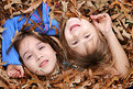
Critique By:
Steve Rosenbach (K:8338)
11/12/2005 2:56:12 AM
Wow, this is beautiful, Erik! What a great-looking kid, and what an expression. You caught it just perfectly, composed it perfectly - even the shallow DOF and the motion of the kids in the background adds to the impact of this image.
|
| Photo By: Erik Neldner
(K:10846)
|
|
|
Critique By:
Steve Rosenbach (K:8338)
11/10/2005 12:26:42 PM
>>...counter to Geneva Conventions.<<
I think the Geneva Conventions will be very useful if we ever get into a war with, say, Norway ;-)
-- Stever
|
| Photo By: Steve Rosenbach
(K:8338)
|
|
|
Critique By:
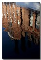
Steve Rosenbach (K:8338)
11/10/2005 3:17:04 AM
Many thanks to Kamran and the rest of you for your kind words!
I should have mentioned that except for "Levels" adjustment in Photoshop (I just set a part of the image that should be black to black and the rest fell in line) the image wasn't manipulated at all. The beauty early-morning reflection onto the water was there for the taking!
best regards,
SteveR
|
| Photo By: Steve Rosenbach
(K:8338)
|
|
|
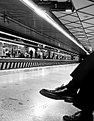
Critique By:
Steve Rosenbach (K:8338)
11/9/2005 3:22:55 PM
A masterpiece of perspective - everyone has taken a photo of a railway or subway platform to show the perspective, but your use of showing the legs and glossy shoes in the foreground is really unique and deals beautifully with what would otherwise be "empty" space in the image.
|
| Photo By: Kamran Bakhtiari
(K:24036)
|
|