|
|
Critique By:
Rafael Torcida (K:1926)
4/8/2005 9:04:50 AM
Thank you Kevin, I really like your comment and I'm glad I could make you shiver. The photograph is based on a piece of music that it's kind of somber so that's what I tried to achieve.
About the grain, yes it's forced with PS because I think this grain goes well with the somber mood, and I really love grain in photography.
Thanks again for you comment!.
|
| Photo By: Rafael Torcida
(K:1926)
|
|
|
Critique By:
Rafael Torcida (K:1926)
2/22/2005 11:02:45 PM
Beautiful macro portrait. Amazing light! and the grain effect looks really good. Well done!.
|
| Photo By: carlo raingini
(K:11977)
|
|
|
Critique By:
Rafael Torcida (K:1926)
2/21/2005 10:15:22 PM
Amazing landscape!. Colour use is terrific. The reflection works wonderfully well. Only drawback is horizon line... slightly dropped to the right... easily fixable with PS  . .
|
| Photo By: William Wilson
(K:380)
|
|
|
Critique By:
Rafael Torcida (K:1926)
2/21/2005 10:13:37 PM
Beautiful portrait!!. You captured the spirit of these two boys really well. Only distracting element is the face in the backgroun, between the boys. The background look really good with the rest of the photograph. I like it very much!. Well done.
|
| Photo By: Kinta Olia
(K:48)
|
|
|
Critique By:
Rafael Torcida (K:1926)
2/21/2005 10:11:20 PM
Great light play Tamara! I like it very much!. Colour selected is one of my favourites too... but that's my personal taste .
|
| Photo By: Tamara N
(K:2617)
|
|
|
Critique By:
Rafael Torcida (K:1926)
2/19/2005 8:23:42 PM
Beautiful fair photograph. Good use of the slow shutter. Slightly oversaturated for my personal taste.
|
| Photo By: Lea Mulqueen
(K:7396)
|
|
|
Critique By:
Rafael Torcida (K:1926)
2/19/2005 12:04:48 PM
Hi Tamara,
many thanks for you kind words and for visiting my new photoblog site. I'm really happy you liked it. Thanks!
|
| Photo By: Rafael Torcida
(K:1926)
|
|
|
Critique By:
Rafael Torcida (K:1926)
2/18/2005 9:55:41 PM
WoW!. Very good photograph Judita!. I like it very much. The only drawback is the chromatic noise on the shot. I find it annoying. May be you could desaturate the shot or apply some colour2bw technique to avoid the effect. A bw noise would look great in this shot!.
|
| Photo By: Judita Sendak
(K:600)
|
|
|
Critique By:
Rafael Torcida (K:1926)
2/18/2005 9:54:10 PM
Beautiful combination of portrait and landscape. Good use of light and tones. The only distracting element is the shadow in the lower right corner but probably it couldn't be avoided. Well done!.
|
| Photo By: ugur cetin
(K:5895)
|
|
|
Critique By:
Rafael Torcida (K:1926)
2/18/2005 9:42:46 PM
Taunis, thanks for your comments .
Should I go to the psychologist?, HAhahaha... just kidding....
|
| Photo By: Rafael Torcida
(K:1926)
|
|
|
Critique By:
Rafael Torcida (K:1926)
2/13/2005 11:20:22 PM
Reading the comments of this photograph I've realized I'm not the first one getting absolutely amazed with this photograph. The only drawback I can find is the slow size you used to upload the picture. I would like to see this as big as possible . Congratulations for a perfect job!.
|
| Photo By: Barry Wakelin
(K:7838)
|
|
|
Critique By:
Rafael Torcida (K:1926)
2/12/2005 1:30:07 AM
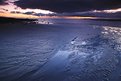
Disturbing and powerful work canses. The low key lightning works wonderfully well here, creating intriguing hints of the place where the photo was taken and just giving us minimal details.
Full of atmosphere!.
|
| Photo By: canses
(K:1048)
|
|
|
Critique By:
Rafael Torcida (K:1926)
2/12/2005 1:27:01 AM
Ohhhh!!!!.... The Intercontinental Amstel Hotel!!!. I once spent a full weekend in this amazing (and quite expensive :P) hotel -fortunately using reward points- and it's so cute outside and inside. BTW, Taunis, this week I went to Amsterdam again, just for business but I had a great time in the city... I love Amsterdam!!! (and not exactly because of the red light district ).
Anyway, composition and exposure are great (I find quite beautiful the mirrored image of the hotel). The only problem I see is the slightly blurred image, probably because of the long exposure you had to use. Also, the white balance could be better adjusted.
Thanks for making my thoughts went back to that wonderful weekend some years ago!.
|
| Photo By: Teunis Haveman
(K:37426)
|
|
|
Critique By:
Rafael Torcida (K:1926)
2/4/2005 7:54:26 PM
Apart from photography I'm a great fan of roller coasters and theme parks... and I've been some months in Vienna... so I know very well the Prater and this flying coaster called Volare (and made by Zamperla)
You found an interesting pattern in this photograph. It's a pity that the first helix is cut. If you could re-frame concentrating just in the double helix you could get a better result. Colours are great!!!.
BTW, Volare is a really boring roller coaster :P. For a flying experience I suggest Air in Alton Towers (UK) .
|
Photo By: AJ Miller
(K:49168)

|
|
|
Critique By:
Rafael Torcida (K:1926)
1/25/2005 12:03:06 AM
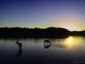
Hi Teunis.... bufff... this is top notch!!!!. Amazing shot combining a great landscape with a wonderful "life" theme.... the reflections on the water make the composition stronger and really professional.
I could say this is your best shot in usefilm. Follow this way... A perfect 7.
|
| Photo By: Teunis Haveman
(K:37426)
|
|
|
Critique By:
Rafael Torcida (K:1926)
1/24/2005 9:28:33 AM
Hi George, nice one too... hehehe... this is fun, I went to Key West at the end of november, so it seems this transatlantic is cycling very often in the Key West Hilton Marina . I hope you had a great time there!. It's a really nice place to have some vacations.
And you took your photograph with the camera I always wanted to have, an E-10. I supposed nowadays it must be considered "old", but when Olympus released it I wanted to have one. Unfortunately my budget didn't allowed me such a "gift".
Thanks for having a look to my photograph .
|
| Photo By: George Black
(K:102014)
|
|
|
Critique By:
Rafael Torcida (K:1926)
1/11/2005 9:25:47 PM
Beautiful portrait. Great use of the landscape format and grain, that combines very well with the expression in the man's face. It's almost cinematic.
I find it heavily contrasted. A little less contrast would enhance detail and wouldn't break the powerful lines in the face.
|
| Photo By: Art Lastowski
(K:42)
|
|
|
Critique By:
Rafael Torcida (K:1926)
12/7/2004 12:05:54 AM
This one is really amazing Taunis... You demonstrate with your photographs that advance exposure and excellent results can be achieved with an small digicam. That makes me happy... and it's the demonstration that photographs are not in the equipment but in the photographer. This one is stunning.... I know it is the kind of photograph that everyone likes , but... damn!, it is so good that it deserves a special place. An slight drawback: the strange reflection in the upper left corner... the heal tool of PS should be capable of fix this very fast .
Thanks for your support and kind comments!.
|
| Photo By: Teunis Haveman
(K:37426)
|
|
|
Critique By:
Rafael Torcida (K:1926)
12/1/2004 11:42:50 PM
beautifully original photograph on the boundaries of the abstract. Great use of line play emphasized by the BW. I really like the small amount of blurred background behind one of the chairs.... it creates a 3D effect on me that I love .
|
| Photo By: Steve Smith
(K:56)
|
|
|
Critique By:
Rafael Torcida (K:1926)
12/1/2004 11:40:07 PM
great use of available light. You perfectly captured the expression on your subject and the bluish tone of light matches wonderfully with the mood of the photograph. Sure there's a colour cast... but a wonderful one!!!!!. That makes the point here!.
|
| Photo By: Peter C.
(K:3076)
|
|
|
Critique By:
Rafael Torcida (K:1926)
12/1/2004 11:37:33 PM
quite interesting experiment based enterely on shadows and textures. I like the composition. Drawback is the bluish tone in the shadows. I think this photo should work even better as a pure BW one. Have you tried to move it to the "grey world"?.
|
| Photo By: drilan P drilan
(K:12030)
|
|
|
Critique By:
Rafael Torcida (K:1926)
11/26/2004 9:49:04 PM
Beautiful and interesting wide angle shot. The use of a wide angle lens and the vignetting empower the isolation effect. Cool.
|
| Photo By: David Grandy
(K:20)
|
|
|
Critique By:
Rafael Torcida (K:1926)
10/30/2004 1:08:33 PM
Beautiful and full of life shot Taunis. Composition is also great combining architecure lines and breaking them including the woman with the red coat. Only drawback is tight framing, specialy in the wheels of the bycicle... a little more air in that area would be great. I love this one!.
|
| Photo By: Teunis Haveman
(K:37426)
|
|
|
Critique By:
Rafael Torcida (K:1926)
10/29/2004 8:16:53 AM
Beautiful and amazing shot Cliff, it's really nice. I really like it's been taken with a digital camera... photographs are still in the eyes of the photographer, not in the cameras they use  . (Who said beautiful and saturated landscapes weren't possible with digital cameras ). . (Who said beautiful and saturated landscapes weren't possible with digital cameras ).
Inspiring!.
|
| Photo By: Cliff Andreas
(K:571)
|
|
|
Critique By:
Rafael Torcida (K:1926)
10/20/2004 8:33:05 AM
Beautiful and original shot André... how the globalized super-consumer products blur human existance and make all of us more or less the same.... just a spot...
|
| Photo By: André Bermak
(K:14443)
|
|
|
Critique By:
Rafael Torcida (K:1926)
10/18/2004 11:11:01 PM
Thanks for your comment. You're absolutely right in your focus appreciation. My digital camera took the wrong focus distance even if I tried to focus on the eye. Digicams are not very reliable.... at least this one :P. I wish I had my SLR for this shot.
|
| Photo By: Rafael Torcida
(K:1926)
|
|
|
Critique By:
Rafael Torcida (K:1926)
10/5/2004 5:23:25 PM
Nice try in new fields Taunis. I like the expression of the man and dog, and the bw mood. The sky is overburnt and distracts a little bit. May be you can apply a gradient over it and blend it with a multiply mode in photoshop to add some information there.
|
| Photo By: Teunis Haveman
(K:37426)
|
|
|
Critique By:
Rafael Torcida (K:1926)
10/5/2004 10:02:10 AM
Thanks for your comments Viktor.... any suggestion for the titles?. I like the way it is now but I'm willing to hear any idea .
|
| Photo By: Rafael Torcida
(K:1926)
|
|
|
Critique By:
Rafael Torcida (K:1926)
9/26/2004 10:07:03 PM
Hey John. Nice picture here. I love minimal composition like this one. The play of lines works wonderfully well and the bright blue sky is a nice add.
|
| Photo By: John H.
(K:2158)
|
|
|
Critique By:
Rafael Torcida (K:1926)
9/26/2004 9:28:24 PM
Hey Mark!.Great photograph here. Both composition and lighting combine great here. You caught the perfect moment of the three guys in a tight, really interesting composition. Great!.
|
| Photo By: Mark Scheffer
(K:1809)
|
|