| |
|
Featured Critiques by Photographer
1
|
|
Critique By:
Mark Longo (K:12760)
8/4/2006 10:02:09 PM
Lovely lines and textures balance this very well. I much admire your choice of balancing the ground with a lot of sky here. It seems to make the ground more solid, more massive, and very three dimensional. Obviously the dimension is greatly promoted by the distant biker. The tree to the right is a nice bit of punctuation to the lines and flow of the shot. It also looks to me like a cartoon profile opf a luaghing character, but that's my own mind doing it's thing! Anyway, a wonderful feeling of space and dimension here and an evocative summer mood. Good use of B&W. Wonder what the color version looked like.
Best Regards,
Mark
|
| Photo By: brian underdown
(K:-960)
|
|
|
Critique By:
Mark Longo (K:12760)
2/17/2006 1:25:54 PM
I love this one. The colors are superb. A very appealling air of informality! And a really attractive (appetizing?) grouping of colors!
I think the orange takes the arrangement to a new place than some of the other shots you have displayed of this similar arrangements. Somehow the vivd color of the orange highlights the soft subtlety of the other colors in the shot, and also provides a nice central focus. My eye ventures out from there, but always has a resting place to return to. I think the glass beads are an interesting element, though maybe I would like them to be more evident. I did not notice them at first glance, but I'm not sure how to suggest making them more evident. Really though, I don't think they're a crucial element and could be there or not there, which is fine. I think the arrangement is strong as it is and doesn't really need them.
I like the shallow DOF in this. I believe the background colors are red peppers but it also looks like a gathered red cloth backdrop in the lowered light and I think that is an attractive and interesting apsect. I also love the mating of the onion and wadded paper. The textures are so similar and the paper calls attention to the element of delicacy in the arrangement brought by the onion skin. I like the paper as human element via the handwriting too, and the fact that it's a discarded sheet adds to the lovely informality of the arrangement. I also like that you positioned the arrangement at the end of the tray, rather than along a longer edge, with the orange sort of spilling off the end. It may have seemed like an obvious choice at the time but it makes the arrangement look more happenstance, more casual and less posed, which I think is a nice nuance. Clever.
The lighting is superb! The darkness to the left and the dullness of the red provides a wonderful contrasting backdrop that makes the main subjects pop, and also hold much more attention for the viewer. Also, the fade-to-black on the left introduces a subtle hint of mystery.
Lastly, I think the paper and onion, as elements that are positioned off the tray, yet still in contact with the tray and arrangement grounds the tray nicely, even though we don't see much of the surface it all sits on. We don't need to.
Ina, this is an awesome work, you should be very proud of this. It's definitelty a fave of mine, I hope its one of yours too!
Best,
Mark
|
| Photo By: Ina Nicolae
(K:44481)
|
|
|
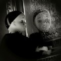
Critique By:
Mark Longo (K:12760)
2/10/2006 9:38:54 PM
Fantastic! This shot comunicates a complex mood wonderfully and effectively! Use of B&W is key to the mood and helps the overall mood of the shot become more abstract (I mean absrtact in the emotional sense, not the visual).
The detail and line patterns in the mirror are lovely and create a sort of interaction between the doll and the doll's reflection. It's hard to describe exactly what I mean by that, but it is a another important element of the shot, I think.
Lastly, I think the low angle with respect to the doll is the genius of this shot. The shooting angle brings a portrait-like quality to the shot, as though the viewer were sitting down, watching a figure standing at a mantle staring wistfully into a mirror. A very human shot.
Definitely one of your best Ina, there is so MUCH in this! Sure wish I shot it! :-) Congrats!!!
Mark
|
| Photo By: Ina Nicolae
(K:44481)
|
|
|
Critique By:
Mark Longo (K:12760)
1/25/2006 6:12:20 PM
Another excellent architectal. It is interesting to notice the different reflective effects created by the different types of exteriors on these two buildings. Obviously the abstract lines of the buildings are interesting as well, but I especially like the lines created by the sky against the building edges. Seen that way, it is an image of three abstract shapes: build/sky/building. You angle/perspective taken for this shot is very well chosen.
As a separate note, I have just seen your current "artist portrait", which is very well done. The style puts me in the mind of many wonderful portraits I have seen of Laurie Anderson, a tremendously gifted multi-media artist. My kudos to yourself or whomever shot that portrait. It is very very well done.
Best regards,
Mark
|
| Photo By: Jeanette Hägglund
(K:59855)
|
|
|
Critique By:
Mark Longo (K:12760)
8/21/2005 7:31:14 PM
Yes, I agree 100%, the simple answer is that you like it! All the rest doesn't matter much by comparison to that. And I like it too, please don't take my noise comment too much to heart. This is a great photograph that certainly deserves all the praise it's getting.
In fact, looking at this image on a better monitor (my usual monitor) I see much less noise, which seems odd. The monitor I used earlier was a cheaper monitor than my usual, and I'd have expected to detect less noise with the cheap monitor. But not the case here... Perhaps the scan and size of the cheaper monitor is not displaying the image very well, or something about this particular images color's doesn't mate well with that monitor...
In any event, I say above, a wonderful shot worthy of your excellent portfolio!
Mark
|
| Photo By: Larry Fosse
(K:66493)
|
|
1
|
|


")