|
|
Critique By:
Ann Nida (K:45248)
2/5/2006 4:54:19 PM
Great DOF used here. Even with that super sized lens I've found birds are so hard to capture as they move so fast. I think considering the light and how timid this type of bird normally is you've done a top job of getting this one. Some birds will sit there and almost pose for you while you take their photo. This isn't one of those. A very timid bird who flies away at first sense of danger and won't let anything get too close. Birds are not my forte so from where I'm sitting I think you've done well.
Thanks for dropping by my waterfall image. That image was intentionally tight. I have many of that same waterfall as it's my favourite. I've captured it in all sorts of variations.
Cheers - Ann 
|
Photo By: Jeroen Wenting
(K:25317)

|
|
|
Critique By:
Ann Nida (K:45248)
1/13/2006 10:18:58 AM
For my tastes and in my honest opinion here's what I have for you in a nutshell Michael.
The top one has too much dark on the left side of the image.
The centre one is excellent as it shows a great wide angle and to me is a nice subject worthy of such a panorama.
The bottom one appears to have not enough sky for the large main subject. I would hjave liked to have given that great rock formation more space to breathe so a bit more sky would have worked better for me.
Having said all that I like the centre work the best.
All this coming from soneone who is jealous of such great work and who cannot do panoramas. I haven't tried this stitching of images yet but if and when I do delve into this area I hope I can do half as masterfully as you have done here. Lovely tonal depth in all these images. Beautiful work.
Cheers - Ann
|
| Photo By: Michael Kanemoto
(K:22115)
|
|
|
Critique By:
Ann Nida (K:45248)
11/12/2005 7:09:05 AM
This makes a beautiful collection on the one image Robert. I'm probably in the minority here but I really love colour in all its tones and shades. I do like some things in B&W but for the msot part I think we (or at least my parents generation and my younger years) had to go through too many years with B&W photos and B&W TV then colour came in and WOWed the world and now that the world has digital colour to boot everyone wants to go back to B&W. It's like they got what they want and now they don't want what they got. haha Needless to say I really like the colour version here the best as a single but I also really like the Sepia and the B&W too.
Now having been so wordy and said all that I wonder if it might be an idea to change the position of them putting the sepia first then B&W then the colour on the right as though it was all going through time itself. Just a thought that passed through my head. Great shot Robert. I really like this one.
Thanks also for taking the time to view and comment on my Space Shuttle image.
Cheers - Ann
|
| Photo By: Robert Kocs
(K:89085)
|
|
|
Critique By:
Ann Nida (K:45248)
11/4/2005 12:49:55 AM
You should always use a tripod when taking photos of waterfalls. You will need a camera with manual settings so you can set a slow shutter speed to get the misty water effect. If you do have a camera with manual settings try a few different shutter speeds. Depending on the waterfall and available light I have found around 1/8 of a second to 1 second usually gives me a nice misty effect but that also depends on the distance I am from the water, the amount of water going over the falls and other factors that enter into the equation. It took me years to get my waterfalls misty and many missed shots. As a amtter of fact it was only recently that I took those waterfall shots and I got those with the help and advice of other people here.
Again my suggestion would be to set up your tripod and try to perfect your composition first. When you have found which focal length works best for you and which angle you think looks best to shoot your subject and what is in your actual frame then you can post it here for people to give advice on how to improve the technical aspect of your images.
I found it's always best to try to get the entire waterfall from top to bottom in the photo. A few times I've zoomed in thinking I'll get something artsy only to get home and see that my photos look like they have been cut off and I missed the top or bottom pool.
Of course each to their own but my preferred learning curve is to learn composition first then the technical side will happen all in good time.
Good luck. Ann
|
| Photo By: lauren Cornwall
(K:154)
|
|
|
Critique By:
Ann Nida (K:45248)
11/4/2005 2:59:36 AM
Nice composition there showing the guy on just the corner stretch of beach. Looks like a cold, windy day with those white caps. Makes for interesting colours and textures. I like the strip of blurred land in the background and the great clarity in the foreground. Nice relaxing image yet the waves give it some excitement too. Good shot and nice to view....ahem....if you know what I mean.  Cheers - Ann Cheers - Ann
|
| Photo By: Larry Donnelly
(K:644)
|
|
|
Critique By:
Ann Nida (K:45248)
10/16/2005 4:46:08 AM
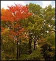
There are some lovely colours in this image D.A. I think I would like to see a tighter crop without the top sky portion of the image as the brightness is distracting from the lovely warm colours in the trees and I would even crop some off the bottom to remove some of the green. By cropping this image it would centralize the colours being the main subject and draw the eye further to the colours. At least that's just my humble opinion. I love fall colours. Nice capture. Cheers - Ann
|
| Photo By: D W
(K:2560)
|
|
|
Critique By:
Ann Nida (K:45248)
10/13/2005 3:48:08 AM
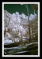
I liked the thumbnail when I saw it but when I opened it up to see the larger image I particularly enjoy the sky effect. It appears to be a deep green which works very well against the white trees. I love the tree trunk against that green sky. It almost glows. Very nice photo. A pleasure to view and the frame is beautiful. Would love to know how you did the frame. Cheers - Ann
|
| Photo By: Don Loseke
(K:32503)
|
|